Explore infrastructure metrics over time (deprecated)
Metrics Explorer is deprecated in the latest versions. Use Metrics exploration in Discover instead of the Metrics Explorer app. To find the Discover equivalent of each Metrics Explorer control, refer to Move to Discover.
The Metrics Explorer page enables you to create time-series visualizations based on aggregation of your metrics, chart them against related metrics, and break them down per the field of your choice. You can group and create visualizations of metrics for one or more resources that you are monitoring.
Additionally, for detailed analyses of your metrics, you can annotate and save visualizations for your custom dashboards by using the Time Series Visual Builder (TSVB) within Kibana.
To open Metrics Explorer, find Infrastructure in the main menu or use the global search field.
To learn more about the metrics shown on this page, refer to the Metrics reference documentation.
If there are no metrics to display, Kibana prompts you to add a metrics integration. Click Add a metrics integration to get started. If you want to add more data in the future, click Add data from any page in the Infrastructure app.
Need help getting started? Follow the steps in Get started with logs and metrics.
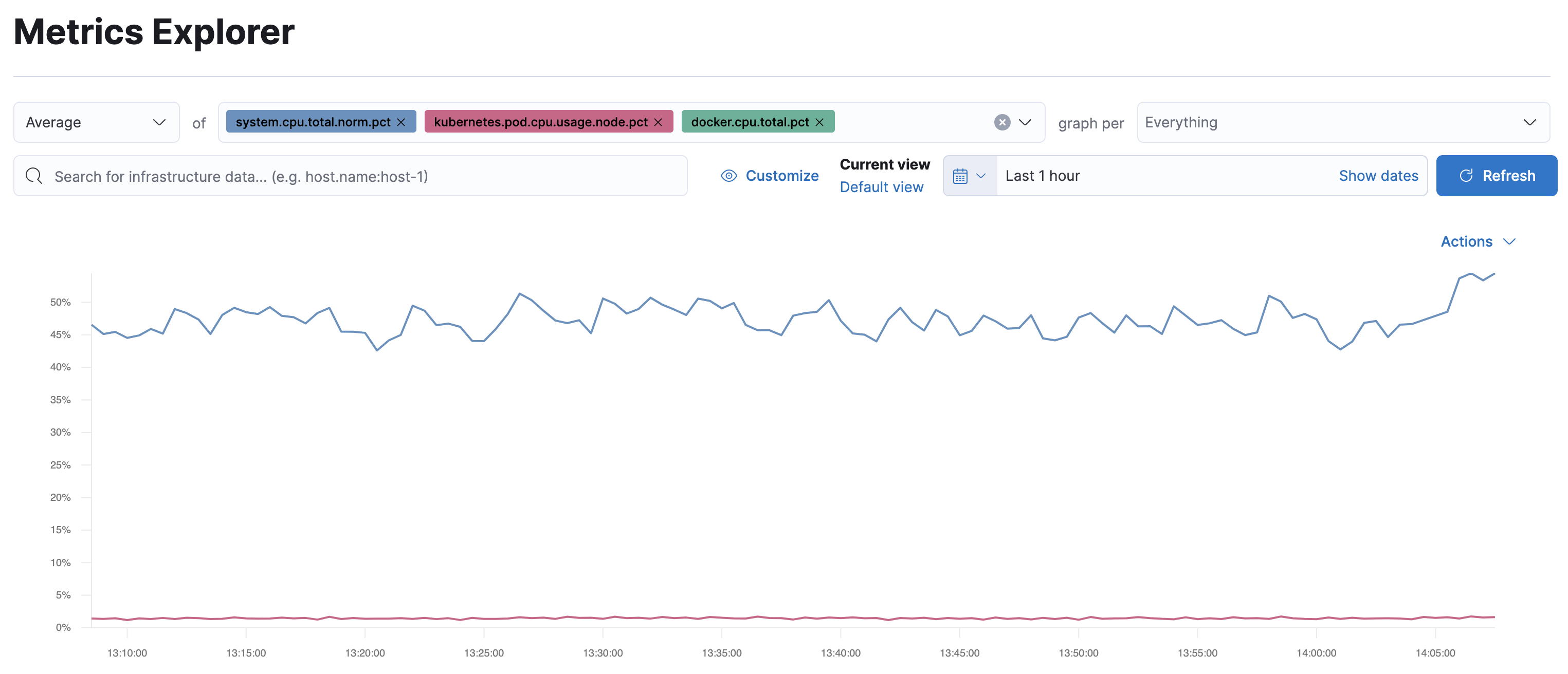
By default, the Metrics Explorer page displays the CPU usage for hosts, Kubernetes pods, and Docker containers. The initial configuration has the Average aggregation selected, the of field is populated with the default metrics, and the graph per dropdown is set to Everything.
As an example, let’s view the system load metrics for hosts we’re currently monitoring.
In the of field, delete the selected metrics, and then add
system.load.1,system.load.5, andsystem.load.15.The graph displays the average values of the metrics you selected.
In the graph per dropdown, add
host.name.There is now an individual graph displaying the average values of the metrics for each host.
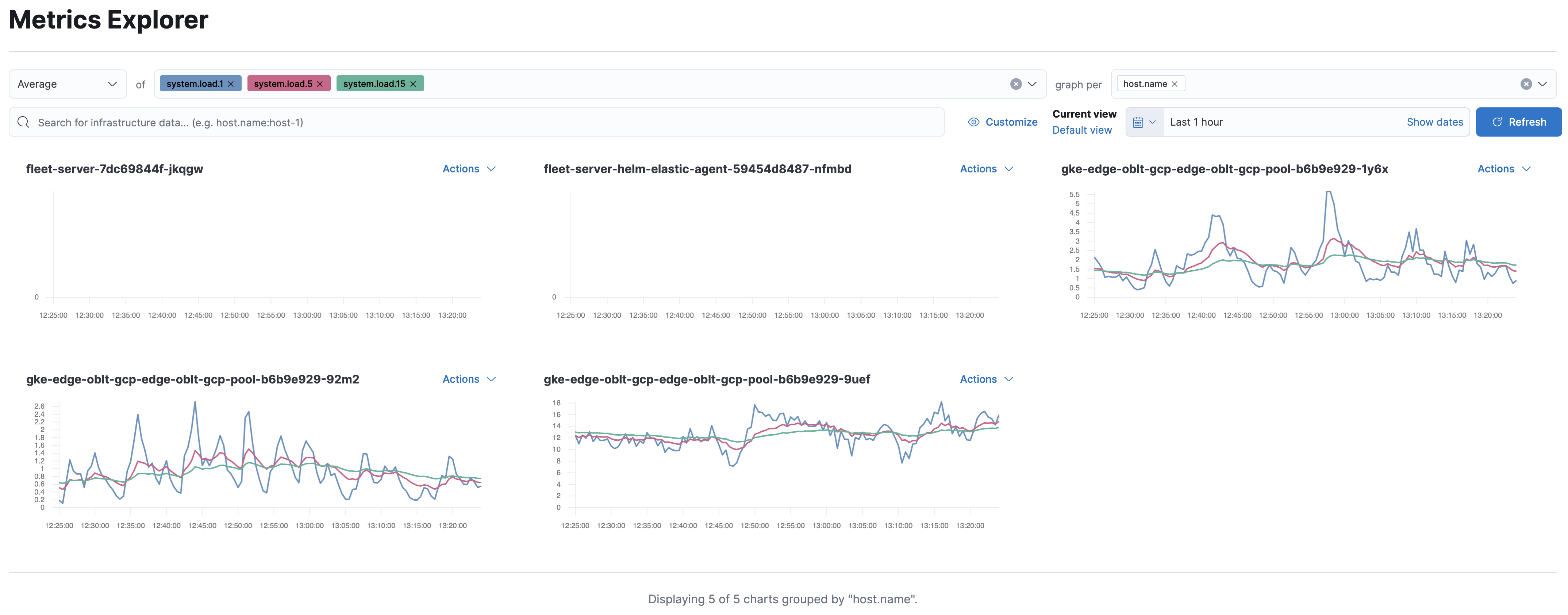
Select Actions in the top right-hand corner of one of the graphs and then click Add filter.
This graph now displays the metrics only for that host. The filter has added a Kibana Query Language filter for
host.namein the second row of the Metrics Explorer configuration.Let’s analyze some host-specific metrics. In the of field, delete each one of the system load metrics.
To explore the outbound network traffic, enter the
host.network.egress.bytesmetric. This is a monotonically increasing value, so from the aggregation dropdown, selectRate.Hosts have multiple network interfaces, so it is more meaningful to display one graph for each network interface. From the graph per dropdown, add the
system.network.namefield.There is now a separate graph for each network interface.
Let’s visualize one of the graphs in TSVB. Choose a graph, click Actions, and then select Open In Visualize.
In this visualization the max of
host.network.egress.bytesis displayed, filtered byhost.nameandsystem.network.name.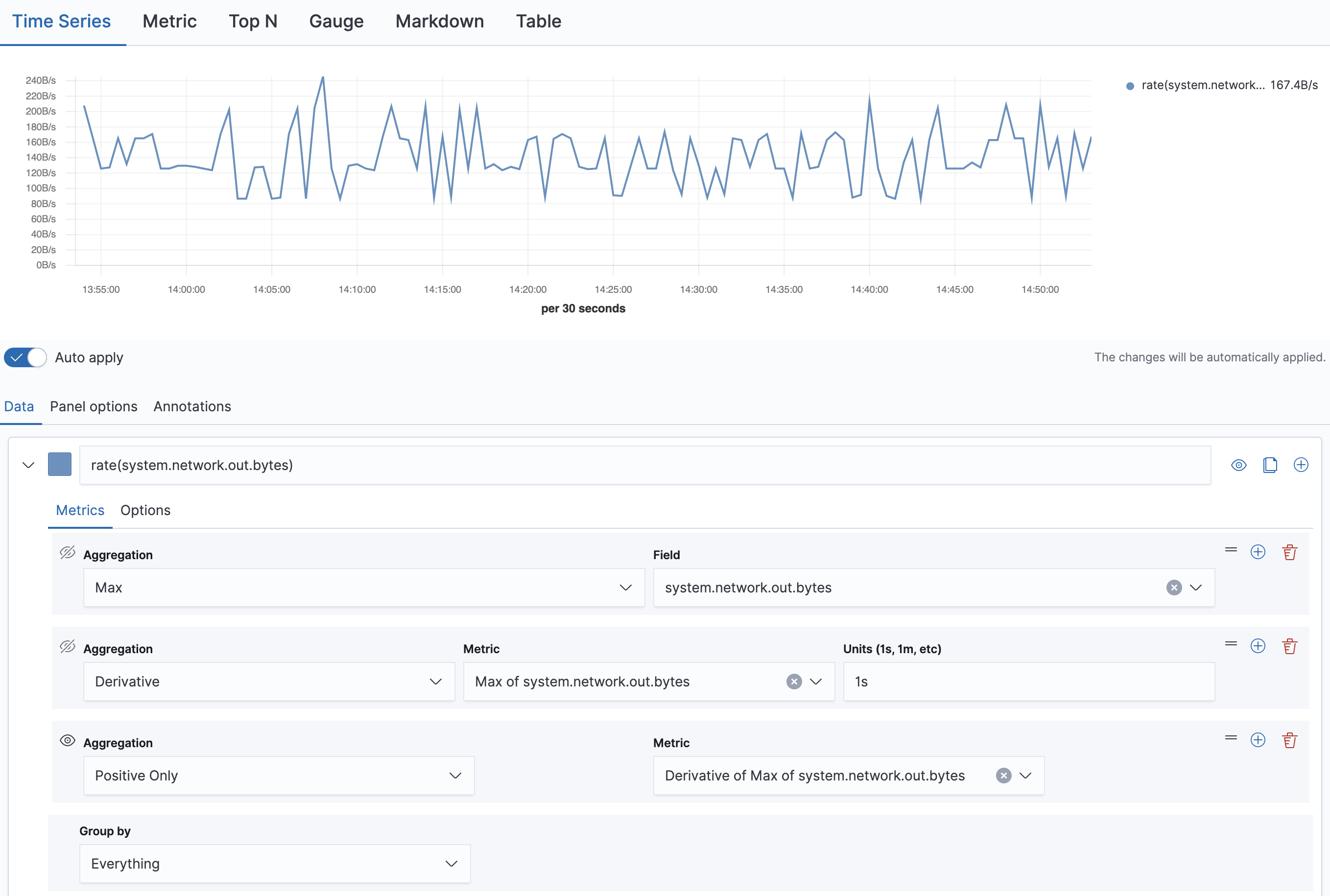
The
derivativeaggregation is used to calculate the difference between each bucket. By default, the value of units is automatically set to1s, along with thepositive onlyaggregation.To calculate the network traffic for all the interfaces, from the group by dropdown, select
Termsand add thesystem.network.namefield.You will also need to add the Series Agg aggregation and the Sum function. From the Aggregation dropdown, select
Series Agg, and from the Function dropdown, selectSum.If you would like to save this visualization and add it to a custom dashboard later, click Save.
Metrics exploration in Discover replaces Metrics Explorer. Most Metrics Explorer controls have a direct equivalent:
| In Metrics Explorer | In Discover |
|---|---|
| Selecting metrics in the of field | Search the metrics grid for the metrics you want |
| The graph per dropdown | The Dimensions control, which accepts up to five dimensions at a time |
| Actions → Add filter | Select a value on a chart, or add a WHERE clause to your ES|QL query |
| The aggregation dropdown | The Edit grid of metrics button, which lets you change how each metric type is aggregated
|
| Actions → Open In Visualize | Copy to dashboard, which saves the chart to a new or existing dashboard |
Discover selects its data source with the TS ES|QL command, for example TS metrics-*, rather than with an index pattern. Breakdown dimensions come from fields mapped as time_series_dimension, so the data stream you query must use the time series index mode. For the full set of requirements, refer to Explore metrics data with Discover.