Add Options list and Range slider controls to dashboards
Add interactive controls to your dashboards to help viewers filter data without writing queries. This page covers how to add, edit, and remove Options list and Range slider controls.
To add other control types, refer to Add time slider controls or Add variable controls.
You can also ask Elastic Agent Builder to add Options list and Range slider controls when it creates or updates a dashboard through chat.
To add Options list and Range slider controls to a dashboard, you need:
- All privilege for the Dashboard feature in Kibana
- An existing dashboard open in Edit mode
- A data view configured with fields available for filtering
To add interactive Options list and Range slider controls, create the controls, then add them to your dashboard.
Open or create a dashboard.
Open the Create control flyout:
-
In Edit mode, select Add → Controls → Control. -
In Edit mode, select Controls → Add control in the dashboard toolbar.
-
Choose how to populate the values available in the control:
- Select a field: base the control on a data view field. The control offers the values found in that field.
-
Write a query: populate the control with the results of an ES|QL query. Use this for high-cardinality fields, where listing every value isn't practical, or when you want to filter or otherwise shape the values the control offers.
- From the Data view dropdown, select the data view that contains the field you want to use.
- In the Field list, select the field you want to filter on.
- Write an ES|QL query that returns a single column. The column determines the field the control filters on and the values it offers. Use a command such as
STATS BYto return a single column. - Run the query to preview the values it returns under Values preview. If the query returns more than one column, select a column or narrow the query. If it returns no values, edit the query and run it again.
With an ES|QL query, you can shape the values offered in the control more precisely.
For example, use
WHEREto limit the values the control offers, instead of surfacing every value in the field. The following query offers only the operating systems seen in requests for CSS files from the sample web logs, instead of every operating system in the data:FROM kibana_sample_data_logs | WHERE extension.keyword == "css" | STATS BY machine.os.keyword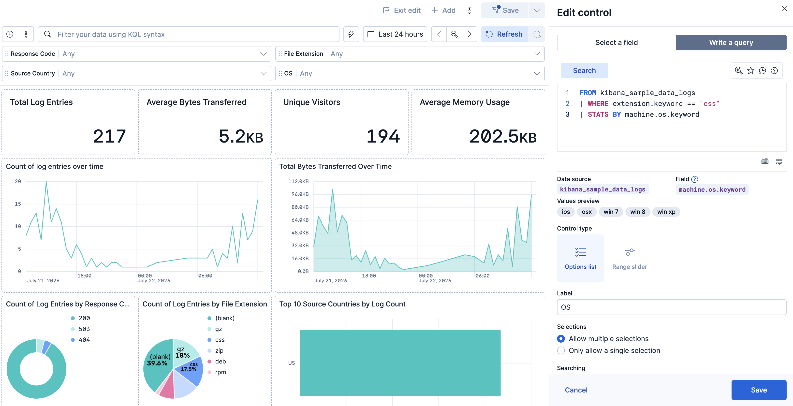 Tip
TipBecause the values come from a query, you can also chain the control to a variable control by referencing its variable with the
?variable_namesyntax.Under Control type, select Options list or Range slider. Range sliders are only compatible with numeric fields. The slider's minimum and maximum come from the data: the field's values, or the query results if you populate it with a query.
Configure how the control looks and behaves. You can give it a clearer label, allow single or multiple selections, adjust how its search matches values, and set whether it chains with other controls. The available settings depend on the control type. For the complete list, refer to Dashboard control settings.
Select Save to add the control to the dashboard. The control appears right away in Edit mode, where you can test it and adjust its settings before viewers see it.
Choose where the control appears. New controls are pinned to the top of the dashboard by default, where they apply to all panels. To move a control into the dashboard body, hover over the control and select Unpin. To move it back, select Pin to dashboard. Once unpinned, you can move, resize, and arrange the control on the dashboard like any other panel, including placing it inside a collapsible section to scope it to that section's panels. Placement changes which panels a control filters. For details, refer to How controls affect the dashboard. Save the dashboard. The control becomes a permanent part of it, and viewers can use it to filter the relevant panels.
When a dashboard has more than one control, the controls interact:
- By default, selecting a value in one control updates the others to show only values that still return data. This behavior is called chaining. You can turn it off for a control with its Use global filters setting.
- If a value you already selected no longer matches any data, the control marks it as invalid, as long as Validate user selections is on (the default).
After adding a control to your dashboard, you can change its settings, clear its values, move it, adjust its width, or delete it. How you access these actions depends on whether the control is pinned:
- When pinned, hover over the control to reveal its action icons.
-
When unpinned, hover over the control to reveal its action icons, or open its panel menu, which adds standard panel actions such as Duplicate and Copy to dashboard.
| Action | Description |
|---|---|
| Clear | Clear the selected values without changing the control's settings. Available only when a value is selected. |
| Unpin or Pin to Dashboard
|
Move the control between the top of the dashboard and the dashboard body. For details, refer to Pinned and unpinned controls. |
| Edit | Change the control's field, type, query, and other settings in the Edit control flyout. For the full list, refer to Dashboard control settings. |
| Display settings
|
For pinned controls, set the minimum width and whether the control expands to fill the available space. Resize an unpinned control by dragging it, like any other panel. In earlier versions, set the width directly in the control's settings when you add or edit it. |
| Remove or Delete | Delete the control from the dashboard. |