Build bar charts with Kibana
Bar charts are one of the most versatile and widely used visualizations for comparing values across categories. They're perfect for showing distributions, rankings, and comparisons, making complex data understandable at a glance.
They work with any type of data: numeric values, counts, averages, or calculations. You can compare sales by region, track errors by service, analyze user engagement by feature, or rank products by revenue. Using bar charts, you can display data horizontally or vertically, stacked to show part-to-whole relationships, or grouped to compare multiple metrics side by side.
You can create bar charts in Kibana using Lens.
Before you start, make sure you have data indexed into Elasticsearch or install sample data. By default, Lens uses data views to access your Elasticsearch data. Data views are created automatically in most cases when you ingest data. You can also create one manually to select just the data that you want. Alternatively, you can use the ES|QL query mode to query your Elasticsearch data directly.
To build a bar chart:
-
Access Lens
Lens is Kibana's main visualization editor. You can access it:
- From a dashboard: On the Dashboards page, open or create the dashboard where you want to add a bar chart, then add a new visualization.
- From the Visualize library page by creating a new visualization.
-
Set the visualization to Bar
Make sure that the visualization type is set to Bar.
-
Define the data to show
- Select the data view that contains your data.
- Set the Horizontal axis to define categories for your data. This is typically a dimension like a category field, date histogram, or terms aggregation. This setting creates the individual bars.
- Set the Vertical axis to define the numerical values or quantities being measured. They're what determine the height or length of your bars.
- Optionally:
- Add a Break down by dimension to split each bar into segments, creating stacked or grouped bar charts.
- Add multiple metrics to compare different measures side by side.
- Add layers to your chart to integrate additional visualizations, annotations, or a reference line.
- Configure the axis settings to customize scale, labels, and gridlines.
The chart preview updates to show bars representing your data. If you added a breakdown dimension, bars are segmented or grouped by category.
Refer to Build bar charts with Kibana > Bar chart settings for all data configuration options for your bar chart.
-
Customize the chart to follow best practices
Tweak the appearance of the chart to your needs. Consider the following best practices:
- Select appropriate orientation
- Use vertical bars for time-based data and horizontal bars when category labels are long or you have many categories to display.
- Use color strategically
- Apply colors to distinguish between categories or highlight important values. Use consistent color schemes across related dashboards.
- Keep it focused
- Avoid cluttering with too many bars or categories. If you have more than 10-15 categories, consider filtering to show top values or using a different visualization type.
- Label clearly
- Use descriptive axis labels and titles. Add value labels when exact numbers are important.
- Sort meaningfully
- Sort bars by value (ascending or descending) to make comparisons easier, or keep them in alphabetical/chronological order when the sequence matters.
Refer to Build bar charts with Kibana > Bar chart settings for a complete list of options.
-
Save the chart
- If you accessed Lens from a dashboard, select Save and return to save the visualization and add it to that dashboard, or select Save to library to add the visualization to the Visualize library and be able to add it to other dashboards later.
- If you accessed Lens from the Visualize library, select Save. A menu opens and lets you add the visualization to a dashboard and to the Visualize library.
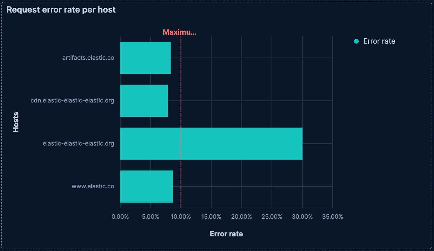
Stacked bar charts show how different components contribute to a total value. Each bar is divided into colored segments representing different categories, allowing you to view both the total and the breakdown.
Stacked bar charts work best when:
- You want to show part-to-whole relationships
- The total value is meaningful
- You have 2-7 segments per bar, more can become hard to read
- The segments don't vary wildly in size
To create a stacked bar chart:
- Create a Bar visualization and set it to Stacked.
Tip
You can also set it to Percentage for a stacked display but as percentages of the total instead, allowing you to compare proportions even when absolute values differ greatly.
- Add the main metric you want to visualize to the vertical axis.
- Add a dimension to the horizontal axis to create the bars.
- Add a dimension to Break down by to split each bar into stacked segments, recognizable with varying colors.

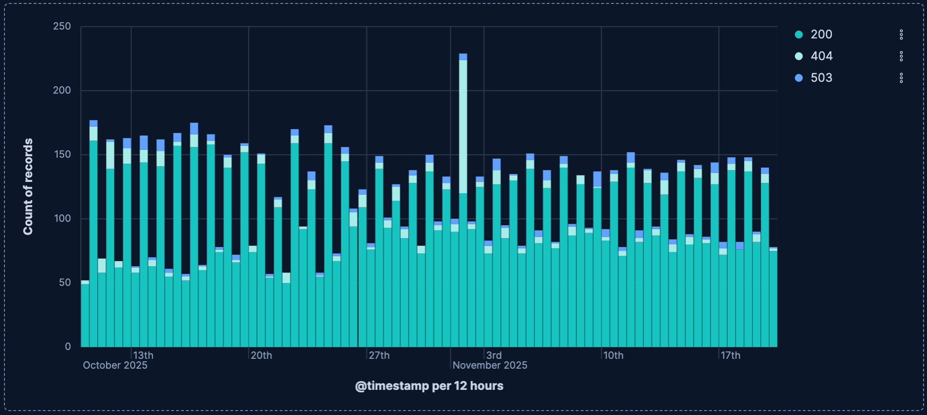
Unstacked bar charts display multiple bars side by side for each category, allowing you to compare different metrics or time periods.
Use unstacked bar charts when:
- You need to compare 2-4 metrics across categories
- Direct comparison between metrics is more important than viewing totals
- The metrics have similar scales
To create an unstacked bar chart:
- Create a Bar chart visualization and set it to Unstacked
- Add the main metric you want to visualize to the vertical axis.
- Add a dimension to the horizontal axis.
- Add a dimension to Break down by to split each bar into different bars that show next to each other, recognizable with varying colors.
Customize your bar chart to display exactly the information you need, formatted the way you want.
- Data
-
The dimension that creates your individual bars. Common functions include:
- Top values: Create bars for the most common values in a field.
- Field: Select the field to group by. You can add up to 4 fields to create multi-term bars. When multiple fields are selected, each bar represents a unique combination of values across those fields. You can reorder the fields by dragging them to change their priority.
- Number of values: How many top values to display. The default number of values depends on your environment:
-
Defaults to 9. -
Defaults to 5.
-
- Rank by: Specifies the dimension the top values are ranked by. Available options:
- Count of records: Rank by the number of documents containing each value. This is the default when a metric is defined.
- Alphabetical: Rank by the term key alphabetically. This is the default when no metric is defined.
- Rarity: Find terms that appear in very few documents, using a rare terms aggregation. You can configure the Max doc count to set the maximum number of documents a term can appear in to be considered rare (default: 1, max: 100). Only available for non-numeric fields and single-field terms.
- Significance: Find statistically unusual terms compared to the overall data set, using a significant terms aggregation. Only available for
keywordfields and single-field terms. - Custom: Define a custom metric aggregation to rank by (for example, rank by the sum of a numeric field rather than by count).
- Rank direction: Ascending or descending order. Disabled when Rank by is set to Rarity or Significance.
Advanced settingsSeveral advanced options allow you to refine the behavior of the breakdown:
- Include documents without the selected field: Off by default.
- Group remaining values as "Other": On by default.
- Enable accuracy mode: This option improves results for high-cardinality data, but increases the load on the Elasticsearch cluster.
- Include values: Values from the breakdown dimension to always show a tile for.
- Exclude values: Values from the breakdown dimension to always exclude from the displayed tiles.
- Date histogram: Create time-based bars with configurable intervals.
- Field: Select the date field to use for the time-based grouping.
Include empty rows: This option is on by default. Turn it off to exclude empty rows from the data.
Bind to global time picker: Associate the selected field to the Lens or dashboard main time selector.
Minimum interval: Define the time interval for aggregating the data. For example,
30s,20m,24h,2d,1w,1MDrop partial intervals: Exclude incomplete intervals from the data. This option is off by default.
- Intervals: Group data into numerical ranges.
- Field: Select the numeric field to create intervals from.
- Filters: Define custom categories using KQL queries.
- Top values: Create bars for the most common values in a field.
- Appearance
-
Define the formatting of the horizontal axis, including:
- Name: Customize the axis label to describe what the bars represent.
- Value format: Select to display values as number, percent, bytes, bits, duration, or with a custom format.
- Data
-
The metric that determines the height of your bars. When you drag a field onto the vertical axis, Kibana suggests a function based on the field type. You can change it and use aggregation functions like
Sum,Average,Count,Median,Min,Max, and more, or create custom calculations with formulas. Refer to Lens > Use formulas to perform math for examples, or to the Formula reference available from Lens.Advanced settingsDepending on the data you defined, several options allow you to apply additional filtering to the data taken into account to compute the final value to show.
Based on the type of visualization you're creating, only some of the following options can be available:
- Normalize by unit: Normalize the metric values to show per unit of time.
- Filter by: Specify a query.
- Reduced time range: Reduce the time range specified on the dashboard's time filter by the specified duration.
- Time shift: Shift the time range by the specified duration. This is useful if the value should use a different time range than the one selected on the dashboard.
- Hide zero values: Don't show values equal to zero. This option is on by default.
- Appearance
-
Define the formatting of the vertical axis, including:
- Name: By default, the chart uses the function or formula as the axis label. It's a best practice to customize this with a meaningful title.
- Value format: Select to display values as number, percent, bytes, bits, duration, or with a custom format.
- Series color: Assign a specific color to bars. This option isn't available when the Breakdown option is defined for the chart, because it's the color mapping of that option that is then taken into account.
- Axis side: Choose to display the vertical axis on the left or right side of the graph. By default, the axis displays on the left.
- Data
-
Split your bars into segments or groups based on another dimension. Each unique value creates its own segment or bar, allowing you to show composition or compare metrics across multiple dimensions. Common functions include:
- Top values: Create bar segments for the most common values in a field.
- Field: Select the field to group by. You can add up to 4 fields. When multiple fields are selected, each segment represents a unique combination of values across those fields. You can reorder the fields by dragging them to change their priority.
- Number of values: How many top values to display. The default number of values depends on your environment:
-
Defaults to 9. -
Defaults to 3.
-
- Rank by: Specifies the dimension the top values are ranked by. Available options:
- Count of records: Rank by the number of documents containing each value. This is the default when a metric is defined.
- Alphabetical: Rank by the term key alphabetically. This is the default when no metric is defined.
- Rarity: Find terms that appear in very few documents, using a rare terms aggregation. You can configure the Max doc count to set the maximum number of documents a term can appear in to be considered rare (default: 1, max: 100). Only available for non-numeric fields and single-field terms.
- Significance: Find statistically unusual terms compared to the overall data set, using a significant terms aggregation. Only available for
keywordfields and single-field terms. - Custom: Define a custom metric aggregation to rank by (for example, rank by the sum of a numeric field rather than by count).
- Rank direction: Ascending or descending order. Disabled when Rank by is set to Rarity or Significance.
Advanced settingsSeveral advanced options allow you to refine the behavior of the breakdown:
- Include documents without the selected field: Off by default.
- Group remaining values as "Other": On by default.
- Enable accuracy mode: This option improves results for high-cardinality data, but increases the load on the Elasticsearch cluster.
- Include values: Values from the breakdown dimension to always show a tile for.
- Exclude values: Values from the breakdown dimension to always exclude from the displayed tiles.
- Date histogram: Create time-based bars with configurable intervals.
- Field: Select the date field to use for the time-based grouping.
Include empty rows: This option is on by default. Turn it off to exclude empty rows from the data.
Bind to global time picker: Associate the selected field to the Lens or dashboard main time selector.
Minimum interval: Define the time interval for aggregating the data. For example,
30s,20m,24h,2d,1w,1MDrop partial intervals: Exclude incomplete intervals from the data. This option is off by default.
- Intervals: Group data into numerical ranges.
- Field: Select the numeric field to create intervals from.
- Filters: Define custom categories using KQL queries.
- Top values: Create bar segments for the most common values in a field.
- Appearance
-
Define the formatting of the breakdown, including:
- Name: Customize the legend label.
- Value format: Select to display values as number, percent, bytes, bits, duration, or with a custom format.
- Color mapping: Select a color palette or assign specific colors to categories.
When creating or editing a visualization, you can customize several appearance options from the
Style or Legend menus.
- Appearance
- Select the bar orientation. It can be Horizontal or Vertical.
- Titles and text
-
Specify to hide or show bar values on bar charts:
- Hide: Removes the numeric value from the bars entirely. Only the bar height represents the magnitude.
- Show, if able: Attempts to draw the value inside each bar, but the label will only render when there’s enough vertical space to keep text legible; crowded bars will not have labels.
Your selection applies to the entire chart layer, so you can turn labels on for quick KPI-style charts or keep them off for dense histograms.
- Left axis
-
Left-axis controls for Lens bar charts let you tune how the vertical scale looks and behaves. Key options are:
- Title: Set the label that appears under the axis (for example, "Date"). You can hide the label entirely if the layout is tight.
- Gridlines: Toggles vertical guide lines across the chart, which help compare bar positions against the axis scale.
- Tick labels: Show or hide the textual values beneath the ticks. When visible, the orientation picker lets you rotate them (horizontal, angled, vertical) to avoid overlap on dense timelines.
- Orientation: Set the placement of the axis title. It can be Horizontal, Vertical, or Angled.
- Axis scale: Select linear (default), log, or square-root scaling.
- Bounds & rounding: Manually clamp the axis to a min/max or let Lens round to nice intervals. For numeric histograms this also controls whether “nice” bucket labels are used.
NoteLeft axis and Bottom axis options can interchange depending on the orientation you selected for the bar chart.
- Bottom axis
-
Bottom-axis controls for Lens bar charts let you tune how the horizontal scale looks and behaves. Key options are:
- Title: Set the label that appears under the axis (for example, "Date"). You can hide the label entirely if the layout is tight.
- Gridlines: Toggles vertical guide lines across the chart, which help compare bar positions against the axis scale.
- Tick labels: Show or hide the textual values beneath the ticks. When visible, the orientation picker lets you rotate them (horizontal, angled, vertical) to avoid overlap on dense timelines.
- Show partial data markers: Highlights buckets at the edges of the time range that only contain partial data—useful for time-based bar charts so viewers know the first/last bucket might be incomplete.
- Show current time marker: Draws a vertical marker for “now” on time charts, so you can see how recent the latest bar is.
Configure elements of your bar chart's legend. Configurable options include:
- Visibility
- Specify whether to automatically show the legend or hide it.
- Position
- Choose to show the legend inside or outside the chart, then pick the side (left, right, top, or bottom) and fine-tune alignment (vertical/horizontal) for grid-style layouts.
- Width
- Set the width of the legend.
- Layout
-
For legends positioned outside the chart at the top or bottom, choose how series labels are arranged:
- List: A compact layout that flows series labels to fit the available space. List is the default for new charts when the legend is at the top or bottom.
- Grid: A table-style layout that aligns series labels and statistics into rows and columns.
Visualizations created before this setting was introduced keep their previous layout until you change it.
- Statistics
- Choose one or more statistics to show (for example, average, min, max, last value). Lens appends those numbers to every series label so you don't have to hover over the chart to see headline figures.
- Label truncation
- For legends positioned inside the chart, outside on the side, or outside at the top or bottom with the Grid layout, choose whether to truncate long series labels and set the maximum number of lines for each label.
The following examples show various configuration options that you can use for building impactful bar charts.
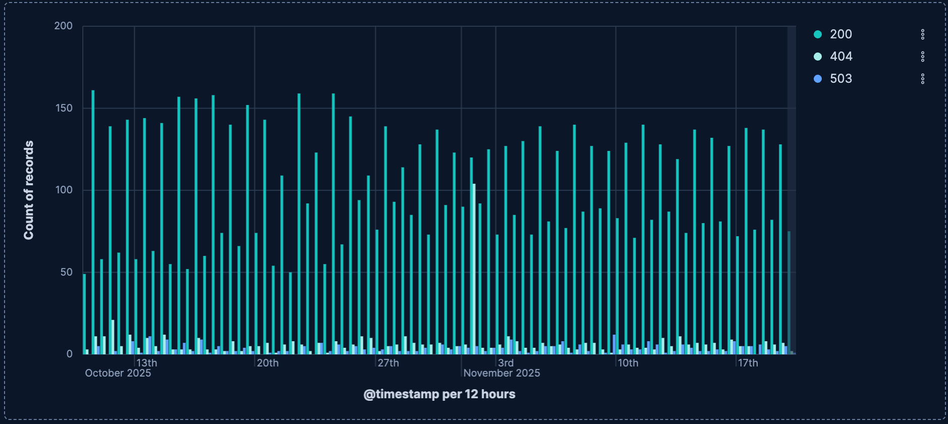
- Weekly website traffic per region
-
Track website visits over time, broken down by traffic source:
- Title: "Weekly website traffic per region"
- Vertical axis:
count()- Name: "Page Views"
- Value format:
Number
- Horizontal axis:
date_histogram(timestamp, interval='1w')- Name: "Week"
- Break down by:
geo.dest- Number of values:
9
- Number of values:
- Layout:
Stacked - Legend: Right side, showing regions
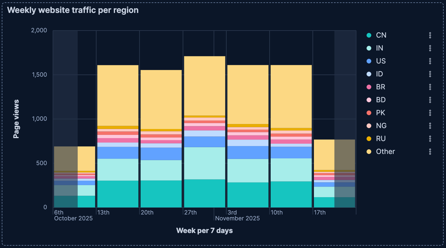
- Request error rate per host (with threshold)
-
Monitor error rates across hosts with a target threshold line:
- Title: "Request error rate per host"
- Vertical axis:
count(kql='response > "300"') / count()- Name: "Error Rate %"
- Value format:
Percent
- Horizontal axis:
terms(service.name)- Name: "Hosts"
- Number of values:
4 - Rank by: Alphabetical
- Reference line: Value
0,10(10% threshold)- Label: "Maximum acceptable error rate"
- Color: Red, dashed line
- Layout: Horizontal orientation (for better service name readability)
