Build mosaic charts with Kibana
Mosaic charts display the relationship between two categorical variables as a grid of rectangles, where both the width and height of each rectangle represent proportions of the data. They are ideal for visualizing how categories combine, showing conditional distributions, and exploring relationships between two dimensions. They work best with a moderate number of categories in each dimension (2-8 each).
You can create mosaic charts in Kibana using Lens.

Before you start, make sure you have data indexed into Elasticsearch or install sample data. By default, Lens uses data views to access your Elasticsearch data. Data views are created automatically in most cases when you ingest data. You can also create one manually to select just the data that you want. Alternatively, you can use the ES|QL query mode to query your Elasticsearch data directly.
To build a mosaic chart:
-
Access Lens
Lens is Kibana's main visualization editor. You can access it:
- From a dashboard: On the Dashboards page, open or create the dashboard where you want to add a mosaic chart, then add a new visualization.
- From the Visualize library page by creating a new visualization.
-
Set the visualization to Mosaic
New visualizations often start as Bar charts.
Using the Visualization type dropdown, select Mosaic.
-
Define the data to show
- Select the data view that contains your data.
- Configure the Horizontal axis dimension to define the columns. The width of each column represents the proportion of data in that category.
- Configure the Vertical axis dimension to define the rows within each column. The height of each rectangle represents the proportion within that column.
- Configure the Metric dimension to define the value used to calculate rectangle sizes. This defaults to Count.
The chart preview updates to show a grid of rectangles. Column widths represent the proportion of each horizontal category, and rectangle heights within each column show the distribution of vertical categories.
-
Customize the chart to follow best practices
Tweak the appearance of the chart to your needs. Consider the following best practices:
- Limit categories
- Keep both dimensions to a maximum of 6-8 categories each. More categories create tiny rectangles that are hard to read.
- Ensure balanced proportions
- Mosaic charts work best when categories have roughly comparable sizes. If one category dominates (for example, one host handling 90% of traffic), the other columns become too narrow to read. In that case, consider using a bar chart instead.
- Order categories meaningfully
- Arrange categories in a logical order (by size, alphabetically, or by a natural order) to make patterns easier to identify.
- Use color for the vertical dimension
- Colors typically represent the vertical axis categories, making it easier to track how each category appears across columns.
Refer to Mosaic chart settings to find all configuration options for your mosaic chart.
-
Save the chart
- If you accessed Lens from a dashboard, select Save and return to save the visualization and add it to that dashboard, or select Save to library to add the visualization to the Visualize library and reuse it later.
- If you accessed Lens from the Visualize library, select Save. A menu opens and lets you add the visualization to a dashboard and to the Visualize library.
Customize your mosaic chart to display exactly the information you need, formatted the way you want.
The Horizontal axis dimension defines the columns of the mosaic. Column widths represent the proportion of each category.
- Data
-
The Horizontal axis dimension supports the following functions:
- Top values: Create columns for the most common values in a field.
- Field: Select the field to group by. You can add up to 4 fields to create multi-term columns. When multiple fields are selected, each column represents a unique combination of values across those fields. You can reorder the fields by dragging them to change their priority.
- Number of values: How many categories to display. The default number of values depends on your environment:
-
Defaults to 9. -
Defaults to 5.
-
- Rank by: Specifies the dimension the top values are ranked by. Available options:
- Count of records: Rank by the number of documents containing each value. This is the default when a metric is defined.
- Alphabetical: Rank by the term key alphabetically. This is the default when no metric is defined.
- Rarity: Find terms that appear in very few documents, using a rare terms aggregation. You can configure the Max doc count to set the maximum number of documents a term can appear in to be considered rare (default: 1, max: 100). Only available for non-numeric fields and single-field terms.
- Significance: Find statistically unusual terms compared to the overall data set, using a significant terms aggregation. Only available for
keywordfields and single-field terms. - Custom: Define a custom metric aggregation to rank by (for example, rank by the sum of a numeric field rather than by count).
- Rank direction: Ascending or descending order. Disabled when Rank by is set to Rarity or Significance.
- Collapse by: Aggregate values into a single number using
Sum,Average,Min, orMax.
Advanced settingsSeveral advanced options allow you to refine the behavior of the breakdown:
- Include documents without the selected field: Off by default.
- Group remaining values as "Other": On by default.
- Enable accuracy mode: This option improves results for high-cardinality data, but increases the load on the Elasticsearch cluster.
- Include values: Values from the breakdown dimension to always show a tile for.
- Exclude values: Values from the breakdown dimension to always exclude from the displayed tiles.
- Date histogram: Group data into time-based buckets.
- Field: Select the date field to use for the time-based grouping.
Include empty rows: This option is on by default. Turn it off to exclude empty rows from the data.
Bind to global time picker: Associate the selected field to the Lens or dashboard main time selector.
Minimum interval: Define the time interval for aggregating the data. For example,
30s,20m,24h,2d,1w,1MDrop partial intervals: Exclude incomplete intervals from the data. This option is off by default.
- Collapse by: Aggregate values into a single number using
Sum,Average,Min, orMax.
- Intervals: Create numeric ranges for continuous data.
- Field: Select the numeric field to create intervals from.
- Include empty rows: Include intervals with no matching documents.
- Collapse by: Aggregate values into a single number using
Sum,Average,Min, orMax.
- Filters: Define custom KQL filters to create specific columns.
- Collapse by: Aggregate values into a single number using
Sum,Average,Min, orMax.
- Collapse by: Aggregate values into a single number using
- Top values: Create columns for the most common values in a field.
- Appearance
-
- Name: Customize the axis label.
- Value format: Control how numeric values are displayed (number, percent, bytes, and more).
The Vertical axis dimension defines the rows within each column. Rectangle heights represent the proportion of each category within the column.
- Data
-
The Vertical axis dimension supports the following functions:
- Top values: Create rows for the most common values in a field.
- Field: Select the field to group by. You can add up to 4 fields to create multi-term rows. When multiple fields are selected, each row represents a unique combination of values across those fields. You can reorder the fields by dragging them to change their priority.
- Number of values: How many categories to display. The default number of values depends on your environment:
-
Defaults to 9. -
Defaults to 3.
-
- Rank by: Specifies the dimension the top values are ranked by. Available options:
- Count of records: Rank by the number of documents containing each value. This is the default when a metric is defined.
- Alphabetical: Rank by the term key alphabetically. This is the default when no metric is defined.
- Rarity: Find terms that appear in very few documents, using a rare terms aggregation. You can configure the Max doc count to set the maximum number of documents a term can appear in to be considered rare (default: 1, max: 100). Only available for non-numeric fields and single-field terms.
- Significance: Find statistically unusual terms compared to the overall data set, using a significant terms aggregation. Only available for
keywordfields and single-field terms. - Custom: Define a custom metric aggregation to rank by (for example, rank by the sum of a numeric field rather than by count).
- Rank direction: Ascending or descending order. Disabled when Rank by is set to Rarity or Significance.
- Collapse by: Aggregate values into a single number using
Sum,Average,Min, orMax.
Advanced settingsSeveral advanced options allow you to refine the behavior of the breakdown:
- Include documents without the selected field: Off by default.
- Group remaining values as "Other": On by default.
- Enable accuracy mode: This option improves results for high-cardinality data, but increases the load on the Elasticsearch cluster.
- Include values: Values from the breakdown dimension to always show a tile for.
- Exclude values: Values from the breakdown dimension to always exclude from the displayed tiles.
- Date histogram: Group data into time-based buckets.
- Field: Select the date field to use for the time-based grouping.
Include empty rows: This option is on by default. Turn it off to exclude empty rows from the data.
Bind to global time picker: Associate the selected field to the Lens or dashboard main time selector.
Minimum interval: Define the time interval for aggregating the data. For example,
30s,20m,24h,2d,1w,1MDrop partial intervals: Exclude incomplete intervals from the data. This option is off by default.
- Collapse by: Aggregate values into a single number using
Sum,Average,Min, orMax.
- Intervals: Create numeric ranges for continuous data.
- Field: Select the numeric field to create intervals from.
- Include empty rows: Include intervals with no matching documents.
- Collapse by: Aggregate values into a single number using
Sum,Average,Min, orMax.
- Filters: Define custom KQL filters to create specific rows.
- Collapse by: Aggregate values into a single number using
Sum,Average,Min, orMax.
- Collapse by: Aggregate values into a single number using
- Top values: Create rows for the most common values in a field.
- Appearance
-
- Name: Customize the axis label.
- Color mapping: Select a color palette or assign specific colors to categories. Refer to Assign colors to terms for details.
The Metric dimension defines the value used to calculate rectangle sizes. In mosaic charts, this is typically Count.
- Data
-
The value that determines rectangle proportions. You can use aggregation functions like
CountorSum, or create custom calculations with formulas.Advanced settingsDepending on the data you defined, several options allow you to apply additional filtering to the data taken into account to compute the final value to show.
Based on the type of visualization you're creating, only some of the following options can be available:
- Normalize by unit: Normalize the metric values to show per unit of time.
- Filter by: Specify a query.
- Reduced time range: Reduce the time range specified on the dashboard's time filter by the specified duration.
- Time shift: Shift the time range by the specified duration. This is useful if the value should use a different time range than the one selected on the dashboard.
- Hide zero values: Don't show values equal to zero. This option is on by default.
- Appearance
-
- Name: Customize the metric label displayed in tooltips and legends.
- Value format: Control how numeric values are displayed (number, percent, bytes, and more).
NoteMosaic charts do not support multiple metrics. Each cell represents a single count or aggregated value.
When creating or editing a visualization, you can customize several appearance options from the
Style or Legend menus.
- Slice values
-
Control what values appear on rectangles:
- Percentage: Display the percentage of total (default).
- Integer: Display the raw numeric value.
- Hide: Do not display values.
When displaying percentages, you can also configure the Decimal places (default: 2).
- Visibility
-
Specify whether to automatically show the legend or hide it:
- Auto: Show the legend when there are multiple categories.
- Show: Always show the legend.
- Hide: Never show the legend (default).
- Width
- Control the width of the legend panel: Small, Medium (default), Large, or Extra large.
- Nested
- When using both horizontal and vertical axes, enable this option to show the legend in a hierarchical format.
- Label truncation
- Toggle whether to truncate long legend labels. When enabled, set the Line limit to control how many lines to display before truncating (1-5, default: 1).
The following examples show various configuration options for building impactful mosaic charts.
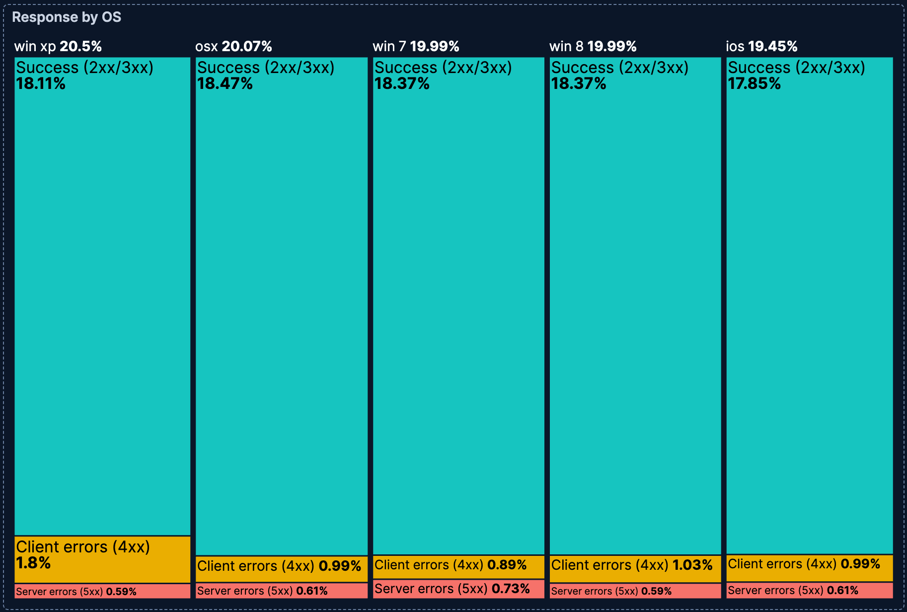
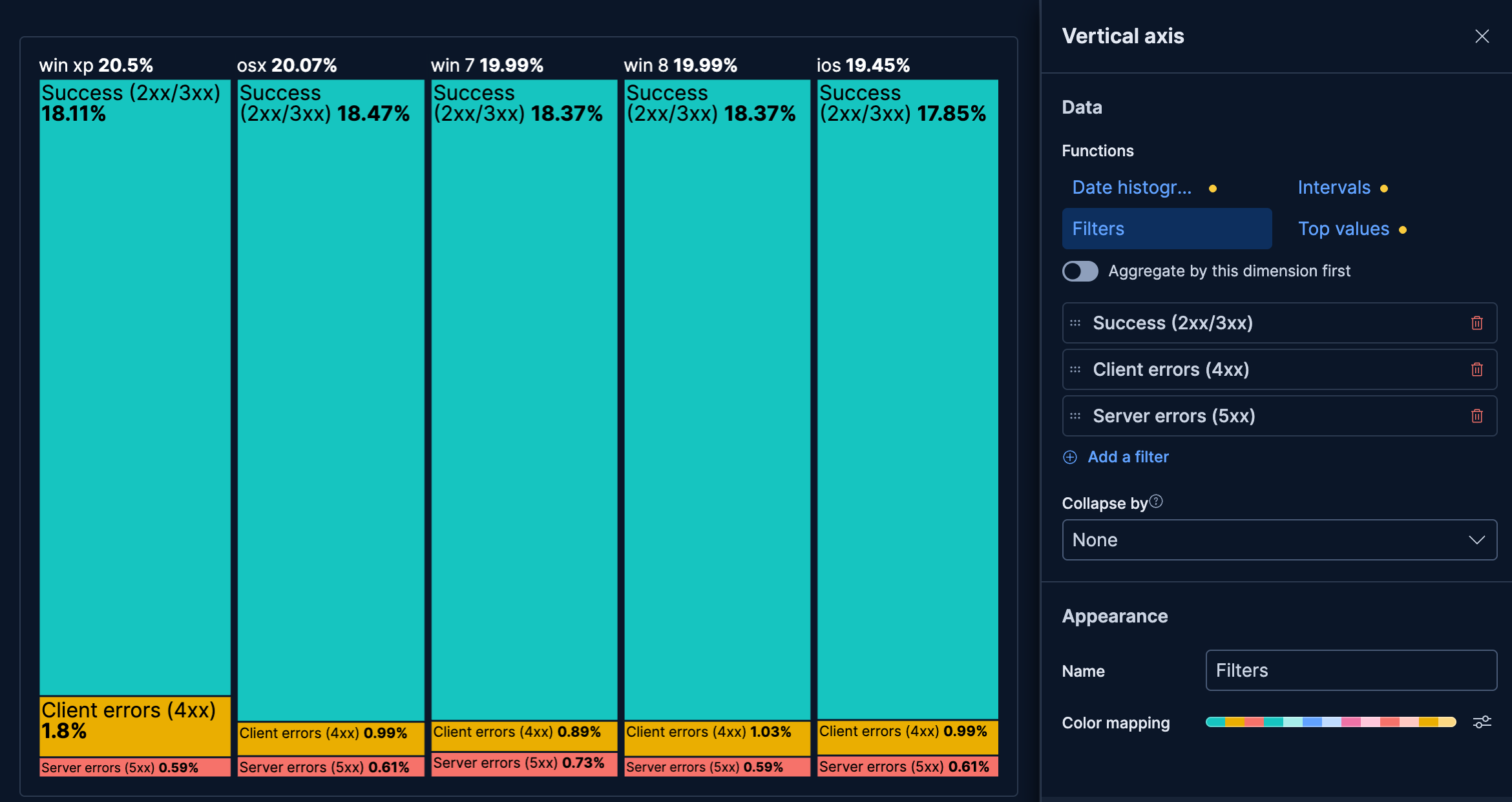
- Response status by operating system
-
Visualize how response status categories vary across operating systems:
- Example based on: Kibana Sample Data Logs
- Horizontal axis:
machine.os.keyword(Top 5 values) - Vertical axis: Filters
- "Success (2xx/3xx)":
response.keyword >= "200" AND response.keyword < "400" - "Client errors (4xx)":
response.keyword >= "400" AND response.keyword < "500" - "Server errors (5xx)":
response.keyword >= "500"
- "Success (2xx/3xx)":
- Metric: Count
- Color mapping: Green for success, yellow for client errors, red for server errors

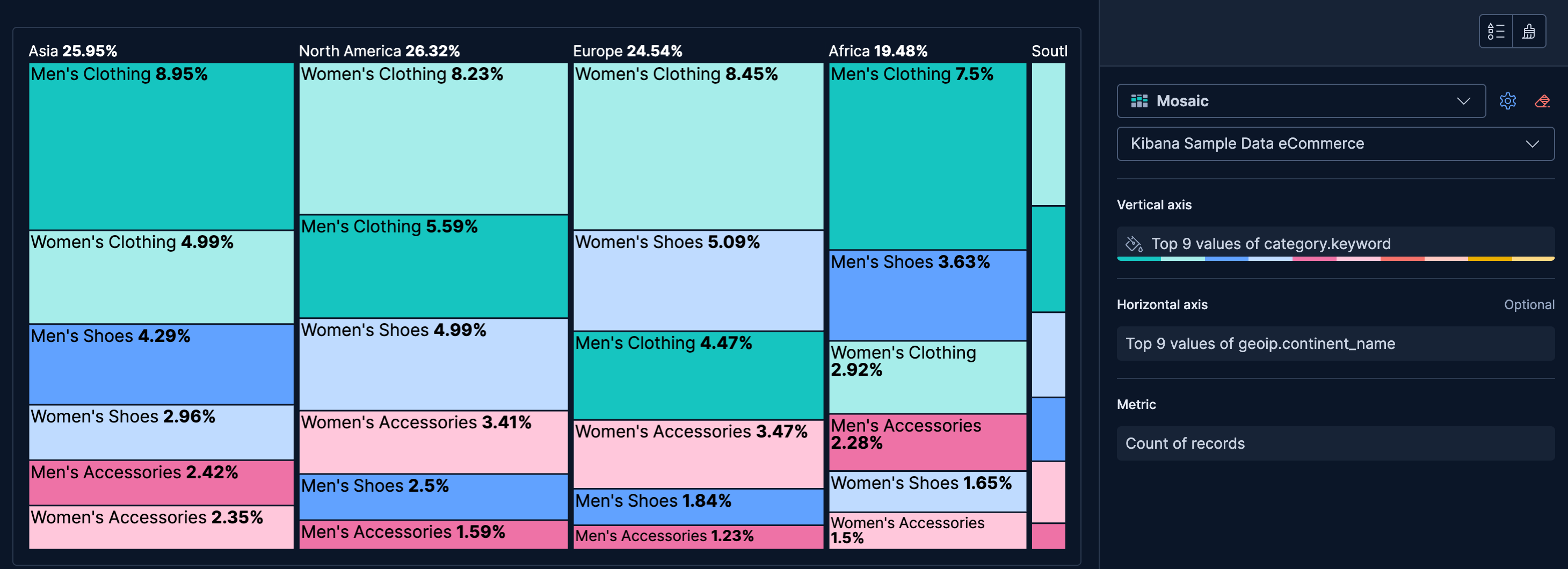
- Product categories by continent
-
Show how product preferences vary across regions:
- Example based on: Kibana Sample Data eCommerce
- Horizontal axis:
geoip.continent_name(Top values) - Vertical axis:
category.keyword(Top 5 values) - Metric: Count
