Build region map charts with Kibana
Region map charts display data on a geographic map, using colors to represent values for different regions such as countries, states, or provinces. They are ideal for showing geographic distributions, comparing metrics across locations, and identifying regional patterns in your data.
You can create region map charts in Kibana using Lens.

Before you start, make sure you have data indexed into Elasticsearch or install sample data. By default, Lens uses data views to access your Elasticsearch data. Data views are created automatically in most cases when you ingest data. You can also create one manually to select just the data that you want. Alternatively, you can use the ES|QL query mode to query your Elasticsearch data directly.
To build a region map chart:
-
Access Lens
Lens is Kibana's main visualization editor. You can access it:
- From a dashboard: On the Dashboards page, open or create the dashboard where you want to add a region map chart, then add a new visualization.
- From the Visualize library page by creating a new visualization.
-
Set the visualization to Region map
New visualizations often start as Bar charts.
Using the Visualization type dropdown, select Region map.
-
Define the data to show
- Select the data view that contains your data.
- Configure the Region key dimension to define which geographic field to use. This field should contain region codes (ISO country codes, state abbreviations, and more) that can be matched to map boundaries.
- Configure the Metric dimension to define the value displayed for each region. This determines the color intensity.
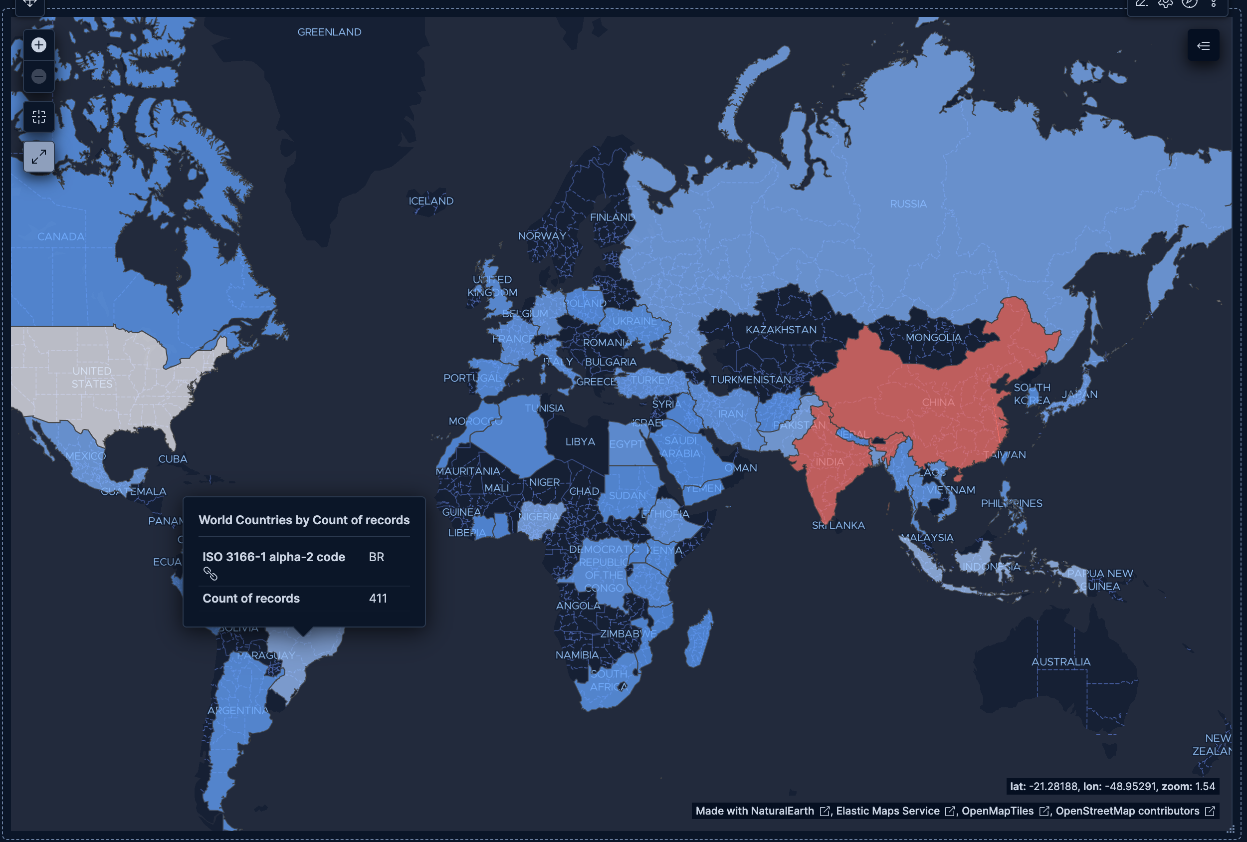
The chart preview updates to show a map with regions colored by metric value. If regions appear gray, verify that your field values match the expected geographic codes (such as ISO country codes). Also check that the correct EMS boundaries and join field are selected in the Region key dimension settings.
-
Customize the chart to follow best practices
Tweak the appearance of the chart to your needs. Consider the following best practices:
- Use appropriate region granularity
- Match the EMS boundaries to your data. For example, use the World Countries boundaries for global data, or a country-specific boundary set for more granular regional analysis.
- Select the correct join field
- Ensure your data values match the selected join field. For example, if your data contains two-letter country codes, select the
iso2join field. - Handle missing regions
- Regions with no matching data appear gray. If too many regions are gray, verify that your field values match the selected join field format.
- Consider choropleth best practices
- Region maps are choropleth maps, where color represents data values. Be aware that larger regions can visually dominate, even if their values are smaller.
Refer to Region map chart settings to find all configuration options for your region map chart.
-
Save the chart
- If you accessed Lens from a dashboard, select Save and return to save the visualization and add it to that dashboard, or select Save to library to add the visualization to the Visualize library and reuse it later.
- If you accessed Lens from the Visualize library, select Save. A menu opens and lets you add the visualization to a dashboard and to the Visualize library.
Customize your region map chart to display exactly the information you need, formatted the way you want.
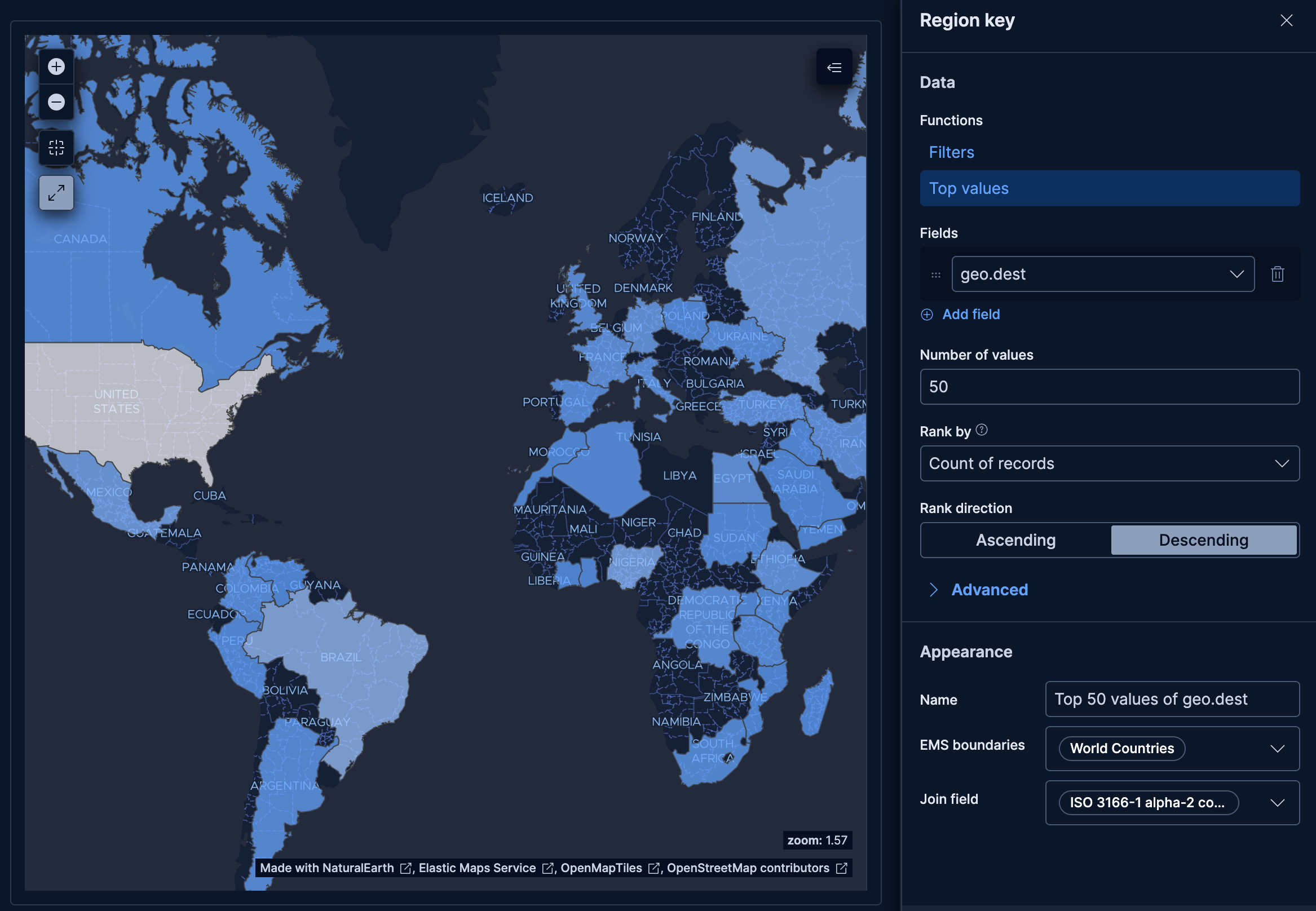
The Region key dimension defines which geographic areas to display on the map.
- Data
-
The Region key dimension supports the following functions:
- Top values: Display the regions with the highest metric values.
- Field: Select the field containing geographic identifiers to group by.
- Number of values: How many regions to display. The default number of values depends on your environment:
-
Defaults to 9. -
Defaults to 5.
-
- Rank by: Specifies the dimension the top values are ranked by. Available options:
- Count of records: Rank by the number of documents containing each value. This is the default when a metric is defined.
- Alphabetical: Rank by the term key alphabetically. This is the default when no metric is defined.
- Rarity: Find terms that appear in very few documents, using a rare terms aggregation. You can configure the Max doc count to set the maximum number of documents a term can appear in to be considered rare (default: 1, max: 100). Only available for non-numeric fields and single-field terms.
- Significance: Find statistically unusual terms compared to the overall data set, using a significant terms aggregation. Only available for
keywordfields and single-field terms. - Custom: Define a custom metric aggregation to rank by (for example, rank by the sum of a numeric field rather than by count).
- Rank direction: Ascending or descending order. Disabled when Rank by is set to Rarity or Significance.
Advanced settingsSeveral advanced options allow you to refine the behavior of the breakdown:
- Include documents without the selected field: Off by default.
- Group remaining values as "Other": On by default.
- Enable accuracy mode: This option improves results for high-cardinality data, but increases the load on the Elasticsearch cluster.
- Include values: Values from the breakdown dimension to always show a tile for.
- Exclude values: Values from the breakdown dimension to always exclude from the displayed tiles.
- Filters: Define custom KQL filters to create specific regions.
- Top values: Display the regions with the highest metric values.
- EMS boundaries
- Select the geographic boundary shapes to use for the map. The Elastic Maps Service (EMS) provides boundary data that defines region outlines. For example, World Countries provides country polygons, while US States provides state polygons. Other boundary sets may be available based on your EMS configuration.
- Join field
-
Select which property of the boundary shapes to use for matching your data. Each boundary set exposes one or more properties that can be used to link your region key values to the correct shape on the map. For example, the World Countries boundaries can be matched by two-letter ISO country code (
iso2), three-letter code (iso3), or country name. Select the property that matches the format of your data.For instance, if your data contains values like
US,GB,DE, select theiso2join field. If it contains values likeUnited States,United Kingdom, select the country name join field instead. - Appearance
-
- Name: Customize the region label displayed in tooltips.
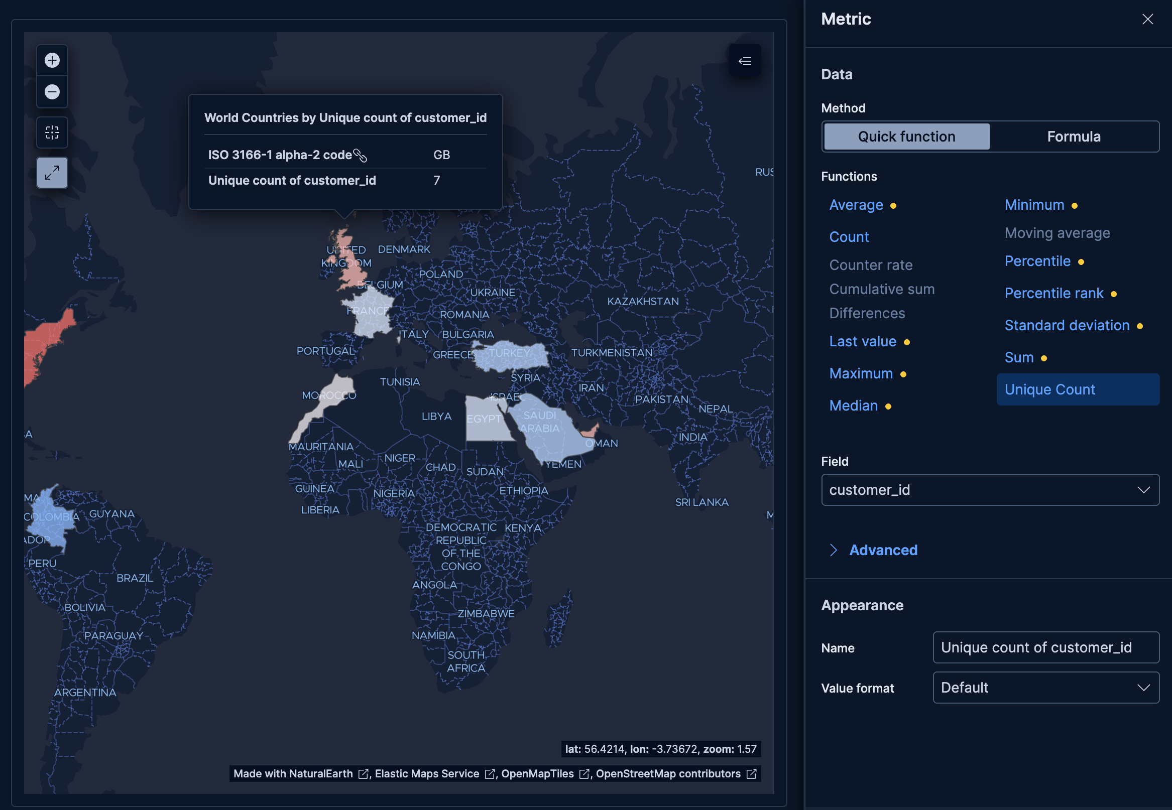
The Metric dimension defines the value that determines each region's color.
- Data
-
The value that determines region color intensity. When you drag a field onto the chart, Kibana suggests a function based on the field type. You can use aggregation functions like
Sum,Average,Count,Median, and more, or create custom calculations with formulas.Advanced settingsDepending on the data you defined, several options allow you to apply additional filtering to the data taken into account to compute the final value to show.
Based on the type of visualization you're creating, only some of the following options can be available:
- Normalize by unit: Normalize the metric values to show per unit of time.
- Filter by: Specify a query.
- Reduced time range: Reduce the time range specified on the dashboard's time filter by the specified duration.
- Time shift: Shift the time range by the specified duration. This is useful if the value should use a different time range than the one selected on the dashboard.
- Hide zero values: Don't show values equal to zero. This option is on by default.
- Appearance
-
- Name: Customize the metric label displayed in tooltips.
- Value format: Control how numeric values are displayed (number, percent, bytes, and more).
The following examples show various configuration options for building impactful region map charts.
- Website traffic by destination country
-
Visualize which countries receive the most web traffic:
- Example based on: Kibana Sample Data Logs
- Region key:
geo.dest(Top values) - EMS boundaries: World Countries
- Metric: Count

- Customer distribution by country
-
Show where your customers are located around the world:
- Example based on: Kibana Sample Data eCommerce
- Region key:
geoip.country_iso_code(Top 50 values) - EMS boundaries: World Countries
- Metric: Unique count of
customer_id

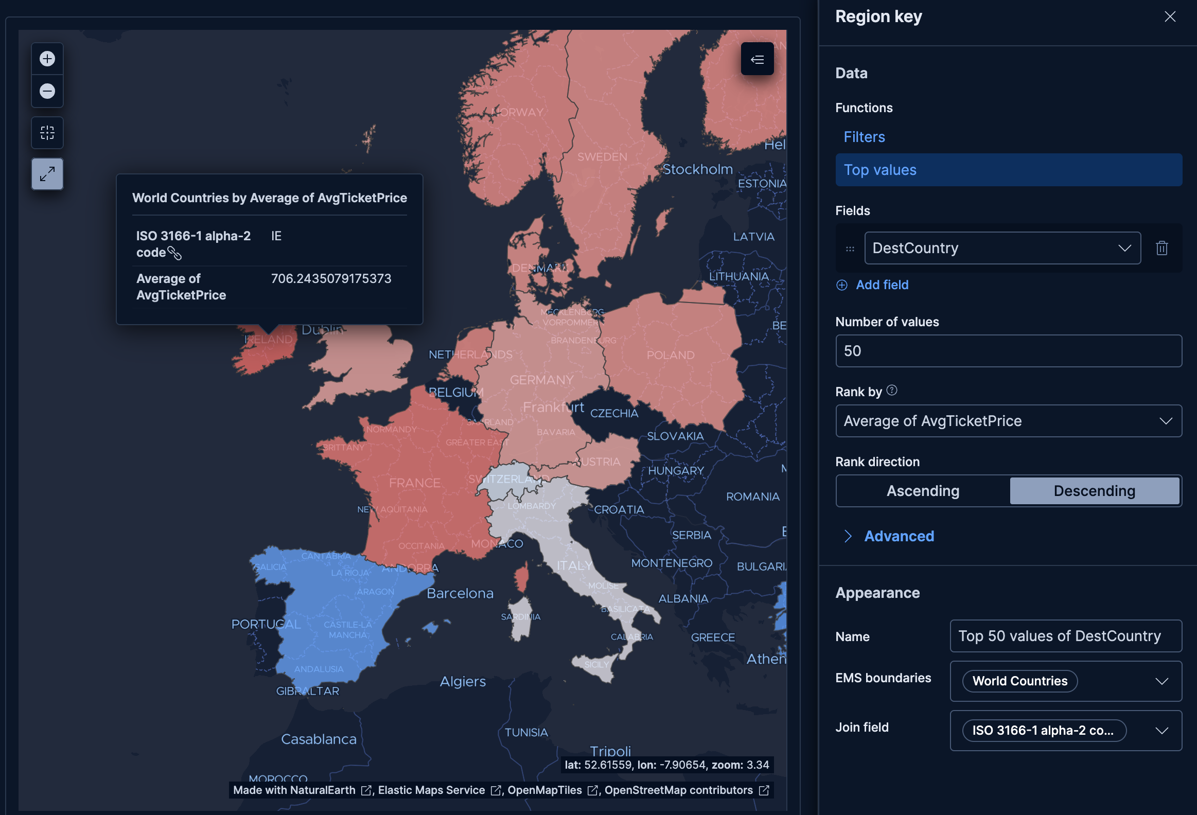
- Average ticket price by destination country
-
Compare average flight ticket prices across destination countries:
- Example based on: Kibana Sample Data Flights
- Region key:
DestCountry(Top 50 values) - EMS boundaries: World Countries
- Metric: Average of
AvgTicketPrice
