Build treemap charts with Kibana
Treemap charts display hierarchical data as nested rectangles, where each rectangle's size represents a quantitative value. They are ideal for showing part-to-whole relationships within hierarchies, comparing relative sizes of categories, and visualizing how data is distributed across multiple levels.
You can create treemap charts in Kibana using Lens.

Before you start, make sure you have data indexed into Elasticsearch or install sample data. By default, Lens uses data views to access your Elasticsearch data. Data views are created automatically in most cases when you ingest data. You can also create one manually to select just the data that you want. Alternatively, you can use the ES|QL query mode to query your Elasticsearch data directly.
To build a treemap chart:
-
Access Lens
Lens is Kibana's main visualization editor. You can access it:
- From a dashboard: On the Dashboards page, open or create the dashboard where you want to add a treemap chart, then add a new visualization.
- From the Visualize library page by creating a new visualization.
-
Set the visualization to Treemap
New visualizations often start as Bar charts.
Using the Visualization type dropdown, select Treemap.
-
Define the data to show
- Select the data view that contains your data.
- Configure the Group by dimension to define how the rectangles are grouped. Add multiple Group by dimensions to create a hierarchy.
- Configure the Metric dimension to define the size of each rectangle.
The chart preview updates to show rectangles sized by your metric. If you added multiple Group by dimensions, smaller rectangles appear nested inside the top-level categories.
-
Customize the chart to follow best practices
Tweak the appearance of the chart to your needs. Consider the following best practices:
- Limit hierarchy depth
- Keep your treemap to 2-3 levels of hierarchy. Deeper nesting becomes difficult to read and interpret.
- Order categories by size
- Arrange rectangles by size (largest first) to make comparisons easier. This is the default behavior in Lens.
- Use color meaningfully
- Apply colors to distinguish top-level categories or to represent an additional metric (such as growth rate or status).
- Ensure readable labels
- Labels are automatically hidden on rectangles that are too small to fit them. If too many labels are missing, reduce the number of categories or increase the panel size.
Refer to Treemap chart settings to find all configuration options for your treemap chart.
-
Save the chart
- If you accessed Lens from a dashboard, select Save and return to save the visualization and add it to that dashboard, or select Save to library to add the visualization to the Visualize library and reuse it later.
- If you accessed Lens from the Visualize library, select Save. A menu opens and lets you add the visualization to a dashboard and to the Visualize library.
Customize your treemap chart to display exactly the information you need, formatted the way you want.
The Group by dimension defines how rectangles are grouped. You can add up to 2 levels of grouping to create hierarchical visualizations.
- Data
-
The Group by dimension supports the following functions:
- Top values: Create rectangles for the most common values in a field.
- Field: Select the field to group by. You can add up to 4 fields to create multi-term groups. When multiple fields are selected, each group represents a unique combination of values across those fields. You can reorder the fields by dragging them to change their priority.
- Number of values: How many top values to display. The default number of values depends on your environment:
-
Defaults to 9. -
Defaults to 5.
-
- Rank by: Specifies the dimension the top values are ranked by. Available options:
- Count of records: Rank by the number of documents containing each value. This is the default when a metric is defined.
- Alphabetical: Rank by the term key alphabetically. This is the default when no metric is defined.
- Rarity: Find terms that appear in very few documents, using a rare terms aggregation. You can configure the Max doc count to set the maximum number of documents a term can appear in to be considered rare (default: 1, max: 100). Only available for non-numeric fields and single-field terms.
- Significance: Find statistically unusual terms compared to the overall data set, using a significant terms aggregation. Only available for
keywordfields and single-field terms. - Custom: Define a custom metric aggregation to rank by (for example, rank by the sum of a numeric field rather than by count).
- Rank direction: Ascending or descending order. Disabled when Rank by is set to Rarity or Significance.
- Collapse by: Aggregate values into a single number using
Sum,Average,Min, orMax.
Advanced settingsSeveral advanced options allow you to refine the behavior of the breakdown:
- Include documents without the selected field: Off by default.
- Group remaining values as "Other": On by default.
- Enable accuracy mode: This option improves results for high-cardinality data, but increases the load on the Elasticsearch cluster.
- Include values: Values from the breakdown dimension to always show a tile for.
- Exclude values: Values from the breakdown dimension to always exclude from the displayed tiles.
- Date histogram: Group data into time-based buckets.
- Field: Select the date field to use for the time-based grouping.
Include empty rows: This option is on by default. Turn it off to exclude empty rows from the data.
Bind to global time picker: Associate the selected field to the Lens or dashboard main time selector.
Minimum interval: Define the time interval for aggregating the data. For example,
30s,20m,24h,2d,1w,1MDrop partial intervals: Exclude incomplete intervals from the data. This option is off by default.
- Collapse by: Aggregate values into a single number using
Sum,Average,Min, orMax.
- Intervals: Create numeric ranges for continuous data.
- Field: Select the numeric field to create intervals from.
- Include empty rows: Include intervals with no matching documents.
- Collapse by: Aggregate values into a single number using
Sum,Average,Min, orMax.
- Filters: Define custom KQL filters to create specific groups.
- Collapse by: Aggregate values into a single number using
Sum,Average,Min, orMax.
- Collapse by: Aggregate values into a single number using
- Top values: Create rectangles for the most common values in a field.
- Appearance
-
- Name: Customize the legend label.
- Color mapping: Select a color palette or assign specific colors to categories. Refer to Assign colors to terms for details. Color mapping is only available on the first Group by dimension. Nested levels inherit colors from their parent category.
The Metric dimension defines the size of each rectangle.
- Data
-
The value that determines rectangle size. When you drag a field onto the chart, Kibana suggests a function based on the field type. You can use aggregation functions like
Sum,Average,Count,Median, and more, or create custom calculations with formulas.Advanced settingsDepending on the data you defined, several options allow you to apply additional filtering to the data taken into account to compute the final value to show.
Based on the type of visualization you're creating, only some of the following options can be available:
- Normalize by unit: Normalize the metric values to show per unit of time.
- Filter by: Specify a query.
- Reduced time range: Reduce the time range specified on the dashboard's time filter by the specified duration.
- Time shift: Shift the time range by the specified duration. This is useful if the value should use a different time range than the one selected on the dashboard.
- Hide zero values: Don't show values equal to zero. This option is on by default.
- Appearance
-
- Name: Customize the metric label displayed in tooltips and legends.
- Value format: Control how numeric values are displayed (number, percent, bytes, and more).
When creating or editing a visualization, you can customize several appearance options from the
Style or Legend menus.
- Slice labels
-
Control how labels appear on rectangles:
- Show: Display labels on all rectangles where space permits (default).
- Hide: Do not display labels on rectangles.
- Slice values
-
Control what values appear on rectangles:
- Percentage: Display the percentage of total (default).
- Integer: Display the raw numeric value.
- Hide: Do not display values.
When displaying percentages, you can also configure the Decimal places (default: 2).
- Visibility
-
Specify whether to automatically show the legend or hide it:
- Auto: Hide the legend (default).
- Show: Always show the legend.
- Hide: Never show the legend.
- Width
- Control the width of the legend panel: Small, Medium, Large, or Extra large.
- Label truncation
- Toggle whether to truncate long legend labels. When enabled, set the Line limit to control how many lines to display before truncating (1-5, default: 1).
- Nested
- When using multiple Group by dimensions, enable this option to show the legend in a hierarchical format.
The following examples show various configuration options for building impactful treemap charts.
- Bytes per file extension
-
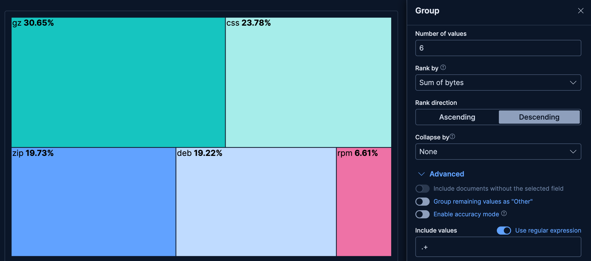
See which file extensions consume the most bandwidth, excluding blank values:
- Example based on: Kibana Sample Data Logs
- Group by:
extension.keyword- Top 6 values
- Advanced: include values matching the
.+regular expression to exclude blank values
- Metric: Sum of
bytes

- Flights by carrier and destination country
-
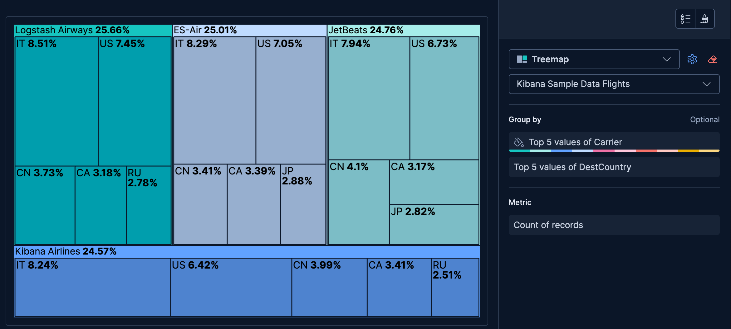
Show how flight volume is distributed across airlines and their destination countries, using two hierarchy levels:
- Example based on: Kibana Sample Data Flights
- Group by (Level 1):
Carrier(Top 5 values) - Group by (Level 2):
DestCountry(Top 5 values) - Metric: Count

- Response status per host
-
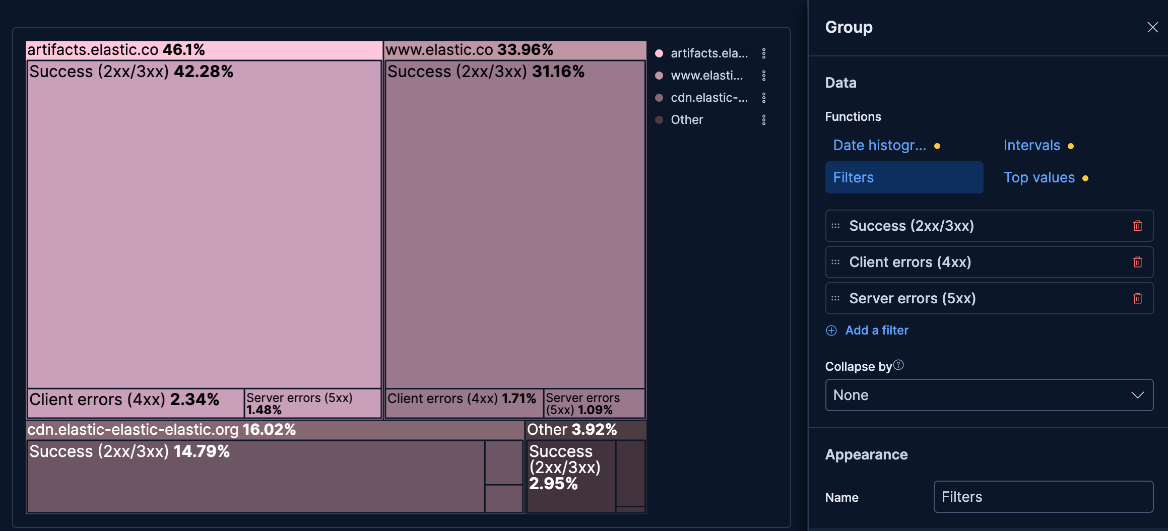
See which hosts handle the most traffic and how their response status breaks down:
- Example based on: Kibana Sample Data Logs
- Group by (Level 1):
host.keyword(Top 3 values) - Group by (Level 2): Filters
- "Success (2xx/3xx)":
response.keyword >= "200" AND response.keyword < "400" - "Client errors (4xx)":
response.keyword >= "400" AND response.keyword < "500" - "Server errors (5xx)":
response.keyword >= "500"
- "Success (2xx/3xx)":
- Metric: Count
- Color: Gradient (
#ffc7db)
