Unlocking insights: How to analyze Strava data with Elastic AIOps


 Share on Twitter
Share on Twitter

 Share on LinkedIn
Share on LinkedIn

 Share on Facebook
Share on Facebook

 Share by Email
Share by Email

 Print this page
Print
This is the sixth blog post in our Strava series (don’t forget to catch up on the first, second, third, fourth, and fifth)! I will take you through data onboarding, manipulation, and visualization.
What is Strava, and why is it the focus? Strava is a platform where recreational and professional athletes can share their activities. All my fitness data from my Apple Watch, Garmin, and Zwift is automatically synced and saved. Getting the data out of Strava is the first step to get an overview of my fitness.
This time we take a look at some of our newest features in the machine learning space.
AIOps
In the past few releases, we introduced many features related to machine learning and AIOps. From importing custom models to out-of-the-box functions such as explain log rate spikes.
The explain log rate spikes feature does something extraordinary. It allows the user to select a particular bar in a histogram and compare it against another set of data, showing what influencers (fields) are different. We will use this to our advantage. Everyone invested in sports has these few months a year where we train extra hard and put in a ton of more workouts. Looking back at this, this can be treated as an anomaly since it strives away from our usual behavior.
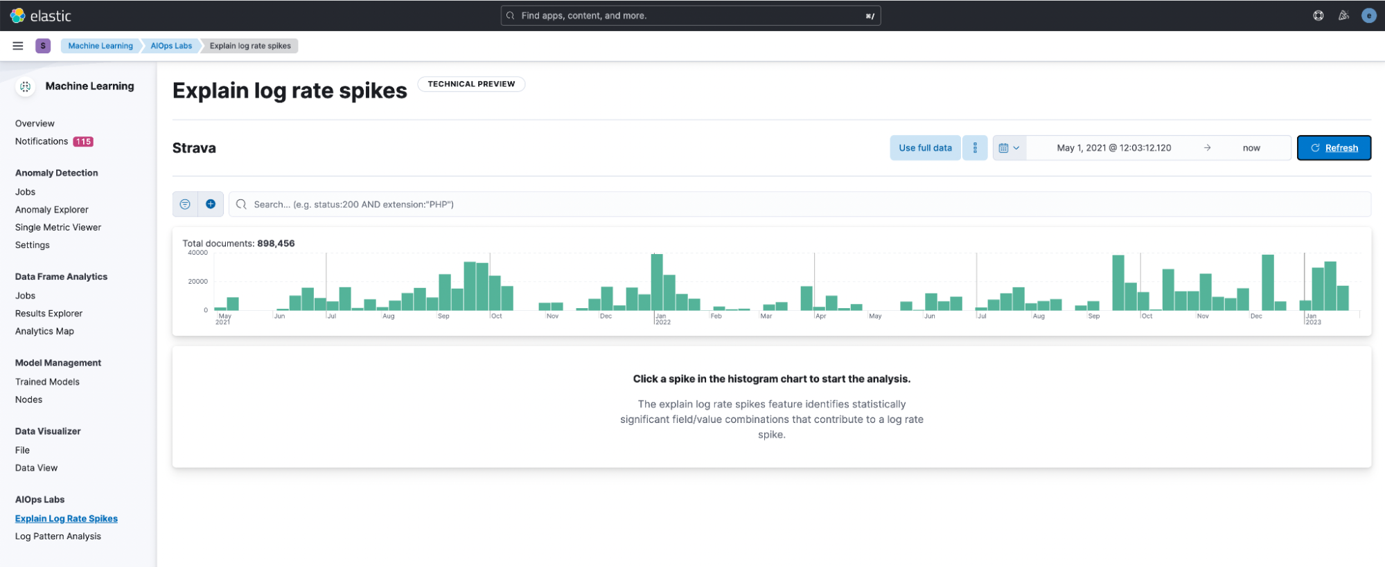
After opening it and selecting the data view, Strava, I am greeted with this window. Immediately the histogram helps a ton in visually identifying differences. I decided to click on the bar in December.
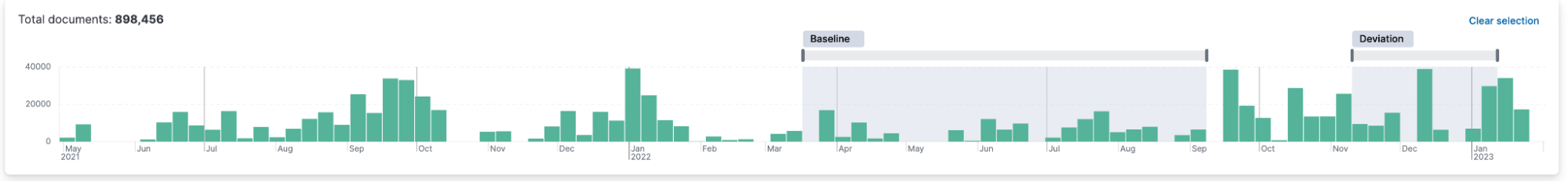
It will automatically start an analysis and mark the deviation around your selected data. You can resize the baseline and deviation to your desire.
It outputs all fields that are different. Let’s see what we get for our Strava index.

It makes sense that the strava.sport_type is a deviation! Since November, I’ve been using Zwift + Wahoo Kickr, so the Virtual Rides are increasing. More hiking here and there also makes sense since it’s cold, and I hike in cold weather.
See the little yellow overlay on top of the green? That represents how many of the documents have that field value. By the way, when you hover over the field and scroll up, you see the histogram more significantly than just the minimal version next to the field.
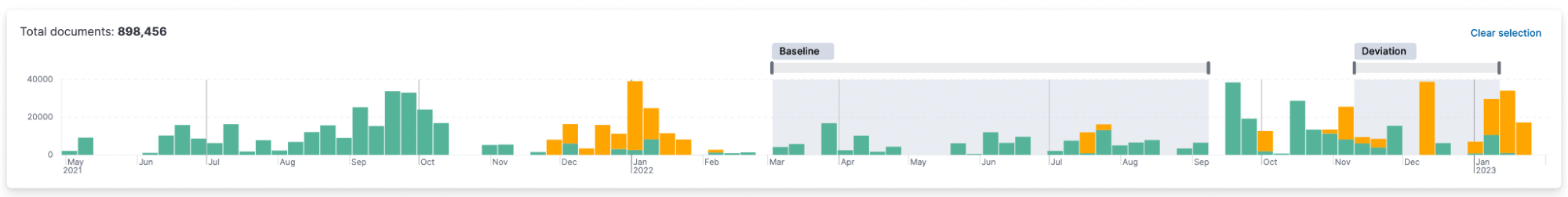
It is fantastic to see a repeating trend in that. According to the baseline, in this case, the summer months. The winter months with virtual rides are an anomaly.
Single metric job for distance
Could machine learning help us identify anomalies with our distance? One thing that makes this very interesting is that we have a low set of data points. For the past two years, it’s roughly 300 data points.
Let’s create a single metric job using the strava-summary index (that one we created using the transforms) and select mean(distance). The only thing worth changing is the Bucket span. This is set to 15m, but let’s change it to 1d. We want to analyze if our distance in a single day is an anomaly.
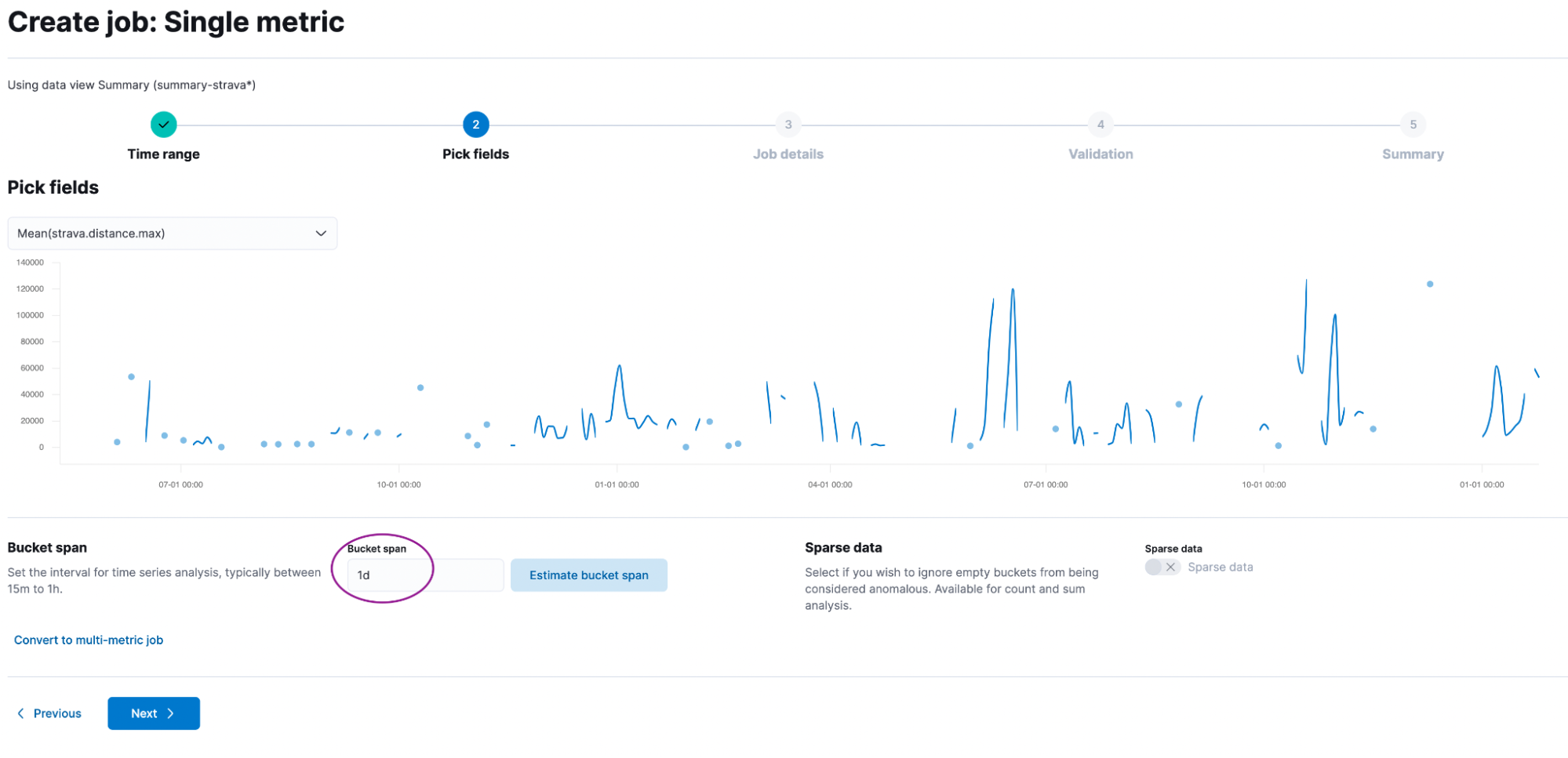
Give it a good name like strava-distance and add it to a group called strava. No need to dabble with the advanced settings. Just click Create Job.
Now go to the single metric viewer. You are greeted with this page:
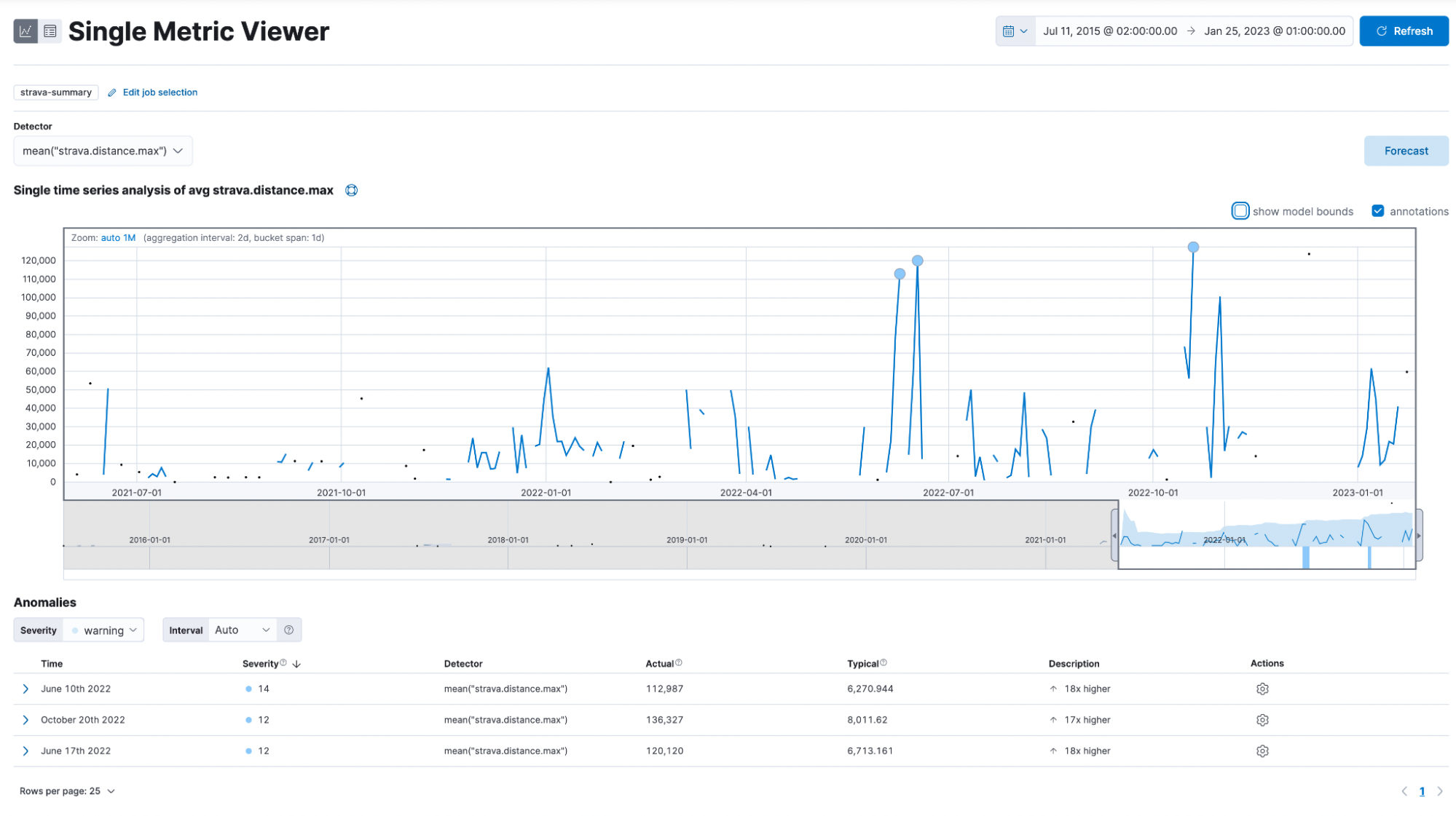
This shows you a graph for all data points, some circles, and some of you might even see plus signs.
How can I interpret this now? The anomalies are listed on the bottom and show the timestamp, severity, detector, actual, typical, and description. Noteworthy is the severity, which is either low, medium, or high. Actual is the value it is. On June 10, 2022, I rode 112km (the comma symbol is 1000 separator and not for decimal place), while the model would expect me to ride only 6km.
Lastly, we want to click on the forecast button and enter some reasonable amount of time, like 90d, for 90 days. The yellow line in the chart represents the predicted data values, and the shaded yellow area represents the bounds for the predicted values, which also indicates the confidence of the predictions.
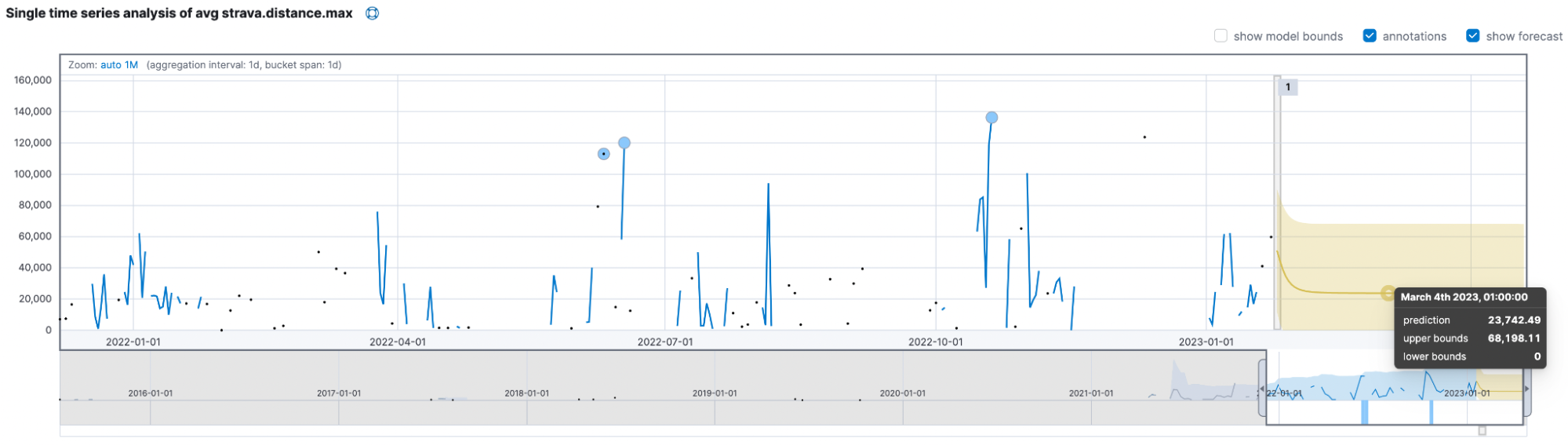
The models think I will only ride up to 68km and usually be near the ~24km mark. The critical takeaway is to beat the model and ride at least 70km daily to prove it wrong!
Summary
We achieved quite a bit in this blog post, and you can start exploring your data now! Don’t forget to check out our book Machine Learning with the Elastic Stack.
Ready to get started? Begin a free 14-day trial of Elastic Cloud. Or download the self-managed version of the Elastic Stack for free.
Check out the other posts in this Strava series:
- Part 1: How to import Strava data into the Elastic Stack
- Part 2: Analyze and visualize Strava activity details with the Elastic Stack
- Part 3: Get more out of Strava activity fields with runtime fields and transforms
- Part 4: Optimizing Strava data collection with Elastic APM and a custom script solution
- Part 5: How tough was your workout? Take a closer look at Strava data through Kibana Lens
- Part 7: From data to insights: Predicting workout types in Strava with Elasticsearch and data frame analytics
Share
- Share on Twitter
Share on Twitter
- Share on LinkedIn
Share on LinkedIn
- Share on Facebook
Share on Facebook
- Share by Email
Share by Email
- Print this page
Print