Tracking peak time for trick-or-treaters in Kibana

 Share on Twitter
Share on Twitter

 Share on LinkedIn
Share on LinkedIn

 Share on Facebook
Share on Facebook

 Share by Email
Share by Email

 Print this page
Print
It’s the most spooky time of the year! Many of us have fond memories as children of dressing up in scary costumes and heading door to door in search of treats. As adults, we may be on door duty handing out candy.

Irrespective of which side of the door you’re standing on, have you ever wondered when the peak time for trick or treating is? Below, we’ll explain how to ingest data and build sample visualizations using Kibana to show when to expect trick-or-treaters knocking on the door.
Ingesting our trick-or-treater data
To examine this question, we need data. Thankfully, the wonderful Jeffrey A. Shaffer has been collecting data on the trick-or-treaters coming to his door from 2008 up to and including 2022, which he shares on the data + science blog. This dataset is limited to Cincinnati, Ohio, meaning it will have a U.S. bias. However, it’s still a great, small dataset to start having some frightful fun with Kibana.
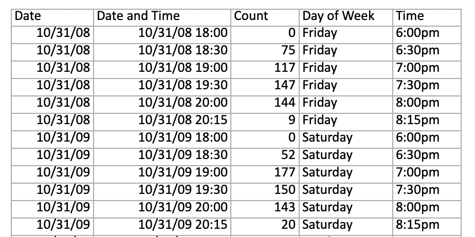
The blog provides two files with different structures of the same dataset: one with separate dimensions for each 30 minute interval, and one with a single time dimension. Although intended for use in Tableau, I found the second data set, Halloween Data Set in Excel for Tableau (2008-2022), with a single time dimension made time series trending easier in Kibana. You can see the structure of the file below.
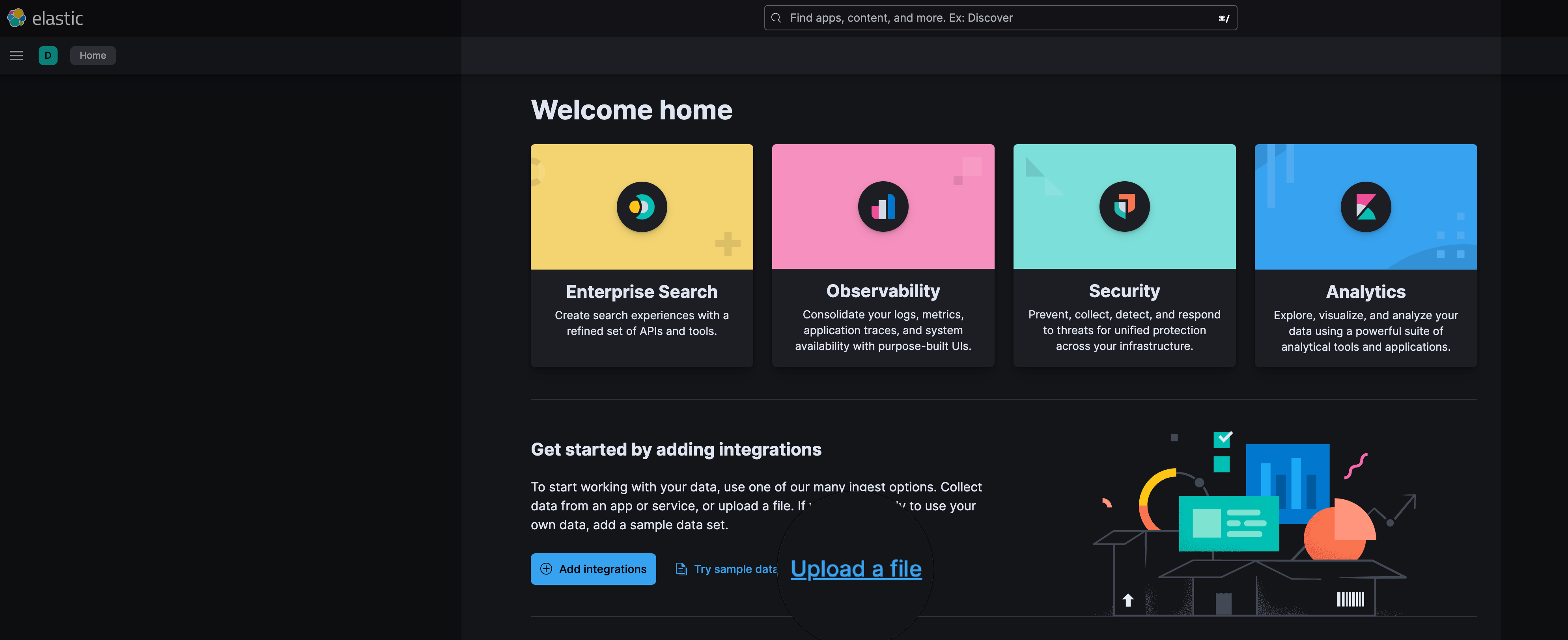
While there are many ways to ingest data into Elasticsearch, the quick and easy way is to use the upload file feature in Kibana, as depicted in the below screenshot. To ingest the XLSX file from the blog, it needs to be converted to CSV file prior to upload. This can be done with any spreadsheet application. The upload file feature in Kibana, as depicted in the below screenshot, can be used to configure and ingest the data.
Check carefully the data types of the fields, paying particular attention that your date field is of the correct type. Date fields are denoted by a small calendar image next to the field name, as highlighted in the below screenshot.
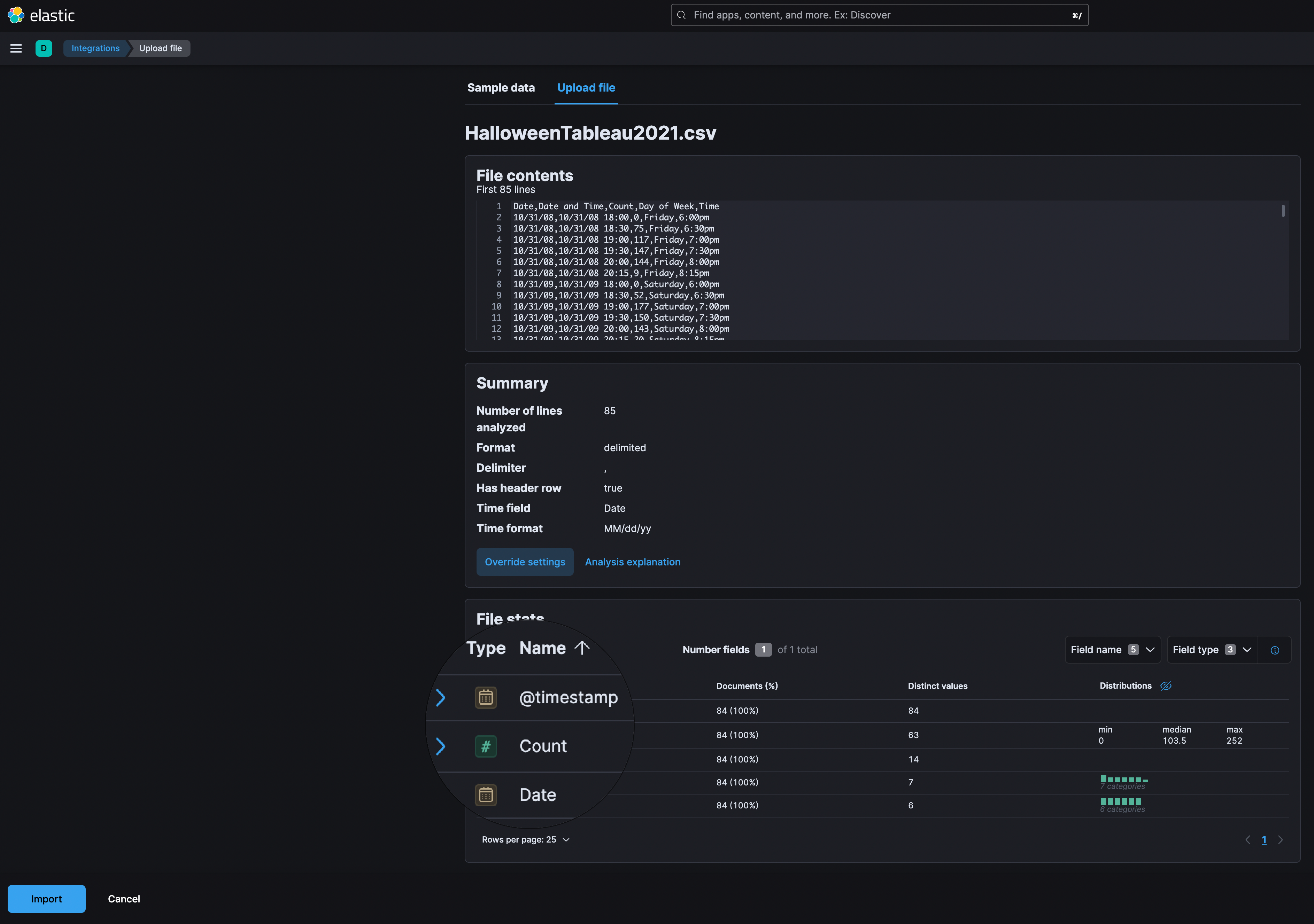
The date field is essential for time-series trending, as it will be used for the @timestamp field in the index. For this reason, I’ve changed the automatically selected Time field to Date and Time and updated the format to include the time to ensure the generated @timestamp field uses this value. Upon import, Kibana will process and upload the data via a newly created ingest pipeline.
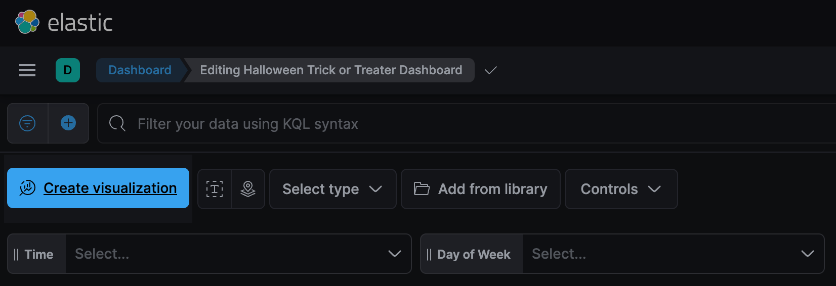
Building our dashboard
There are many ways to include visualizations within a new dashboard. Kibana Lens, which is the default mechanism invoked by the Create visualization button, is used to create each individual visualization.
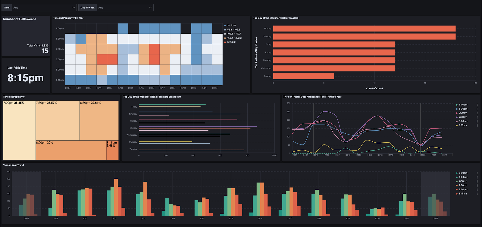
Picking the right visualization is more of an art than a science. For that reason, our dashboard has a mixture of metrics, heatmaps, and line charts over the time series and bar charts to make sense of our data, as you can see below.
When is the peak time for trick-or-treating?
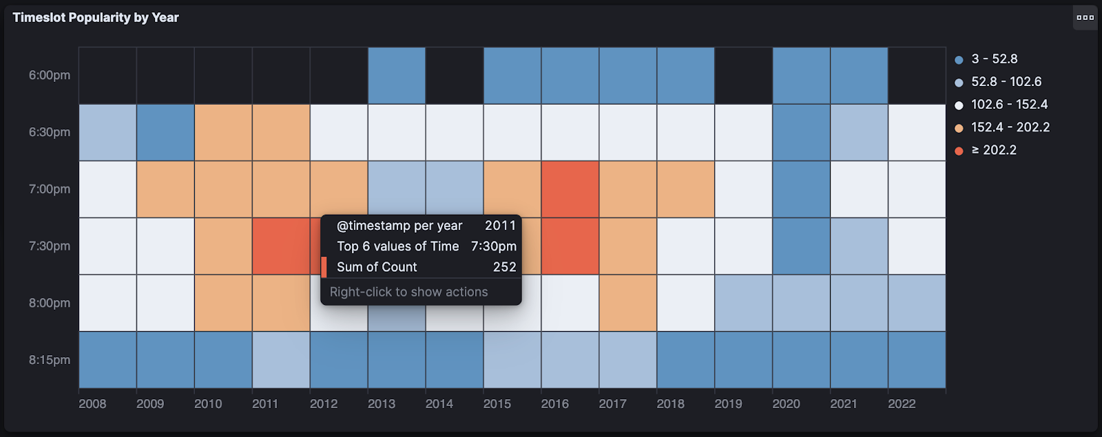
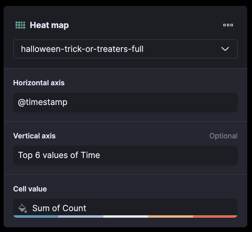
Let’s answer this all-important question. In our dashboard, there are two charts that provide the answer. The heat map is great for showcasing the intensity of values. In this example, @timestamp is used on the horizontal axis with top 6 values of time and sum of count for the cell value. The configuration in Kibana Lens looks a bit like this:
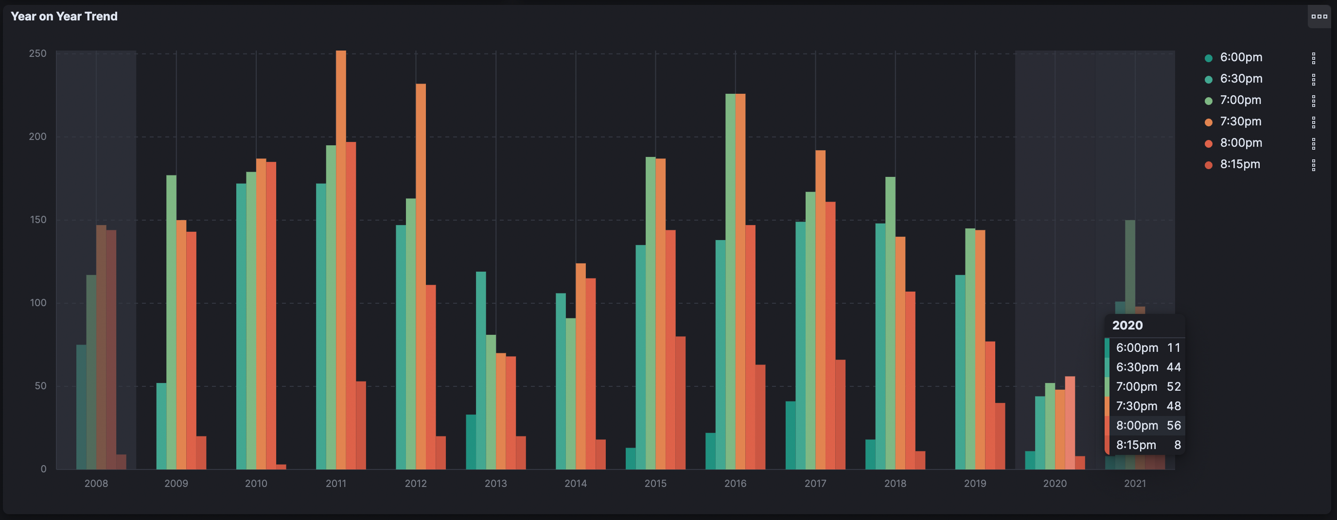
Back to the data, the seasonal orange shows that over the years, the largest number of trick-or-treaters appear in the 7:00pm–8:00pm timeframe. Before and after this range tends to be a good time for a candy break for those on door duty.

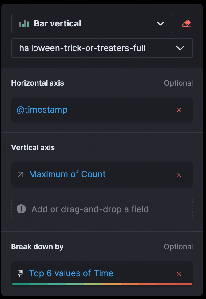
This peak distribution is also apparent in the bar series, which also shows us the behavior over the years. Just like the heatmap, our Lens configuration uses @timestamp on the horizontal access. However, as you can see from the below configuration, we also use maximum of count for the vertical axis and a breakdown of the top values by the time field. Note that since each time point for the date is unique, selecting minimum or sum would not yield a difference to your resulting visualization.
The drop in trick-or-treaters during the global pandemic where kids stayed inside in 2020 is clear from the minimum peak as per the below screenshot. The year 2011 also was a great year for candy hauls, with the largest number of children appearing that year. Yet a question remains: what contributed to the smaller trick-or-treater footprint in 2013 and 2014?
What’s next?
Using Kibana, we have shown that 7:00pm–8:00pm in Cincinnati is the busy period where you may be queuing to get your candy and seeing all the amazing costumes from other trick-or-treaters.
What insights can you glean from this data? Can you answer the question of what happened in 2013 and 2014? Or do you have insights from Kibana dashboards over other spooky data sets that you would like to share? Get in touch and share what you build in our community.
Happy Halloween!
Share
- Share on Twitter
Share on Twitter
- Share on LinkedIn
Share on LinkedIn
- Share on Facebook
Share on Facebook
- Share by Email
Share by Email
- Print this page
Print