Designing intuitive Kibana dashboards as a non-designer

 Share on Twitter
Share on Twitter

 Share on LinkedIn
Share on LinkedIn

 Share on Facebook
Share on Facebook

 Share by Email
Share by Email

 Print this page
Print
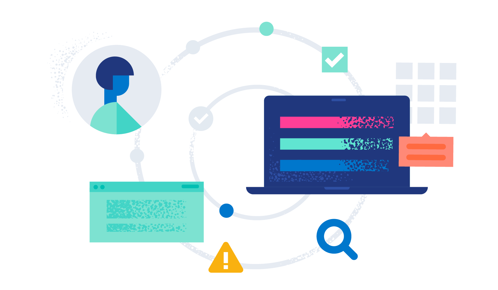
Developers, SRE engineers, and talented technologists often need to build quick dashboards to showcase important information on the state of their applications that can be consumed by mixed audiences. If you’re not a frontend developer or designer, it can feel scary building intuitive dashboards that all can understand and consume without being overloaded with information. Especially if you don’t feel you possess the artistic design flair of your colleagues, it can feel like you’re missing that key set of rules that they implicitly hold in their heads.
As a frontend engineer, I’ve been fortunate to work with designers and users alike and learn tips on how to build intuitive experiences without bamboozling users into information overload and to access the important information they need directly. I’ve also helped mentor and train backend engineers on visualization best practices to help them find their own design flair when building dashboards.
Here, I share tips on how to lay out controls based on some key laws of UX, and how to pick suitable charts to connect people with large volumes of data in Kibana.
[Related article: Building Kibana dashboards more efficiently]
Group similar themes together
It is easy for the number of controls in a dashboard to quickly balloon out of control. Although making use of scrolling and keeping the most useful highlights at the top can help, it is problematic for several reasons. Just like a car dashboard, we will miss important details as the control is out of our peripheral view, and most likely this detail is not required for the task at hand. For example, having details of the directions to take 1 hour into your journey is a distraction from the current turn you have to take, therefore you wouldn’t list it on the satnav screen. For this reason, try to limit the number of controls on your dashboard to prevent the need for scrolling at all.
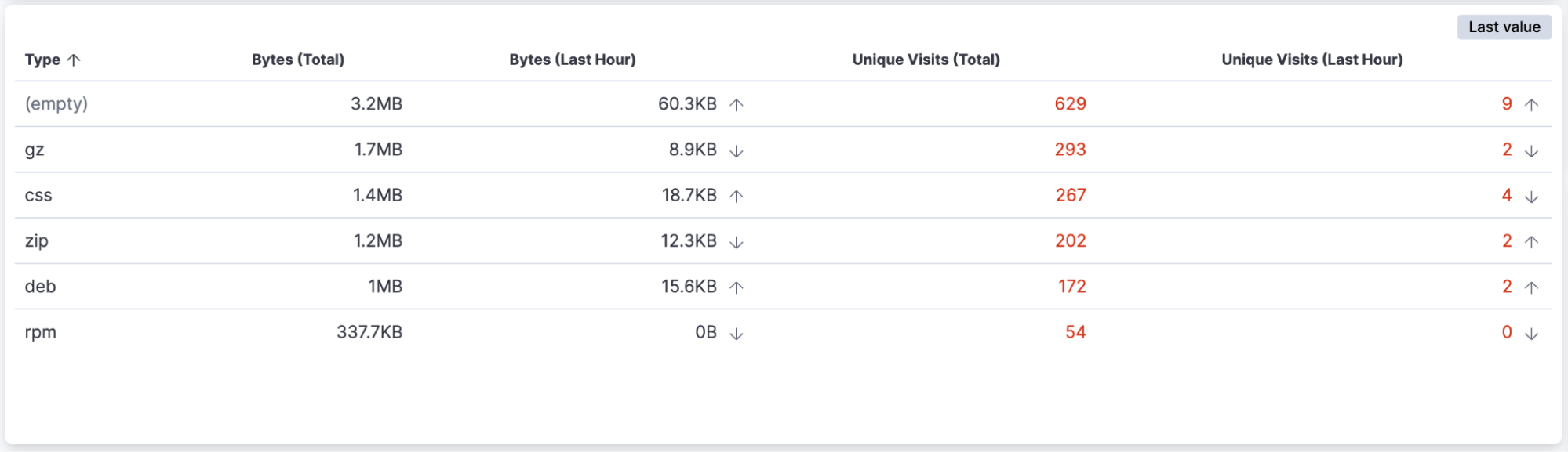
The laws of proximity and common region are great heuristics to follow in the grouping of dashboard controls. They state not only that people tend to group items located close together, but that controls included within a common boundary are also assumed to have a close association.
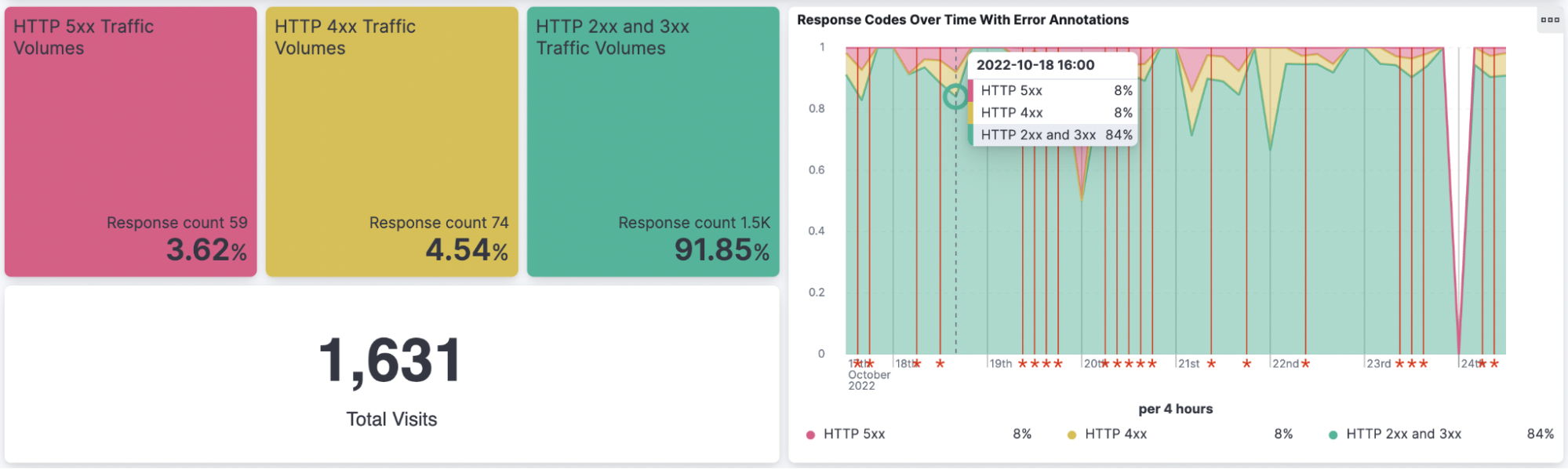
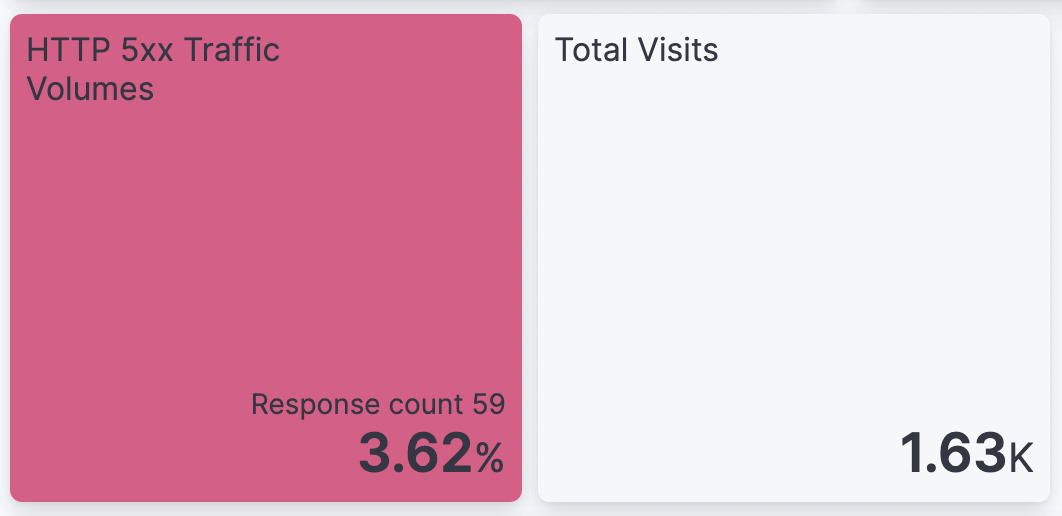
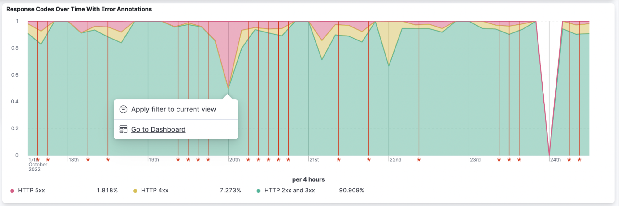
A good way to take advantage of these phenomena in your dashboards is to group measures and charts that share a common data dimension together. For example, grouping high-level metric cards with HTTP error codes together with the trend over time, as depicted in the above illustration, is a good way to help users find insights as the controls share a common theme.
Consider which control will help users understand their data
It can be difficult to figure out which type of control is most suitable for the data you want to present to consumers if you’re not from a design or data analysis background. It might be tempting to present everything in a data table to allow users the flexibility to dig into the details. However, living in the age of information overload means all of us can be subjected to large volumes of data and regular interruptions in our jobs that lead to sensory overload.
This webinar does give some useful tips around 30 minutes in on some useful considerations for selecting a control based on the number of categories. Here are some further rules of thumb to help you select key charts for your data:
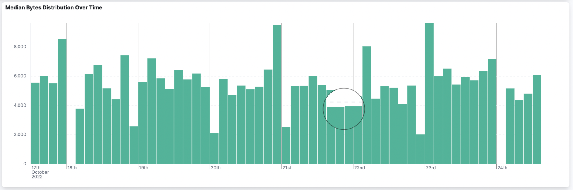
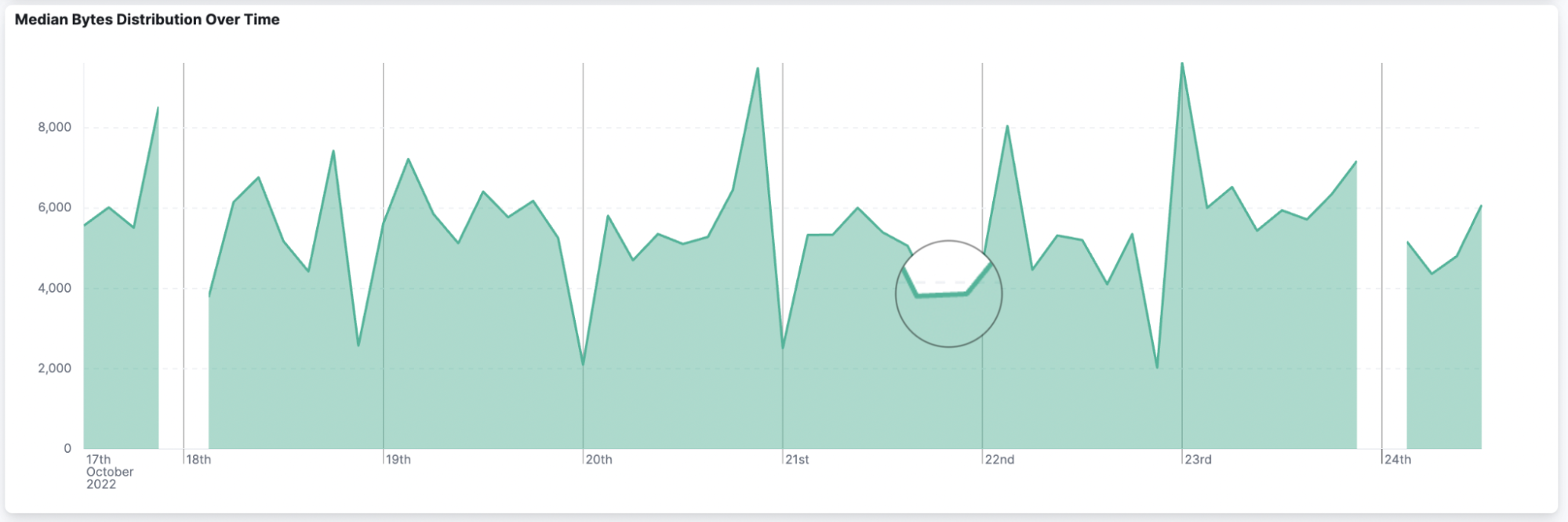
1. Examining trends over time series can be achieved using histograms, area charts, or line charts, using the horizontal axis to provide adequate space for longer periods. If you are unsure which to pick, I tend to go for line series if I care about identifying subtle differences between data points, which can be masked by histograms, as you can see in the illustration below.
2. Showing several key measures can be achieved using a small data table. Ensure you limit the number of metrics to the essential ones. Using Miller’s law, which states that people can only keep 7 plus or minus 2 items in their memory, is a good rule of thumb to follow here, but isn’t a strict requirement.
3. Small metric cards are great for showing high-level metrics alongside more complex trends.
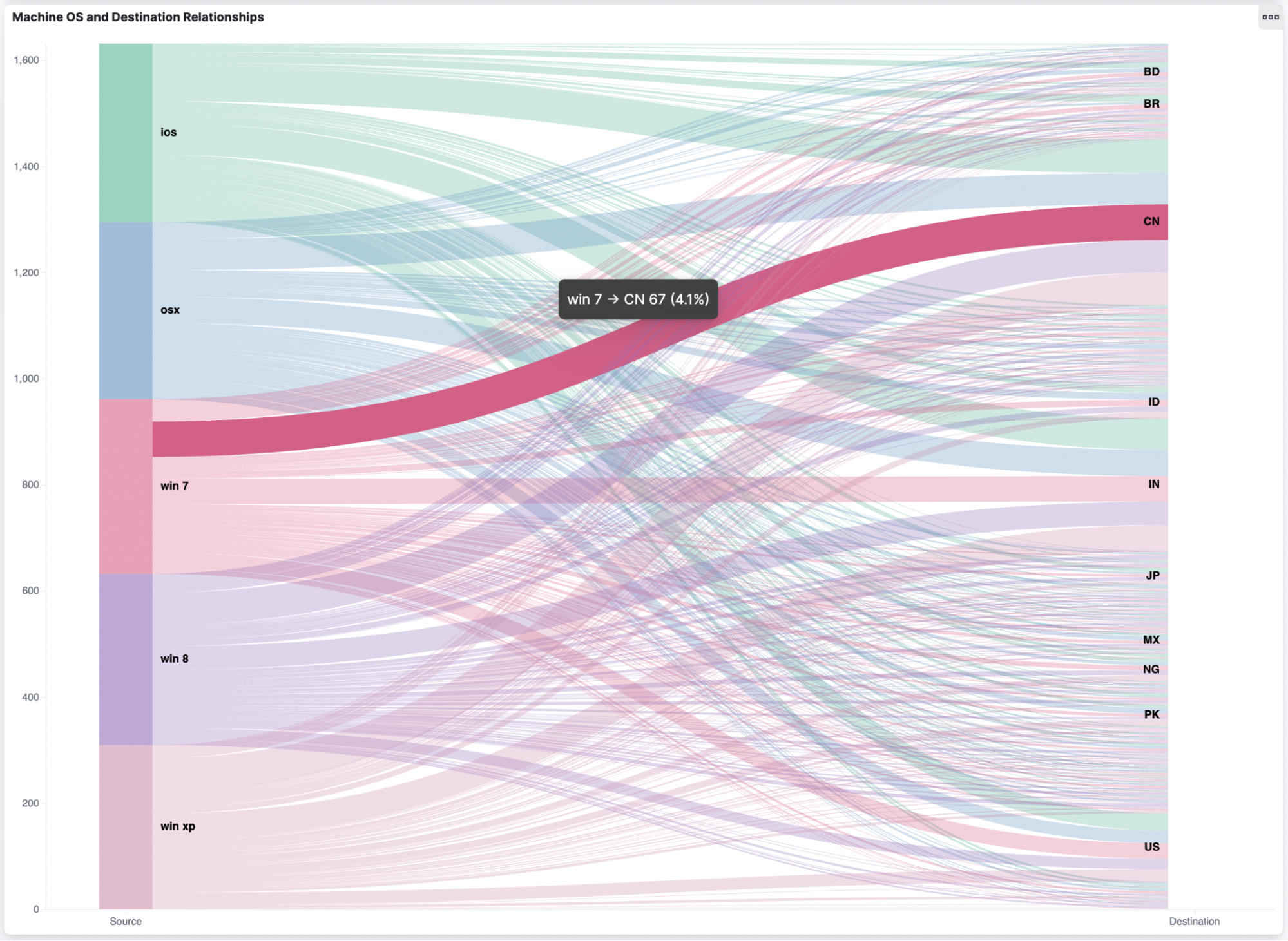
4. Flows and relationships are better shown in custom visualizations such as a Sankey diagram to show the connections and their relative composition compared to other relationships.
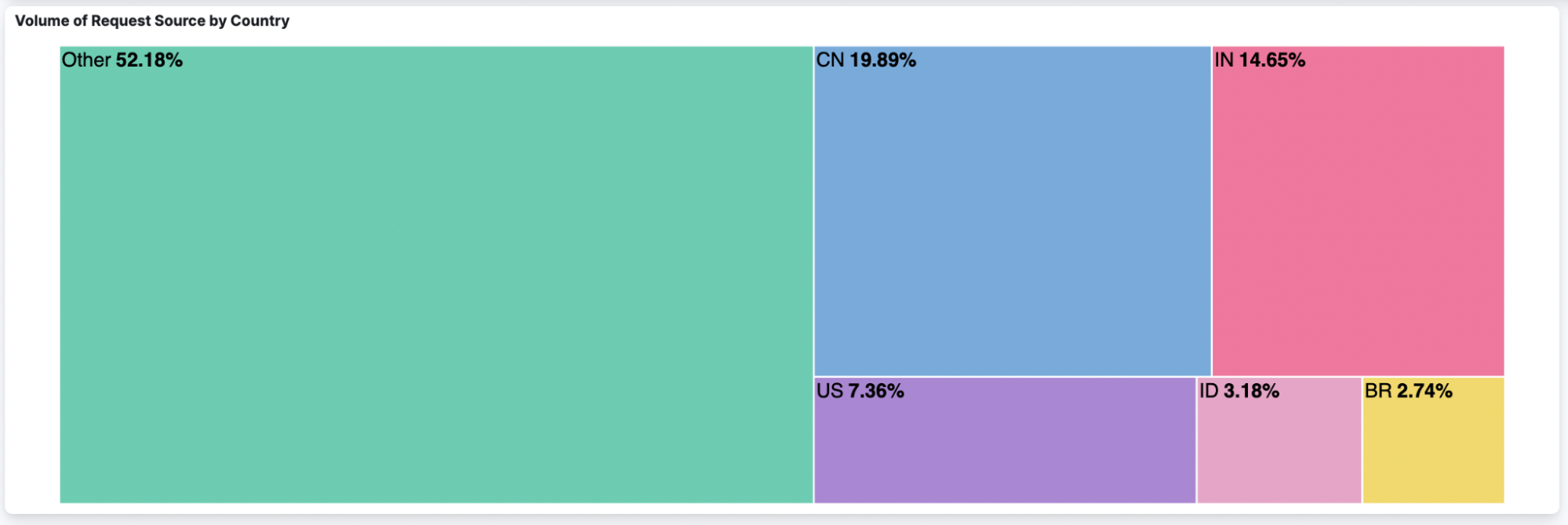
5. Size can be a good way to represent the proportions of your population. Waffle or treemap diagrams are a good way to help users identify the larger categories within your population.
Be comfortable trying out different configurations to see what works and doesn’t work with your dataset. One control may seem quite chaotic and difficult to gain insights, but another control over the same data may help identify unexpected trends.
Use drilldowns for more information where you can
One key problem with high-volume datasets such as logs is that often you need to dig into the details quickly to find out more. In the example below, you can see we are able to navigate from the stacked area chart below to another dashboard.
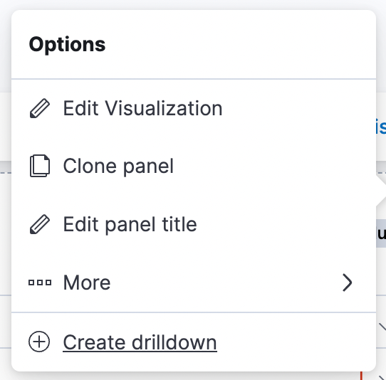
Many controls allow you to specify a dashboard or URL that you can navigate to via the Create drilldown option on the context menu, as shown below.
This is a great way to push the more detailed information to a place that is still accessible, but can show smaller volumes by applying the filters of your chart selection to flow through.
Be mindful of titles and labeling
When users view dashboards, they should be able to quickly identify what data they are seeing, what series are present, and what the measures are. However, we also want to reduce the amount of text to only essential information to reduce the amount of noise.
Only use titles on controls if they add additional context to legends and labels, such as on charts. Also ensure that the text is clear, concise, and self-explanatory.
Reuse Elastic color schemes to make accessibility easier
Color choice is a difficult consideration for many reasons. Firstly, we need to support users who may struggle to see particular colors, or balance contrast, such as those with color blindness. Secondly, color can have different meanings to cultures across the world. Finally, color coding in some domains can provide additional context, such as the red, amber, green theme commonly associated with success and error states in the observability space.

By using the in-built Elastic color schemes, dashboard creators are able to navigate some of these challenges and ensure an accessible experience for users. One action dashboard creators can take is to match colors to series across different controls. The above example shows using the same color coding between the HTTP code metric tile and the area chart series. The cards are also in the same order as the series to help provide consistency to users.
Seek out resources and feedback on your dashboards
These tips will help you with building Kibana dashboards that users can use to quickly find insights into logs and data. Building effective dashboards is more of an art than a science. Sometimes something that worked before may not quite fit with your data this time around.
We all form our own design opinions based on the applications we use, as well as the Kibana dashboards that our colleagues have built. Try cloning existing dashboards and having a play. It’s important to get thoughts and feedback from users, other dashboard creators, developers, and other people as you go along. Also make use of the resources available on the Elastic website, with the key ones listed in the resources section below.
Happy dashboarding!
Share
- Share on Twitter
Share on Twitter
- Share on LinkedIn
Share on LinkedIn
- Share on Facebook
Share on Facebook
- Share by Email
Share by Email
- Print this page
Print