But First, Coffee... (An Elastic{ON} Canvas Story)
This is the first in a series about Canvas at Elastic{ON} 2018. Part 2 covers visualizing metrics from our Ask Me Anything booth at the conference.
"But first, coffee" - I'm not sure about you, but that's how I start my day. However, this post isn't about that miraculous bean, roasting, or a showdown between Starbucks, Peet's, Philz, or Blue Bottle. Instead, in this series, we will dig in to some of the very cool Canvas workpads that were on display at Elastic{ON} 2018 (you can check out the Canvas demo in the keynote). We will go over laying out the initial look, "upgrading" the images, and the configuration for each of the data elements.
This post focuses on -- you guessed it -- coffee. In particular, coffee consumption at Elastic{ON}.
What is Canvas?
First it is probably useful to briefly mention a couple of quick things about Canvas. Currently available as a technology preview, Canvas is a composable, extensible, creative space for live data. A great complement to Kibana dashboards, Canvas allows you to express your data in a highly polished way, whether it be in the boardroom, the NOC, or on your lobby displays. To learn more about why Canvas came to be, check out the introductory blog post; to keep up to date with the status of Canvas, jump over to the dedicated Canvas mini-site.
Dissecting the Café Canvas
The Mockup
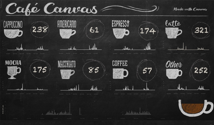
Café Canvas, or as it was known when I was working on it, "Elasticoffee", was my first foray into the world of Canvas. We started with a mockup that actually looks pretty similar to the final version, above, except we used placeholders for the cups. The design of it was obviously driven by a chalkboard look, reminiscent of street-corner coffee shops. We used a couple chalk-like fonts, a crude sketch of a cup, and some demo data to build up a prototype.
Once we had our layout figured out we called in someone that knows something about design and graphics, to get our layout to look like the final version you see at the top - with hand-drawn cups, and hand-lettered banners and captions.
The Data
Once we had the mockup we needed real data, and a way to GET that real data. For this we used some Z-Wave buttons (Wallmote Quad) from Aeotech, and a Z-Wave stick attached to a Raspberry Pi 3. We turned to a home automation platform, Home Assistant, to capture the presses and send the data to our Elastic cluster.
The coffee station had two sets of these buttons, one button for each drink, giving folks something to do (or click) while they waited for their beverage. We had acrylic displays on each side of the coffee station, which looked something like this:
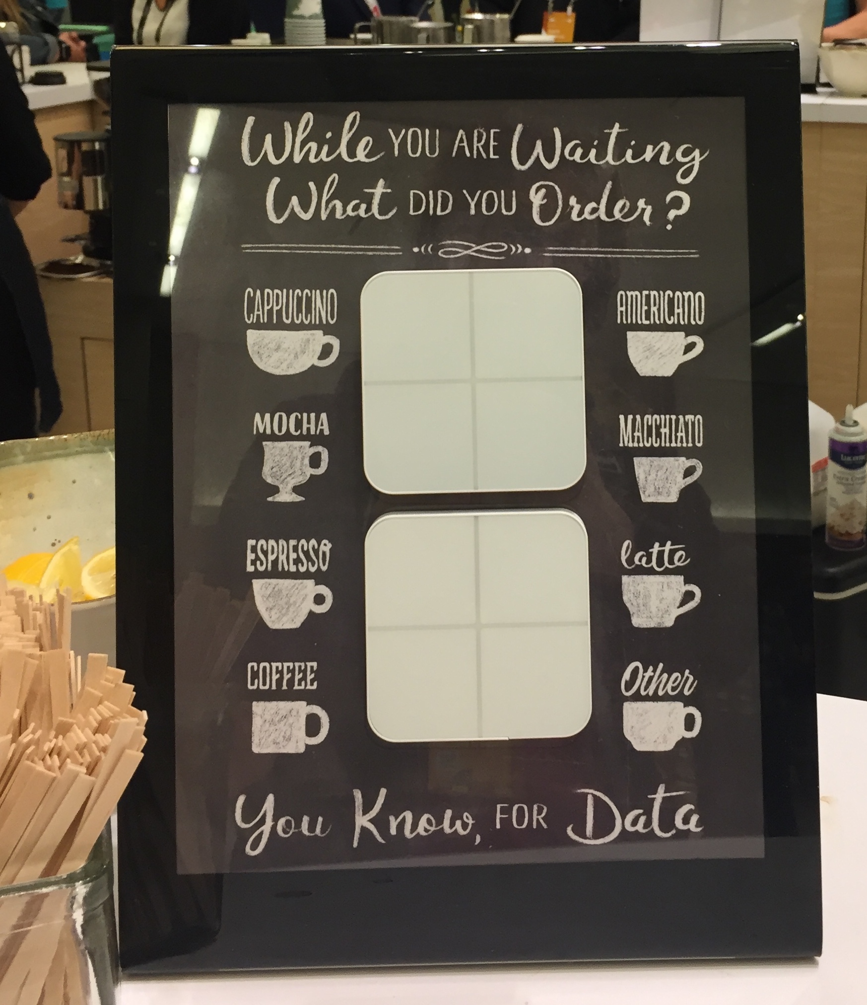 (photo credit: Janko Strassburg)
The data was pretty simple, we just used a REST call to send over each press. Each press looked like this:
    {
      "@timestamp": "2018-02-27T22:26:39Z",
      "beverage": "Latte",
      "beverageClass": "Hot Beverages",
      "beverageIndex": 5,
      "beverageSide": "left",
      "entityID": "zwave.quad2",
      "quadId": 2,
      "quadMod": "1",
      "quantity": 1,
      "sceneData": "0",
      "sceneID": "2"
    }
The documents carry a lot more information that we need for the workpad, including which of the Wallmotes was used, which side it was on, and of course a timestamp. Really the only things that we used on the workpad were the beverage and the timestamp.
Breaking it Down
At first blush when you look at the workpad it seems like there are many different data points - but when it comes down to it there are really only a few parts:
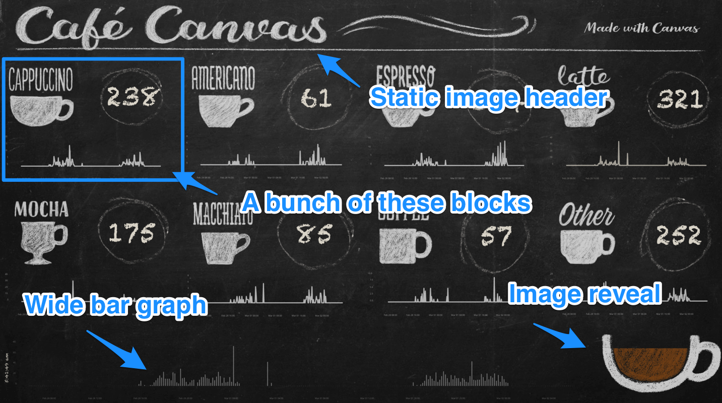
- The header, which is a static image
- A wide bar graph at the bottom, showing total orders
- An image reveal, showing the overall count of beverages against a goal (more on that later)
- A block for each of the beverage types.
Let's take a look at the details for each of these sections.
A Note About Editing
Note that there are two different ways to configure elements using Canvas - one is via the details panel on the right:
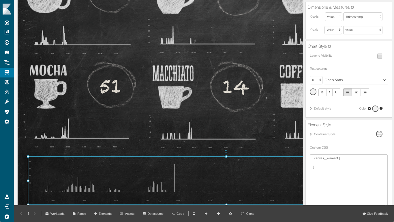
The other way is via the code editor:
I use the details panel until I can't.
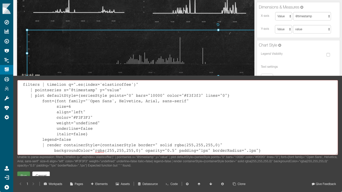
The Bar Chart
When I switch to code I like to format it nicely, rather than have it in one long line, so it is a bit easier to read. The code for our bottom bar graph looks like this:
    filters | timelion q=".es(index='elasticoffee')"
    | pointseries x="@timestamp" y="value"
    | plot defaultStyle={seriesStyle points="0" bars="10000" color="#f3f3f3" lines="0"}
         font={font family="'Open Sans', Helvetica, Arial, sans-serif"
               size=6
               align="left"
               color="#F3F3F3"
               weight="undefined"
               underline=false
               italic=false}
         legend=false
         | render containerStyle={containerStyle border=" solid rgba(255,255,255,0)"
              backgroundColor="rgba(255,255,255,0)" opacity="0.5" padding="1px" borderRadius=".1px"}
Canvas uses pipelining to process data. The first few items are the actual "data" parts of the expression. The filters takes whatever date or global query filter is set on the page (in this case, the date range), and only looks at that data. The datasource for this element is a timelion query for everything in the "elasticoffee" index (of course, only those documents that fall in the filtered time range). This is then converted to a pointseries, with the x-axis serving as the time.
The data from the pointseries is plotted as a bar graph - notice that the points=0 and lines=0 - you can actually mix and match the points/lines/bars if you want to have points at the top of the bars like lollipops, or connect them. In this case we wanted just the bars. The rest of the plot statement is just formatting. It specifies the font, color, and size for the axes of the graph, and says that there shouldn't be a legend.
The remainder of the expression is the render - this tells Canvas how to draw the element. In this case, the render doesn't have an "as" clause, so it just carries through and draws what it gets in, the bar chart. The containerStyle specifies the characteristics of the element, most important is the opacity="0.5" - this gives it the chalk look.
The Coffee Cup Image Reveal
The Image Reveal is really two images - an empty cup, and a full cup:

The code for the image reveal is pretty simple:
    filters | escount index="elasticoffee"
    | math "value / 3000"
    | if {compare "gt" to=1} then=1 else={context}
    | revealImage
         origin="bottom"
         image={asset "asset-c402b820-79de-401a-9c1e-7bc09ccea31e"}
         emptyImage={asset "asset-2bf1ee0e-24e5-47f3-8663-f79ad4f2094e"}
    | render containerStyle={containerStyle opacity="0.8"}
This time we are counting all of the elements in the elasticoffee index that match our filter context. We take that value, and divide it by our "goal", in this case, 3000. We include an if statement-- the image reveal is a percentage, and it doesn't like it if it goes over 1. Finally, the config for the image reveal itself. Images in Canvas are turned into reusable "assets":
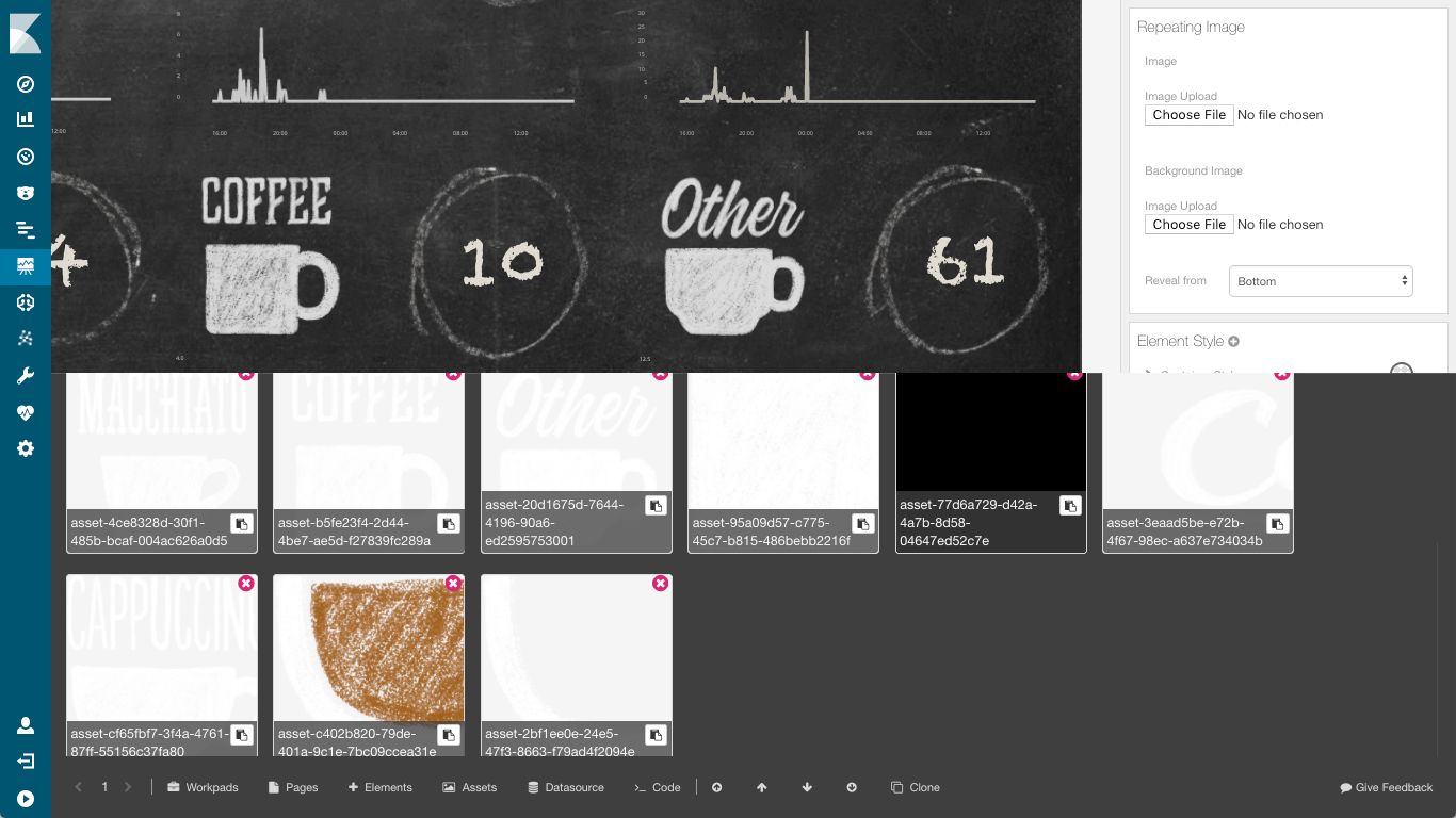
The asset IDs are then used in the config, so we have an asset for the full image and one for the the empty version of the image. We can also specify the direction of the reveal, which in this case is from the bottom. This is really cool, because you can get very creative - if we had more room we could have shown the pot pouring the magic elixir into the cup,
Beverage Choices
There are eight different beverage choices (OK, seven plus one catch-all). Let's look closer at the cappuccino one:
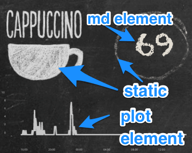
Each of these has two static elements, the cup asset, which is different for each beverage, and the little chalk circle, which is the same for each (we uploaded the circle then cloned it). To make it look a bit more authentic, after cloning we rotated the different circles various amounts, and resized them a bit so they looked hand-drawn. That leaves us with the two data elements.
The code for the line graph is:
     filters
     | timelion q=".es(q=beverage:Cappuccino, index='elasticoffee', metric=sum:quantity)"
     | pointseries x="@timestamp" y="value"
     | plot defaultStyle={seriesStyle points="0" bars="0" color="#f3f3f3" lines="3"}
          font={font family="'Open Sans', Helvetica, Arial, sans-serif" size=6
              align="left"
              color="#F3F3F3"
              weight="undefined"
              underline=false
              italic=false}
          legend=false
     | render containerStyle={containerStyle backgroundColor="rgba(255,255,255,0)" opacity="0.75"}
While the code for the markdown element is even simpler:
     filters
     | markdown {escount index="elasticoffee" q="beverage:Cappuccino"}
          font={font family="'fantasy', 'Chalkduster', sans-serif"
              size=70 align="center"
              color="#e0dbd1"
              weight="undefined"
              underline=false
              italic=false}
To break these down, of course we have our filters. The line chart uses similar notation to the bar chart we saw earlier, except for each of the beverages we have a different query, searching the elasticoffee index for the corresponding beverage, in this case, Cappuccino. We still put the timestamp on the x-axis, but this time our plot only has lines-- no bars nor points (lines="3").
The number is about as easy as it gets. We simply print out the the count of items in the elasticoffee index of the specified beverage, within our filter. A bit of font tweaking and we have the finished product.
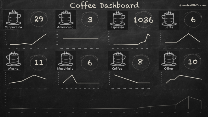
Clone the elements, put them in place, update the queries, and we quickly have the other seven slots ready to go.
What I Learned Doing This
There were several things that I learned building this workpad - after all, this was my first venture into the world of Canvas. One thing that shined was how responsive the team is. I encourage you to try this out, file issues or ask questions on the Kibana Discuss site.
Some tips:
- Have up a rough vision of your final output.
- Don't worry about fancy graphics up front
- The code for some of these things gets pretty complex.
- Tweak it so it is easier to read
- Remember, the code is a pipeline.
- Build it up, one pipe at a time. Throw a "render as=debug" at the end, and you will get json output
- Code, then clone.
- Make sure what you have works before you clone
- You can ALSO replace the code for an element via copy/paste
- Customize the appearance.
- Tweak the colors and opacity - it really adds a new look to elements
- Vary the style of charts/graphs.
- A lot of the visual appeal comes from using varied charts and styles- I wouldn't want to mix "similar" items, like the beverages, but by having different types of charts and metrics keeps the workpad looking fresh
- Put a timestamp on every page.
- We had some network glitches at the venue which kept interfering with the refresh. A timestamp on the page makes it a lot easier to tell if it the data is as fresh as the coffee
- Use the ~~force~~ grid.
- When in edit mode, ALT + G pops up a grid to help align things
Finally, if you noticed at the image reveal I had a "goal" of 3000 to get a full cup. I based this number on how many attendees we had and how much coffee I drink per day. We ended up turning this down to about 1500 so the cup actually showed some progress. What I learned here is that I really drink a lot of coffee.
As mentioned above, Canvas is a technology preview, available as its own separate plugin. The code editor is extremely powerful and opens the door to a variety of customization options. As time progresses, we plan to add most of the functionality that is available in the expression language directly to the UI, making Canvas much easier to use and accessible to a wider audience. Be on the lookout: in the coming months we will be pulling Canvas into the newly opened X-Pack, with full support for features like reporting and Elasticsearch SQL syntax.
Want to try the data?
Head on over to our examples repo, where you can find Elasticoffee collateral. This includes the data from the conference, the actual canvas workpad which you can import, and even the code for the home assistant config which includes the script we used.