Here to Help... (An Elastic{ON} Canvas Story)
This is the second in a series about Canvas at Elastic{ON} 2018. Part 1 covers visualizing attendee caffeine intake at the conference.
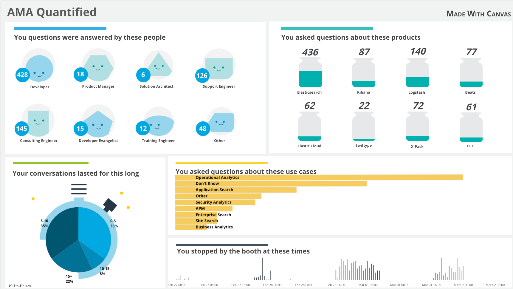
Along with all of the great talks, demos, and of course, coffee, at Elastic{ON} there was an Ask Me Anything (or "AMA") Booth, where users, customers, and partners could go for some quality time with the team. This booth was always packed - I mean that it was a madhouse (in a good way). This was the place to go with specific questions-- questions about products, processes, use cases, or enhancements. There seemed to be at least ten Elasticians staffing the booth throughout the conference, and at times there seemed to be too many to count. Support engineers, consultants, product managers, and developers engaged in deep conversation, sketching and designing on the tabletop with dry-erase markers or in notebooks. Even I managed to answer a few questions!
This is the second installment in the Canvas Story series, where we dig in to some of the very cool Canvas workpads that were on display at Elastic{ON} 2018 (you can check out the Canvas demo in the keynote). We'll go over the final layout and configuration for each area, and delve into some changes that I would make, in hindsight.
What is Canvas?
Now available as a technology preview, Canvas is a creative space for live data. To learn more about why Canvas came to be, check out the introductory blog post; to keep up to date with the status of Canvas, jump over to the dedicated Canvas mini-site.
AMA Metrics Canvas: Break it Down
Gathering the Data
You may have seen the Elasticians with their iPads, phones, and computers filling out the internal "AMA Survey" app. This is how the data made its way into the cluster. The application is a simple React app, which records the data in Elasticsearch:
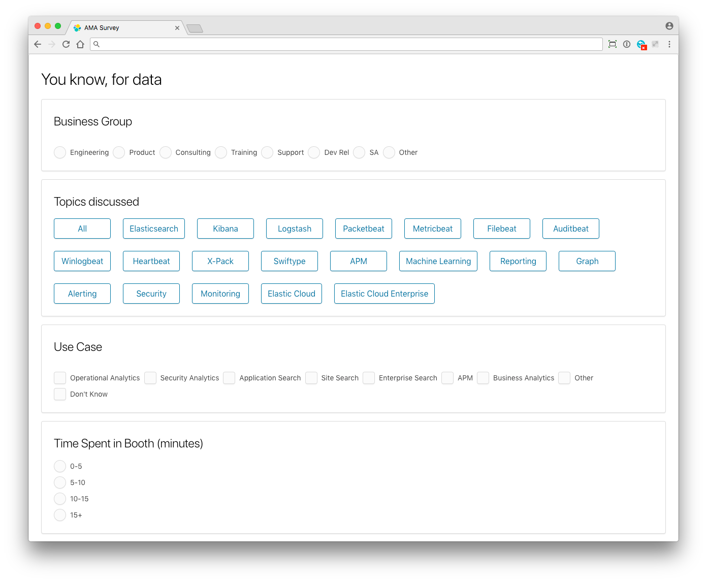
We captured the group that the Elasticians report through, the types of products discussed, and one or more use cases the conversations centered on. The time spent on the conversations was bucketed, enabling us to gauge the complexity of the issues.
The Layout
Much like the Café Canvas from our previous installment, this workpad isn't as complicated as it looks. Breaking it down there are only six different types of data elements on this workpad, with multiple instances containing slightly different parameters (We obviously leveraged folks more artistically creative than I to come up with the graphics):
Around the Horn
Group Bubbles
Starting at the top left, we see the breakdown of the groups which were staffing the booth throughout the conference. Each of these actually consist of four different elements - a graphic with a "face" shape, a little circle, and a couple markdown elements:
After the markdown element is added, you can tweak the settings in the control panel, or edit in code. When I switch to code I like to format it nicely, rather than have it in one long line, so it is a bit easier to read. The code for the above markdown pieces looks like:
filters |
    markdown {escount index="amaresponses" q="business_group:Engineering"}
         font={font family="Open Sans, Helvetica, Arial, sans-serif"
              size=24
              align="center"
              color="#FFFFFF"
              weight="bold"
              underline=false
              italic=false}
    | render
The filters command simply applies any global filters from the page to this element, it is pretty standard to start with this. This is a markdown element, and all that we need is the count of the documents in the amaresponses index which have a business_group of Engineering. The rest of the config is setting the appearance, ending in the render command.
If you look at the whole workpad you'll notice that there are some groups with more than one word in the name- the config for this has to escape the quotes. For example, the escount element for the Developer Evangelist group is:
{escount index="amaresponses" q="business_group:\"Dev Rel\""}
Which allows us to get those that match exactly.
Jug(gling) the Data
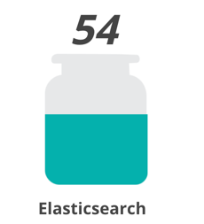
As we move around clockwise, we get to the products breakdown. This was a place that I underestimated how many questions we would handle - The Elasticsearch category quickly made it to 100%! We had to change the denominator in the "image fill" elements. We ended up with the denominator for the Elasticsearch category to be 800, while the others were set to 400.
The image-fill element is straightforward - One "empty" image, one "full" image, and a number [0-1]. The empty and full jars looked like this:

The configuration behind the jars, recalling that the denominator for the Elasticsearch term is higher than the others, was:
filters
    | escount index="amaresponses" q="topics:Elasticsearch"
    | math "value / 800"
    | if {compare "gt" to=1} then=1 else={context}
    | revealImage origin="bottom"
        image={asset "asset-d8aad426-206b-4ae9-9340-9f4b1f740386"}
        emptyImage={asset "asset-7aeb2f8e-27af-4cf8-98b1-b4b6c3d80a74"}
    | render
Again, for those elements which have two words in the topic, we have to escape the quotes in the query:
| escount index="amaresponses" q="topics:\"Elastic Cloud Enterprise\""
The Beats bucket was also a little more complicated, with multiple values:
| escount index="amaresponses" q="topic:Filebeat OR Packetbeat OR Auditbeat OR Filebeat OR Winlogbeat OR Heartbeat".
This is similar to the markdown queries from the group section. A slightly different query, and some math to measure against our goal. One important part is the if statement - if {compare "gt" to=1} then=1 else={context}, which makes sure that we don't exceed 1.0. The numbers above the jars
Is just another markdown element, tweaked with italics:
filters
    | markdown {escount index="amaresponses" q="Kibana"}
         font={font family="Open Sans, Helvetica, Arial, sans-serif"
             size=35
             align="center"
             color="#444444"
             weight="bold"
             underline=false
             italic=true}
    | render
Dynamic Bar Chart
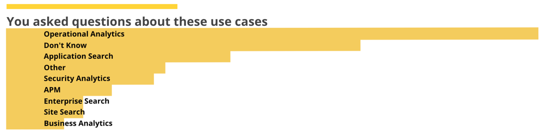
The next element in our tour is the use case summary. In a preliminary version of this workpad this was also done with an image reveal, but some last-minute tweaks to the Canvas plugin allowed us to use a standard plot with some axis definitions to come up with the final look.
We start out configuring it using the sidebar, until we can't:
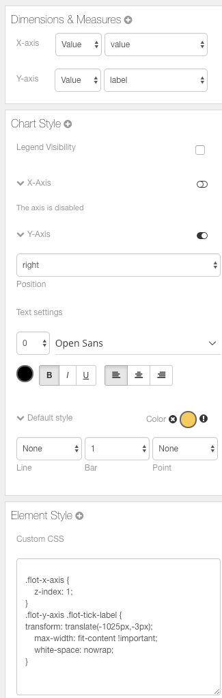
The first pass is decent:
But I would like to see a little separation between the bars, so we duck down into the code editor and set the bars manually (bars=.8)
filters
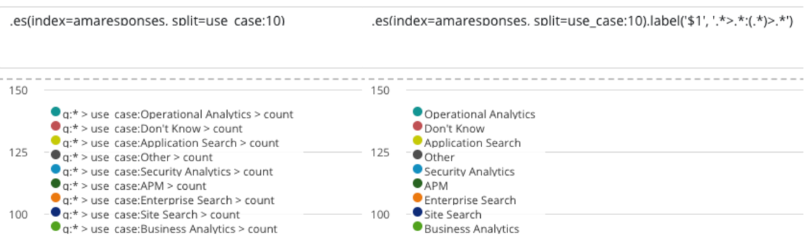
| timelion query=".es(index=amaresponses, split=use_case:10).label('$1', '.*>.*:(.*)>.*')" interval="9999d"
| pointseries x="value" y="label"
| plot font={font family="'Open Sans', Helvetica, Arial, sans-serif"
size=15
align="left"
color="#000000"
weight="bold"
underline=false
italic=false}
legend=false
xaxis=false
yaxis={axisConfig position="right"}
defaultStyle={seriesStyle points="0" bars=".8" color="#f5cc5d" lines="0" horizontalBars=true}
| render css="
.flot-x-axis {
z-index: 1;
}
.flot-y-axis .flot-tick-label {
transform: translate(-1025px,-3px);
max-width: fit-content !important;
white-space: nowrap;
}
"
Yielding
Which looks more along the lines of what I was thinking of.
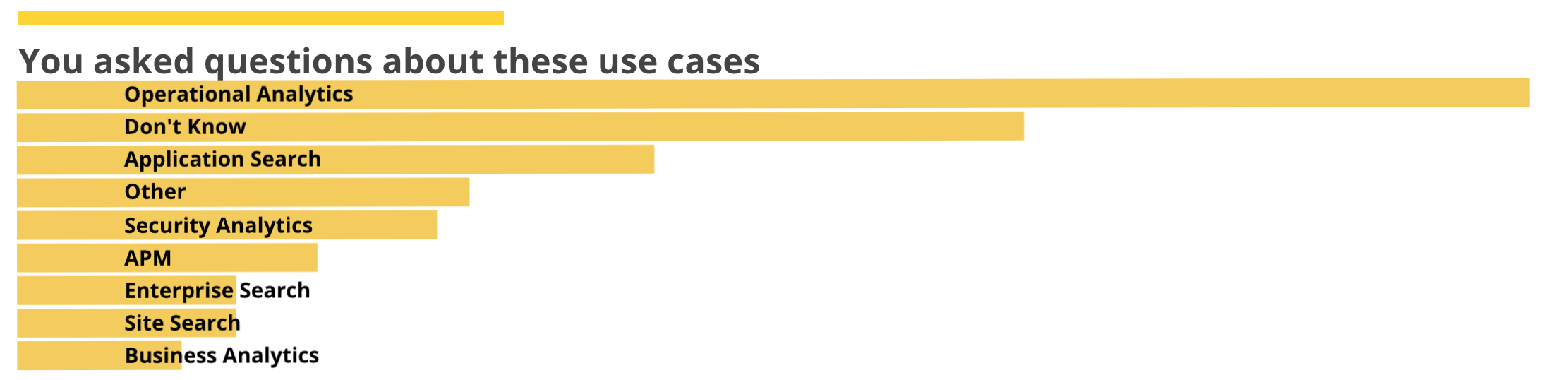
This one, admittedly, is a bit more complicated than others. Even though most of it is the formatting, we should will go into a bit more detail. We again start with the filters, but rather than esdocs or escount we are using Timelion, adding in a tricky interval which returns just one total per use case rather than an entire histogram. By specifying the parameterized label we can extract the use case name. Compare the Timelion results without the label (left) and with the label (right). If we hadn't done this the long q:*> use_case:Blah part would have been in the names.
After the Timelion query we pipe it through a pointseries, with the y-axis coming from the terms, and the x-axis the value. The remainder of the code deals with layout.
Consultation Time Series
The bottom of the workpad has the count of visits broken down by time. This also uses a Timelion query, but this time actually caring about the time. The code for this:
filters
    | timelion q=".es(index='amaresponses')"
         from="2018-02-27T00:00:00"
         to="2018-03-02T10:59:59"
    | pointseries x="@timestamp" y="value"
    | plot defaultStyle={seriesStyle points="0" bars="10" lines="0" color="#263746"}
         legend=false
         yaxis=false
    | render css="
    .canvas_element {
        overflow: hidden;
    }
    .flot-x-axis .flot-tick-label {transform: translateY(-20px); margin:0px;}
    " containerStyle={containerStyle border="-2px undefined undefined"}
This gets the bucketed count from Timelion, but forces it to only use the time window of the event. In this case the x-axis of the pointseries is the timestamp, while the height of the bars indicates the count. The bars get a width of 10, while there are neither points nor lines configured.
Time on Our Side
The last element on our tour is the pocket watch. It might look the most complex but that's just Canvas trickery - the pocket watch is really just a pie chart on top of a graphic. If I rearrange you can see the individual pieces.
Transparent backgrounds and creative layering let you make fantastic visuals. The configuration of the pie chart is pretty simple:
filters
    | esdocs index="amaresponses"
    | ply by="time_spent" expression=${rowCount | as "count"}
    | pointseries color="time_spent" size="count"
    | pie font={font family="'Open Sans', Helvetica, Arial, sans-serif"
                    size=14
                    align="left"
                    color="#000000"
                    weight="bold"
                    underline=false
                    italic=false}
         palette={palette "#00A8E1" "#00556F" gradient=true}
         labelRadius=90
We start with the filters, then query the esdocs for all documents in the amaresponses index. The pipeline hits something we haven't seen yet - the ply operation, which subdivides a datatable and passes the resulting tables into an expression, merging the output. So for each of the values of time_spent it counts the rows and returns the count for bucket. If I modify the code to show the debug output:
filters
    | esdocs index="amaresponses"
    | ply by="time_spent" expression=${rowCount | as "count"}
    | render as=debug
The debug output shows explains what is going on, and what the resulting data looks like:
{
"datatable": {
"columns": [
{
"name": "time_spent",
"type": "string"
},
{
"name": "count",
"type": "number"
}
],
"rows": [
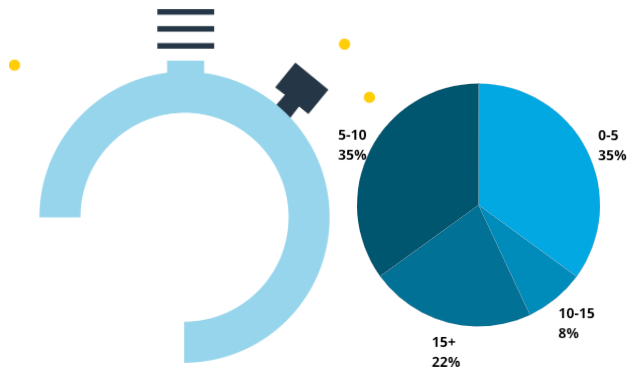
{"count": 22, "time_spent": ["15+"]},
{"count": 35, "time_spent": ["5-10"]},
{"count": 8, "time_spent": ["10-15"]},
{"count": 35, "time_spent": ["0-5"]}
],
"type": "datatable"
},
"paginate": true,
"perPage": 10
}
The pointseries color="time_spent" size="count" is doing what it sounds like -- breaking them down colored by the time_spent, and the size based on the number of items in that window. This data is sent through the pie operation, with some style information and a labelRadius attribute, which controls where the labels go relative to the width of the element.
Ch-ch-ch-ch-changes
There are a couple of things that I would do differently if I were to modify this to be a little better at handling the different number of questions that we got for each of the product groups. I guess they aren't things that I would do differently - I actually did make the changes in a copy of the canvas.
This one uses a mix of image reveal and image repeat to convey the difference in sizes. Rather than several big jars of varying sizes, I instead made the big jar just hold fifty answers - and when that jar gets full it fills in one of the "overflow" jars, along with the overall tally markdown still at the top. Here is a closeup of the Elasticsearch and Kibana jars:
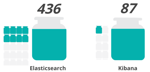
I did have to tweak the code (and create the small jar empty and full images, which are the same as the big jars, with a little border added to leave a little room around them). The small jars are an image repeat:
filters
    | escount index="amaresponses" q="Elasticsearch"
    | math "value/50"
    | repeatImage
        emptyImage={asset "asset-2ad47327-52ca-43ff-b287-dc688a51942a"}
        image={asset "asset-5c698545-3156-40ec-96da-939da0f41955"}
        size=20
        max=15
    | render
The math "value / 50" gives us one jar per 50 items (rounded down to a whole number), and specified how big each jar should be (size=20) and the maximum number of jars to show is (max=15).
Want to try the data?
Head on over to our examples repo, and under canvas you can find AMA Responses collateral. This includes the data from the conference, the actual canvas workpad which you can import, and even the code for the home assistant config which includes the script we used.