Analyzing Elastic Workplace Search usage in a Kibana dashboard — part 2
For the 7.10 release of Elastic Workplace Search, we highlighted some of the new analytics logging capabilities and took you through a short walkthrough of some sample analysis scenarios. With the 7.11 release we introduced analytics fields, which open up new possibilities for exploring query and click data with helpful dashboards and visualizations.
We’ve structured the analytics event log output to allow as much flexibility as possible. We have our own ideas as to what types of analysis we would like to see in our usage of Workplace Search, but we also want you to be able to slice and dice metrics as you see fit. We encourage you to explore the data on your own, but in this post we’ll provide some concrete use cases and examples of what you can now do with the additional data points.
What’s new?
In the 7.11 release, we’ve added a number of new fields for analysis:
- query refinements
- query filters
- query hash value
- document types (query and click)
- query feedback events
In the last blog post, we showed you how to make some quick visualizations using Kibana Lens. In this post, we’ll take this a step further and go into the intricacies of building out a couple more sophisticated visualizations on top of these new fields.
As before, the raw analytics event data can be found using the index pattern .ent-search-workplace-search-analytics-ecs-ilm-logs-*. For a couple of more sophisticated queries, we’ll be utilizing an Elasticsearch transform index to perform some pre-aggregation on several fields. For the dashboard and metrics we’ve defined below, we’ve created our transform (source gist available here) that aggregates at a per-query session level the following metrics:
- Any query refinements and the count of refinements
- Any query filters used and the count of filters
- The total click counts for this query session
- The start and end timestamps of the query session
- The time in seconds from the start of the query session until the first result click
There are certain tradeoffs that need to be considered when creating and using transforms. Scripted aggregations of your data can be quite powerful when paired with Kibana visualizations. This comes through allocating additional computation and storage resources to create and maintain the transformations. When defining the metrics you want to analyze for your Workplace Search usage, you will need to know what you want to get out of your data and decide for yourself what and how many transformations you want to use to explore your data.
Creating visualizations for an analysis dashboard
To illustrate some of the new analysis and metrics we can pull out of the logged fields, we can create a Kibana dashboard showing most of the new analytics that are available with this update, including:
- Average click position and mean reciprocal rank: The average rank in the results that click events occurred, and in contrast, the mean reciprocal rank.
- Average seconds from query until first click: The elapsed time from when a query is issued until the user clicks on a result.
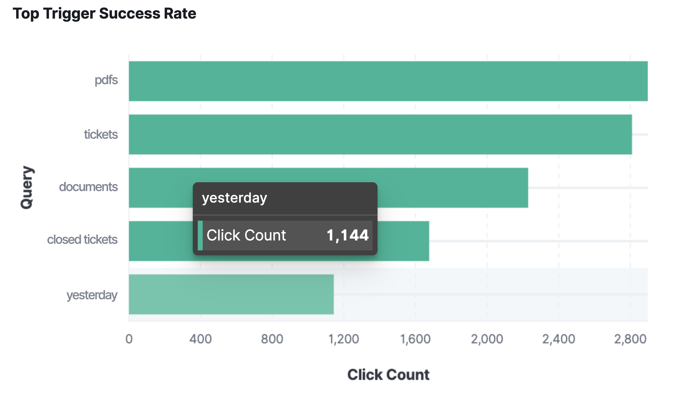
- Top trigger success rate: The top queries that produced triggers as defined by the number of clicks.
- Top clicks by document type: The top document types that were clicked.
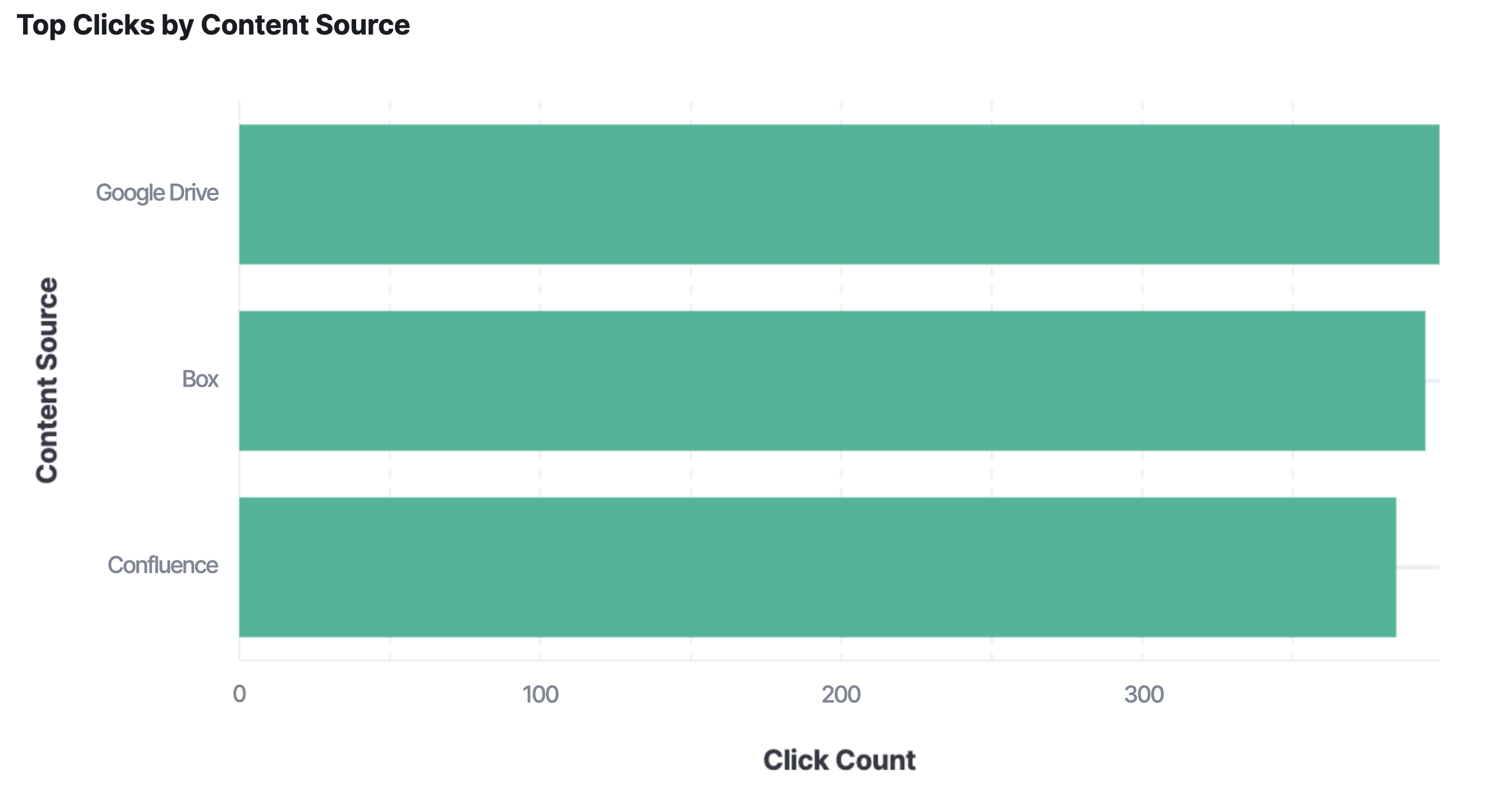
- Top clicks by content source: The top content sources from documents that were clicked.
- Top clicked documents by content source: The documents that had the most clicks per content source.
- Top queries with no clicks: The most common queries that resulted in no users clicking on any results. This can help you figure out what people are searching for but not finding relevant results. You can then tune the query results to help, or create additional content to help address the gap.
We’ll go through how to create each of these below, but if you want a jump start for recreating this dashboard, you can download and import this gist into Kibana.
Average click position and mean reciprocal rank
To create the metric view in Kibana for the average click position:
- Using Lens, choose the general index pattern above and a horizontal bar chart type.
- Set the metric for the visualization to the SearchMetrics.click.result.rank field.

To create the metric visualization for mean reciprocal rank:
- Create a new Lens metric visualization using the analytics index pattern.
- Set the metric for the visualization on the SearchMetrics.click.result.reciprocal_rank field.
Average seconds from query until first click
- Create a new Lens metric visualization using the transform we defined above.
- Set the metric for the visualization on the time_to_first_click field.

Top trigger success rate
- Using Lens, choose the transform index pattern and a horizontal bar chart type.
- Set a filter on the query_refinement_count field for “between” from “1” (and leave the “to” field blank).
- Set the field for the visualization on the query_value.keyword field.
Top clicks by content source
- Using Lens, choose the general index pattern above and a horizontal bar chart type.
- Drag the SearchMetrics.click.result.content_source field into the chart area.
Top clicks by document type
- Using Lens, choose the general index pattern above and a horizontal bar chart type.
- Drag the SearchMetrics.click.result.document_type field into the chart area.
Top clicked documents by content source
- Using Lens, choose the general index pattern above and a horizontal stacked bar chart type.
- Drag the SearchMetrics.click.result.content_source field into the chart area.
- Drag the SearchMetrics.click.result.id field into the chart area on top of the content sources.
Top queries with no clicks
The visualization for this in the dashboard above uses a Vega script on a custom scripted metric aggregation that allows the analyst to slice and dice the data in arbitrary time intervals, which is currently not possible in Lens or standard Kibana visualizations operating on predefined aggregation types. The query uses a script metric to aggregate the frequency of queries across the prescribed time range where there are no associated clicks. We are then easily able to graph the query counts for the top five queries. The nice thing about utilizing a Vega visualization type here, as alluded to above, is that we are able to also define the Kibana global timestamp range as a parameter to filter the results.
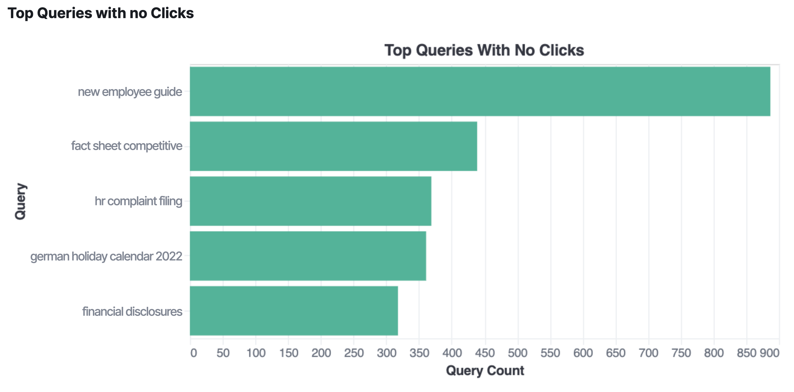
The script itself, although not complex, is a bit large for this blog post, but we have created a gist for you to reference.
Other metrics and visualizations
For more complex but still quite useful analytics, we can create additional transforms. Or in Kibana, we can create a Canvas workpad by pulling data using Elasticsearch SQL on the indices and the transformations we created with our source data. As we’ve seen with the “top queries with no clicks” chart above, these manual queries can also be turned into Vega scripts if you need to add them to your dashboard.
Below are a few examples of other interesting metrics using the new fields available with this update.
Monthly engagement volume
This is a metric based on the ratio of the number of clicks to the number of queries. This indicates whether the search results are relevant, or at least interesting, to the user. The higher the ratio of clicks to queries, the more we can assume that the results are interesting to the users who are searching.
This metric is made possible by a date histogram and bucket scripting, as shown in this gist. You can further massage this query into a Vega visualization to produce a line chart to plot the engagement over time by month, week, or any other time frame you’d like.
N-day user retention
We can use our new logged analytics events to get some insight into how many people are using our workspace on a weekly (or daily, or monthly) basis. The basic formula for determining user retention is to count the number of unique users at the end of our time period divided by the number of unique users at the start.
We can create an aggregation that can do this using date histograms and moving function aggregations, as shown in this gist. Again, we can turn this into a visualization using Vega to plot a line chart to easily see how well our search instance is engaging and retaining users.
Conclusion
The analytics data collected by Workplace Search offers you and your analysts insight into tuning your Workplace Search instances to better fit the needs of your users. This post covers a number of helpful use cases, but ultimately every analyst knows what is best for their needs. We hope we’ve given you the tools to get what you need.
This is just a bit of insight into what we’ve added to Workplace Search analytics, and we have even more exciting things on deck. We also encourage you to explore, experiment, and give us feedback on what you would like to see in future iterations of Workplace Search.
Workplace Search brings unified search across all of your organization’s workplace tools, like Slack, GitHub, Google Drive, Salesforce, and more. And a tremendous number of key features in Workplace Search are available for free. Sign up for a free trial of Elastic Workplace Search on Elastic Cloud and bring a fast, functional, organization-wide search experience to your team.