Get more out of Strava activity fields with runtime fields and transforms


 Share on Twitter
Share on Twitter

 Share on LinkedIn
Share on LinkedIn

 Share on Facebook
Share on Facebook

 Share by Email
Share by Email

 Print this page
Print
This is the third blog post in our Strava series (don’t forget to catch up on the first and second)! I will take you through a journey of data onboarding, manipulation, and visualization.
What is Strava and why is it the focus? Strava is a platform where athletes, from recreational to professional, can share their activities. All my fitness data from my Apple Watch, Garmin, and Zwift is automatically synced and saved there. It is safe to say that if I want to get an overview of my fitness, getting the data out of Strava is the first step.
Why do this with the Elastic Stack? I want to ask my data questions, and questions are just searches!
- Have I ridden my bike more this year than last?
- On average, is my heart rate reduced by doing more distance on my bike?
- Am I running, hiking, and cycling on the same tracks often?
- Does my heart rate correlate with my speed when cycling?
In this blog, we won’t be able to answer all of these questions yet — stay tuned for more posts in this series to come.
Elastic runtime fields to the rescue!
In the last blog, we imported Strava’s activity data into our own cluster. I realized there is an important detail about my data: I am comparing apples to oranges in all of my dashboards! Does a general overview of my full cycling make sense? I am unsure since the effort is hugely different for short, medium, and long rides. Strava does not populate a field like that.
I can create a range filter in Kibana Query Language with strava.distance < 60000 to capture all rides below 60km, strava.distance > 60000 and strava.distance < 100000 to do 60km–100km, and last strava.distance < 100000 for the 100km+ rides. I can even put that into a Lens visualization, where I use the advanced filter settings and get a nice pie chart that tells me how many of my rides are in which region. Still, I think this makes a great example of a runtime field! Let’s check out how we can achieve this.
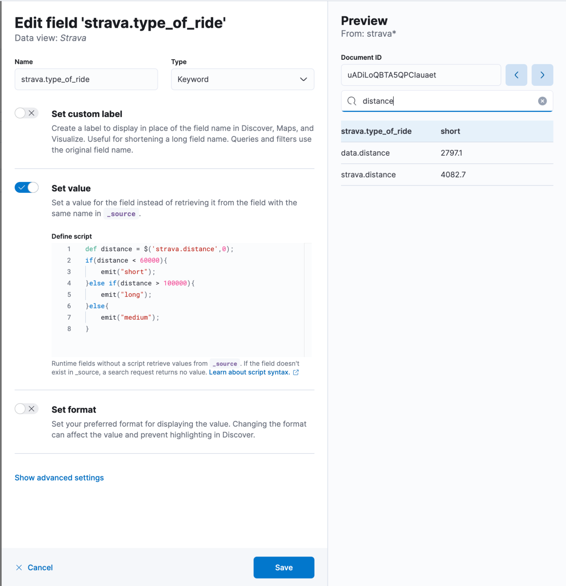
In Discover, click in the bottom left corner on Add Field. A flyout will appear where you should provide a name. I use strava.type_of_ride. It is of course a keyword field. The only somewhat challenging part is the set value button because we need to provide a piece painless and that can be daunting at first. Once you get used to it, it’s pretty easy to quickly create additional fields, dissect documents, and do much more without reindexing your data.
In our case, the code is the following:
def distance = $('strava.distance',0);
if(distance < 60000){
   emit("short");
}else if(distance > 100000){
   emit("long");
}else{
   emit("medium");
}The $(‘strava.distance’,0) is a really handy way to access fields in a null-safe manner. It will try to access strava.distance. If that is null, not available, or not even existing in the mapping, instead of throwing an error, it returns a 0. That helps tremendously. The if & else if & else clause is self-explanatory, as it is a different way than the above-explained KQL query.
In the end, your add field window should look like this — don’t forget to hit save!
Transforms — rethinking your data
Due to the nature of Elasticsearch, this results in lots of documents. It might be fine if you are doing this for yourself, but it can get tricky as soon as you invite multiple friends and have more and more data poured into it. Transforms are a way to solve certain situations by trading granularity for less storage. Let’s face it — how often are you going to look into the second granularity from your ride from three years ago? Still, you might want to have it in an overview calendar view. That is what we will create today:
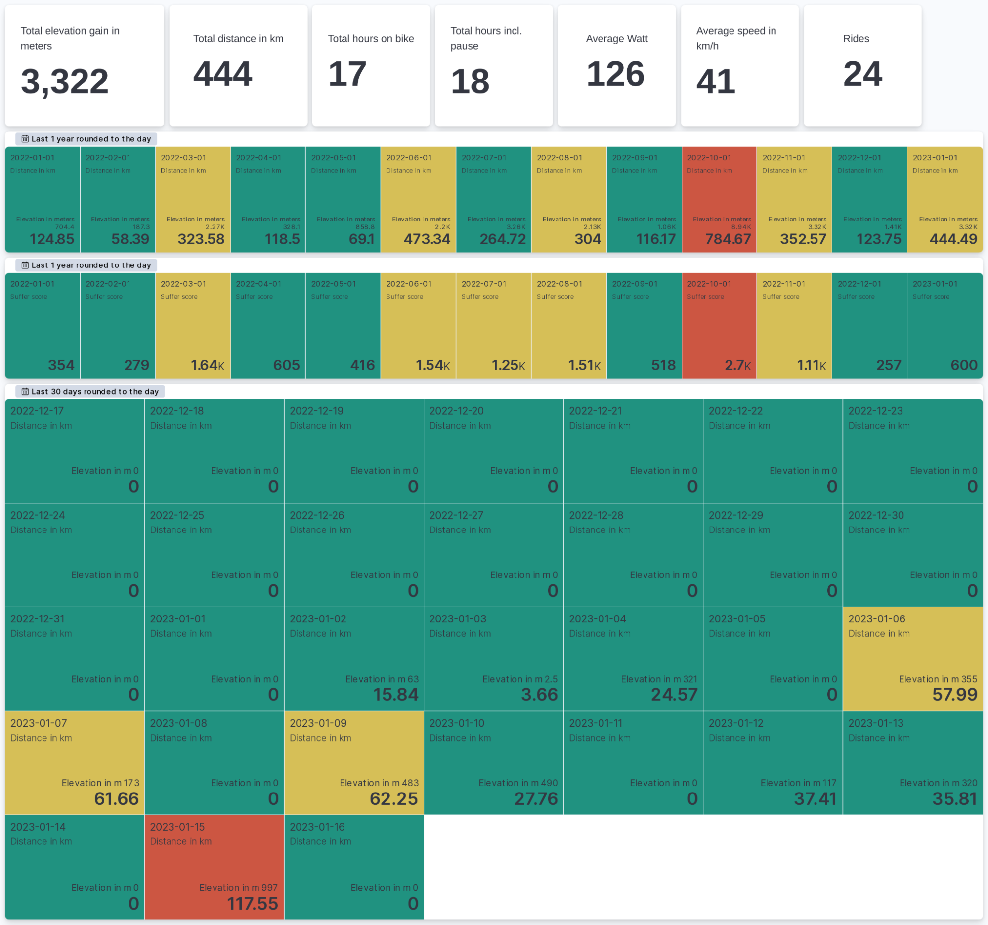
This is all done in Kibana using the new metric-type visualization in Lens. We look at a monthly and daily breakdown. Why is it important to reduce the amount of data? Well, suppose you open up the dashboard. You run an aggregation of the high-resolution data, and Elasticsearch needs to look at many documents to calculate the sum, average, and percentiles. When we run a transform beforehand, we can optimize this by reducing the date resolution to daily.
In this case, we are talking about pivot style transforms. A transform will group data by our term strava.upload_id and by a date histogram set to daily. After the group, we select the aggregations that we want to have. This is interesting because we can do all sorts of things, like percentiles for 1,5,25,50,75,95,99 or just an average. We can do multiple aggregations for the same field as well. Want to know your min, max, and average heart rate for this ride? Sure, throw it in there! Just don’t forget: if you are not doing any aggregation — for example, cadence — you won’t be able to look at the cadence.
There are many more options available and documented. You can always change it inside the JSON editor and modify it.
In the background, this is an aggregation that runs continuously. No need to worry about starting it manually. We can leave it running, and as soon as new data is detected, it will take care of it. We can change the interval — in this case, I go for 60 minutes. You can have a range of values, with 60 minutes being the upper limit. I don’t need the transform to run every minute to check if it needs processing since my data is not updated that frequently.
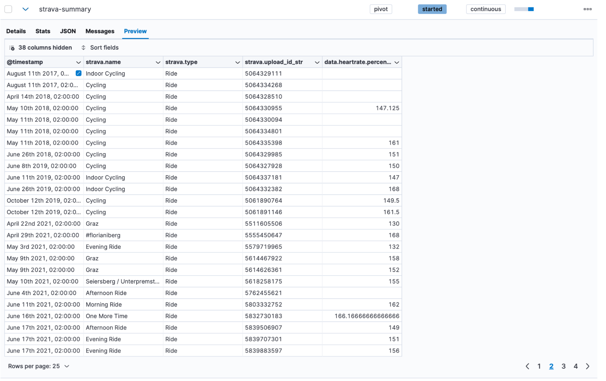
After letting it run for a few minutes, we can click into the preview function and see what it created:
We achieved quite a bit together in this blog post, and you can start exploring your data now!
Ready to get started? Begin a free 14-day trial of Elastic Cloud. Or download the self-managed version of the Elastic Stack for free.
Check out the other posts in this Strava series:
- Part 1: How to import Strava data into the Elastic Stack
- Part 2: Analyze and visualize Strava activity details with the Elastic Stack
- Part 4: Optimizing Strava data collection with Elastic APM and a custom script solution
- Part 5: How tough was your workout? Take a closer look at Strava data through Kibana Lens
- Part 6: Unlocking insights: How to analyze Strava data with Elastic AIOps
- Part 7: From data to insights: Predicting workout types in Strava with Elasticsearch and data frame analytics
Share
- Share on Twitter
Share on Twitter
- Share on LinkedIn
Share on LinkedIn
- Share on Facebook
Share on Facebook
- Share by Email
Share by Email
- Print this page
Print