Canvas: Data Table and Debug Elements
Canvas currently provides a selection of approximately twenty built-in elements that can be added to workpads (see the Getting Started blog for a full list). In this blog, we are going to focus on just two of them: the Data Table and Debug elements.
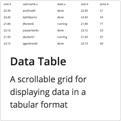 |
Data TableA highly flexible and dynamic table that supports scrolling, pagination, and custom CSS out of the box. |
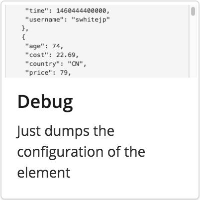 |
DebugProvides access to the JSON data behind the scenes, allowing for more accurate analysis of any issues that might arise. |
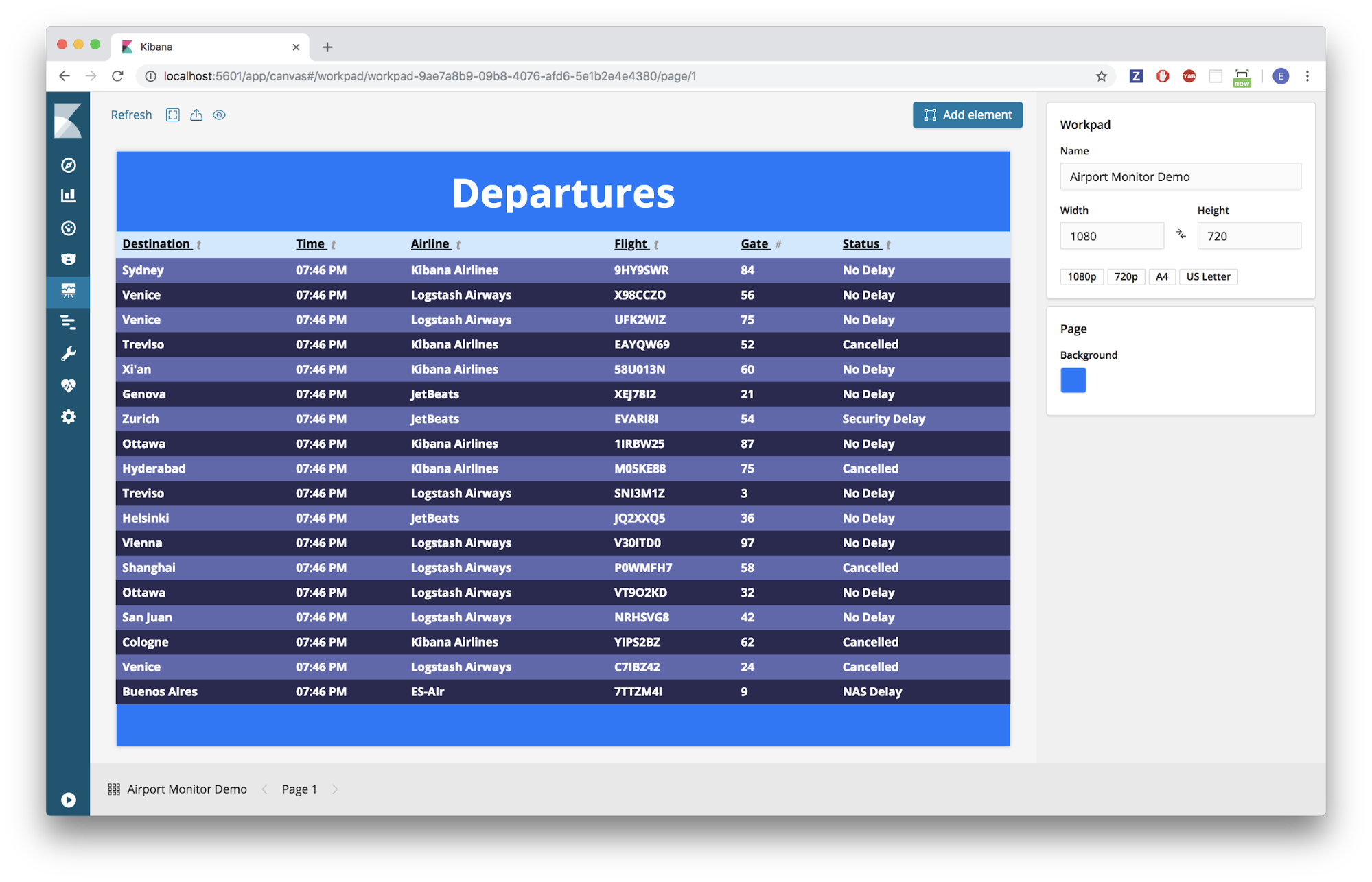
Specifically, we will be using Canvas to build a very familiar data table: an airport flight monitor.
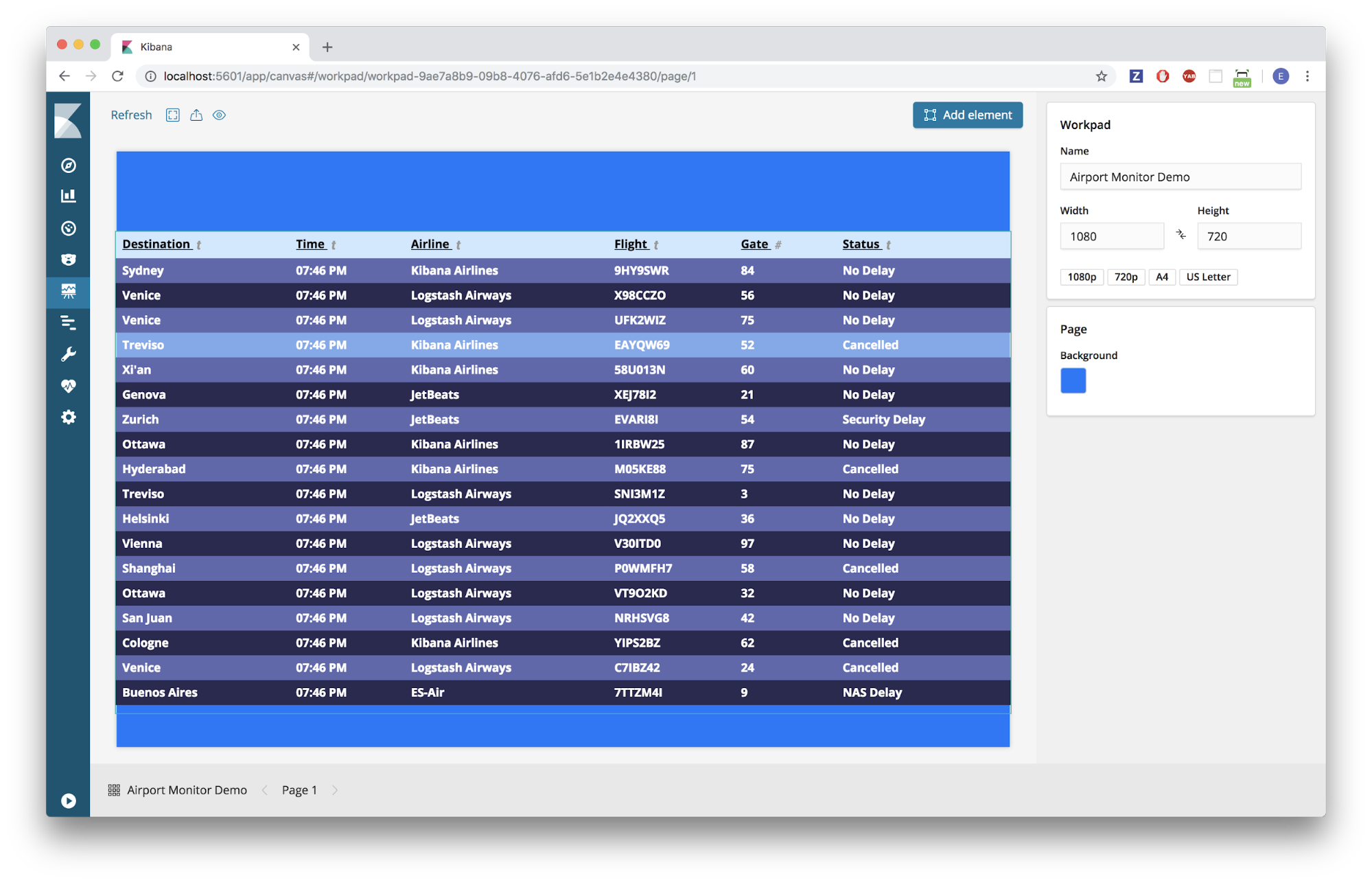
Here’s a look at the finished product that we will be creating in Canvas:
Requirements & Review
We will be building on the concepts that we went over in the Getting Started blog, and assume you have the following:
- Elasticsearch and Kibana up and running (version 6.4+)
- Canvas installed (Canvas is built-in to Kibana in versions 6.5+)
Installing Sample Data
For this tutorial, we are going to be using a sample data set that is provided by Elastic — specifically, the sample flight data.
Note: This data set is only available in Kibana versions 6.4 or greater.
Navigate to your Kibana instance:
- Click on the main “Kibana” home page in the sidebar
- At the bottom of the “Add Data to Kibana” section, click on the link that says “Load a data set and a Kibana dashboard.”
- In the “Sample flight data” tile, Click “Add”
Quick Reference
The table below provides information about the flight sample data set that was just installed. The fields in bold underline are the ones we will be using later in this activity, but feel free to play around with some of the others.
| kibana_sample_data_flights | ||
|
AvgTicketPrice Cancelled Carrier DestCityName DestCountry FlightDelayType FlightTimeMin OriginCityName OriginCountry Dest DestAirportID |
DestLocation DestRegion DestWeather DistanceKilometers DistanceMiles FlightDelay FlightDelayMin FlightNum FlightTimeHour Origin OriginAirportID |
OriginLocation OriginRegion OriginWeather _id _index _score _type dayOfWeek hour_of_day timestamp |
Building an Airport Monitor
Create
The first thing we need to do is create a workpad, and then add a data table with our data.
Create a Canvas Workpad
- Navigate to your Kibana instance
- Click on the “Canvas” tab in the sidebar
- Click “Create workpad”
- Give the new workpad a unique name
Create a Data Table element
- Click on the “Add element” button
- Choose the “Data Table” element
- TIP: When an element is first created, it is populated with demo data so you can start playing with it right away!
- In the editing panel on the right, select the “Data” tab
- Click “Change your data source”
- Select “Elasticsearch SQL”
- Type the following into the SQL query editor:
SELECT
  DestCityName AS Destination,
  timestamp AS Time,
  Carrier AS Airline,
  FlightNum AS Flight,
  FlightDelayType AS Status,
  Cancelled
FROM
  kibana_sample_data_flights
Note: You may have noticed that our sample data set doesn’t contain a field for the airport gate number. We will use a random number generator to create this column later in the blog.
- Click “Save”
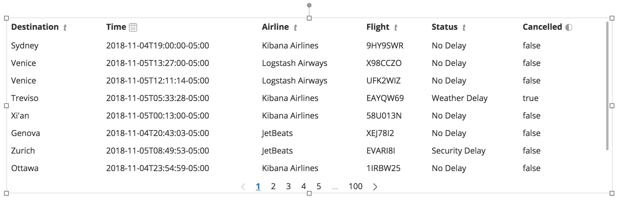
- You should now have a data table that looks something like the following:
CODE
Now we have a data table filled with our data; however, it isn’t formatted the way we want it. We’re going to need to jump into some of the code behind the scenes to adjust things.
Adjust the Time column format
- Make sure the data table is selected
- In the lower right-hand corner of the screen, click the “Expression editor” toggle
- Inside the expression editor, you should find the following code:
filters
| essql
  query="SELECT
  DestCityName AS Destination,
  timestamp AS Time,
  Carrier AS Airline,
  FlightNum AS Flight,
  FlightDelayType AS Status,
  Cancelled
FROM
  kibana_sample_data_flights"
| table
| render
Break it down -- This code has four main sections:
- Filters: If we added a Time Filter element to this workpad, the data coming into this data table element would first pass through the time filter, and only the remaining data would be displayed. If we delete this line, our data table element would no longer be affected by any filter elements added to the workpad, which is helpful for certain situations.
- Datasource: In this case, we are using the Elastic SQL datasource, and we can see and edit our SQL query here as well.
- Element: This line defines what type of element is displayed on the workpad. If you’re feeling adventurous, try changing “table” to “shape” and then click “Run” in the lower right-hand corner, to see what happens. Just be sure change it back!
- Render: This provides functionality for customizing the look and feel of a given element. Later in this blog, we’ll add some custom CSS to the render function to make our data table more stylish!
- We need to modify the data before it gets displayed in the “table” element function. So, in between the “essql” datasource function and the “table” element function, we are going to add a new function called “mapColumn.” The function “mapColumn” simply allows us to modify values in a given column. The column we are interested in modifying is the “Time” column. So, we add the following code on line 12:
...
FROM kibana_sample_data_flights"
| mapColumn Time fn={}
| table
...
- Canvas provides many built-in functions that we can leverage, including the “formatdate” function. We would like the time to be displayed in the following format: “hh:mm A”. So, we add the following to our code on line 12:
...
FROM kibana_sample_data_flights"
| mapColumn Time fn={ formatdate "hh:mm A" }
| table
...
- In the lower right-hand corner of the expression editor, click “Run”
- Uh oh! We got an error! Time to debug...
A Brief Debugging Intermission (Don’t skip this step!)
We’ll get back to the code in a minute, but let’s learn how to debug things in Canvas first.
Identify the Error
- Click on the warning symbol in the table element.
- This should display the cause of the error, similar to the image below:
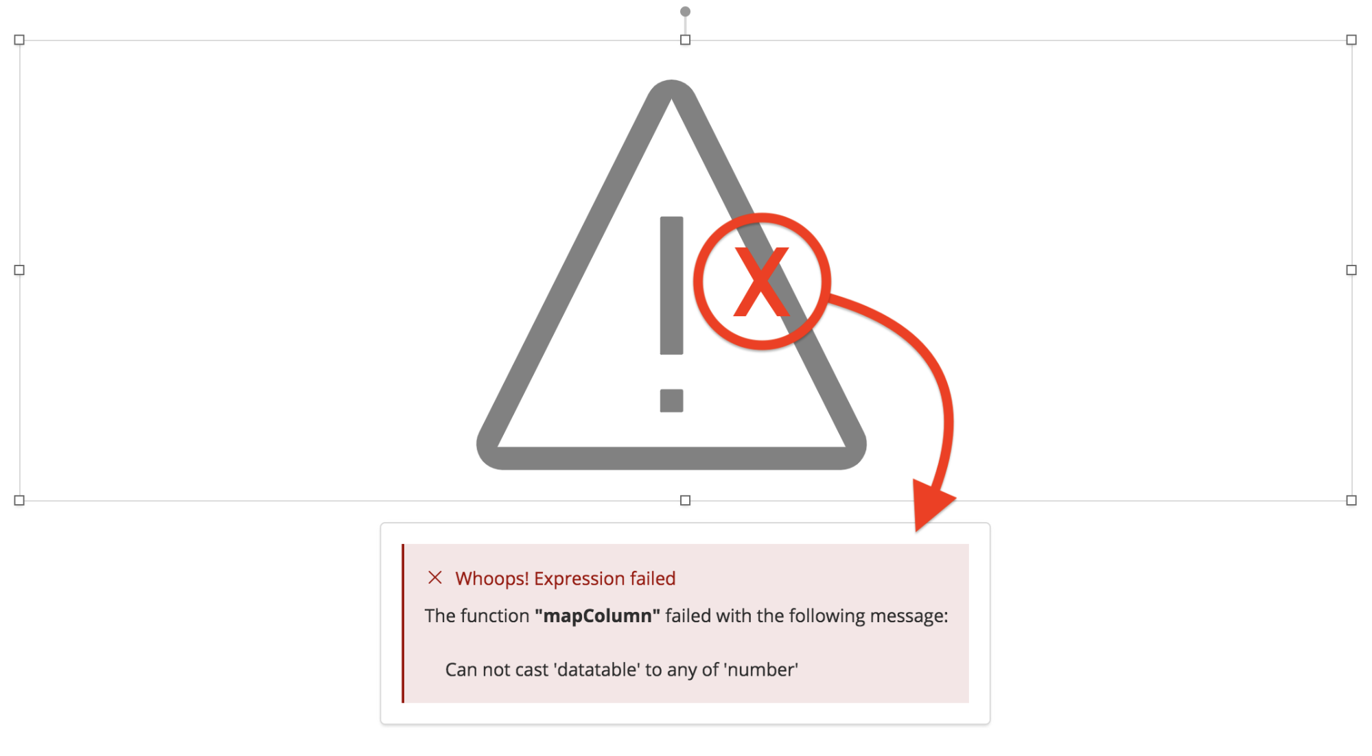
- It looks like the “mapColumn” function is trying to cast our timestamp data to a “number”. This is because the “formatdate” function that we are using requires the timestamps to be in numeric form (i.e. UTC milliseconds).
- What format are the timestamps actually in? To find out, let’s add a “debug” element.
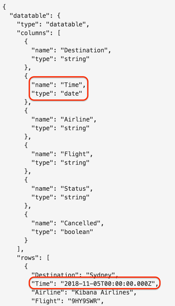
Add a Debug Element
- Click “Add element”
- Select the “Debug” element
- In the editing panel on the right, select the “Data” tab
- Click “Change your data source”
- Select “Elasticsearch SQL”
- Type the following into the SQL query editor:
SELECT
  DestCityName AS Destination,
  timestamp AS Time,
  Carrier AS Airline,
  FlightNum AS Flight,
  FlightDelayType AS Status,
  Cancelled
FROM
  kibana_sample_data_flights
- Click “Save”
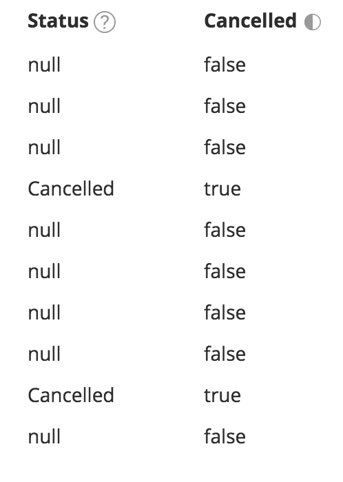
- In the debug element, we can see that the "Time" field has the type “date”, and the first entry has this format: 2018-11-05T00:00:00.000Z
- Thankfully, Canvas has a built-in function that can take “date” types and convert them to numeric UTC milliseconds.
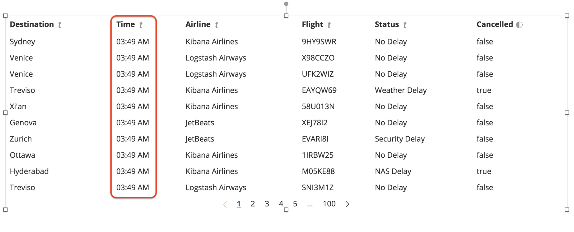
- Reselect the data table, and in the expression editor, add the “date” function to the code as shown below:
| mapColumn Time fn={ date | formatdate "hh:mm A" }
- Click “Run”
- You should now see your data table displaying the timestamps in the proper format.
TIP: No need to add a debug element every time. In the expression editor for any element, you can add the code,
| render as="debug" to see the json for that element. However, it can be handy to keep a dedicated debug element for reference while you’re working.
Now back to our regularly scheduled program!
Code Continued...
Next, let’s add a “Gate” column. Since our data set doesn’t actually have any gate data, we'll just randomly generate it using some powerful functions built-in to Canvas.
Add Gate Data
- The easiest way to add another column is to add another entry to our SQL query. We’re just going to duplicate the “FlightNum” data and call the new column, “Gate”.
- In the editor panel on the right, click the “Data” tab and in the SQL editor, add the following line:
SELECT
  DestCityName AS Destination,
  timestamp AS Time,
  Carrier AS Airline,
  FlightNum AS Flight,
  FlightNum AS Gate,
  FlightDelayType AS Status,
  Cancelled
FROM
  kibana_sample_data_flights
- Click “Save”
- In the expression editor, we are going to add another “mapColumn” function below the first one. This time we are going to modify the “Gate” column:
...
| mapColumn Time fn={date | formatedate "hh:mm A"}
| mapColumn Gate fn={}
| table
...
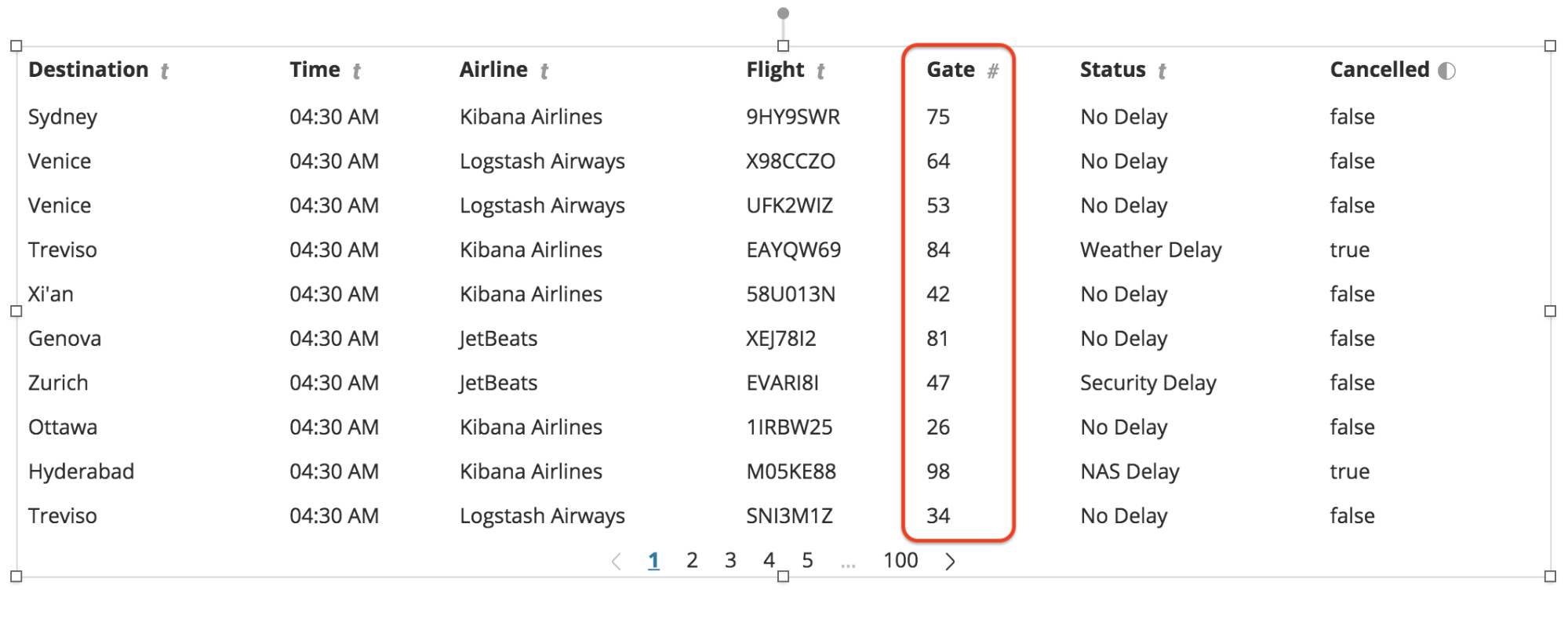
- To get actual gate numbers, we need to generate random numbers between 1-100. Thankfully, Canvas has some handy built-in math functions that we can leverage. We're going to use the “random” function; however, this function generates a random numbers with long decimals, which is not something we want. So, we will add a second function to round the random numbers after we generate them using the "round" function. So, our code will now look like this:
| mapColumn Gate fn={ math "round(random(0,100),0)" }
- Click “Run”
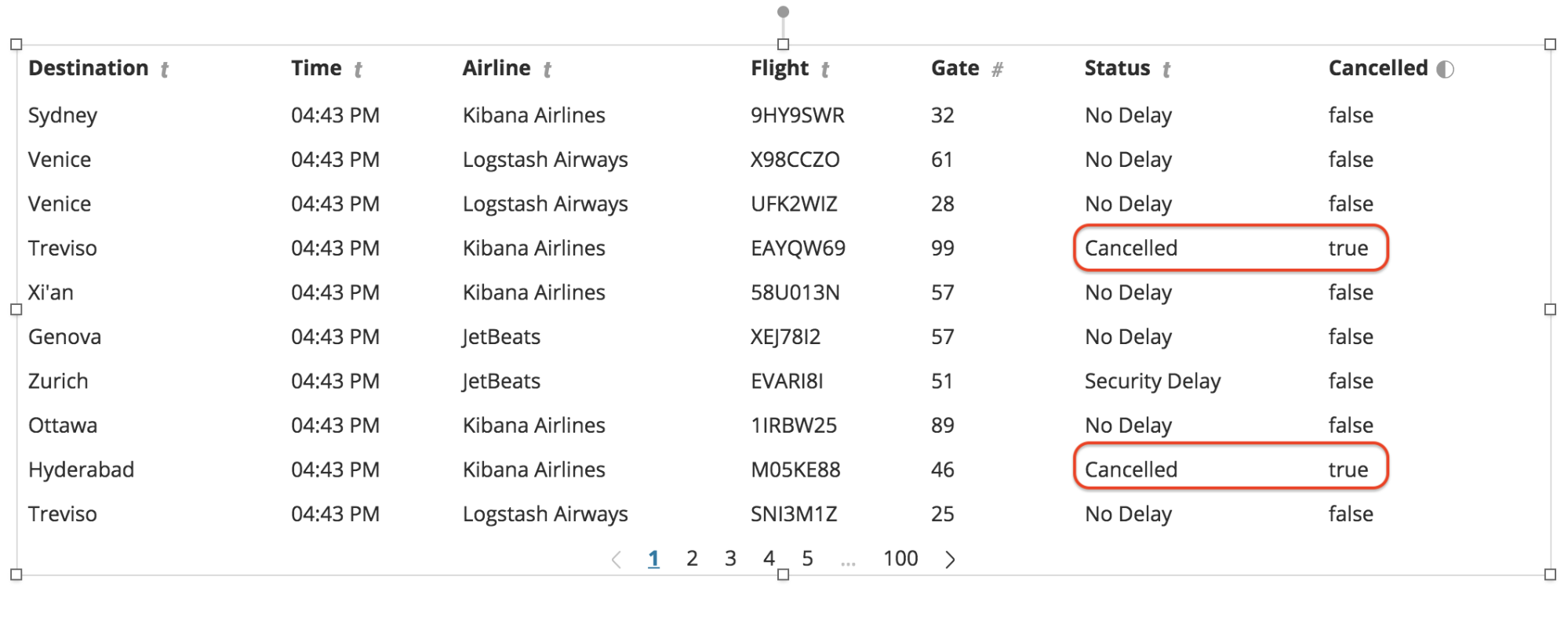
- You should now see the new “Gate” column full of randomly generated gate numbers:
Combine Columns
The “Cancelled” column really should be combined with the “Status” column, so that we are simply showing a status of “Cancelled” any time the value is “true”.
- Make sure the data table element is selected and the expression editor is open
- We need to add another "mapColumn" function, but this time for the “Status” column
...
| mapColumn Gate fn={math "round(random(1,100),0)"}
| mapColumn Status fn={}
| table
...
- Next, we need to check if the field (or “cell”) in the “Cancelled” column is equal to “true”
| mapColumn Status fn={if {getCell "Cancelled" | eq true}}
- Then, we want to set the value of the “Status” column to be the string, “Cancelled”, when the conditional is true
| mapColumn Status fn={if {getCell “Cancelled” | eq true} then=”Cancelled”}
- If we click “Run” now, we will see that we are successfully mapping “Cancelled” to the “Status” column; however, we are also getting a “null” value in the “Status” column for everything else.
- The last thing we need to do, is to tell Canvas to keep the original value of the “Status” column for anything that is not “Cancelled”
| mapColumn Status fn={if {getCell "Cancelled" | eq true} then="Cancelled" else={getCell "Status"}}
- Click “Run”
- You should now see that the “Status” column has successfully been combined with the “Cancelled” column
Remove Column
Now that the “Status” column contains all of the information that we want, we no longer need to display the “Cancelled” column (we still need it behind the scenes though). So, let’s remove the “Cancelled” column.
- Make sure the data table element is selected and the expression editor is open
- Canvas has a function called "columns" that is used to include or exclude columns. In this case, we wish to exclude the “Cancelled” column. So, add the following line of code as shown below:
...
| mapColumn Status fn={if {getCell "Cancelled" | eq true} then="Cancelled" else={getCell "Status"}}
| column exclude="Cancelled"
| table
...
- Click “Run”
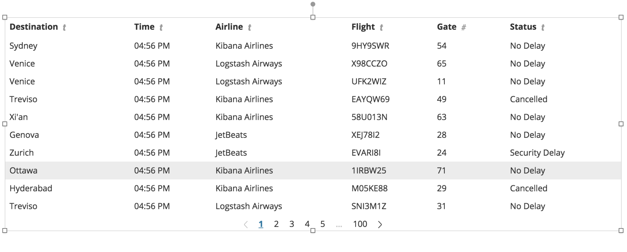
- You should now see that the “Cancelled” column is no longer displayed in the data table element, even though we are still using the data from that column behind the scenes.
Customize
Now that we have all the data the way we want it, let’s customize the look and feel of our workpad.
Set the background color
- Make sure that no elements in the workpad are selected
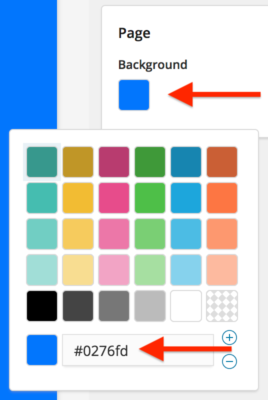
- In the editing panel on the right-hand side of the page, click on the “Page Background” color picker and set the value to be #0276fd
Remove the pagination
- Select the data table element
- On the right-hand side of the page, in the editing panel, select the “Display” tab
- Click the “+” button on the “Table Style” panel
- From the drop down, select “Pagination”
- Click the toggle to turn it off
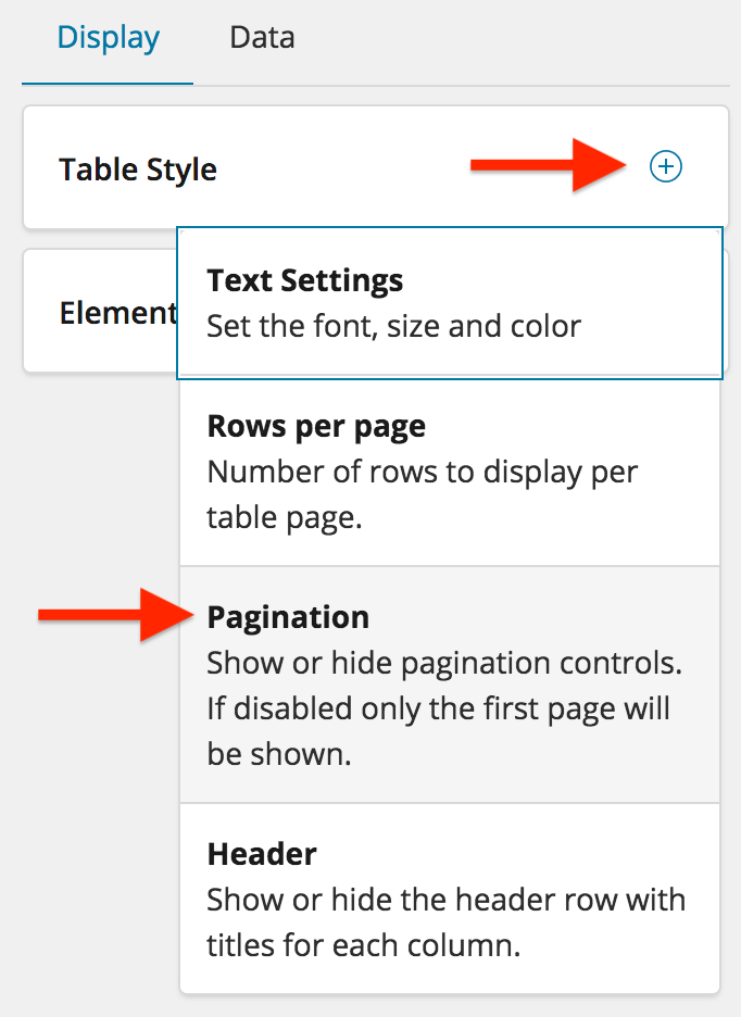
Set the number of table rows
- Once again, click the “+” button on the “Table Style” panel
- From the drop down, select “Rows per page”
- Increase the rows per page to 25
- We actually want 18 rows, so open up the expression editor for the data table element, and change the “perPage” value to 18
| table paginate=false perPage=18
- Click “Run”
- Expand the data table element so that you can see all 18 rows
Style the table text
- Once again, click the “+” button on the “Table Style” panel
- This time, select “Text Settings”
- Set the text to be bold and the color to be white
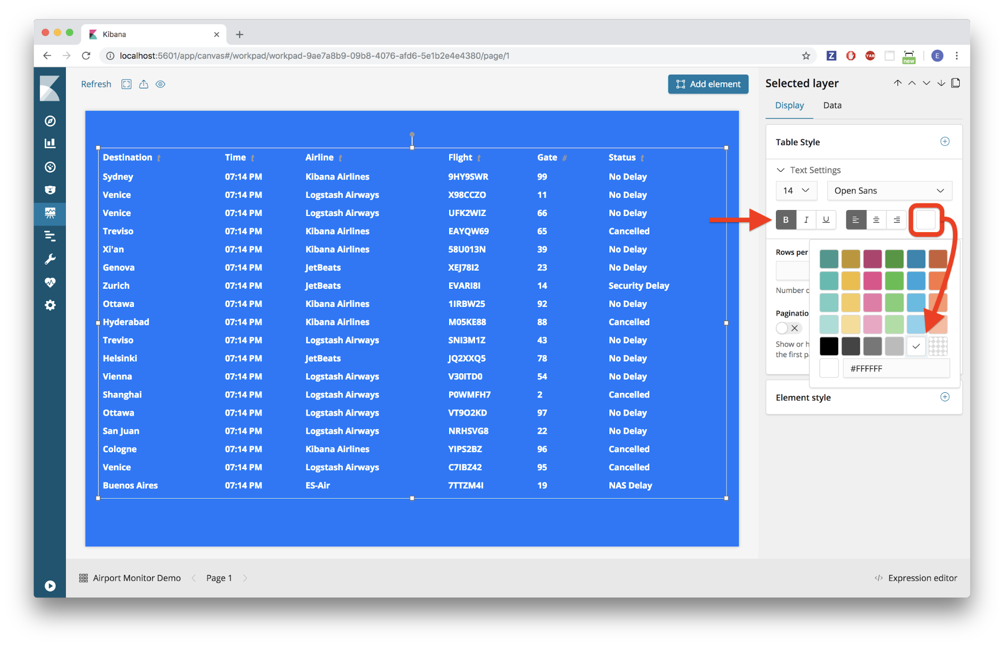
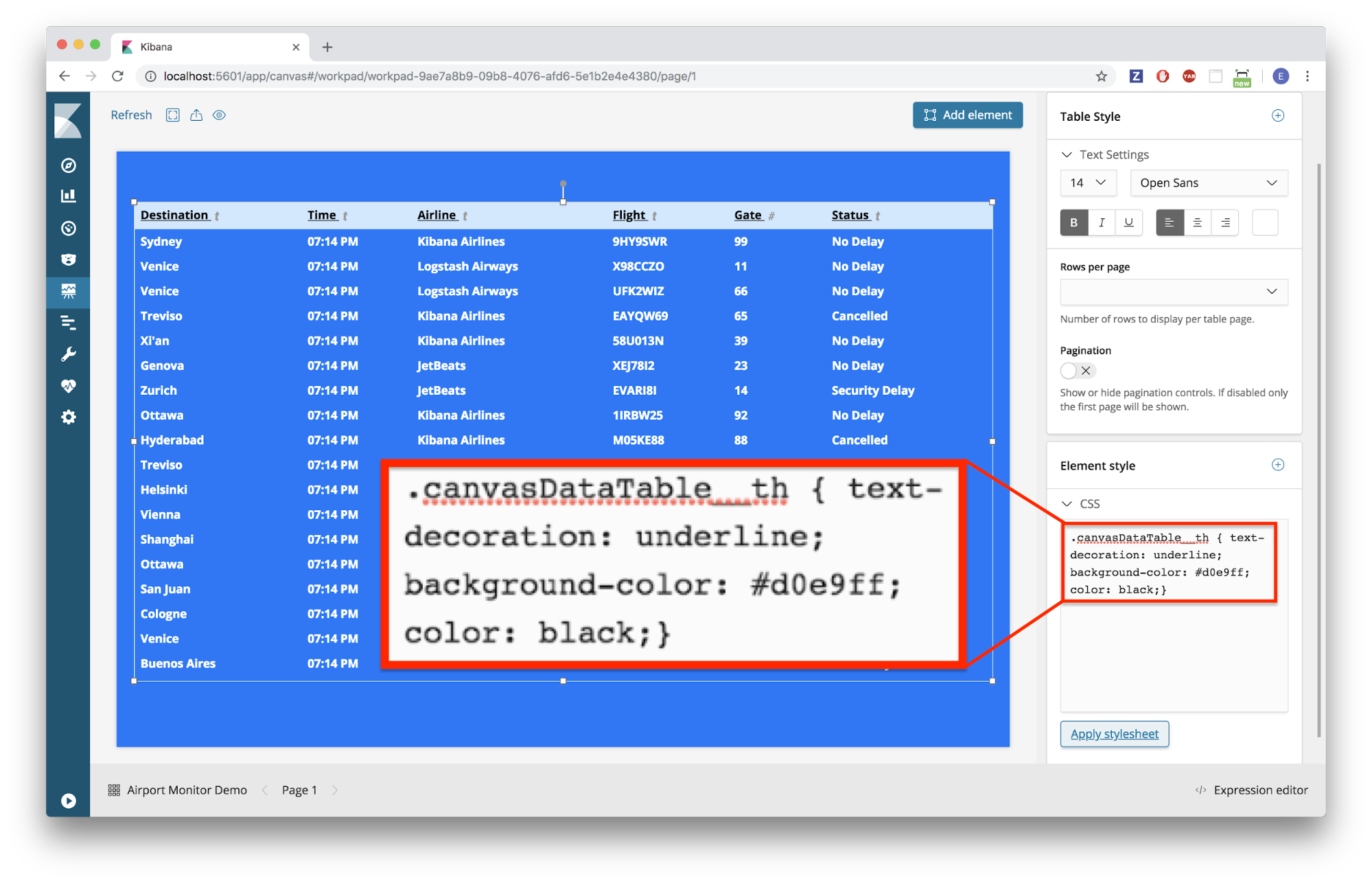
Style the table header
- We want to style the table header, so that it stands out from the rest of the table rows, but we’ve gone as far as the “Table Style” panel will take us, now we need to use some custom CSS
- To do that, click on the “+” button in the “Element Style” panel
- Select “CSS” from the drop down menu
- Delete the contents of the CSS editor, and paste the following code in the CSS editor:
canvasDataTable__th { text-decoration: underline; background-color: #d0e9ff; color: black;}
- Click “Apply stylesheet”
- Your table header should now have a light blue background color with black underlined text
Style the table rows
- We would like to have alternating colors for the rows of the table, so again, we will have to use some custom CSS for this
- Paste the following code into the CSS editor:
.canvasDataTable__tbody>:nth-child(even) {
background-color: #2a2a50;
}
.canvasDataTable__tbody>:nth-child(odd) {
background-color: #5f67af;
}
- Click “Apply stylesheet”
- Adjust the width of data table element to match the width of the workpad
- You should now have rows with alternating colors similar to the image below
Add a title
- Click “Add element”
- Select the “Markdown” element
- Delete all the text from the “Markdown content” editor on the right-hand side of the screen
- Type “Departures” into the “Markdown content” editor
- Click “Apply”
- Resize the “Markdown” element and center it on the screen
- Click the “+” button on the “Markdown” panel in the editing area on the right
- Select “Text Settings” from the drop down menu
- Set the text to be:
- Size: 48
- Font: Bold
- Alignment: Centered
- Color: White
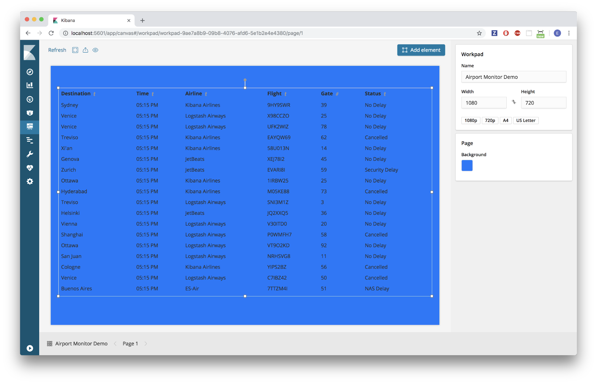
- You should now have a workpad that looks pretty close to something you might actually see in an airport!
Complete Code
Below is the complete code for the data table from the expression editor:
filters
| essql
  query="SELECT
  DestCityName AS Destination,
  timestamp AS Time,
  Carrier AS Airline,
  FlightNum AS Flight,
  FlightNum AS Gate,
  FlightDelayType AS Status,
  Cancelled
FROM
  kibana_sample_data_flights
"
| mapColumn "Time" fn={date | formatdate "hh:mm A"}
| mapColumn "Gate" fn={math "round(random(1,100),0)"}
| mapColumn "Status" fn={if {getCell "Cancelled" | eq true} then="Cancelled" else={getCell "Status"}}
| columns exclude="Cancelled"
| table paginate=false perPage=18
 font={font family="'Open Sans', Helvetica, Arial, sans-serif" size=14 align="left" color="#FFFFFF" weight="bold" underline=false italic=false}
| render
 css=".canvasDataTable__th { text-decoration: underline; background-color: #d0e9ff; color: black;}
.canvasDataTable__tbody>:nth-child(even) {
background-color: #2a2a50;
}
.canvasDataTable__tbody>:nth-child(odd) {
background-color: #5f67af;
}"
Links to other helpful resources
That's it! You've just worked through several examples using Data Table and Debug elements in Canvas. Try adding some other elements to your workpad and experimenting with the full capabilities of Canvas!
Also, check out some other Canvas blog articles here:
Banner image: "Miami Airport Screen" by MPD01605 is licensed under CC BY 2.0