Interactive Inputs on Kibana Dashboards
Kibana 6.1 introduced a new experimental visualization type, Controls. Controls provide the ability to add interactive inputs to Kibana Dashboards. Controls can be used to create two types of inputs: drop-downs and range sliders.
In this post, we're going to go through an example of how to use these two new inputs. But first, here's a short video (2:23) that goes over the steps we're going to take.
Before taking the Controls visualization for a spin, we need to set up our Elastic Stack with a dataset. Nick Peihl recently published the blog post Visualizing France Salary Data with Region Maps in Kibana. I would like to continue Nick’s work and demonstrate how Controls can be used to provide an interactive dashboard. Follow Nick’s blog for instructions on importing the INSEE employment, salaries, and population per town in France dataset into Elasticsearch. Don’t forget to create a new Index pattern in Kibana to match france-example-*.
Creating Drop-Downs and Range Sliders
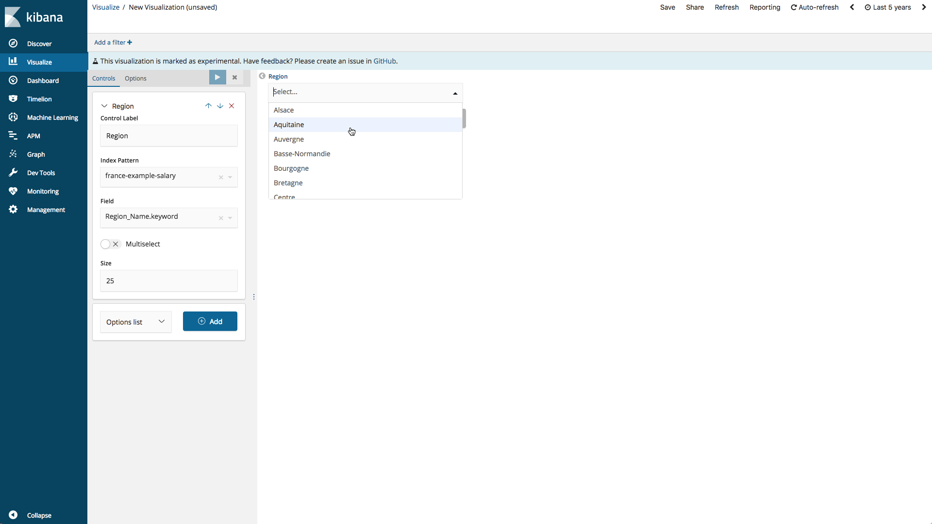
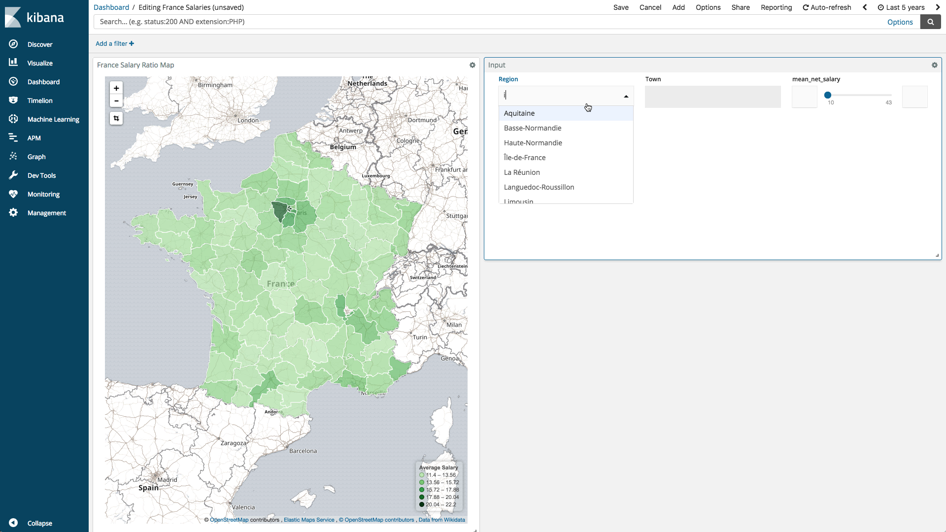
Let’s start by creating a drop-down input to allow filtering by region. The drop-down options lists are dynamically populated with the results of a terms aggregation.
Start by switching to the Visualization application and click the + button to create a new visualization. Scroll down to the Others section and select Controls. Options list is selected by default so just click Add. Next, select the Index pattern france-example-*, select the field Region_Name.keyword, and set the size to 25 (there are 25 unique regions in dataset). Finally, click play. The visualization will display a single drop-down containing the results of a terms aggregation on the field Region_Name.keyword from france-example-* index.
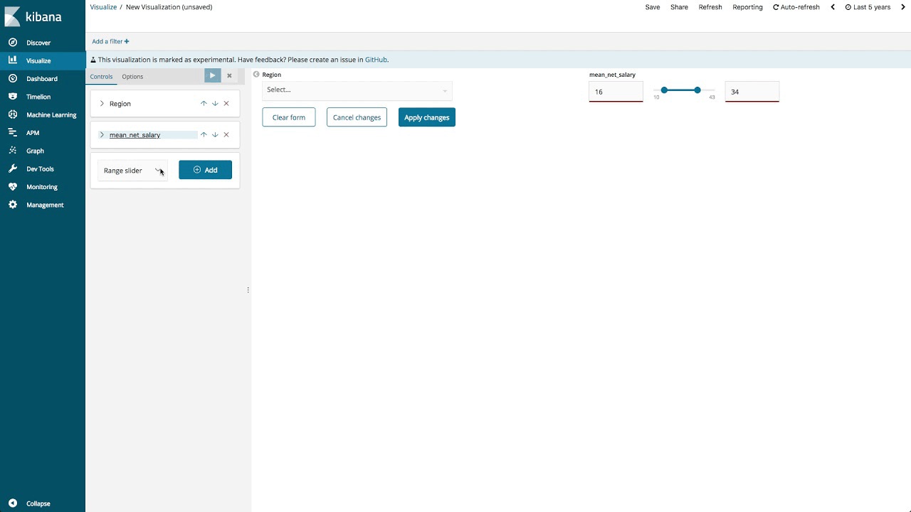
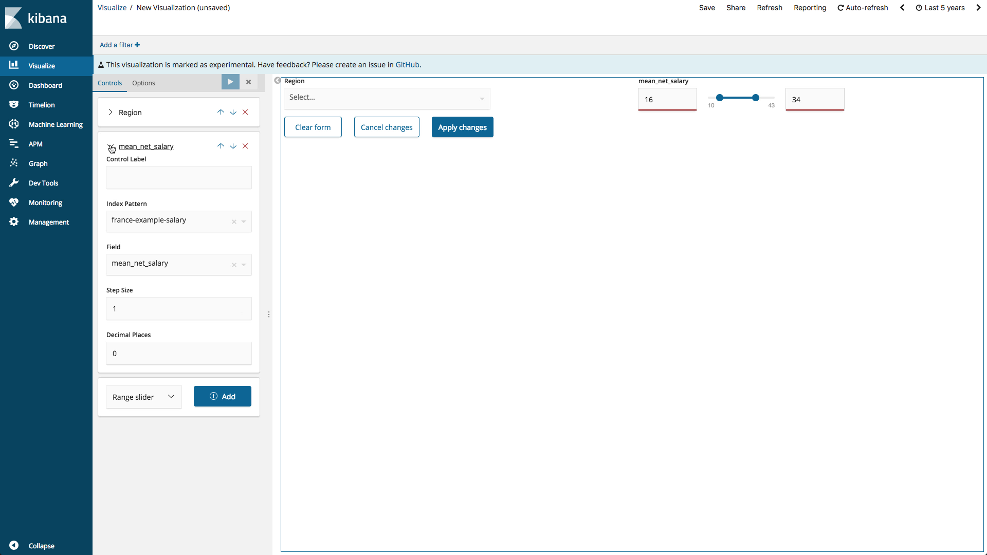
Next, let’s create a range slider to allow filtering by net salary. The range slider minimum and maximum values are dynamically populated with the results of a min and max aggregation.
Add a range slider input by selecting Range slider and clicking Add. Select the Index pattern france-example-*, select the field mean_net_salary, and click play. The visualization will display a range slider with the range defined by the results of a min and max aggregation on the field mean_net_salary from france-example-* index.
Chaining Drop-Down Inputs
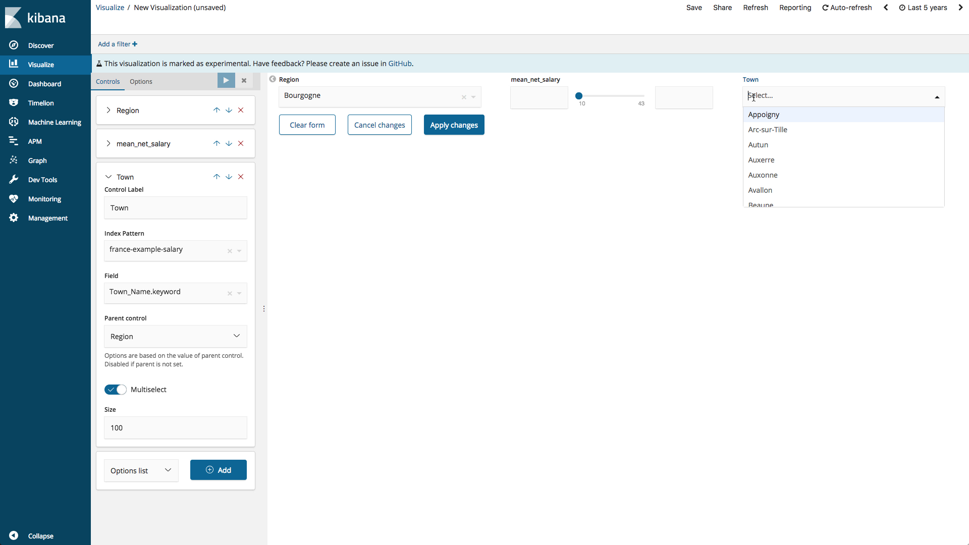
New in Kibana 6.3, is the ability to chain drop-down inputs so that the selection of the first input will filter the terms of the second input. Lets see how this can be useful by adding another drop-down control to allow filtering by town.
Add another drop-down control by selecting Options list and clicking Add. Select the Index pattern france-example-*, select the field Town_Name.keyword, and set the size to 100. To chain the control to the region control, select the Parent control “region”. Finally, click play. The visualization will display another drop-down. The drop-down will be disabled until the region drop-down has values. Then the town drop-down will contain the results of a terms aggregation on the field Town_Name.keyword from index france-example-* filtered by the selected regions.
Putting It All Together
Switch to the Dashboard application and create a new a dashboard. Add the Controls visualization and the “Average Gender Salary Ratio by Department - Region Map” visualization created in Nick’s blog post. Set the controls to values of interest. Click “Apply changes” to filter the dataset by the drop-down and range slider inputs.
What's Next
The Controls visualization is still experimental. Now is a great time to try them out and provide feedback in our Kibana forum. Your feedback could help shape future features. You can also watch this webinar and discover how to level-up your Kibana dashboards.