Eye-catching Canvas dashboards on top of bike sharing data
Aginic is one of Australia’s leading data analytics consulting agencies. As an Elastic partner, we help our joint customers deliver meaningful ‘insight for change’, with our analysts, engineers, developers, designers, and delivery coaches tackling major projects across the health, education, energy, entertainment, defence and finance sectors, to name a few.
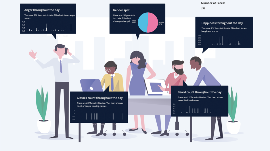
At a recent Elastic Brisbane meetup, our team showcased some of the Elastic Stack’s exciting new Canvas and SQL features, choosing to develop a suite of hypothetical dashboards that could help reshape bike sharing in New South Wales for good.
Our team began digging into some open data sources and past use cases, swiftly landing on Kibana's new application Canvas, which allowed us to combine existing commuter scenario data from the NYC CitiBike System1 into one elegant visualisation. From there, we set out to game out ways to help support improvements in bike rental rates, rental inventory monitoring, overall commuter satisfaction, and overall bike usability in New South Wales.
Here’s how we got there...
Our Canvas dashboard portrayed some of the NYC CitiBike System Data. More specifically, we chose the dataset as it allowed us to take advantage of transactional trips data, as well as point-in-time station status metrics. We thought these two different types of data would allow us to best demonstrate the new Canvas functionality.
The first trip data source made use of historical data hosted on S3. At the time of the presentation, we utilised a simple bulk Logstash CSV import pipeline. This can easily be extended to automatically download results on a schedule to ensure the data in Elasticsearch is kept up to date.
The second station data feed consists of a frequently updated JSON URL containing a range of metrics, including the number of bikes available at each station. The result of a request to this URL is a top-level JSON object of the form
{"last_updated":1549188861,"ttl":10,"data":{"stations":[]}}
The keys to our real-time feed are the last_updated, and ttl (time to live) fields. The ttl field represents the amount of time before this feed will be updated again; thus, we are able to add the last_updated and ttl fields to get the time the feed will be next updated. By writing a custom Python application to sit in a fetch-sleep loop, we are able to ensure our data is as up to date as possible.
Now that the data was in Elasticsearch, we were able to move to Kibana and start to play around with visualisations. Traditionally, dashboards have a number of purposes depending on their use case:
- To communicate information efficiently
- To enable self-service discovery through drill-down and filter functionality
- To automate the generation of specific business unit reports
Interactive, filtering and self-service discovery workloads are a perfect fit for Kibana’s built-in dashboarding functionality, as it allows users to quickly and easily work with the data they are presented. Traditionally, we have seen that to meet non-interactive use cases custom applications (based on e.g. d3) have been built. These custom applications require an investment in terms of development time and ongoing support that the built-in dashboards don’t suffer from.
Canvas removes this hurdle by moving away from traditional grid layout dashboarding style to a seamless object-centric layout. This enables the creation of visualisation styles in freeform, allowing for a higher degree of creative freedom. But more importantly, because of the amount of control a designer can now afford over each object/graphic, interactions between data visualisations and data can denote significantly more meaning at a glance than ever before by pairing them with graphic objects.
The big caveat here is that data presentation tools only work when you understand your audience. The ability to pair meaning (definitions) and data (where it is in a form to be easily understood) is key. This is offset by Canvas’ ease of development, allowing users to iterate quickly through versions in order to meet their needs and to check whether the visualisation as a whole provides enough context to impart information quickly to the viewer. As a platform it allows us to truly realise the potential of design thinking and agile iteration in a Business Intelligence context.
The initial Canvas Workpad was built on the premise of integrating branding into the dashboard itself, as opposed to simply attaching a logo into the corner of the page. It is with this approach that certain possibilities open up, such as the ability to create animated, real-time infographics at a low development cost.
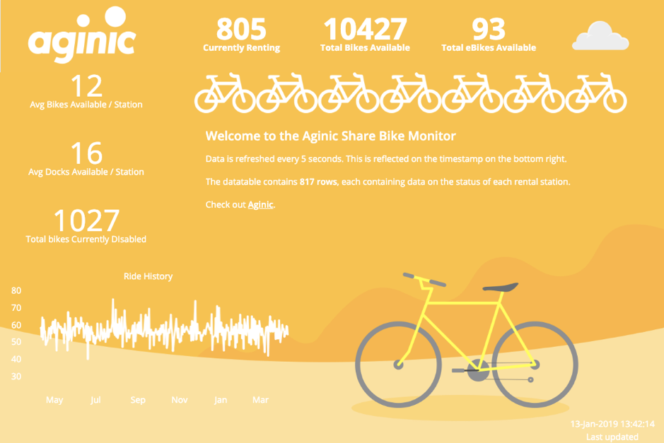
While this dashboard isn’t anything more than a demonstration of Canvas’ technology, it can easily be extended to serve as an overview dashboard for system maintainers or double as a public-facing screen to let potential cyclists know at a glance what’s available for their station. In both scenarios, the use of eye-catching dashboards allows consumers to quickly identify key metrics or information they might be interested in.
Overall, we’ve noticed a ton of potential for the application of Canvas dashboards in our work. A solution like this could improve the ease of use of existing dashboarding use cases, thus increasing uptake and user interaction. While a newer product, Canvas has filled a gap that has been left by traditional dashboarding/BI software. We’re excited to keep working with clients on unique solutions for their visualisation problems using Canvas.
1Aginic Pty Ltd is not affiliated, approved, endorsed, or sponsored by Bikeshare.
Ruben Slabbert
Ruben is a cloud data engineer and application developer who specialises in enterprise data pipelines in Amazon Web Services (AWS), Microsoft Azure, and Google Cloud. In his time at Aginic he has typically taken the lead role in pipeline architecture and has managed cross-functional teams to deliver reliable batch and real-time processing from production systems to data lakes and warehouses in the cloud.
Andrew Li
Andrew is an analytics consultant with a wide range of knowledge in Data Science and full-text search, who has a passion for improving the outcomes through analytics. Starting his professional career with a degree in Mechanical (Biomedical) Engineering, he has consulted to both public and private sector clients across diverse industries including health, government and top ASX performers.