Explore the data in Kibana
editExplore the data in Kibana
editTo get the best results from machine learning analytics, you must understand your data. You must know its data types and the range and distribution of values. The Data Visualizer enables you to explore the fields in your data:
-
Open Kibana in your web browser. If you are running Kibana locally, go to
http://localhost:5601/.The Kibana machine learning features use pop-ups. You must configure your web browser so that it does not block pop-up windows or create an exception for your Kibana URL.
- Click Machine Learning in the side navigation.
- Select the Data Visualizer tab.
-
Click Select index and choose the
kibana_sample_data_logsindex pattern. - Use the time filter to select a time period that you’re interested in exploring. Alternatively, click Use full kibana_sample_data_logs data to view the full time range of data.
-
Optional: Change the sample size, which is the number of documents per shard
that are used in the visualizations. There is a relatively small number of
documents in the sample data, so you can choose a value of
all. For larger data sets, keep in mind that using a large sample size increases query run times and increases the load on the cluster. -
Explore the fields and metrics in the Data Visualizer.
It lists the fields in two sections. The first section contains the numeric ("metric") data types. The second section contains non-numeric data types (such as
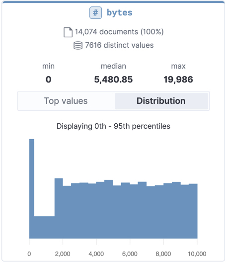
keyword,text,date,boolean,ip, andgeo_point). For more information, see Field data types.For each metric, the Data Visualizer indicates how many documents contain the field in the selected time period. It also provides information about the minimum, median, and maximum values, the number of distinct values, and their distribution. You can use the distribution chart to get a better idea of how the values in the data are clustered. Alternatively, you can view the top values for metric fields. For example:
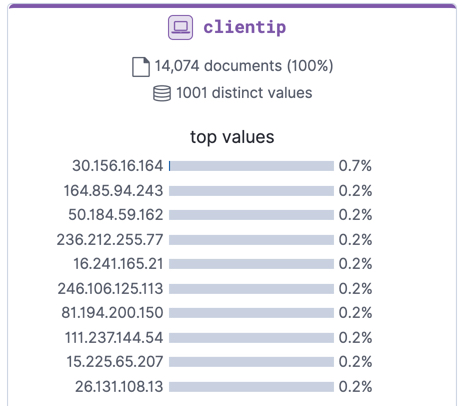
In particular, look at the
clientip,response.keyword, andurl.keywordfields, since we’ll use them in our anomaly detection jobs. Foripandkeywordfields, the Data Visualizer provides the number of distinct values, a list of the top values, and the number and percentage of documents that contain the field during the selected time period. For example: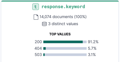
-
Make note of the range of dates in the
@timestampfield. They are relative to when you added the sample data and you’ll need that information later in the tutorial.For
datefields, the Data Visualizer provides the earliest and latest field values and the number and percentage of documents that contain the field during the selected time period: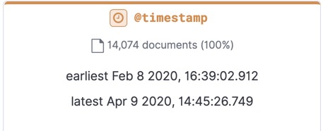
Now that you’re familiar with the data in the kibana_sample_data_logs index,
you can create some anomaly detection jobs to analyze it.