Monitoring Airport Security Operations with Canvas & Elasticsearch
At Crimson Macaw, we recently took on an interesting project with Manchester Airport Group (MAG). We were to create and implement real-time dashboards for Airport Security Operations at Stansted Airport.
This would give the control room and security staff a better view of the passenger flow and security performance, allowing them to quickly make decisions based on real-time data. Data needed to be ingested from a number of on-premises systems and external data sources and then visualised on a number of large screens.
Data Ingestion Challenges
After deciding on Elasticsearch as the data storage layer, we needed to determine what data would be ingested and how we would do it. The information was available from a variety of sources. On-premises database systems, files frequently put into AWS S3 Buckets, as well from external API data sources. An example being National Rail data, which we loaded into Elasticsearch using the STOMP (Streaming Text Oriented Messaging Protocol) interfaces.
This in itself presented some initial challenges that we had to overcome:
- Polling for data from databases had to be more frequent than 1 minute
- Incoming data from STOMP was gzip compressed
Polling Databases More Frequently than Once per Minute
We addressed the first problem with a simple patch to the existing logstash-input-jdbc plugin. Before the patch, schedules could only be expressed in cron format. It used a Job Scheduler known as rufus-scheduler, which supported supplying schedule expressions as either cron or number of seconds. The only change was single line of code to use the repeat method instead of cron:
To be able to make use of this, our patch is available on GitHub.
Handling Gzip Compressed Messages
In order to handle compressed messages arriving from STOMP interfaces, we had to decompress them to filter the data using Logstash. Although there is an existing codec for reading lines of data from a gzip compressed message, in our use case the gzip decompressed messages were multi-line XML. To overcome this, we created our own plugin — logstash-codec-gzip — which we’ve made available on GitHub.
Visualising the Data using Canvas
We started to use Kibana to visualise the data that was available in Elasticsearch hosted in Elastic Cloud, but we couldn’t quite do what we wanted. It felt like a more granular level of control was needed. We came across Canvas by chance, when the Head of BI from Manchester Airport Group and I were at the AWS Summit at London May 2018. We spoke to the folks at the Elastic stand who mentioned Canvas and how they felt it was a better fit for what we wanted to achieve.
“We’re having difficulty in trying to visualise our data in Kibana as it doesn’t give the low-level control that we need.”
“Have you seen Canvas?”
“No, what’s that?”
“Our new visualisation tool; it’s in technology preview at the moment, but it sounds like it might give you what you want”
Installing Canvas and First Impressions
Canvas was available as a plugin for Kibana and installed using the normal process of adding any Kibana plugin. Since Canvas was not available on Elastic Cloud during the technology preview phase, we hosted Kibana in the Manchester Airport Group AWS environment — fully scripted, using Terraform.
Canvas has a nice simple expression language for controlling how each element is visualised. It reminds me of shell programming where the output of one command is piped into the next and sub-expressions are achieved by declaring an expression inside braces.
After a couple of days of familiarising ourselves with Canvas, we were able to visualise the train arrivals into Stansted Airport. This dashboard was created using the Markdown element for the text, Image Repeat for the icons and images in the footer.
Things were looking great and we had control of the individual elements, but there was still something missing. For our use case, we needed more control to provide:
- Format timestamps based on a time zone – data was being stored as UTC, but the time needed to adjust based on daylight saving
- Change the colour of the text and/or images based on known thresholds
Expanding Canvas
Writing plugins for Canvas is very similar to writing plugins for Kibana. They are written in NodeJS and utilise registries which allow you to add additional functions and even new elements that can be selected inside the Canvas UI. We created 3 plugins to achieve the level of control needed.
Using Time Zones when Formatting Timestamps
This was the first plugin we wrote, it’s a very simple expansion of the built-in formatdate:
import moment from 'moment';
import 'moment-timezone/builds/moment-timezone-with-data';
export const formatdatetz = () => ({
  name: 'formatdatetz',
  type: 'string',
  help: 'Output a ms since epoch number as a formatted string according to a given timezone',
  context: {
    types: ['number'],
  },
  args: {
    _: {
      types: ['string'],
      help: 'MomentJS Format with which to bucket (See https://momentjs.com/docs/#/displaying/)',
      required: true
    },
    timezone: {
      types: ['string'],
      help: 'The timezone',
      required: true,
      default: 'UTC'
    }
  },
  fn: (context, args) => {
    if (!args._) return moment.utc(new Date(context)).tz(args.timezone).toISOString();
    return moment.utc(new Date(context)).tz(args.timezone).format(args._);
  },
});
The formatdatetz plugin is available in GitHub for you to install on top of Canvas. Installation is as simple as:
./bin/kibana-plugin install https://github.com/crimsonmacaw/nodejs-canvas-plugin-formatdatetz/releases/download/v1.0.2/canvas-plugin-formatdatetz-1.0.2.zip
Controlling Colour of Text and Images
We couldn’t use Markdown to control the style of text and images (though you can provide cascade style sheets within Canvas, Markdown syntax does not have support for setting HTML class attributes for which style to apply).
The simplest approach was for us to create a plugin that would allow direct coding of HTML and in a similar way to the Markdown element, allow handlebars expressions for data binding. As SVG images can be embedded directly inside HTML, we could apply the same level of control to dynamically change the images based on data retrieved from Elasticsearch.
Creating the Visualisations
Once we had the plugins we wanted, having the control to create something simple as a table with different colours on the rows was now possible.
The visualisations were now coming together, data was being populated into each of the relevant placeholders, but the look and feel still didn’t feel quite right and a request came in that reflected that.
“Can we make them look sexier?”
It was time to take inspiration from the internet, searching for “modern dashboard” on platforms such as Pinterest and Dribbble gave some interesting approaches to designing a dashboard and a different direction was taken.
A number of elements were added to the screen, mostly using the HTML plugin we had created which had a mixture of simple HTML and some complex SVG images dynamically generated.
The initial feedback was positive, however users that hadn’t been part of the design didn’t understand all the metrics without an explanation.
“Wow! That looks a lot better, but what do the bottom of the bars mean?”
Going back to the original requirement of the Airport Security Operations being able to quickly make decisions, meant that although you could produce something that may look impressive, it’s not always the best way to visualise the information. A user should be able to instantly know what is being displayed in front of them without the dashboard having to be explained.
An Iterative Approach
Having become proficient in the Canvas expression language, we held a number of workshops with live editing of dashboards with the stakeholders in the room. It was clear that we had moved on from the wireframe constructed before people had seen the tool or based on their current reporting, to inspired approaches on how best to display the information on the dashboards. Stakeholders took the latest versions of the dashboards to end users for feedback and changes were made based on the feedback given.
Final Dashboards
The following dashboards were the result of collaboration and creative thinking.
“The dashboards that Crimson Macaw have created for us using Elasticsearch and Canvas have given Stansted Airport a modern real-time display of our data that was previously held in individual systems. This has created a number of efficiencies in our internal processes that would not have been possible before.” – Stuart Hutson, Head of BI and Analytics, Manchester Airport Group
Note, the data in all of the dashboards has been randomised for presentational purposes. We created a randomise plugin for Canvas to do this!
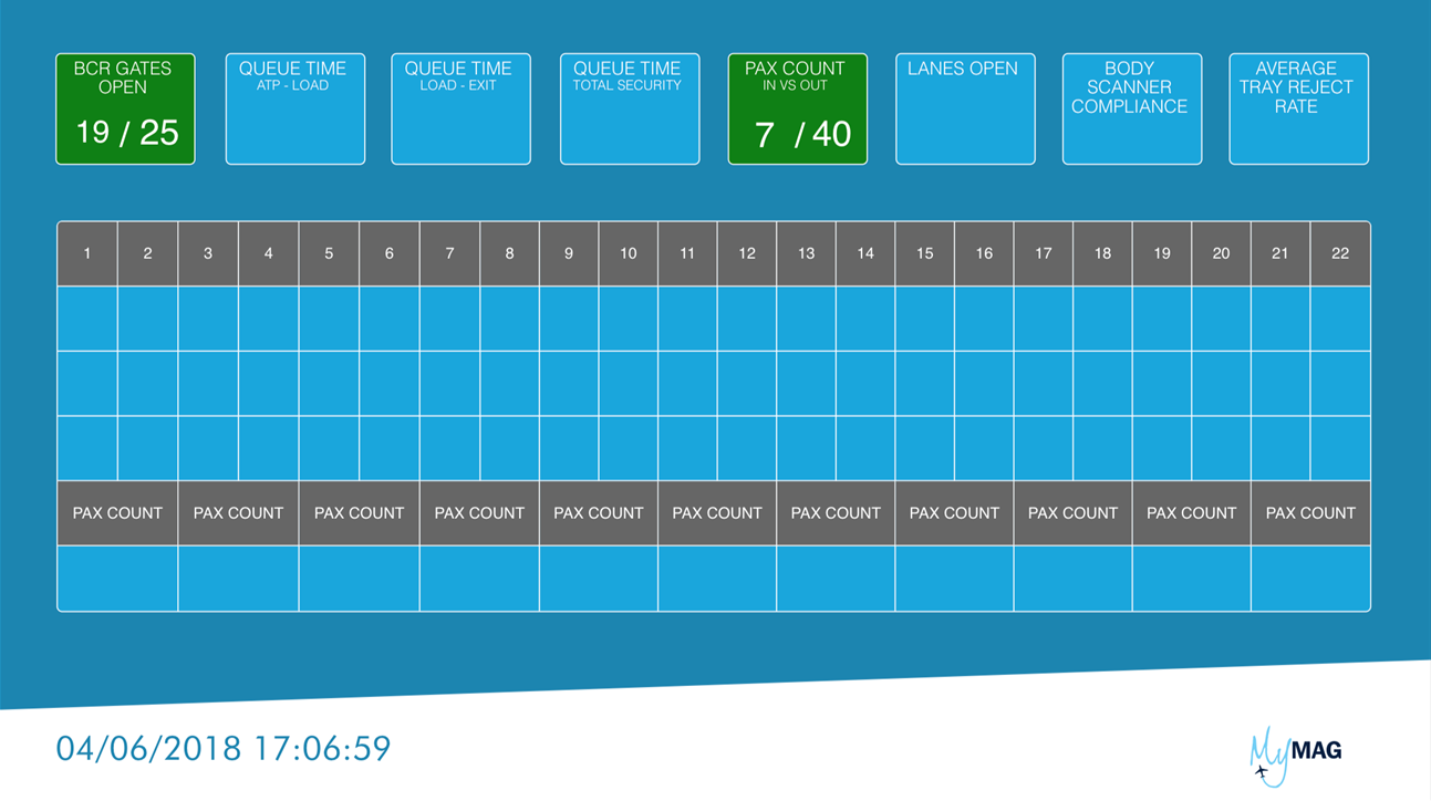
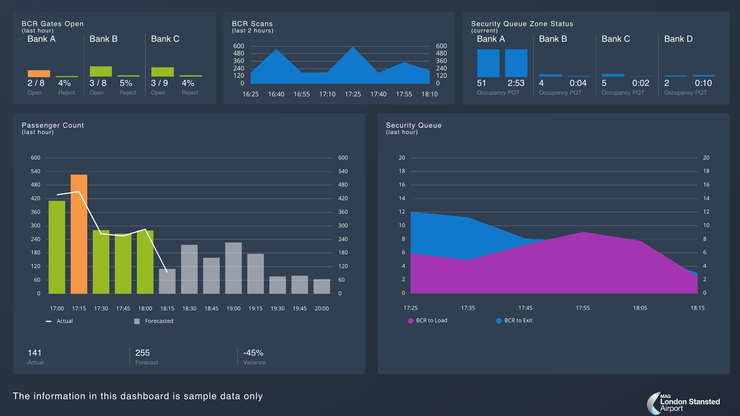
Security Hub
This dashboard shows the current status of the Airport Security, from people entering and leaving the Airport Security to compliance rates, as well as information about the individual lanes. The shape chosen for the security lanes reflects the physical layout within the Airport Security, so that the operation staff can immediately relate the dashboard to a physical lane.
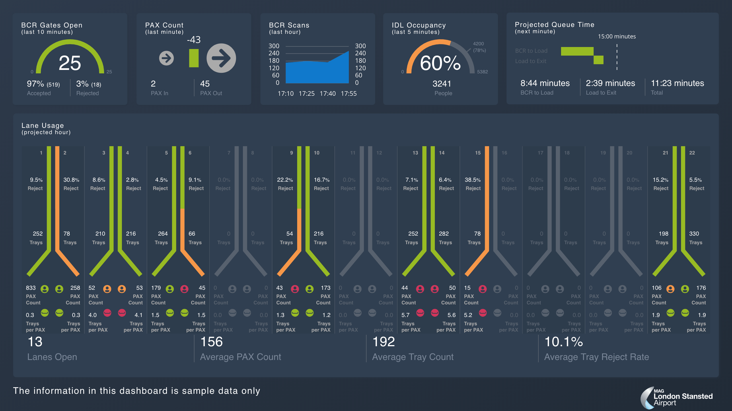
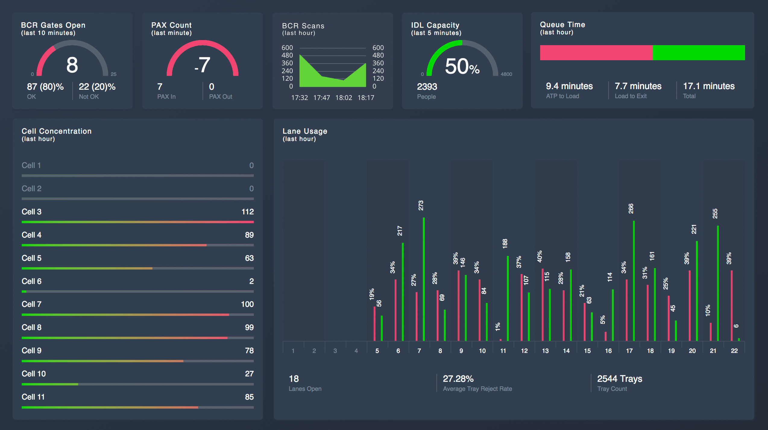
Security Pod
This dashboard shows trend information, displaying people entering the Airport Security area plotted against a predicted forecast of passenger turnup and queue wait times in different areas.
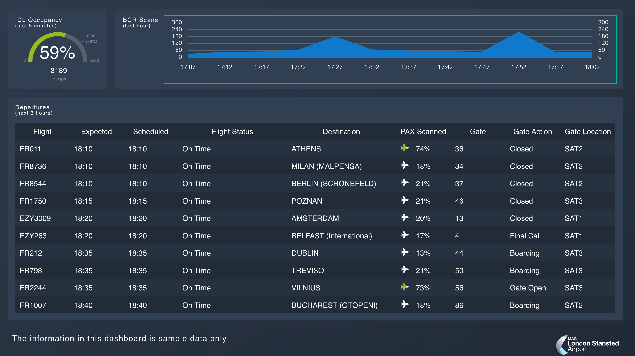
Flight Departures
Very similar to a normal FIDS (Flight Information Display Screen), but with the additional detail of matching the percentage of passengers who have entered Airport Security against the predicted passenger for the upcoming flights.
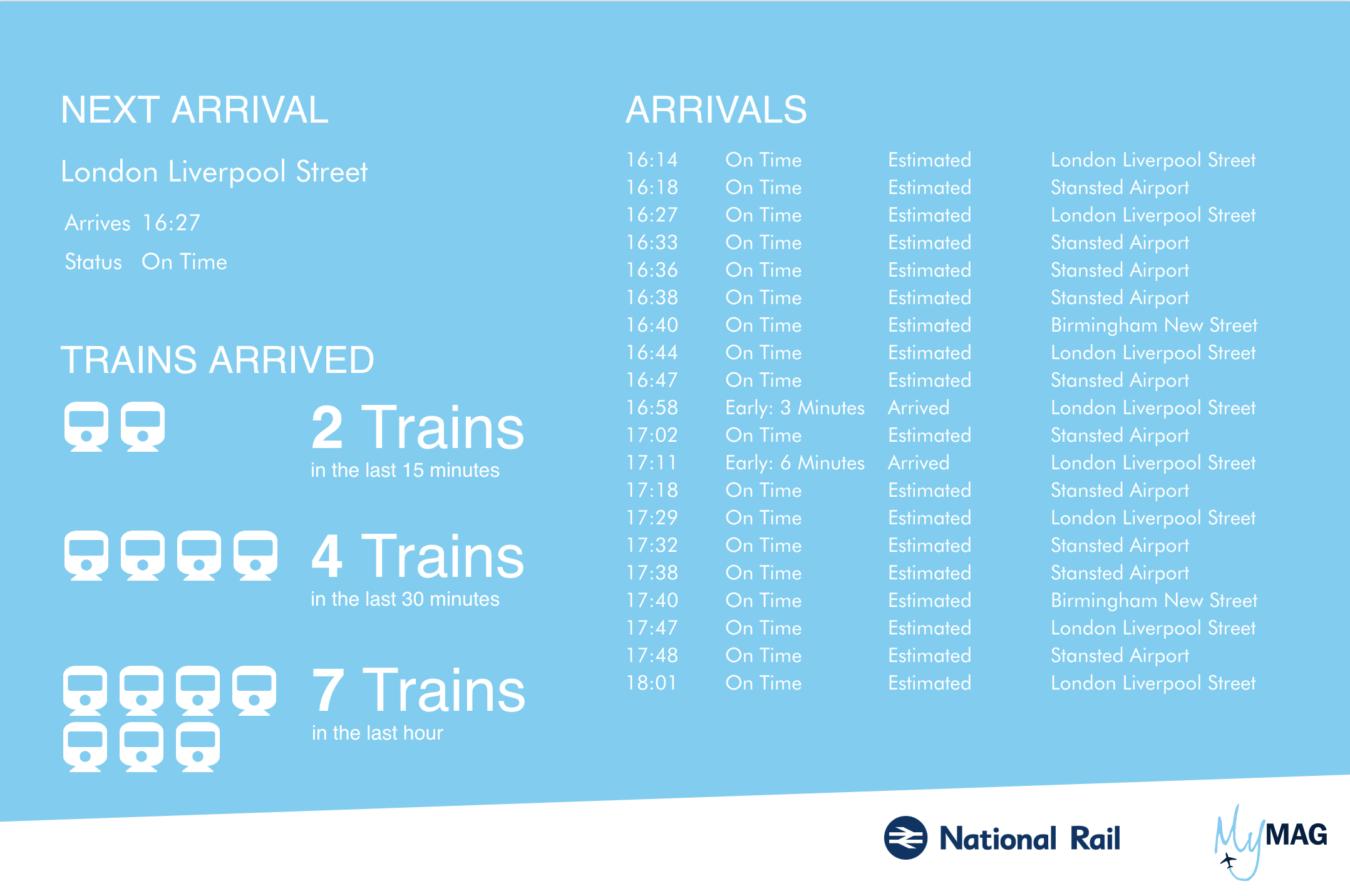
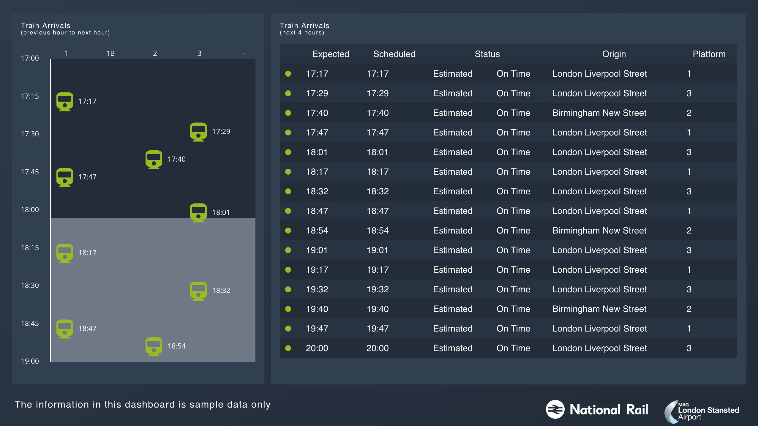
Train Arrivals
A large percentage of passenger arrive into Stansted Airport via train and delays to their journeys can have a significant effect on the number of people arriving at Airport Security. A single train will have hundreds of travelers and multiple trains can arrive in a short period after issues have been resolved.
The dashboard not only displays a typical table of train information, but also shows train arrival time on a timeline. You can see this has changed substantially from the first iteration when we were experimenting with Canvas.
Conclusion
Canvas is a brilliant tool to enable very impressive, real-time visualisation of data. Although Canvas is currently in beta and may need some additional features, having the ability to expand its core functionality with plugins does feel like the Elastic approach to software.
Lots of BI tools limit you to graphs and tables with a sprinkling of gauges and other standard visualisations. The simplicity of creating dashboards with Canvas allows Data Engineers and Data Visualisation Specialists the freedom to create visualisations only limited by their imagination.
Robert Bruce is a founding partner and Director of Engineering at Crimson Macaw, a Cloud/Data IT Consulting company based in Manchester, UK. Robert has worked in the Data Engineering and Web industries for over 20 years and now works in the cloud technology space.