How we rebuilt the APM service map for incident time: the design story behind Observability 9.5
14 enterprise interviews, two prototype rounds, one rebuilt APM service map. The design story behind Elastic Observability 9.5.
Trace every request end-to-end with Elastic. Get hands-on with application performance monitoring, explore the APM docs, or start a free cloud trial today.
Elastic Observability 9.5 ships the biggest overhaul of the APM service map since it was introduced, rebuilt around 14 enterprise interviews, two prototype rounds, and the question people actually bring to it: something broke, how bad is it, where do I look first? This is the design story. The companion posts cover what shipped and how to use it and how it was built.
APM service map redesign started with listening
Before designing anything, we looked at how the existing map was being used and, more importantly, at what customers were telling us about it. The signal was consistent: the map made a great first impression, but at enterprise scale it wasn't yet earning a place in people's daily investigations. Solutions architects told us it held up beautifully with twelve services and didn't yet scale as cleanly to two hundred (customers, inconveniently, insist on having two hundred). And performance at scale came up. A lot.
The opportunity wasn't a nicer looking map. It was a more helpful one. We went into research to find out what "helpful" meant.
Research first, pixels second
Fourteen interviews across six enterprise customers, plus Elastic's own SREs, consultants, and solutions architects. We framed it deliberately. Instead of asking "would you like a nicer map?" (everyone says yes to a nicer map), we asked "walk me through the last incident you investigated."
Three findings did most of the work:
- Nobody opens a service map on a good day. People arrive from an alert, in a hurry, sometimes at 3am. The first job, as one engineer put it, is "proving your innocence": cause, or victim? The map didn't yet show health or alert context at that moment.
- Context beats completeness. Nobody wanted the full topology; they wanted the neighborhood around the problem, and the business context the map never showed.
- Health has to live on the map itself. Alerts, anomalies, SLOs. The map knew your topology; it needed to know where it hurt.
The nice thing about research is that at some point you can stop having opinions. When someone asked why we were putting a preview map inside the alert page, we didn't have to argue or plead. We played a recording.
Designing the APM service map journey, not the screen
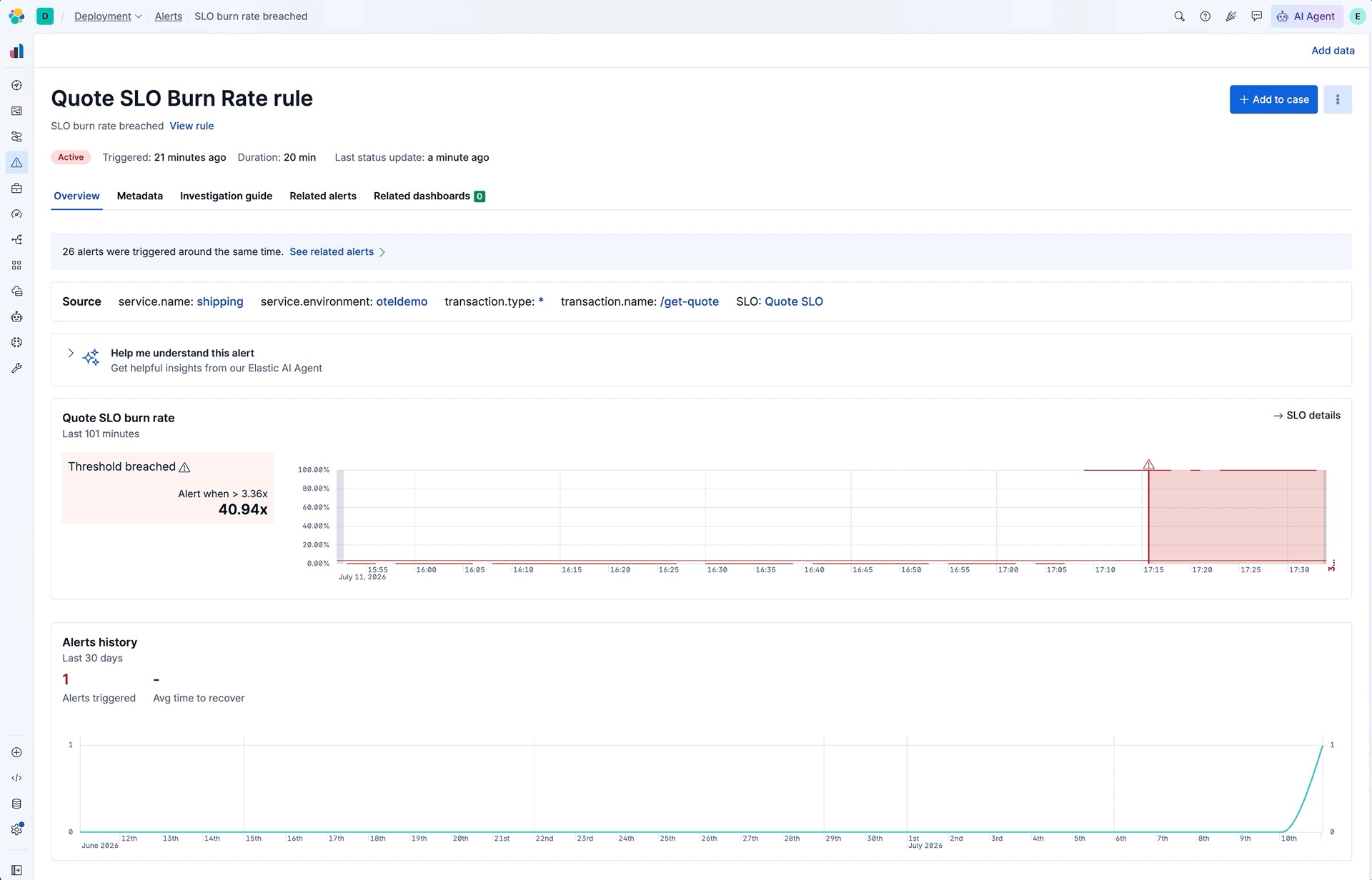
With those findings, we designed the end-to-end flow in Figma: alert fires → preview map scoped to the affected service → click a node, get the context → expand into the full map with grouping and filtering.
We recorded rough walkthrough videos and posted them in public channels. Mildly terrifying, very much worth it: feedback arrived within hours, while a fix was still a Figma edit, not a PR.
Two rounds of validation
In mid-March we shared the E2E designs with cluster admins and SREs working in large, demanding production environments. Two weeks later, the same people were clicking through working Kibana prototypes.
A few moments that shaped 9.5, anonymized:
Curl up in a ball and cry? That would probably be my first answer. […] The first thing I'd want to do is start filtering to red or yellow — filter out everything that's healthy — and bring this from a huge monolithic thing into focus. — SRE, on being shown a production-scale map with ~100 nodes
It lets us know which teams we need to be talking to — other than just knowing the name of the application and hoping we remember who works there. — platform engineer, on grouping by owning team
This path is exactly what I was hoping to do — clicking on the nodes, then I check the transactions. — cluster admin, clicking through the prototype for the first time
And a humbling one, about an expand/collapse control we were quite fond of:
At this point I have no idea that there's actually more there. I'm going to have to blindly click on every one of these and expand and collapse just to see more of the map. — SRE, on our per-node expand/collapse controls
We cut the control. It had a lovely animation. We don't talk about it.
Each session ended with notes, adjustments, and a follow-up booked. Participants saw their feedback reflected two weeks later; several said that's why they kept showing up.
The core trio
The team was a PM, an engineer, and a designer, which is about as unglamorous as it gets. We stayed in one continuous conversation, with a wider team of engineers building alongside us. Jenny (engineering) sat in the research calls. Roshan (PM) posted rough videos in public channels. I read PRs while features were still moving. And when we had doubts (regularly), nobody tried to win. We'd brainstorm, trade knowledge, and go back to what users had said.
Not having to defend decisions is an underrated productivity tool. Nobody writes specs to protect designs when the people building them were in the room for the decision.
The Cytoscape-to-React-Flow migration came out of that same conversation. Jenny tells that story in her post.
Confidence, earned the boring way
By build time, every 9.5 idea had been in front of users five or six times. We weren't hoping anymore; we'd seen it work.
Then in June an email arrived, unsolicited, from a customer who hadn't even seen most of the map work yet:
The new updates are AMAZING! This is the best stuff we've seen in a long time and we love everything about the new look and feel of the Observability/APM dashboards! — enterprise customer (Whoa.)
I'd love to say it was talent. But it was just a loop. We asked, listened, built, and asked again, from the first interview to the release branch. Boring, not flashy. Effective. Like porridge for breakfast when you want to eat healthy. Or a couple of hours on the stairmaster when you want to climb mountains.
We don't know yet how far this will go, by the way; 9.5 is only just reaching people's clusters. But we do know that nothing in it shipped untested or on a hunch, and for now, that's good enough for me.
What I'd steal from us (it works, I checked!)
Start with real signals (usage patterns, customer feedback), even when they sting. "This isn't helping people the way we hoped" is a better brief than any "I think we should…".
Interview around moments, not features. "Walk me through your last incident" showed us what people actually open, skip, and struggle with. "What features do you need on a map?" never would have.
Test journeys in unpolished Figma, decisions in unfinished code. Neither round was enough alone, and neither had to be pretty. Nobody needs a vibe-coded clickable anything; a clear journey is enough to start. Pixels are the easiest part, and they matter the least when the experience is weak.
Share rough work in public, same day. The embarrassment wears off by EOD; the feedback stays (and the connections you make!).
Keep your trio close, keep it talking. Communication, trust, and transparency. Everything good here came from that shape.
The new APM service map is available in Elastic Observability Serverless today, and comes to Elastic Cloud Hosted and self-managed deployments with 9.5. If it makes your next incident a little easier, that's largely thanks to the SREs, admins, and consultants who shaped it, sometimes by talking us out of our favorite ideas.
Thanks to Jenny Pavlova (engineering) and Roshan Gonsalkorale (product), and to the wider team of engineers who turned it into 9.5.
How helpful was this content?
Related Content
The service with the most errors was healthy: root cause analysis from logs with ES|QL
Telemetry Policy: change OpenTelemetry sampling and log levels at runtime, no restart
LLM tracing in Elastic APM: prompts, responses, and token counts in the span view

Android application monitoring with OpenTelemetry: distributed tracing from tap to backend