Evaluating data frame analytics
editEvaluating data frame analytics
editUsing the data frame analytics features to gain insights from a data set is an iterative process. You might need to experiment with different analyses, parameters, and ways to transform data before you arrive at a result that satisfies your use case. A valuable companion to this process is the evaluate data frame analytics API, which enables you to evaluate the data frame analytics performance against a marked up data set. It helps you understand error distributions and identifies the points where the data frame analytics model performs well or less trustworthily.
The evaluate data frame analytics API is designed for providing a general evaluation mechanism for the different kinds of data frame analytics.
To evaluate the data frame analytics with this API, you need to annotate your index that contains the results of the analysis with a field that marks each document with the ground truth. For example, in case of outlier detection, the field must indicate whether the given data point really is an outlier or not. The evaluate data frame analytics API evaluates the performance of the data frame analytics against this manually provided ground truth.
Outlier detection evaluation
editThis evaluation type is suitable for analyses which calculate a probability that each data point in a data set is a member of a class or not. It offers the following metrics to evaluate the model performance:
- confusion matrix
- precision
- recall
- receiver operating characteristic (ROC) curve.
Confusion matrix
editA confusion matrix provides four measures of how well the data frame analytics worked on your data set:
- True positives (TP): Class members that the analysis identified as class members.
- True negatives (TN): Not class members that the analysis identified as not class members.
- False positives (FP): Not class members that the analysis misidentified as class members.
- False negatives (FN): Class members that the analysis misidentified as not class members.
Although, the evaluate data frame analytics API can compute the confusion matrix out of the analysis results, these results are not binary values (class member/not class member), but a number between 0 and 1 (which called the outlier score in case of outlier detection). This value captures how likely it is for a data point to be a member of a certain class. It means that it is up to the user who is evaluating the results to decide what is the threshold or cutoff point at which the data point will be considered as a member of the given class. For example, in the case of outlier detection the user can say that all the data points with an outlier score higher than 0.5 will be considered as outliers.
To take this complexity into account, the evaluate data frame analytics API returns the confusion matrix at different thresholds (by default, 0.25, 0.5, and 0.75).
Precision and recall
editA confusion matrix is a useful measure, but it could be hard to compare the results across the different algorithms. Precision and recall values summarize the algorithm performance as a single number that makes it easier to compare the evaluation results.
Precision shows how many of the data points that the algorithm identified as class members were actually class members. It is the number of true positives divided by the sum of the true positives and false positives (TP/(TP+FP)).
Recall answers a slightly different question. This value shows how many of the data points that are actual class members were identified correctly as class members. It is the number of true positives divided by the sum of the true positives and false negatives (TP/(TP+FN)).
As was the case for the confusion matrix, you also need to define different threshold levels for computing precision and recall.
Receiver operating characteristic curve
editThe receiver operating characteristic (ROC) curve is a plot that represents the performance of the binary classification process at different thresholds. It compares the rate of true positives against the rate of false positives at the different threshold levels to create the curve. From this plot, you can compute the area under the curve (AUC) value, which is a number between 0 and 1. The closer to 1, the better the algorithm performance.
The evaluate data frame analytics API can return the false positive rate (fpr) and the true
positive rate (tpr) at the different threshold levels, so you can visualize
the algorithm performance by using these values.
Regression evaluation
editThis evaluation type is suitable for evaluating regression models. The regression evaluation type offers the following metrics to evaluate the model performance:
- Mean squared error (MSE)
- R-squared (R2)
- Pseudo-Huber loss
- Mean squared logarithmic error (MSLE)
Mean squared error
editThe API provides a MSE by computing the average squared sum of the difference between the true value and the value that the regression model predicted. (Avg (predicted value-actual value)2). You can use the MSE to measure how well the regression analysis model is performing.
R-squared
editAnother evaluation metric for regression analysis is R-squared (R2). It represents the goodness of fit and measures how much of the variation in the data the predictions are able to explain. The value of R2 are less than or equal to 1, where 1 indicates that the predictions and true values are equal. A value of 0 is obtained when all the predictions are set to the mean of the true values. A value of 0.5 for R2 would indicate that, the predictions are 1 - 0.5(1/2) (about 30%) closer to true values than their mean.
Pseudo-Huber loss
editPseudo-Huber loss metric
behaves as mean absolute error (MAE) for errors larger than a predefined value
(defaults to 1) and as mean squared error (MSE) for errors smaller than the
predefined value. This loss function uses the delta parameter to define the
transition point between MAE and MSE. Consult the
Loss functions for regression analyses page to learn more about loss functions.
Mean squared logarithmic error
editThis evaluation metric is a variation of mean squared error. It can be used for cases when the target values are positive and distributed with a long tail such as data on prices or population. Consult the Loss functions for regression analyses page to learn more about loss functions.
Classification evaluation
editThis evaluation type is suitable for evaluating classification models. The classification evaluation offers the following metrics to evaluate the model performance:
- Multiclass confusion matrix
- Area under the curve of receiver operating characteristic (AUC ROC)
Multiclass confusion matrix
editThe multiclass confusion matrix provides a summary of the performance of the classification analysis. It contains the number of occurrences where the analysis classified data points correctly with their actual class as well as the number of occurrences where it misclassified them.
Let’s see two examples of the confusion matrix. The first is a confusion matrix of a binary problem:
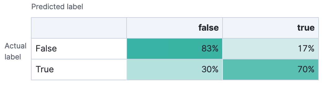
It is a two by two matrix because there are only two classes (true and
false). The matrix shows the proportion of data points that is correctly
identified as members of a each class and the proportion that is
misidentified.
As the number of classes in your classification analysis increases, the confusion matrix also increases in complexity:
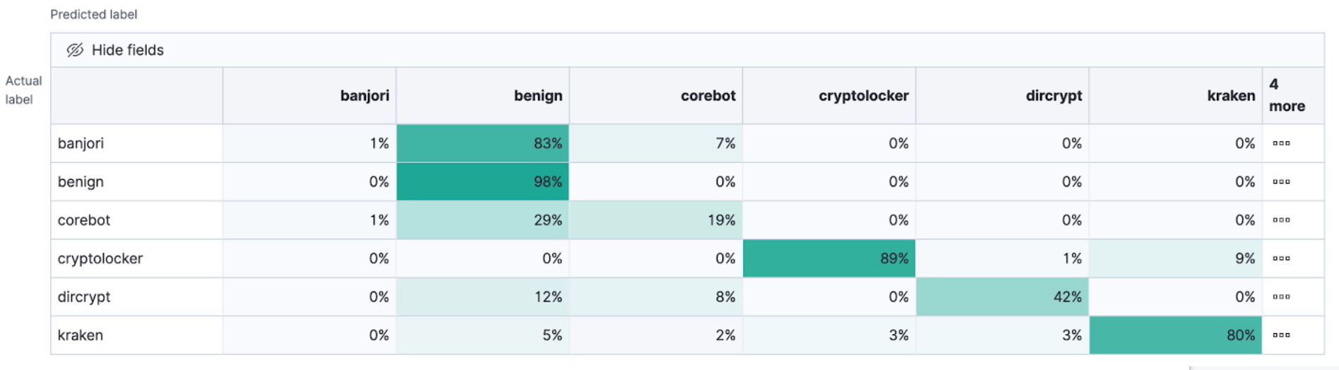
The matrix contains the actual labels on the left side while the predicted labels are on the top. The proportion of correct and incorrect predictions is broken down for each class. This enables you to examine how the classification analysis confused the different classes while it made its predictions.
Area under the curve of receiver operating characteristic (AUC ROC)
editThe receiver operating characteristic (ROC) curve is a plot that represents the performance of the classification process at different predicted probability thresholds. It compares the true positive rate for a specific class against the rate of all the other classes combined ("one versus all" strategy) at the different threshold levels to create the curve.
Let’s see an example. You have three classes: A, B, and C, you want to
calculate AUC ROC for A. In this case, the number of correctly classified
As (true positives) are compared to the number of Bs and Cs that are
misclassified as As (false positives).
From this plot, you can compute the area under the curve (AUC) value, which is a
number between 0 and 1. The higher the AUC, the better the model is at
predicting As as As, in this case.
To use this evaluation method, you must set num_top_classes to -1
or a value greater than or equal to the total number of classes when you create
the data frame analytics job.