Visualizing observability with Kibana: Event rates and rate of change in TSVB
When working with observability data, a good portion of it comes in as time series data — things like CPU or memory utilization, network transfer, even application trace data. And the Elastic Stack offers powerful tools within Kibana for time series analysis, including TSVB (formerly Time Series Visual Builder). In this blog post, I’m going to attempt to demystify rates in TSVB by walking through three different types: positive rates, rate of change, and event rates. Before we get into the nitty-gritty of rates, we need to talk about metric types, specifically related to their shape. For this discussion, we are mainly going to focus on gauges and counters.
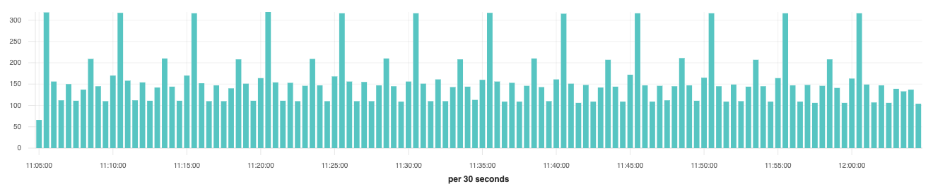
A gauge is a snapshot in time of a value, it goes up and it goes down, sort of like the fuel gauge in your car. A good example is system.cpu.user.pct collected by Metricbeat. On a regular interval, Metricbeat reads the current value for the host’s CPU sensor. It records the value and timestamp then inserts it into Elasticsearch. If we were to visualize the values over time it might look something like this:
A counter is a monotonically increasing number; the value either increases, stays the same, or resets back to zero but it never decreases. Resets usually occur when a system restarts OR when the counter reaches the maximum value of the storage type, 18,446,744,073,709,551,615 for 64-bit unsigned integers.
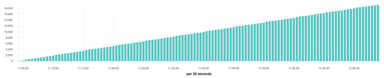
An example of a counter would be system.network.out.bytes. As network traffic is sent over your computer’s network interface, it increments the counter with the number of bytes transferred. If we were to visualize the values over time it could look something like this:
The last concept that’s important to understand is the time interval or buckets. By default, Metricbeat samples values every ten seconds. In the visualizations above, each bar represents 30 seconds of data, so it’s safe to assume that each bar has three values. If we were to plot the average of a metric like system.cpu.user.pct, each bar would represent the average of those three values which might look like (0.45 + 0.1 + 0.9) / 3 = 0.4833.
For counters we can’t take the average because each bar represents the value of the counter at that moment in time. Let’s imagine that every ten seconds, we add 100 to our counter which is starting at zero. In ten seconds the count would be 100, in 20 seconds the count would be 200, and in 30 seconds the count would be 300. If we plotted that on a chart for 30 seconds we would end up with three bars:
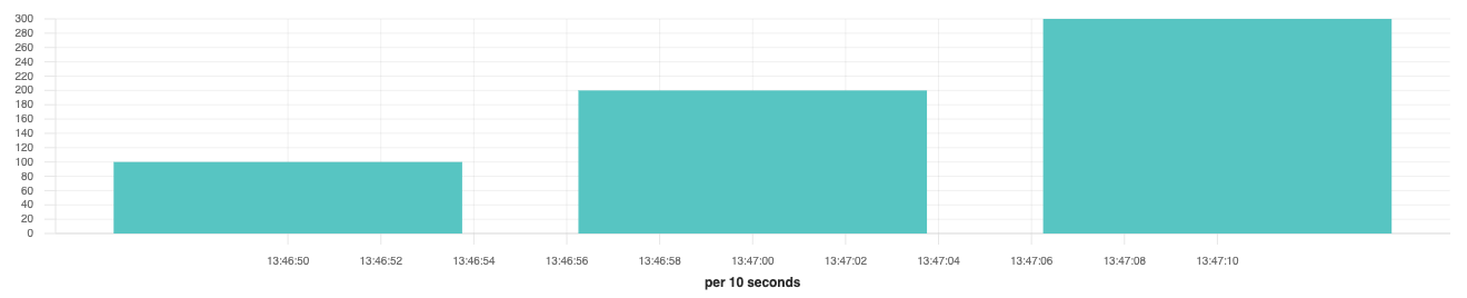
If we changed the interval or size of the buckets to cover 30 seconds of data, then we should have a single bar that is 300, which is also the max value of all three samples. By using the max aggregation with counters, we will always get the correct value for the bucket; the average would be (100 + 200 + 300) / 3 = 200, which is clearly wrong.
Converting counters to positive rates
For converting counters to rates, we are mainly concerned with the positive changes due to how it only grows. In the example above our rate is 100 every ten seconds. What if we wanted to know how fast it was changing per second? Since we don’t know what’s happening for every single second during that ten second period, the best we can do is assume that it’s evenly distributed. We would divide 100 into ten equal one second buckets which would give us an average rate of ten per second.
Let’s do the same thing for system.network.out.bytes but using TSVB to create a visualization:
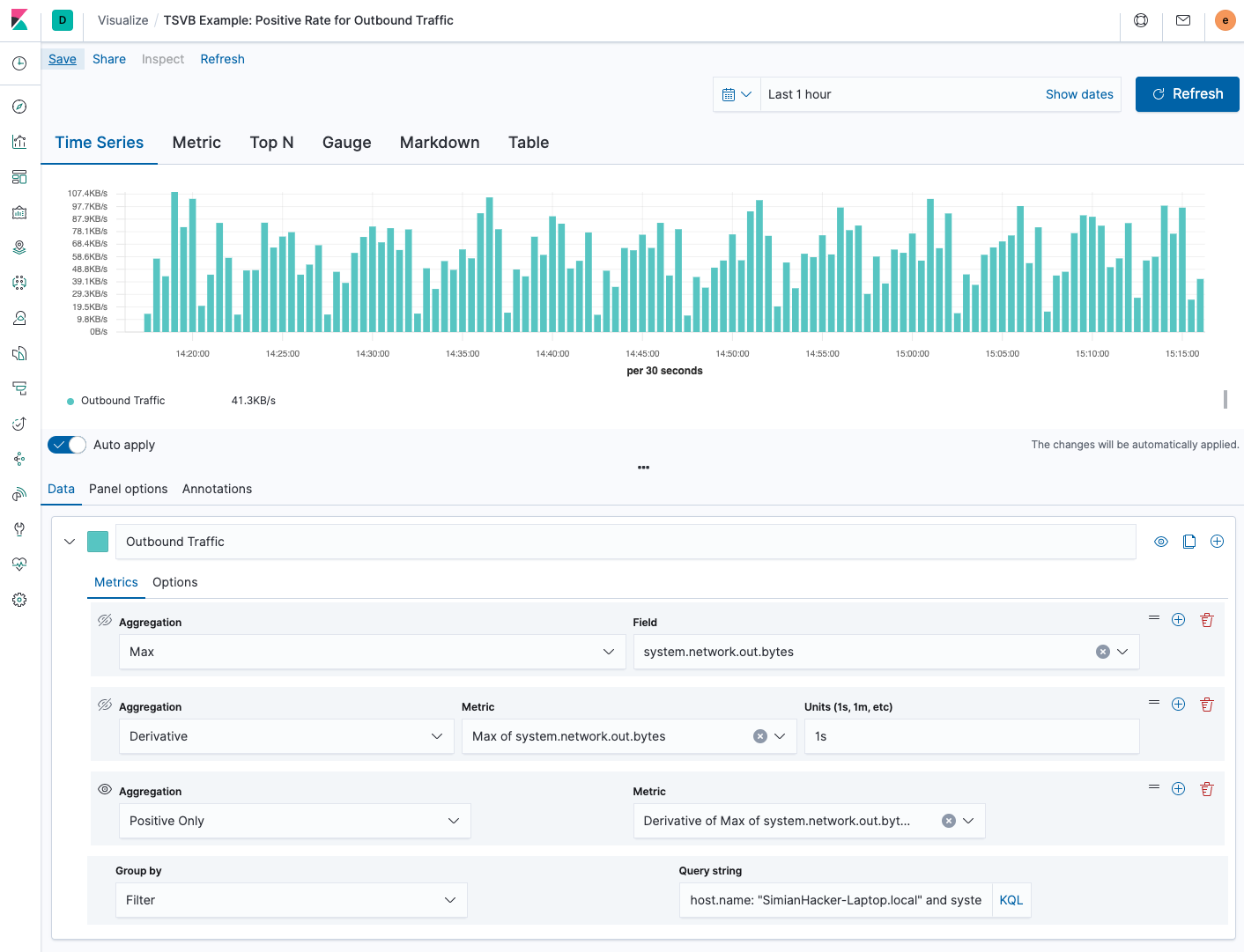
In the screenshot above, we first take the max of system.network.out.bytes. Then we use the derivative pipeline aggregation to calculate the difference between each bucket. Because we are accustomed to visualizing network rates as “per second” we set the units to 1s which will automatically scale down the value regardless of our zoom level or bucket size. Finally, we need to handle the resets with the positive only aggregation, otherwise when the number reset we would see a huge negative dip in the rate.
A few things I need to point out in the example above. Metricbeat ships a value for system.network.out.bytes for every network interface in the system. You will notice I have the “group by” set to “filter” and the “query string” set to host.name: “SimianHacker-Laptop.local” and system.network.name: “en0”. Otherwise, it would just use the “max” value of the network interface with the most traffic recorded.
If I wanted to calculate the network traffic for all the interfaces together, I would need to set the “group by” to “terms” and the field to system.network.name. Then add a special aggregation called “Series Agg” that would “sum” all the rates of all the interfaces together.
Rate of change
"Rate of change" is used to identify how a value changes over time, whether it’s rising or falling. As I was researching for this post, I noticed that depending on the source and the context, people will either use just the plain derivative (instantaneous rate of change) OR they will calculate the percentage of the change, usually in finance applications. Either way will give you a sense of how things are changing.
For the example below, I’m going to stick with showing the percentage change since the calculation is less straightforward. This can be applied to either gauges or counters, the only difference is that we care about the negative values as much as we do about the positive ones. It’s also useful to apply this to a counter after it’s been converted to a positive rate, often referred to as a second derivative.
In this example, we are going to plot the average of system.cpu.user.pct and also the positive and negative rates of change for that metric:
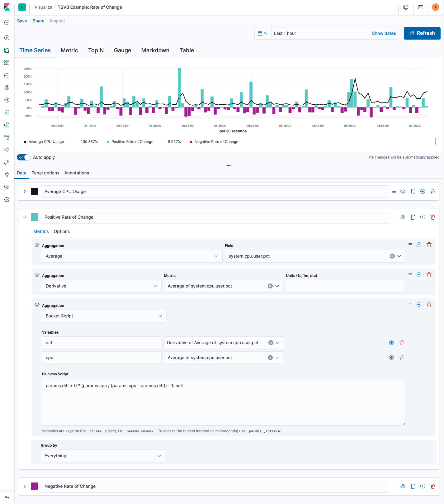
In the screenshot above we have three different series, the black series is the line chart of the average of system.cpu.user.pct, while the teal and purple series are the rates of change as percentages. I wanted to color code the positive and negatives rates of change so I separated them out into two different series.
For the rate of change series, we first calculate the average of system.cpu.user.pct. Then we use the derivative pipeline aggregation to calculate the difference between each bucket, this is the instantaneous rate of change. Finally we are using a bucket script to convert the derivative into a percentage of the change with the following script:
params.diff > 0 ? (params.cpu / (params.cpu - params.diff)) - 1 : null
This first check, params.diff > 0, is to see if the derivative is positive or negative; in this series, we only want to display the positive values. Then we are taking the current value (params.cpu) and dividing it by the previous value (params.cpu - params.diff); finally, we subtract 1. For the negative series, we would change params.diff > 0 to params.diff < 0. If you prefer to just view the instantaneous rate of change, you can omit the bucket script.
Event rates
For “Event Rates”, instead of looking at a specific value of a field, we are going to look at the rate at which events appear in the system. When you open TSVB for the first time, the default metric is “count”. Without doing anything on your part, this is an event rate. Each bucket displays the document count for that interval of time, “per 10 seconds” for the “Last 15 minutes”. If we change the time picker to the “Last 1 hour”, then the interval automatically changes to “per 30 seconds”:
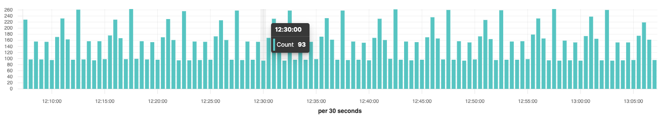
In the chart above, at 12:30:00 the instantaneous event rate is 93 per 30 seconds. What if we wanted to see that in events per second? For that we would just need to divide the value by “bucket size” in seconds, 93 / 30 = 3.1 events per second, this is the average events per second for that 30 second bucket. If we changed the time picker to “Last 24 hours” the bucket size would change to 10 minutes so we would now need to divide the value by 600, this gives us 5.04 events per second for that 10 minute period of time.
Let’s create a visualization in TSVB that always displays events per second, regardless of the time span or bucket size:
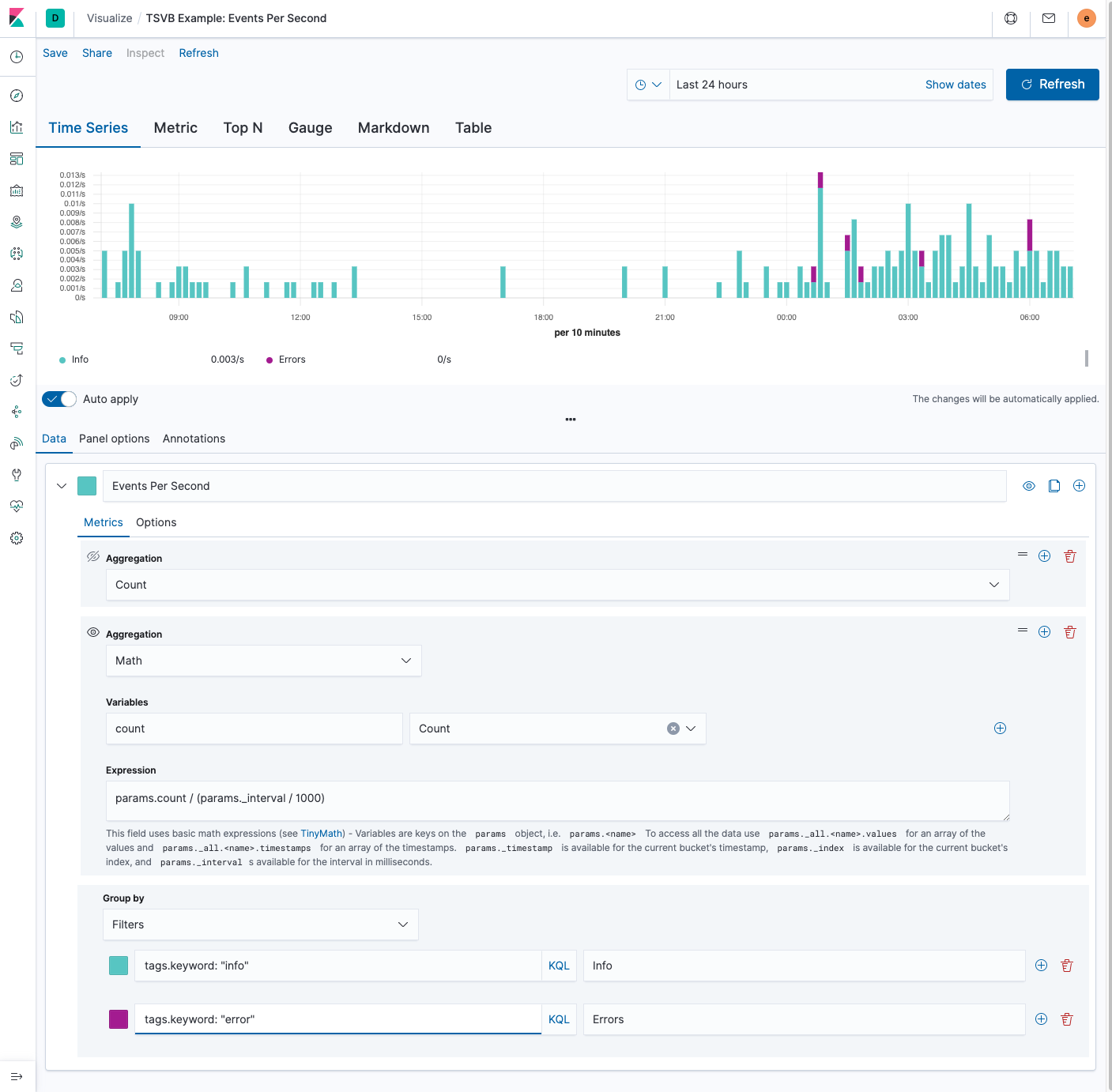
In the screenshot above, we start with the default TSVB aggregation, which is count. Then we add the “Math” aggregation to convert the current rate to a “per second” rate using the following expression:
params.count / (params._interval / 1000)
The “Math” aggregation comes with some built-in variables, described in the help text below the expression input. One of those variables is params._interval which is the bucket size in milliseconds. To convert to a “per second” event rate, we need to first convert from milliseconds to seconds by multiplying params._interval by 1000; then divide params.count by the result. I’ve also set the group by to “Filters” and added some search terms and labels to only display events with “info” and “error” tags. We could also change the “Group by” to “Terms” and use the tag.keyword field to visualize the top ten tags ordered by document count.
Parting thoughts
Visualizing rates really depends on the shape of your metric. Understanding the shape, whether it’s a gauge, counter, or document count, helps guide you towards the right approach. The first thing I do before deciding which approach is to take a peek at the data and try and understand which type of metric I’m working with and how often that metric is being sampled. I like to think that all data has a personality, when we visualize the data we are exposing their traits to the world.
The data in the “Positive rate” and “Rate of change” examples was generated by Metricbeat. For the “Event rate” example, the data is from Kibana’s sample web logs. I exported the visualizations and posted a Gist on Github that you can download and import via Management > Kibana > Saved Objects.
You can try out these tricks on your installation by going to the "Visualize" app in the Kibana sidebar, selecting new, and choosing TVSB. If you don't have an installation, you can get a free trial of the Elasticsearch Service on Elastic Cloud, or you can download the Elastic Stack and run it locally.