Kibana 5.5.0 released
Hello, and welcome to the 5.5.0 release of Kibana! This is another release that is filled with great new features as well as more than 40 bug fixes and more than 60 enhancements. The great new features include filtering in the Context View, an interactive Filter Editor in Discover, Cross Cluster search support, Dashboard cloning, Machine Learning support in Monitoring, a Grok debugger, and new Gauge and Region Map Visualizations!
Kibana 5.5.0 is available on our downloads page and on Elastic Cloud. When you’re finished reading, take a look at the complete release notes for all the goodies.
Discover
Apply filters to the context query #11466
There is now a filter bar in the Context View allowing you to apply new filters to the query. It also copies the currently defined filters when switching in and out of Context View. New filters can be added from within the Context View using the icons in the expanded detail rows.
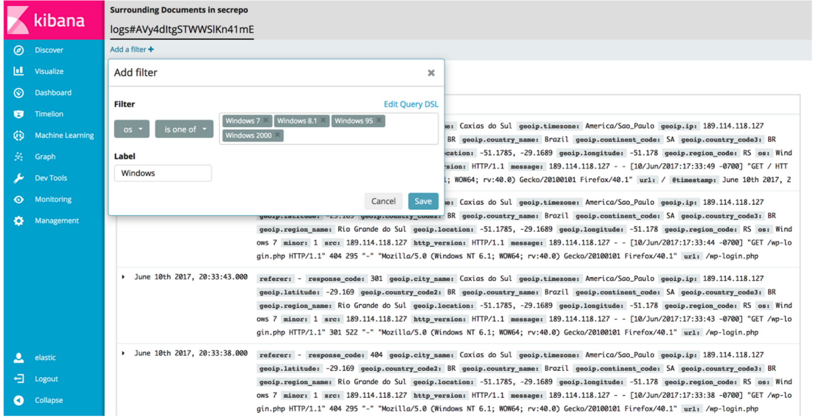
Filter Editors #11375
We've added more helpful input controls for editing filters. When you edit a filter, you'll get drop-downs and text boxes with suggestions from your data instead of just a JSON editor. We've also added the ability to add custom filters without having to click on a visualization.
Platform
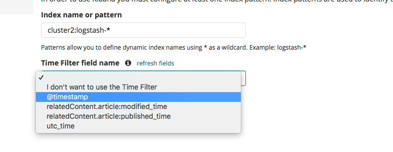
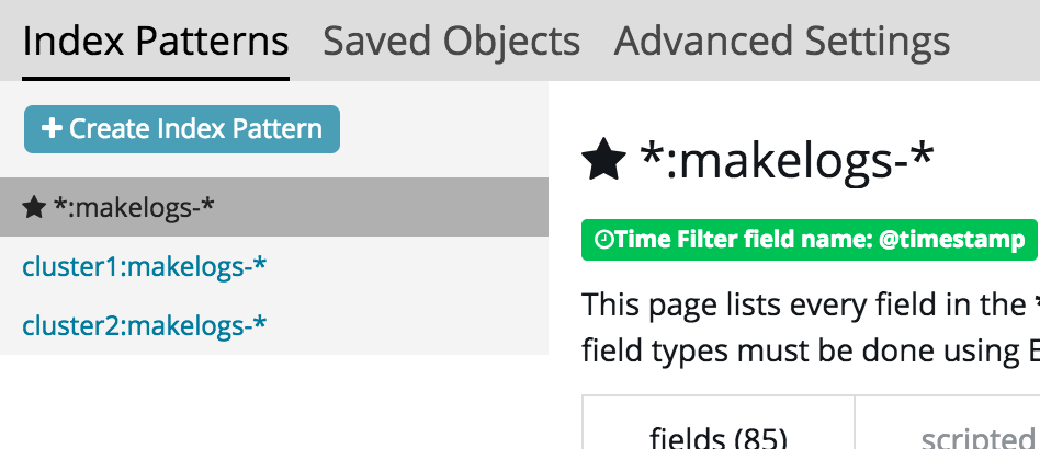
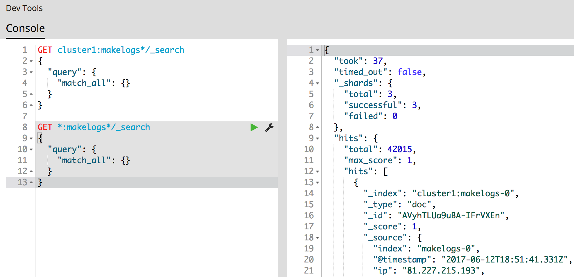
Support Cross Cluster Search #11114
Index Patterns can now point to indices from remote clusters when using Elasticsearch's cross cluster search feature. After setting it up in Elasticsearch, just mention the remote cluster alias in the index name like so: remoteCluster:indexName. Now you can search across clusters without Tribe nodes!
Dev Tools
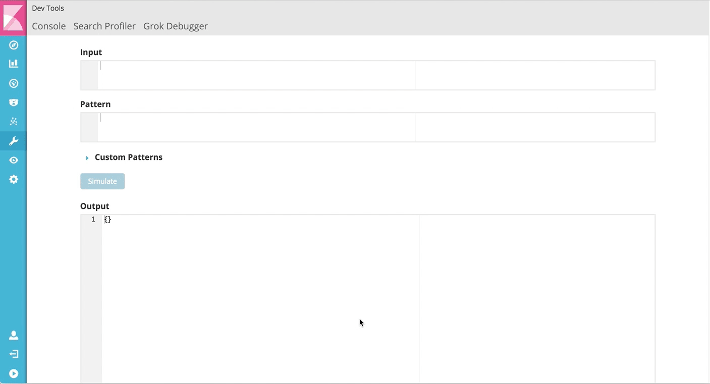
Grok Debugger
Grok Debugger is a new developer tool in X-Pack that will help you build and test grok patterns. It takes inputs for sample log lines and a grok pattern and will simulate the output of a document.
Monitoring
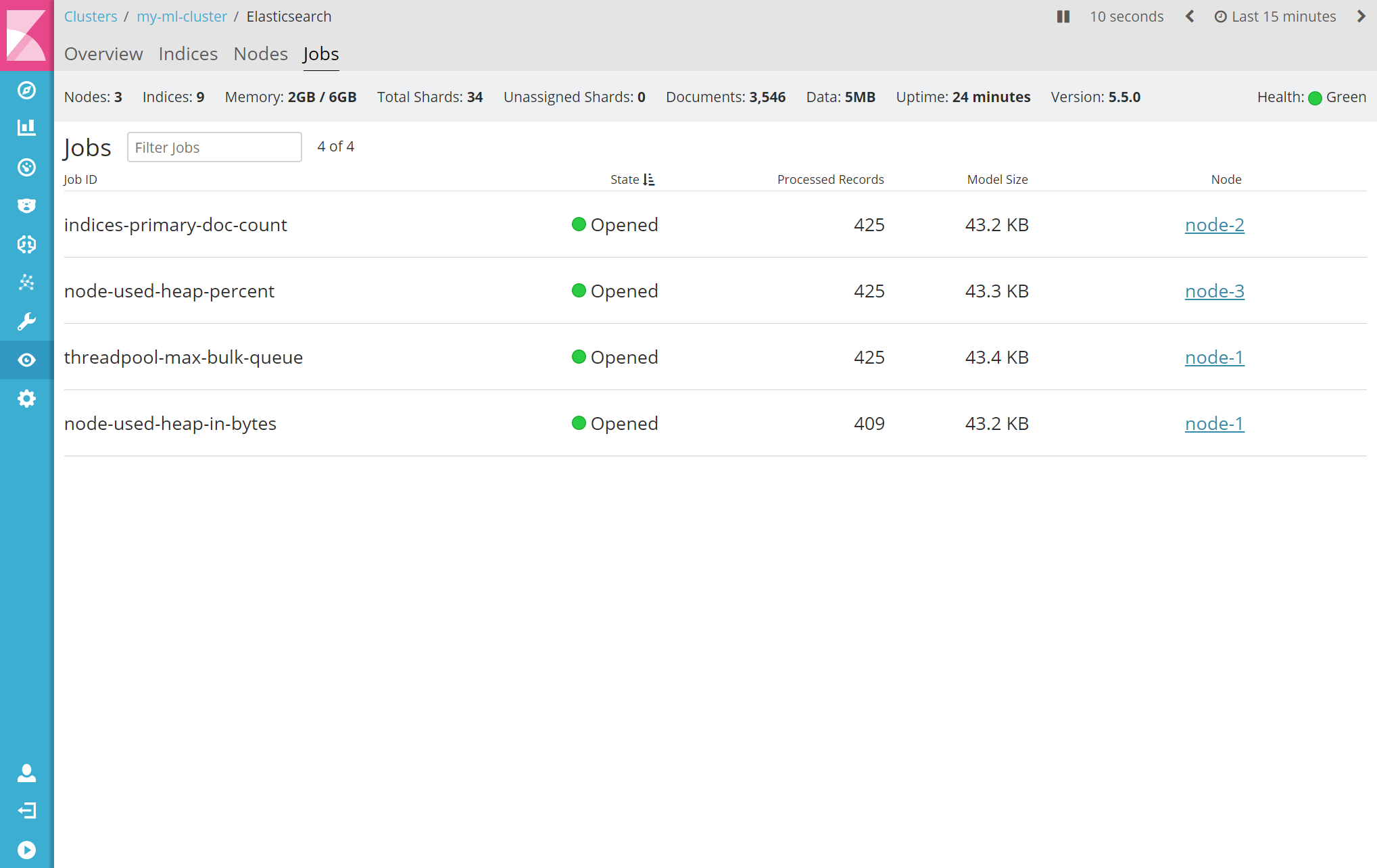
X-Pack Monitoring now includes data from your Machine Learning Jobs! This information allows you to observe historical trends, such as which Elasticsearch node a specific job is running on, the number of processed documents, and the job's state over a set interval of time. To find your jobs, simply select the new "Jobs" tab when monitoring your Elasticsearch cluster. Future releases will dive even deeper with the integration between Monitoring and Machine Learning so that you can further understand the flow of data when working with Machine Learning. As the screenshot shows, one job was started without selecting the full index range. It also shows how jobs are balanced across nodes. The "Jobs" tab is at the Elasticsearch cluster level alongside the Overview, Indices, and Nodes.
Sharing
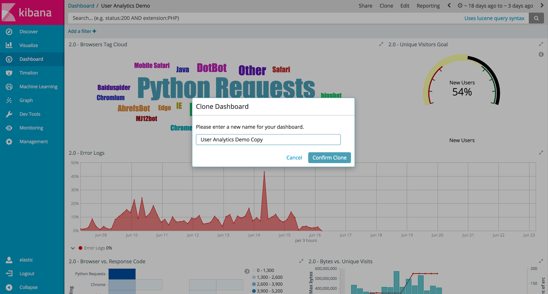
Clone Dashboards in View Mode #10925
Introducing the ability to easily clone dashboards in view mode. Just click the new button in the top navigation, and enter in a new dashboard name.
Visualization
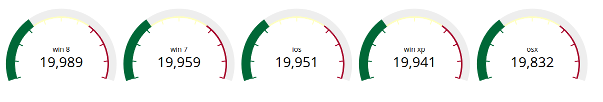
Gauge Chart #10336
The gauge and goals charts are two new visualization types that allow people to track a metric and display the in context of a set of reference values. Gauges are useful to indicate how a metric compares to a range of threshold values, for example, to show whether a server load is within a normal range or instead has reach critical capacity. Goal visualizations are similar, but are primarily used to indicate how far a metric is removed from a certain target value. Also, Metric visualizations now support custom ranges and styling of text and background colors.
Region Map #10937
Kibana now has the Region Map Visualization. These are thematic maps in which boundary vector shapes are colored using a gradient, with higher intensity colors indicating larger values and lower intensity colors indicating smaller values. These are also known as choropleth maps. In order to color these layers, users specify a terms aggregation that matches a field in the vector layer. Kibana offers two vector layers by default; one for countries of the world and one for US Shapes. Users can also bring in their own vector layers by configuring the Kibana-configuration file to point to any GeoJson file that is hosted on a CORS-enabled server.

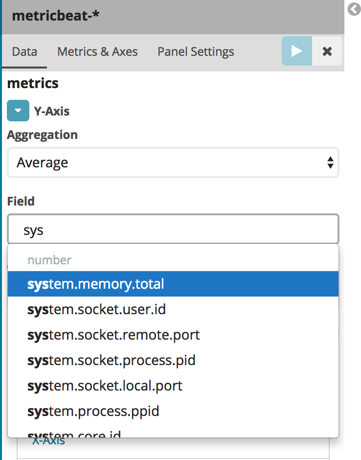
Auto-complete for fields in Visualize
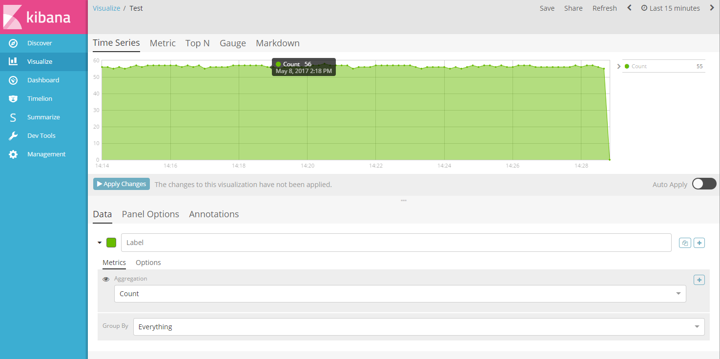
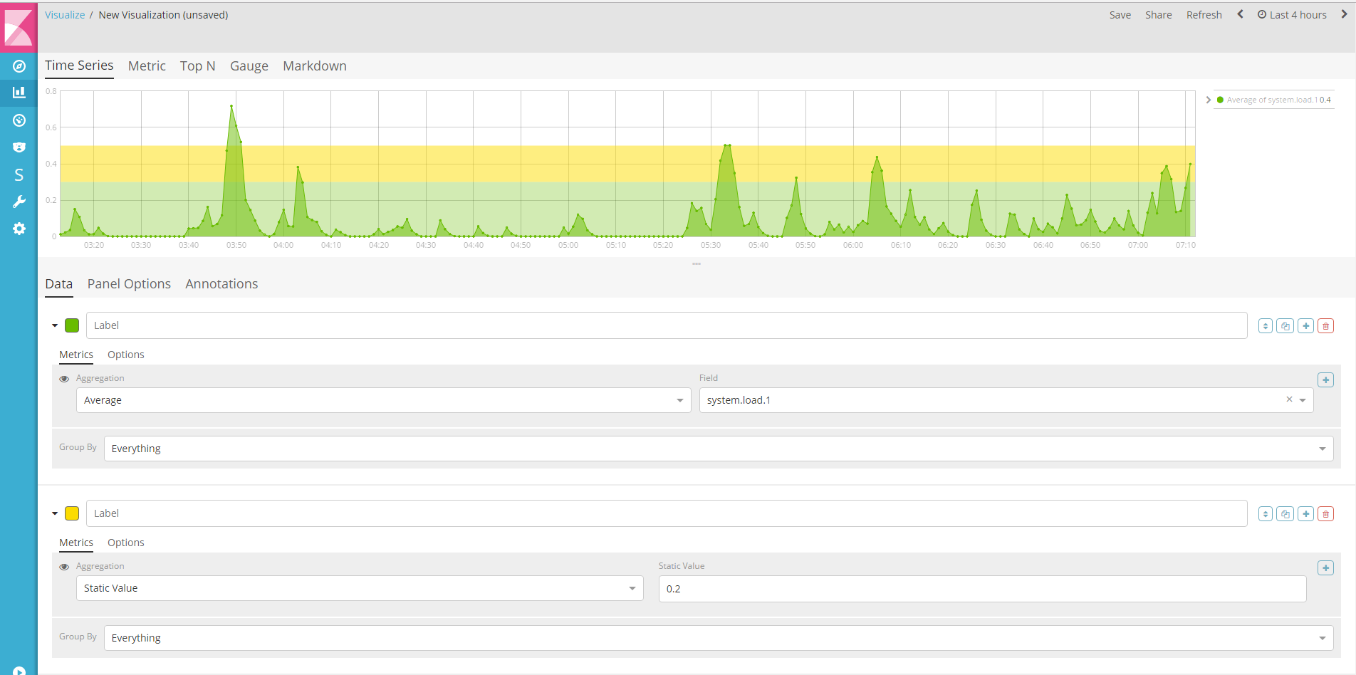
Time Series Visual Builder
You can now create static series, this allows for adding background colors and threshold markers to charts. #11496
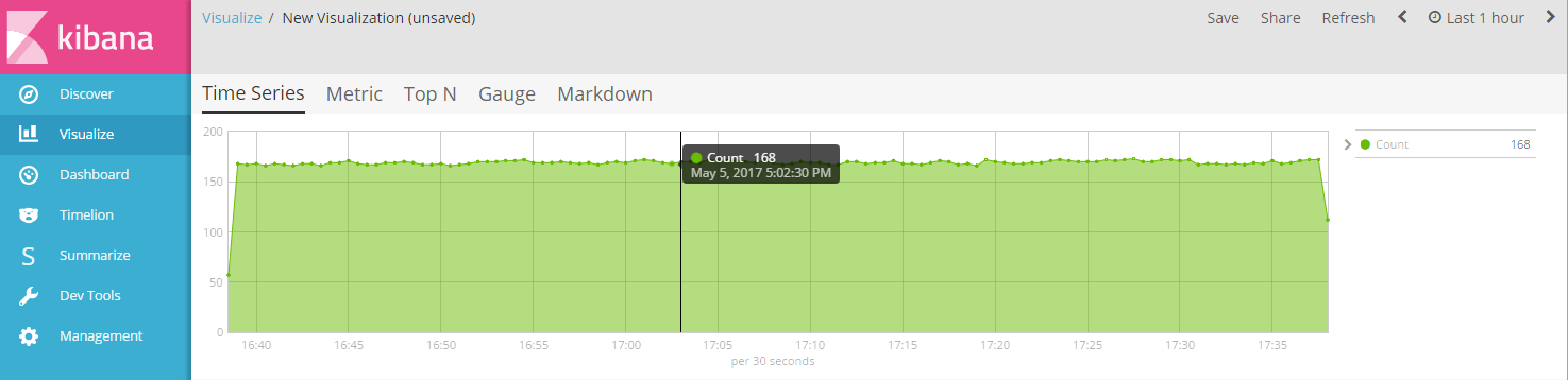
We've added an x-axis label to the Time Series visualization for the Time Series Visual Builder that displays the interval size. For something with 10000 milliseconds it will display 'per 10 seconds'. This also changes the date format of the tooltip to display seconds. #11693
We also changed auto apply feature in Time Series Visual Builder by adding a button to the interface to apply changes when the user has made a change (when auto apply is disabled). This also adds a toggle to turn on or off the auto apply feature. #11460