Hiking the Pacific Crest Trail with the Elastic Stack
My name is Alex Francoeur and I’m one of the Product Managers responsible for Kibana. I am also the oldest of three brothers. For as long as I can remember, I have felt responsible for my brothers overall well being and safety. If you need proof, I have home videos of me outsmarting a few preschool playground bullies trying to steal my brothers frisbee.
Today and in subsequent blog posts I’ll be telling a story about my brother, Mike Francoeur. Mike is a three Michelin star chef and has worked at some of the best restaurants in the world. With a resume ranging from Jean George in New York to Saison in San Francisco, he is truly a world-class chef. If you’ve ever seen any cooking challenge show on the Food Network, that’s his life x 1000. As you can imagine, being a chef can be quite a stressful job. Long hours in a hot kitchen, standing on your feet for 10 - 12 hours every day and serving up food to some of the most successful people in the world.

After many years of working his way up in the industry, he decided to dedicate time to a mental and physical reset. My younger brother is taking 6 months off from the grind in the kitchen to hike the Pacific Crest Trail. And no, this decision has nothing to do with the Reese Witherspoon movie Wild. He has made this explicitly clear to me many times.
And what did I do? Probably the most older-brother thing to do. I decided to track and watch over him using the latest version of the Elastic Stack. As I write this post my brother is a little over a month into his trek, he’s doing fantastic and I’ve been with him every step of the way.

Getting the data in
After much back and forth, my family was finally able to convince Mike to get a GPS tracker that simply tells us he’s OK once a night. For just under $200 my brother purchased a SPOT.
I’m working fairly close with the Kibana Geo team these days and had an epiphany, wouldn’t it be cool if I could track my brother using Elasticsearch’s and Kibana’s geospatial capabilities? Honestly, it was a shot in the dark but lo and behold SPOT actually had an API. You can view that API documentation and example XML/JSON responses here. I’ll admit, the API is a bit lackluster. Luckily all I needed was the geo coordinates to really start having fun with the data. Knowing that the service only stored location history for 7 days also gave me the incentive to store it elsewhere so my brother can recount his entire trip.
There were a few key values I wanted to make sure I captured from the API. The latitude, longitude, messageType, messageContent and batteryState. I started off small and created a simple python script that simply pulls in the latest check in from SPOT and ingests it into Elasticsearch. To do this, I used our elasticsearch-py client in a python script running on a 2nd generation raspberry pi in my basement.
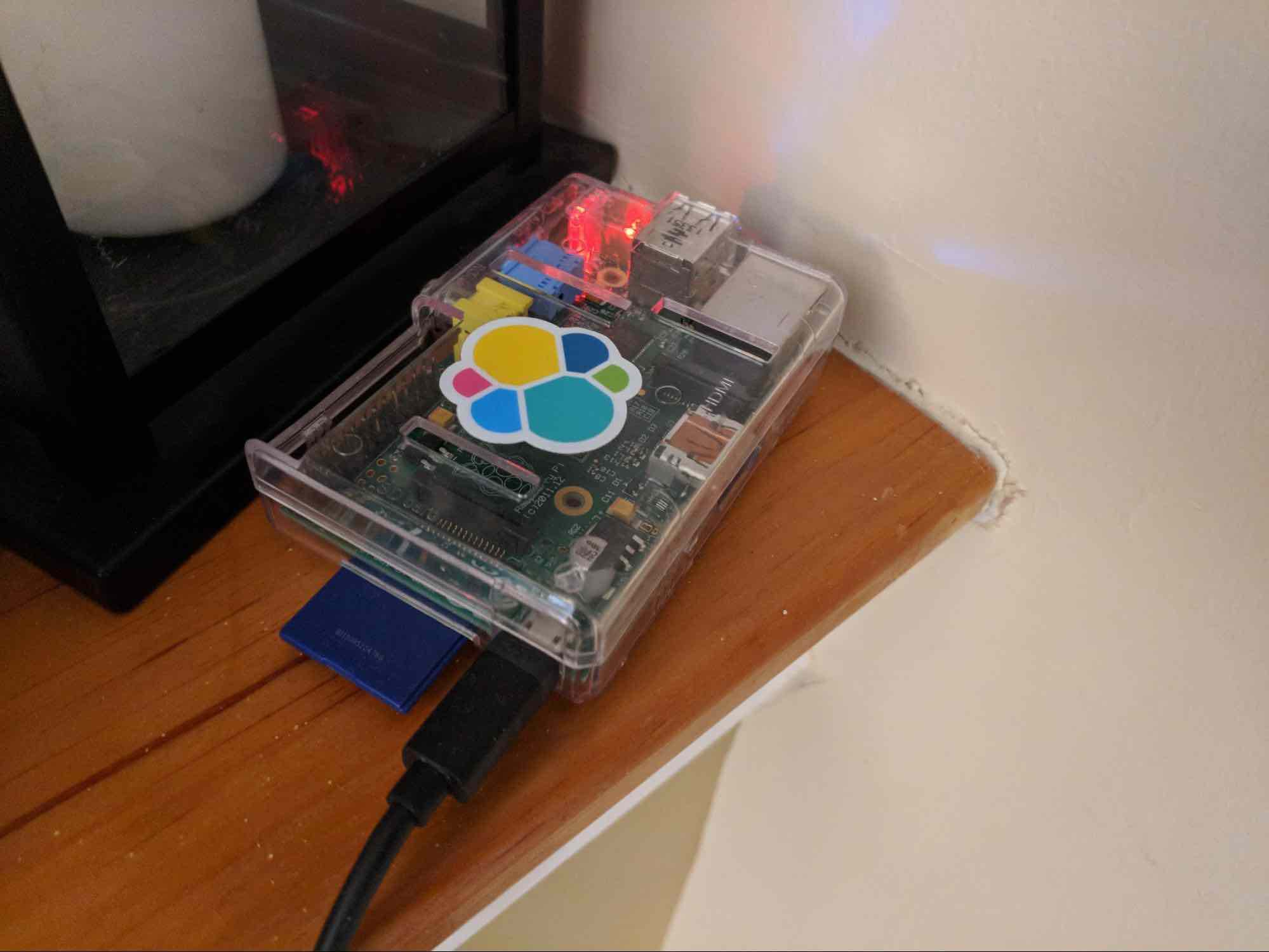
All of my data was hosted on our cloud service, Elastic Cloud, which allows me to easily update between versions with the click of a button. This is great because we have some awesome new features coming up in 6.3 that I’d like to take advantage of. A shameless plug I know, but it’s the truth.
This was all pretty easy to put together, the hard part was convincing Mike to turn on his GPS tracker in between shifts so I could test it out.
More than just latitude and longitude
Take a step back and think about this for a second, geo data is everywhere and you likely take full advantage products that utilize this data on a regular basis - whether you know it or not. With this in mind, I started to think about what type of questions I’d like to answer and what API’s might be out there to help augment my lonely latitude and longitude.
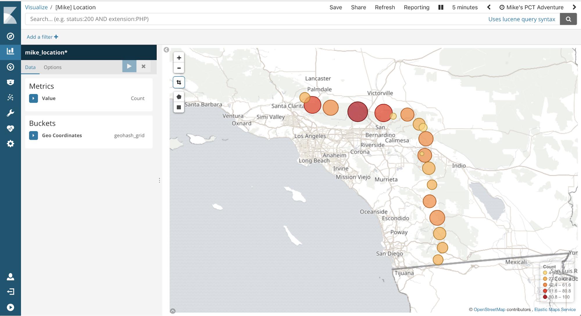
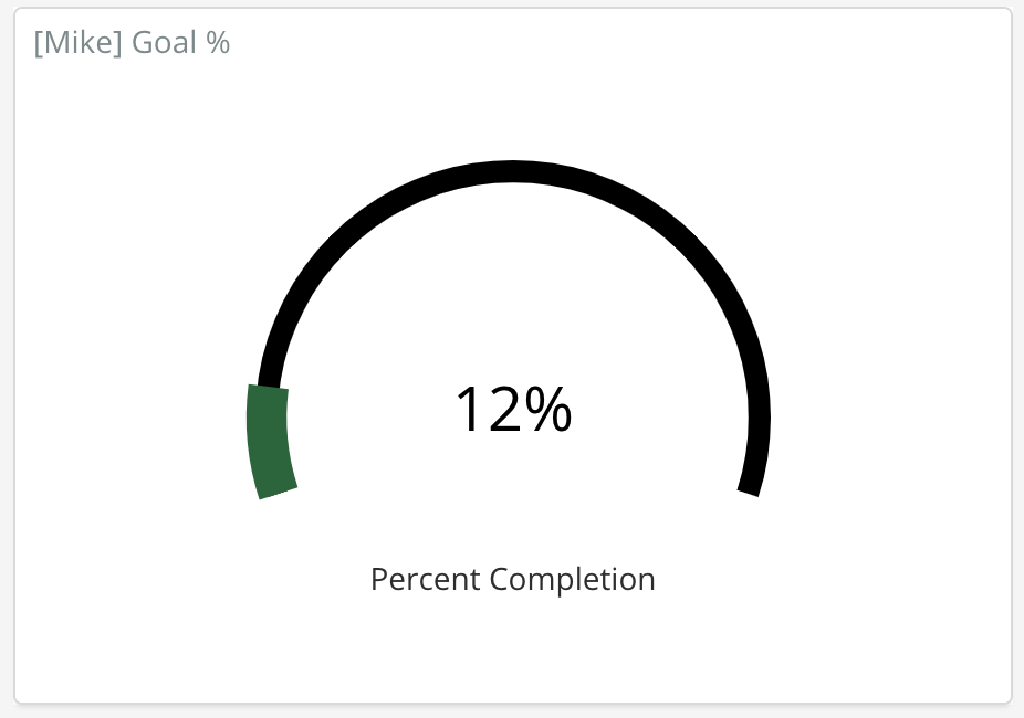
The PCT is located on the Western side of the United States and spans 2,650 miles from the Mexican border and into Canada. As you might imagine, there will be some tremendous shifts in weather. From hiking through the desert in Southern California to scaling the Sierra’s with an ice pick. Well, wouldn’t it be great to know the weather conditions of where my brother is at?
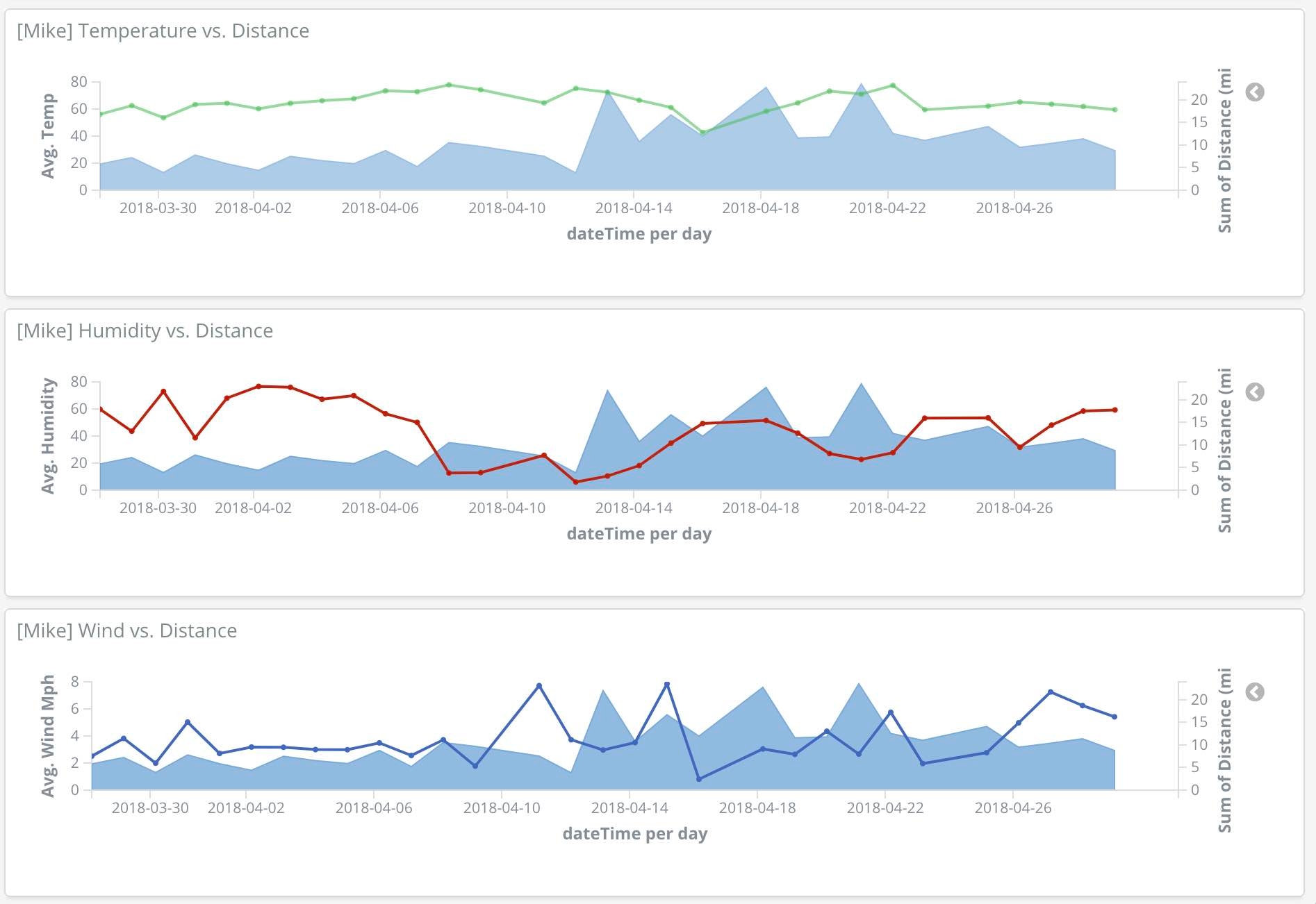
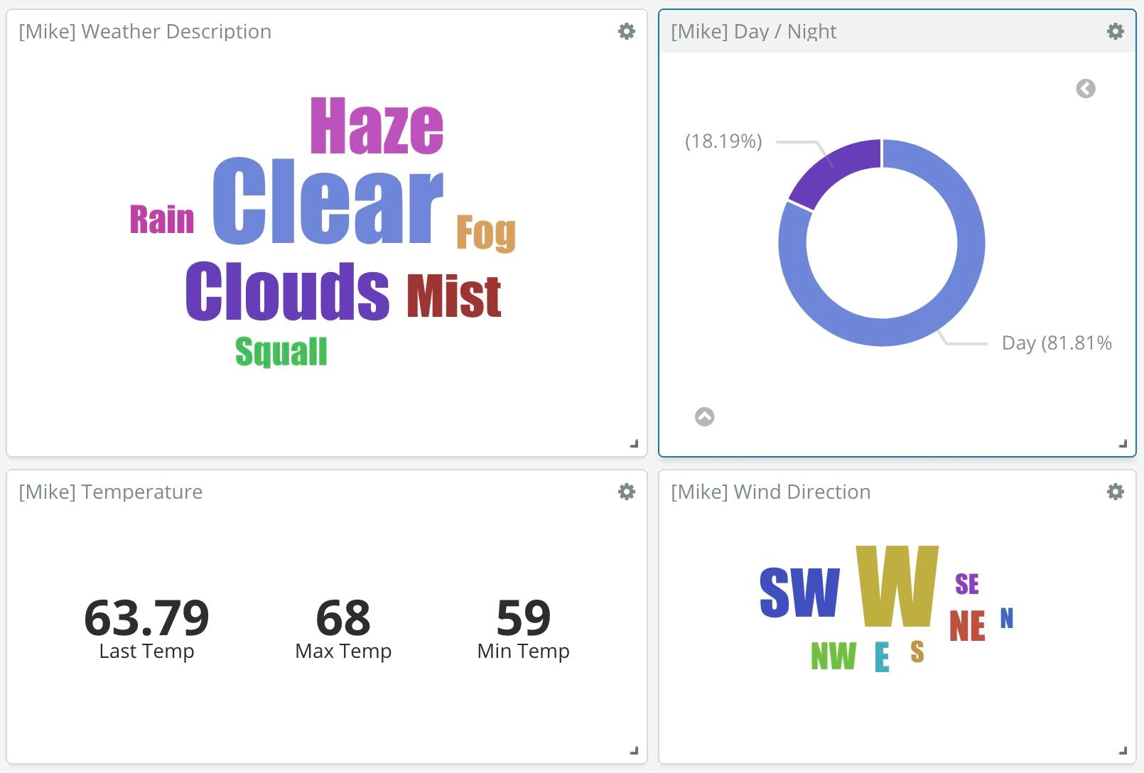
Openweathermap.org provides a substantial amount of information in their open source API. And to unlock all of the goodies that OWM provides, all I need is a latitude and longitude. That of course and this handy dandy python wrapper, pyowm. With weather data I can now better understand how things like heat, humidity, wind speed / direction and general weather affect my brothers day to day activities. Not to mention, I can see if he’s trying to do something stupid like hike in a desert surrounded by rattlesnakes in the middle of the night now that I have sunrise and sunset times (yes, he did; many times).
Adding more dimensions
At this point I have geo points for each check in and some additional weather data. What I really want to understand is how far my brother has traversed and how things like elevation will affect his hike. It was around this time that I discovered Google Maps API’s and how easy to use they are. Google offers a nice Python library called google-maps-services-python. And what do you know, all you need is a latitude and longitude to harness the power of Google Maps and the API’s available.
First and foremost, I wanted to understand the true distance between check-ins. To calculate that, I was able to use the same Google Distance Matrix API that your phone’s GPS uses for walking directions. SPOT only checks in every 10 minutes, so I figured calculating the difference between the most recent point and the previous one would provide me with all I needed. For the most part, this worked but if my brother happened to forget to turn on his SPOT and walk a far distance then I’d see a jump in a single datapoint that’s been ingested. For the overall sum of distance that’s not a problem, but it can sometimes make for an inaccurate time series chart.
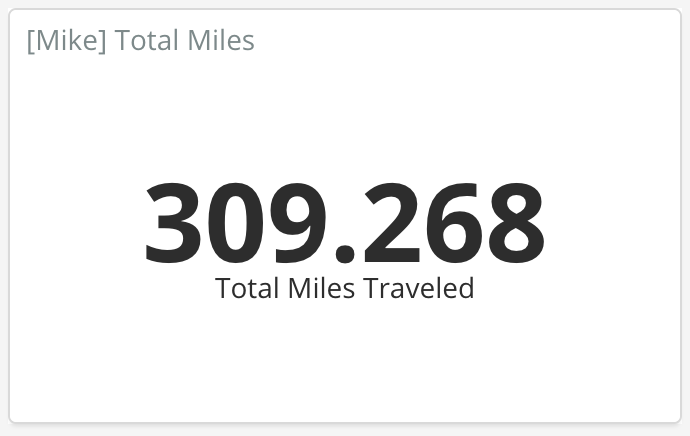
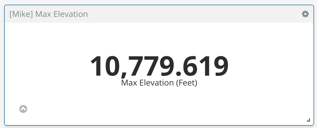
Another dimension I was really interested in understanding better was elevation. How much less distance would my brother cover if he’s climbing the peak of a mountain? Google Maps also offers an Elevation API. Utilizing the API endpoint provided by the python client, I was able to easily gather the elevation for any of the geo points provided. This allows me to easily calculate things like Max Elevation for his hike but opens the door for even more interesting analysis.
Taking advantage of what Kibana has to offer
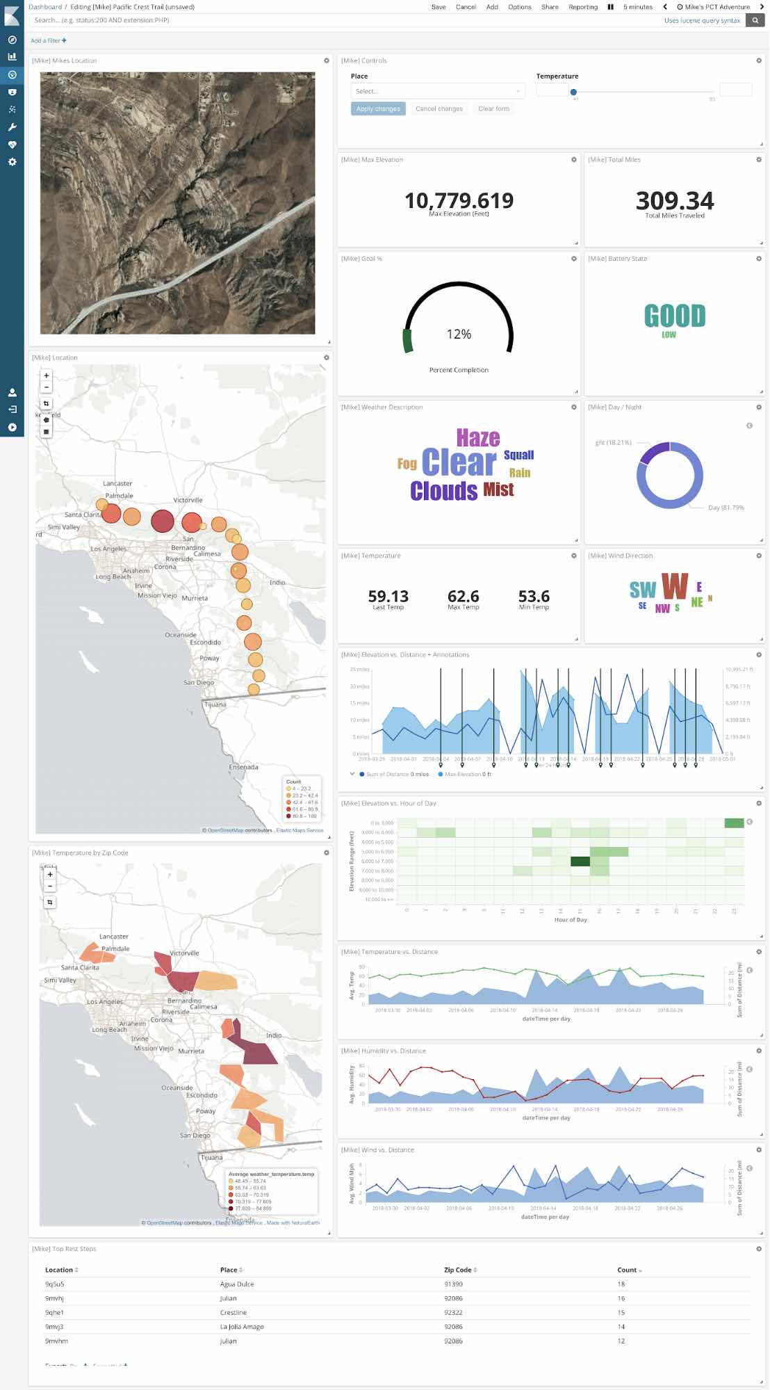
Now that I have a fair bit of data to play around with, I can begin to tweak Kibana for my needs and create visualizations that will help analyze my brothers progress.
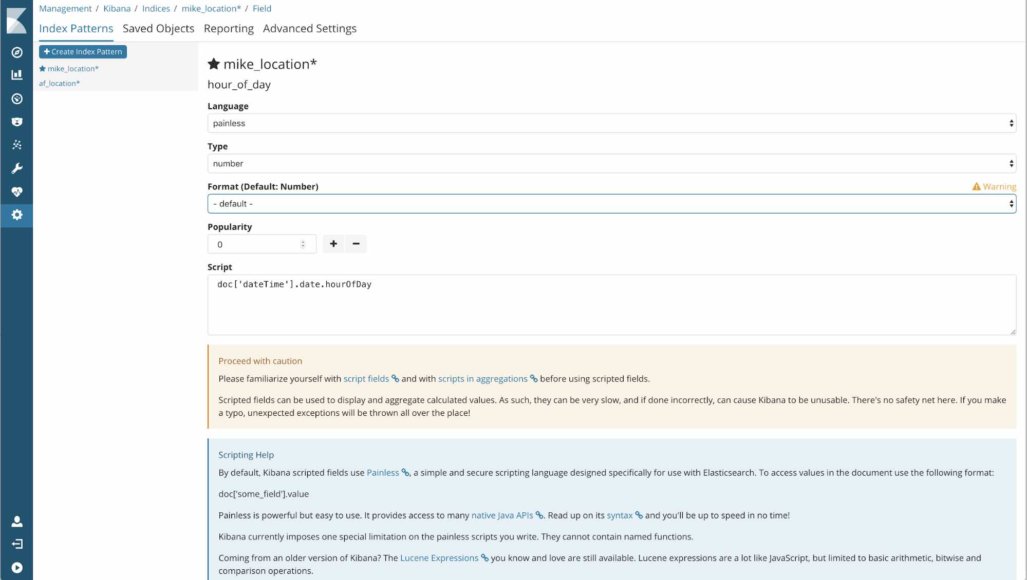
Utilizing some of my new dimensions, I really wanted to see how elevation and time of day affects my brothers distance travelled. To best represent these arbitrary values on an a x and y axis, I decided to use the heatmap visualization. In order to bucket my x axis by hour of day, I utilized Kibana’s scripted fields. My scripted field is as basic as they get and simply uses some of the date functions available in Elastic’s Painless scripting language,`doc['dateTime'].date.hourOfDay`.
For additional information on scripted fields check out the documentation and this blog post.
Once I had the hour of the day, the rest of the visualization was pretty straight forward. I wanted to show the total miles traveled for certain ranges of elevation. With hour of day as my x-axis, I added a range aggregation on my y-axis for the elevation and the sum of miles traveled as the metric. The end result looks something like this.
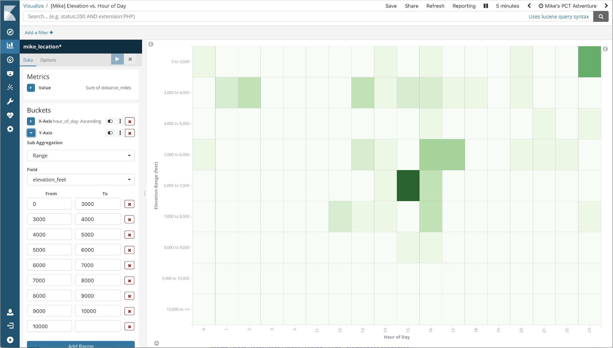
As expected, you’ll noticed most of my brothers travel happens in the middle of the day - when he’s not breaking down or setting up camp.
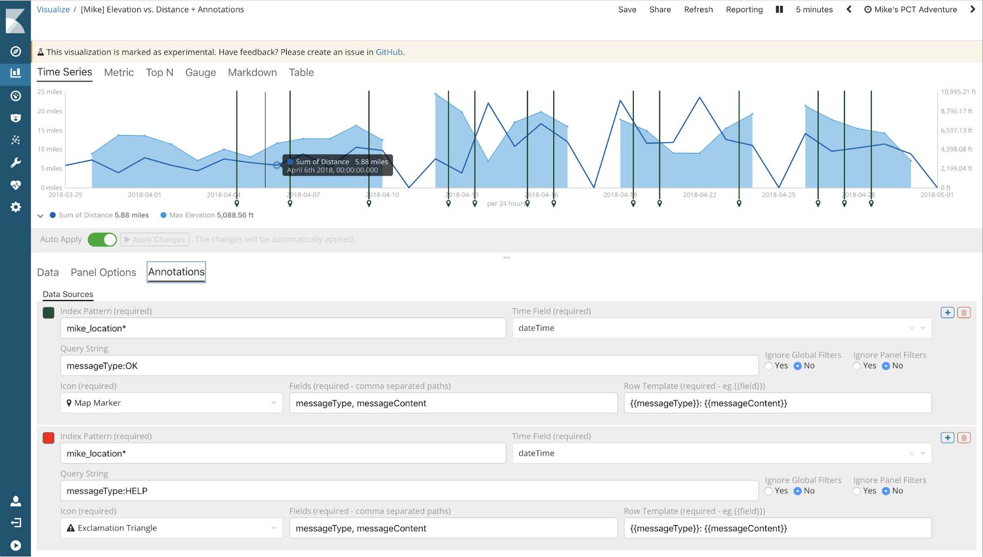
Another visualization I was interested in showing was how the max elevation for a day affected my brothers distance traveled over time. Are his legs getting stronger with each day? Can he hike up a measly 4,000ft peak like he’s taking a walking in the park? I imagine that over time, elevation will have less and less an effect on his distance traveled. To visualize this, I decided to use the Time Series Visual Builder as it offers a number of customization options for both formatting the data and providing annotations inline with a chart. In the example below, you’ll notice I have added annotations specifically for when my brother checks in with an “everything is alright” message or if for any reason he’s flagged for help.
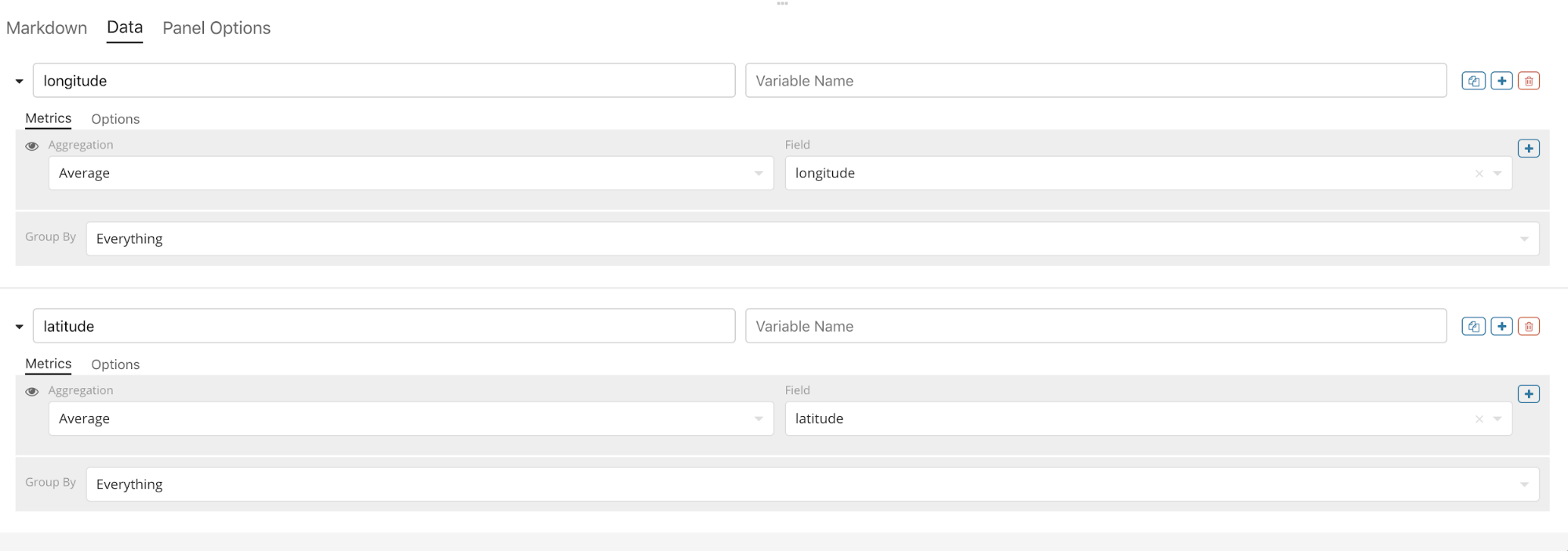
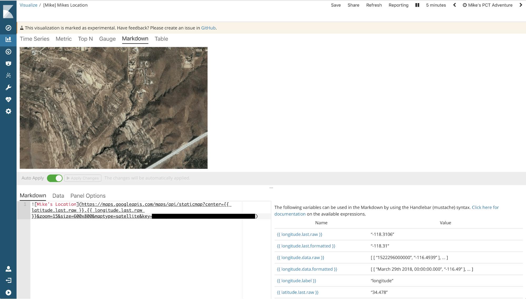
One of my more favorite visualizations I have added to this dashboard is a Markdown visualization with the Time Series Visual Builder that uses the Google Maps Static Maps API. With this API, I am able to provide a satellite image of my brothers location for whatever the time range is I’ve specified.
In this case I am providing the average latitude and longitude as metrics with a minimum bucket of 1 day. The configuration looks like this.
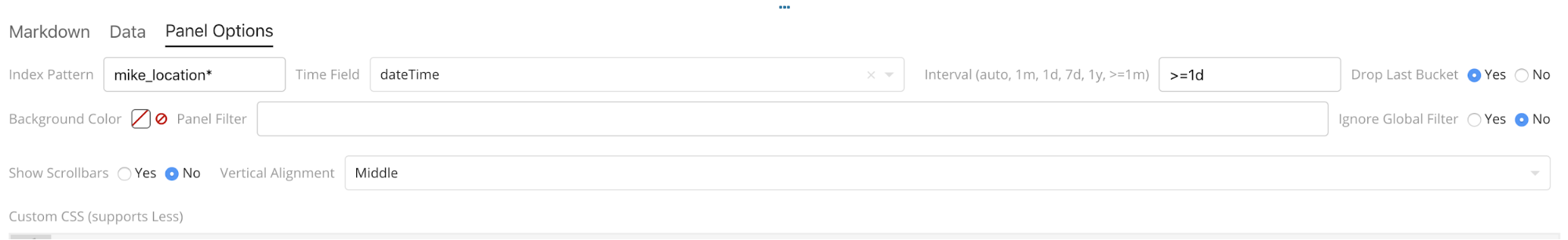
This will provide me with the average latitude and longitude for the last full 24 hour bucket. After a bit of research, I determined that zoom level 15 gives me about 22 miles. That’s about what my brother travels in a day and seemed appropriate for the dashboard.
In 6.3 we plan to introduce the Top Hit aggregation to the Time Series Visual Builder. Once this is available, I’ll likely switch to Top Hit to provide the most recent location rather than an average for lat / lon for the day.
A parent friendly dashboard
Now in order to make my data approachable by all, there were a few new Kibana features I wanted to take advantage of.
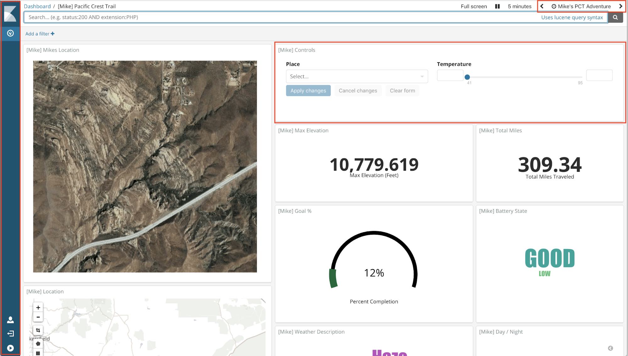
Ideally, I’d like my baby-boomer parents to be able to interact with this dashboard but I really don’t want them messing with any of my Kibana configurations. In 6.0 we introduced the absolute perfect feature for such a use case, Dashboard Only Mode. With Dashboard Only Mode I can provide my fairly non-technical parents with a login that only allows them to see dashboards within my Kibana instance and nothing else. This feature is perfect for parents who scream at their phones to text message or for your CTO who you don’t necessarily want peeking into your raw log files.
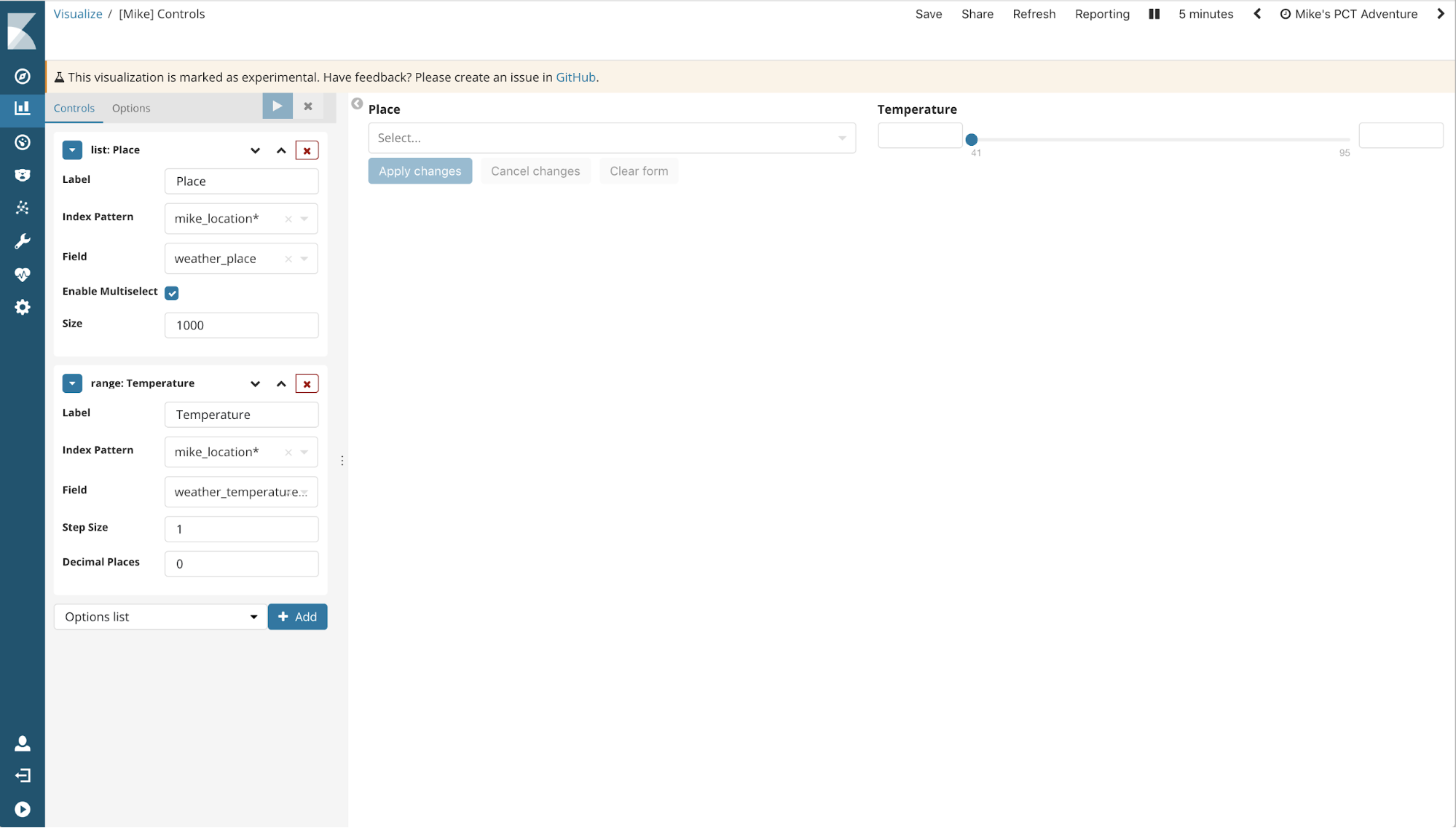
Another new feature I wanted to take advantage of was input controls. This is a new visualization type that was introduced in 6.1 that allows you to fully curate the dashboarding experience. For instance, I do not expect my parents to understand lucene query syntax. However, they are very familiar with making selections from a drop down menu or using a slider to narrow down a search. These components are common across the web and can now be fully integrated into your dashboard. In this case, I’ve created input controls for a place my brother has visited and the temperature he’s hiked during.
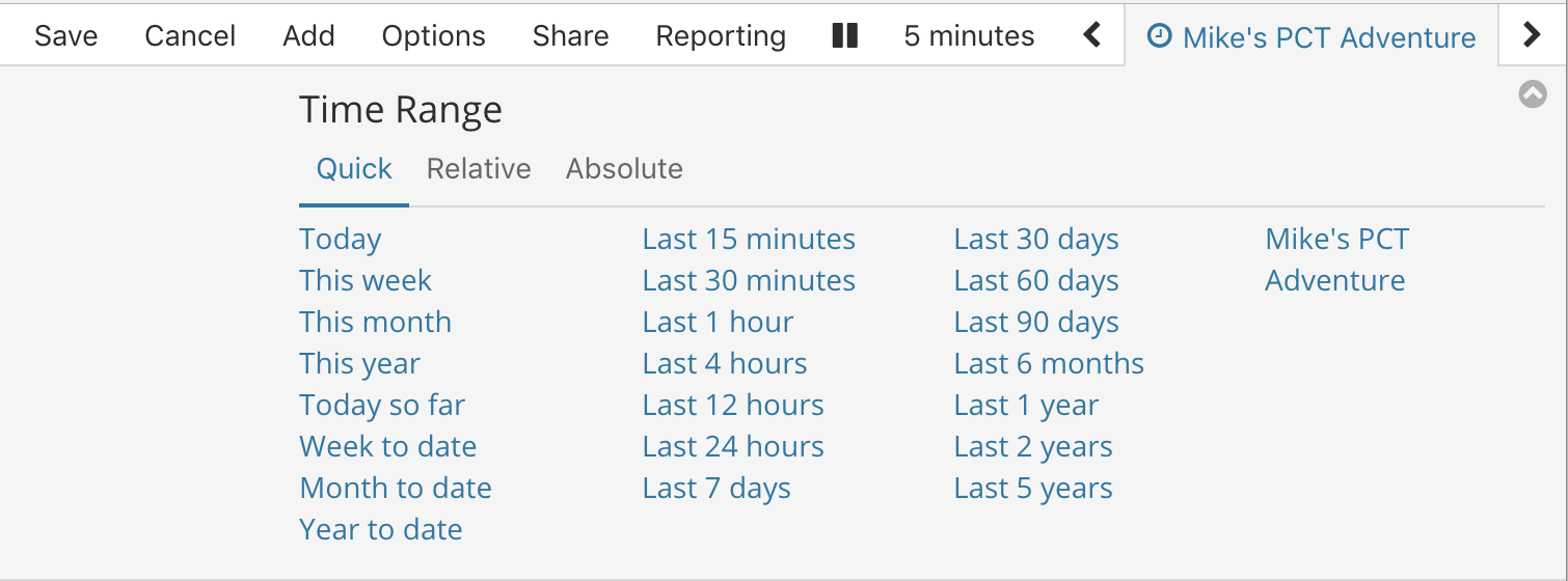
Last but certainly not least, I made a quick adjustment to the time filter. I didn’t want anyone to have to select a relative or absolute time range to have to see my brothers entire trip. So I decided to take advantage of a new 6.2 feature that allows you to completely customize quick time ranges from the dropdown. This is now a configurable advanced setting called `timepicker:quickRanges`.
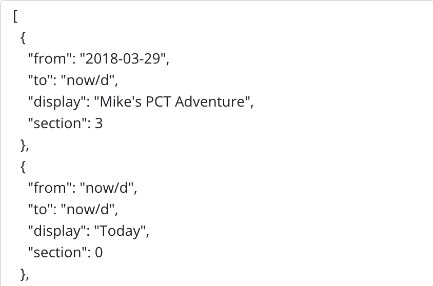
Once configured, the new custom time range now becomes part of your quick selections. If I set this and store the time with the dashboard I now have a default time range that encompasses my brothers entire trip.
A brief analysis of Mike’s activity
There is a lot to be learned with this dataset, but one of the easiest things to capture is when my brother takes a break. I can tell my brother is not hiking in one of two ways. He either has his GPS device on and is not moving from a single location or there are simply gaps in the chart where his SPOT is turned off. Needless to say, aggregated data is much easier to use than no data. So if I apply filters on a geohash or geo centroid bucket with a high count, I’m able to easily identify when my brother needs a breather.
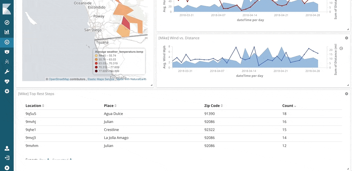
If you take a look at the gif above, you’ll notice that Google’s satellite imagery and the map visualizations quickly show when he’s having a beer or an absurd amount of fast food to carb up.

At the time of this blog post, I have under 1000 documents indexed in Elasticsearch for analysis. Over the next few months, I plan to add additional ingestion enhancements and determine more trends, patterns and findings as more data comes in.
In the coming months
My dashboard to monitor, track and watch over my brother looks like this today.
Looking ahead, there are a lot of features I’d like to take advantage of that the Elastic Stack offers. In upcoming blog posts I plan to tackle the following.
- Enhance my dashboard and make this data actionable. I’ll be adding new visualization types for analysis such as Vega, scheduling PDF reports to send to my family and proactively monitor my brothers GPS battery, extreme weather conditions and HELP message types with Watcher.
- Use Elastic’s Machine Learning capabilities to proactively detect anomalies in my brothers performance and forecast / predict his mileage.
- Brand and create pixel perfect reports with Kibana Canvas. I’d also like to augment my workpads with additional data sources such as Google Photos or Instagram.
Hiking for a good cause

If you’ve enjoyed this blog, appreciate my brothers journey or just generally like when chef’s do crazy things please feel free to donate to my brothers American Suicide Foundation campaign. He is raising money for a cause that hits close to home for a lot of chefs in the industry and he would appreciate even the smallest of donations. As a fun incentive, if enough donations are received we can make the dashboard public so all can track his progress in real time. This way everyone can know exactly when my brother has taken a break to have a cold one in town.