Implementing a Statistical Anomaly Detector in Elasticsearch - Part 1
This graph shows the min/max/avg of 45 million data points (75,000 individual time series over 600 hours). There are eight large-scale, simulated disruptions in this graph...can you spot them?
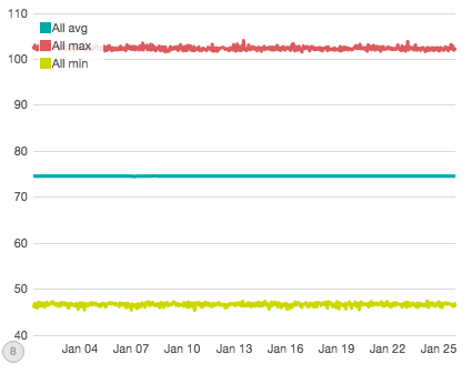
No? It’s ok, I couldn’t either. When you aggregate all your data together into a single graph, the variability of your data tends to smooth out all but the most obvious changes. In contrast, here are a random selection from the 75,000 series that make up the first graph:
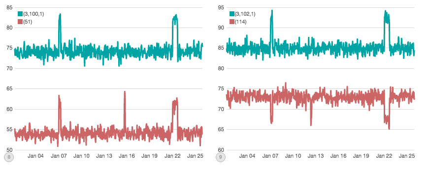
These individual charts make it obvious where disruptions might be occurring. But now we have a new problem: there are 75,000 such charts to keep an eye on! And since every chart has its own dynamic range and noise profile, how do you set a threshold for all of them?
This conundrum is faced by many companies. As data collection increases, we need new ways to automatically sift through the data and find anomalies. This is exactly what eBay has done with their new Atlas anomaly detection algorithm.
The authors of the algorithm realized that any individual series may look anomalous simply due to chance so simple thresholds won’t work, while at the same time aggregating all the data together smooths the data out too much.
Instead, Atlas aggregates together correlated changes in the variance of the underlying data. This means it is robust to noise, but remains sensitive enough to alert when there is a real, correlated shift in the underlying distribution due to a disruption.
After reading the paper, I wanted to see if it could be implemented in Elasticsearch. Over the next three parts of this article, we’ll be exploring how Atlas works and how to build it with a combination of Pipeline aggregations, TimeLion graphs and Watcher alerts. To give you a sneak peak, our final chart will look like this:
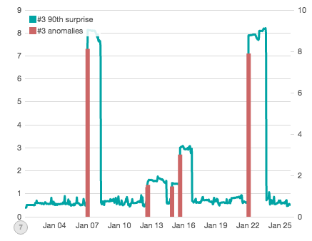
Which accurately places an “anomaly bar” on top of each simulated disruption that was generated for this subset of data. Let’s get to it!
Simulating a production cluster
The first order of business is to generate some data. Since we aren't eBay, we'll have to settle for simulated data. I wrote a quick "Production Cluster Simulator" in Rust which generates our dataset. At a high-level, the simulation is very simple:
- There are
nnodes in the cluster - There are
qqueries which are executed against this cluster (imagine they are search queries for products, etc) - There are
mmetrics which are computed against the result of each query - A data-point is recorded for each
(node, query, metric)tuple every hour
To make the simulation realistic, each (node, query, metric) has a unique gaussian distribution which it uses to generate values. For example, the tuple (1,1,1) may pull values from a normal distribution centered on 58 and a width of 2 std, while the tuple (2,1,1) may pull values from a distribution centered on 70 and 1 std.
This setup is important for several reasons. First, the same query and metric combination will have a different distribution on each node, introducing a wide amount of natural variability. Second, because these distributions are normal Gaussian, they are not limited to a hard range of values but could theoretically throw outliers (just statistically less likely). Finally, even though there is a large amount of variability between the tuples...the individual (node, query, metric) tuples are very consistent: they always pull from their own distribution.
The final piece in the simulator is simulating disruptions. Each (node, query, metric) tuple also has a "disrupted" distribution. At random points in the timeline, the simulator will toggle one of three disruptions:
- Node Disruptions: a single node in the cluster will become disrupted. That means all query/metric pairs will change over to their "disrupted" distribution on that node. E.g. if node
1becomes disrupted, all(1, query, metric)tuples are affected - Query Disruptions: up to one-tenth of all queries in the cluster will changeover to their "disrupted" distribution, regardless of the metric or node. E.g. if query
1becomes disrupted, all(node, 1, metric)tuples are affected - Metric Disruptions: one or more metrics in the cluster will changeover to their "disrupted" distribution, regardless of query or node. E.g. if metric
1becomes disrupted, all(node, query, 1)tuples are affected
The disruptions randomly last between 2 and 24 hours each, and may overlap. The goal of these disruptions are to model a wide variety of errors, some which may be subtle (handful of queries which show abnormal results) while others are more obvious (an entire node showing abnormal results). Importantly, these disruptions pull from the same dynamic range as the "good" distributions: they aren't an order of magnitude larger, or have drastically wider spread (which would both be fairly easy to spot). Instead, the distributions are very similar...just different from the steady-state "good" distributions, making them rather subtle to spot.
Find the disruptions!
Ok, enough words. Let's look at some graphs of our data. We saw this graph earlier; it is the min/max/avg of all data across a month of simulated time. I simulated 30 nodes, 500 queries and 5 metrics, polled every hour for 600 hours. That comes out to 75,000 points of data per hour and 45m total.
We already know this graph isn’t super useful, so let’s try to partition the data a bit to gain more insight. The next graph shows Metric #0, which experienced two direct disruptions (e.g. all node/query pairs involving Metric #0 were affected, totaling 15k "disrupted" data-points per hour, for several hours each disruption):
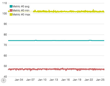
If you squint closely, you can see two minor bumps in the average. Both bumps are indeed caused by simulated disruptions...but only the second bump is actually due to a direct "outage" of Metric #0. The first bump is caused by a different disruption. The other direct outage of Metric #0 we are looking for isn't visible here.
Ok, let's try one last time. What if I told you that Query #204 had a direct outage where all node/metric pairs involving #204 were affected? Can you see it on this graph:
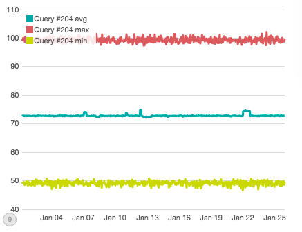
Well, you can see some disruptions to the average...but none of those are the direct disruption (they are related to other disruptions to individual nodes or metrics).
Ok, so at this point I think you can appreciate the subtlety of these disruptions. They are very small, and even when you have foreknowledge about which chart to look at it can be very hard to pin down the error. If you don't know a disruption is occurring, you have to monitor all the individual time-series (which is not feasible at eBay’s scale).
Implementing Atlas in Elasticsearch
The first step is to design a set of aggregations. Here is the final query, which we'll walk through step-by-step:
{
   "query": {
      "filtered": {
         "filter": {
            "range": {
               "hour": {
                  "gte": "{{start}}",
                  "lte": "{{end}}"
               }
            }
         }
      }
   },
   "size": 0,
   "aggs": {
      "metrics": {
         "terms": {
            "field": "metric",
            “size”: 5
         },
         "aggs": {
            "queries": {
               "terms": {
                  "field": "query",
                  "size": 500
               },
               "aggs": {
                  "series": {
                     "date_histogram": {
                        "field": "hour",
                        "interval": "hour"
                     },
                     "aggs": {
                        "avg": {
                           "avg": {
                              "field": "value"
                           }
                        },
                        "movavg": {
                           "moving_avg": {
                              "buckets_path": "avg",
                              "window": 24,
                              "model": "simple"
                           }
                        },
                        "surprise": {
                           "bucket_script": {
                              "buckets_path": {
                                 "avg": "avg",
                                 "movavg": "movavg"
                              },
                              "script": "(avg - movavg).abs()"
                           }
                        }
                     }
                  },
                  "largest_surprise": {
                     "max_bucket": {
                        "buckets_path": "series.surprise"
                     }
                  }
               }
            },
            "ninetieth_surprise": {
               "percentiles_bucket": {
                  "buckets_path": "queries>largest_surprise",
                  "percents": [
                     90.0
                  ]
               }
            }
         }
      }
   }
}
It's long, but not super complicated. Let's start looking at the components individually. First, we set up our query scope with a simple filtered query (or bool + filter if you are on 2.0) over a time range. We'll use this to generate data points for each 24 hour window in our data:
"query": {
   "filtered": {
      "filter": {
         "range": {
            "hour": {
               "gte": "{{start}}",
               "lte": "{{end}}"
            }
         }
      }
   }
},
Next is the aggregation, which is where all the heavy lifting takes place. This aggregation uses a two-tiered set of terms aggregations on metric and query:
"aggs": {
   "metrics": {
      "terms": {
         "field": "metric"
      },
      "aggs": {
         "queries": {
            "terms": {
               "field": "query",
               "size": 500
            },
            "aggs": {
               "series": {
                  "date_histogram": {
                     "field": "hour",
                     "interval": "hour"
                  },
We want a single “surprise value” per metric, so our first aggregation is a terms on “metric”. Next, we need to partition each term by query (and ask for all 500 queries). Finally, for each query, we need to generate a window of data over the last 24 hours, which means we need an hourly date histogram.
At this point, we have a time-series per query per metric, for any given date range defined in our query. This will generate 60,000 buckets (5 metrics * 500 queries * 24 hours) which will then be used to calculate our actual statistics.
With the bucketing done, we can move onto the statistical calculations embedded inside the date histogram:
"avg": {
   "avg": {
      "field": "value"
   }
},
"movavg": {
   "moving_avg": {
      "buckets_path": "avg",
      "window": 24,
      "model": "simple"
   }
},
"surprise": {
   "bucket_script": {
      "buckets_path": {
         "avg": "avg",
         "movavg": "movavg"
      },
      "script": "(avg - movavg).abs()"
   }
}
Here we calculate the average of each bucket, which acts to “collapse” all the values in that hour to a single value we can work with. Next, we define a Moving Average Pipeline aggregation. The moving average takes average bucket values (since the buckets_path points to "avg") and uses a simple average over the 24 hour period.
In the Atlas paper, eBay actually uses a moving median, instead of an average. We don't have a moving median (yet!), but I found that the simple average works just fine. The simple average is used here, instead of the weighted variations, because we don't want any time-based weighting...we actually just want the average of the window.
Next, we define the "surprise" aggregation, which calculates each bucket's deviation from the average. It does this by using a Bucket Script pipeline agg which subtracts the "avg" from the "moving average", then takes the absolute value (which allows us to detect both positive and negative surprises).
This surprise metric is end-goal for each time-series. Since surprise is the deviation from the average, it is a good indicator when something changes. If a series is averaging 10 +/- 5, and the values suddenly start reporting as 15 +/- 5 ... the surprise will spike because it deviates from the previous averages. In transient outliers, this is smoothed out quickly. But when an actual disruption occurs and the trend changes, the surprise will alert us.
Collecting the relevant data
The Atlas paper doesn't really care about all the surprise values, it just wants the top 90th percentile. The top 90th represents the "most surprising" surprise. So we need to extract that from our giant list of calculated surprise.
The Atlas design takes the last surprise value from each series, finds the 90th percentile and records that. Unfortunately, that isn't quite possible with pipeline aggregations yet. We don't have a way to specify the "last" bucket in a series (although I've opened a ticket to include this functionality in the future).
Instead, we can "cheat" and record the largest surprise from the series, which works as an acceptable proxy. We can then accumulate all the largest values and find the 90th percentile:
           "largest_surprise": {
                     "max_bucket": {
                        "buckets_path": "series.surprise"
                     }
                  }
               }
            },
            "ninetieth_surprise": {
               "percentiles_bucket": {
                  "buckets_path": "queries>largest_surprise",
                  "percents": [
                     90.0
                  ]
               }
            }
         }
      }
   }
}
Which concludes the aggregation. The end result is that we will have a single "ninetieth_surprise" value per metric, which represents the 90th percentile of the largest surprise values from each query in each metric. This aggregation crunches through 60,000 buckets to calculate 5 aggregated values.
Those 5 aggregated values are the pieces of data that we will use in the next step.
To be continued
This article is already getting quite long, so we are going to resume next week. This aggregation gets us about 80% of the way towards implementing Atlas. The next step is to take these calculated 90th percentile metrics and graph them, as well as alert when they go "out of bounds".
Footnotes
- Rust Simulator code (a very fast'n'dirty Rust program, please don't judge it too harshly!)
- Statistical Anomaly Detection — eBay's Atlas Anomaly Detector
- Goldberg, David, and Yinan Shan. "The importance of features for statistical anomaly detection." Proceedings of the 7th USENIX Conference on Hot Topics in Cloud Computing. USENIX Association, 2015.