How to bring Jupyter Notebook visualizations to Kibana dashboards with Vega
In this blog post you’ll learn how to create visualizations for Kibana dashboards from Jupyter Notebooks. The good news for you as a Python developer: You won’t have to spend time writing cumbersome plain JSON documents or even JavaScript code. Under the hood, we’re going to make use of Kibana’s Vega plugin which became generally available with Elastic Stack 7.10.
Jupyter Notebooks are one of the natural habitats of data scientists, offering great ways to explore and visualize data to gain new insights. An important part of a data scientist’s workflow is the final step of sharing that knowledge or deploying a notebook’s content to a production environment. While Jupyter Notebooks themselves are web-based and a static HTML rendered version can be shared easily, a notebook — with its focus on including the full process and code — might not be the right fit for the target audience. This is where Kibana can play a role in a data scientist’s arsenal of tools.
Data visualization offers great opportunities to share analysis results with experts and non-experts alike. There’s already a great ecosystem of scientific visualization libraries for Python and Jupyter Notebooks, but they have their pain points. For static data or batch-processed analysis results, it might be sufficient to publish visualizations as non-interactive charts or as part of a workflow using a static website generator. However, visualizations that update in real time when new data becomes available can be difficult with Jupyter Notebooks.
On the other hand, Kibana offers a runtime environment to easily create real-time charts and dashboards backed by Elasticsearch’s powerful aggregations. However, out of the box, Kibana lacks some of the features data scientists can do much more easily using scientific visualization frameworks. Things like charts using small multiples, binned histograms, scatterplot matrices and boxplot or violin charts. So how can we get the best of both worlds?
Luckily, we can make use of a visualization technology that’s usable in both Jupyter Notebooks and Kibana: Vega.
Tie Jupyter Notebooks and Kibana together with Vega
Vega allows us to describe how data should be visualized, independent of any programming language. Vega specifications are plain JSON files though, so writing more complex visualizations can be cumbersome. To help with this, we can use the Altair library for Python as a wrapper to let us write Vega specifications more easily. The full workflow looks like this:
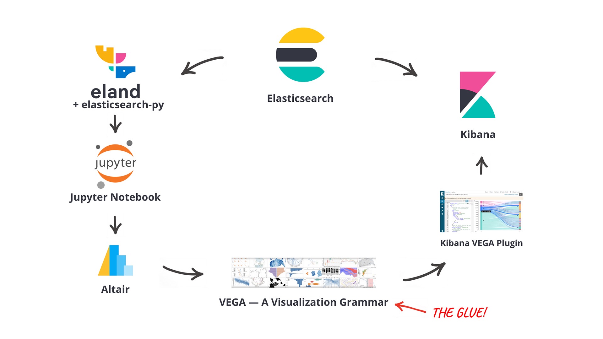
With this set of libraries the main benefit is that a data scientist can continue to work with the environment/stack they are most familiar with (Python/Jupyter Notebooks), without touching raw Vega JSON specifications or coding custom JavaScript visualizations. So the whole workflow is a good example of how the language-independent Vega spec allows you to move and deploy between stacks (e.g., Python/Jupyter vs. JavaScript/Kibana).
Save time with example workflows
Who here wants to write more JSON? No one? I didn't think so...
To get you started, we've created a set of Jupyter Notebooks to demonstrate the workflow and some useful approaches which allow you to create scientific visualizations which are otherwise tricky to produce using out-of-the-box Kibana visualizations. Please note that you’ll need to use at least Elastic Stack 7.9 and Altair 4.1 to make sure the underlying shared Vega version supports the created visualizations.
The examples begin by demonstrating the general workflow and then guide you how to move on to more complex setups. Let's briefly explore some of the contents and goals of the notebooks.
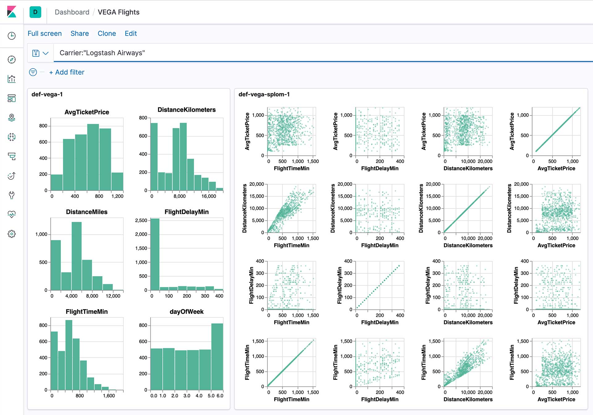
Data prep and workflow explanation using binned histograms
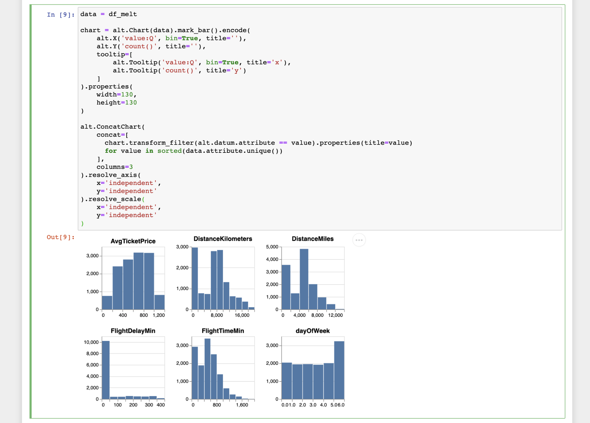
The first set of notebooks cover how to get data from Elasticsearch via eland, and discuss some different approaches for visualizing small multiples of binned histograms and scatterplots with eland and Altair. They cover the basic requirements to successfully create and publish a custom visualization from Jupyter to Kibana.
Working with Elastic machine learning
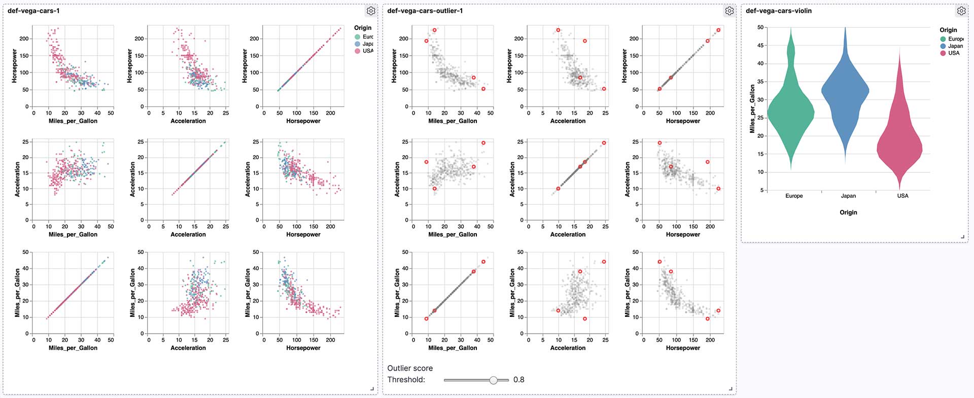
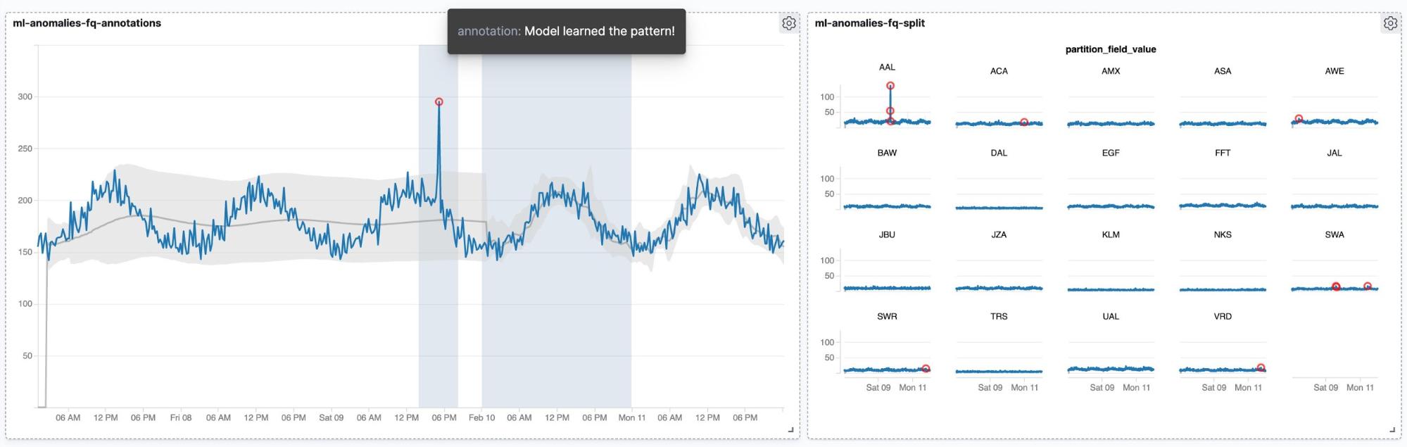
We prepared some examples that allow you to visualize results created using Elastic machine learning. There’s a set of notebooks that covers how to create a dashboard with results from outlier detection including a Vega based slider to adjust the threshold for highlighting. The overall workflow can also be used to create custom charts for evaluating results from classification tasks. Finally, we conclude the examples with some more charts for visualizing anomaly detection results.
All notebooks can be found on Github here: https://github.com/walterra/jupyter2kibana
Summary
In this blog post we outlined a workflow for data scientists to combine the power and flexibility of Jupyter Notebooks with an option to deploy visualizations to Kibana dashboards. Going through the above examples should give you a good understanding of the workflow. If you have any questions about the workflows, I encourage you to reach out on our Discuss forums.
Would you like to try it out for yourself? The quickest way to get started is to get a free 14-day trial of the Elasticsearch Service, or download the Elastic Stack.