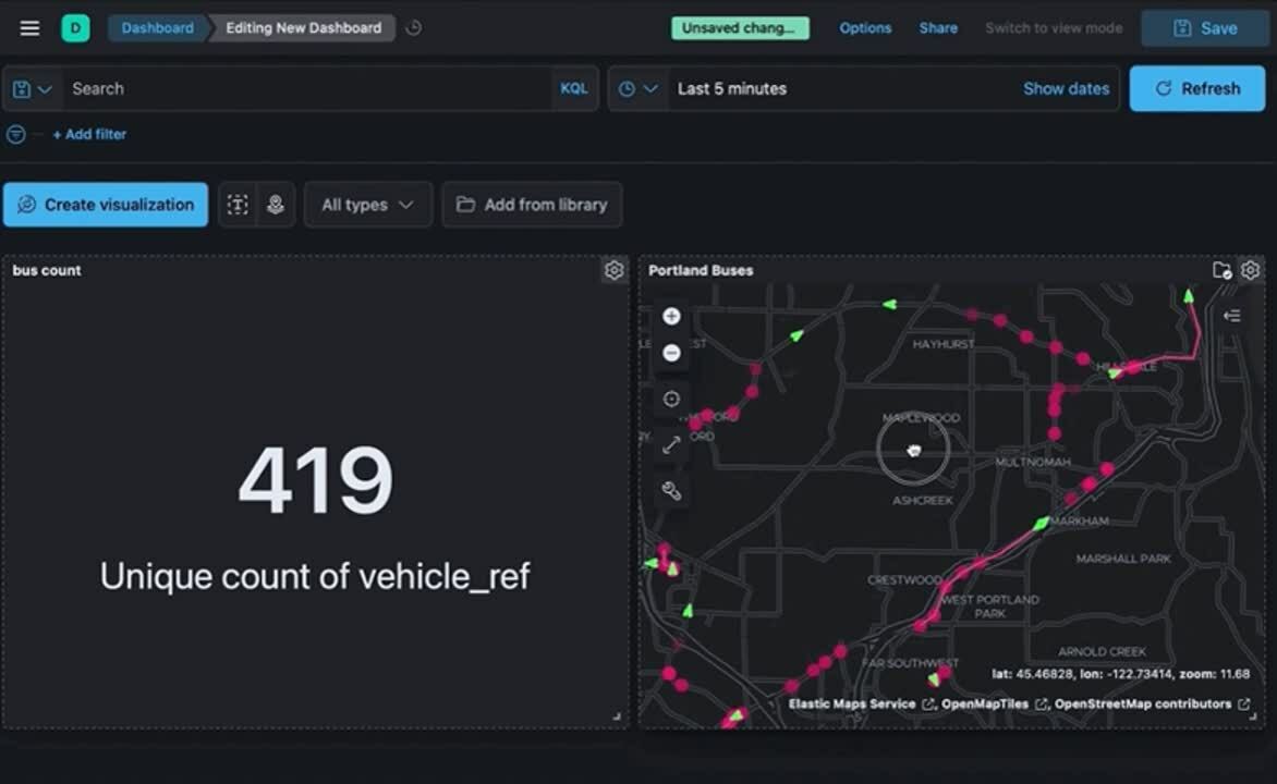
10 common questions answered with formulas and time travel in Kibana
Kibana creates easy ways to do powerful things with all of your data — to ask and answer questions and follow the flow of analysis. Many times the answer to your question requires calculations based on queried data. Formulas allow you to author your own metrics by combining multiple aggregated fields using math operations.
In addition, moving through and replaying your data in time and space are powerful ways to gain historical context and understand additional insight about the present.
In the below sections you’ll find 10 examples of questions you can answer with dashboard data and map visualizations in Kibana via formulas, time shifts, and moving through data in time. Try following along with your own data or using Kibana’s sample datasets. Have a question? Head on over to our discuss forum.
On to the list!
- Is the proportion of errors increasing?
- How does performance compare to last week?
- How does this data compare to peers?
- What is having the biggest effect on my average?
- What's the raw gain/loss compared historically?
- What's the gain/loss as a percentage of past performance?
- How did the data get to where it is now?
- How can I explore a dashboard in space interactively?
- What's the per-unit version of this metric?
- What's my industry-specific calculation— like a "Net Promoter Score"— for the last period?
1) Is the proportion of errors increasing?
Ratios are useful because they can help show the proportion to the overall total and answer a question raw counts cannot: “Am I seeing this in this measure increase because I'm getting more data overall?” Ratios can be constructed by filtering a subset of your data and comparing it to the overall, unfiltered, total. Try using KQL to act as this filter in a custom formula to build your ratios on the fly.
The below example shows the ratio of unique users experiencing HTTP error codes (response.code greater than an HTTP 200) compared to unique users overall. To drive extra insight, the visualization includes the hour of the day as rows and day of the week as columns. If your data is missing these fields you can always add them as a runtime field.
unique_count(clientip, kql='response.keyword > 200') / unique_count(clientip)
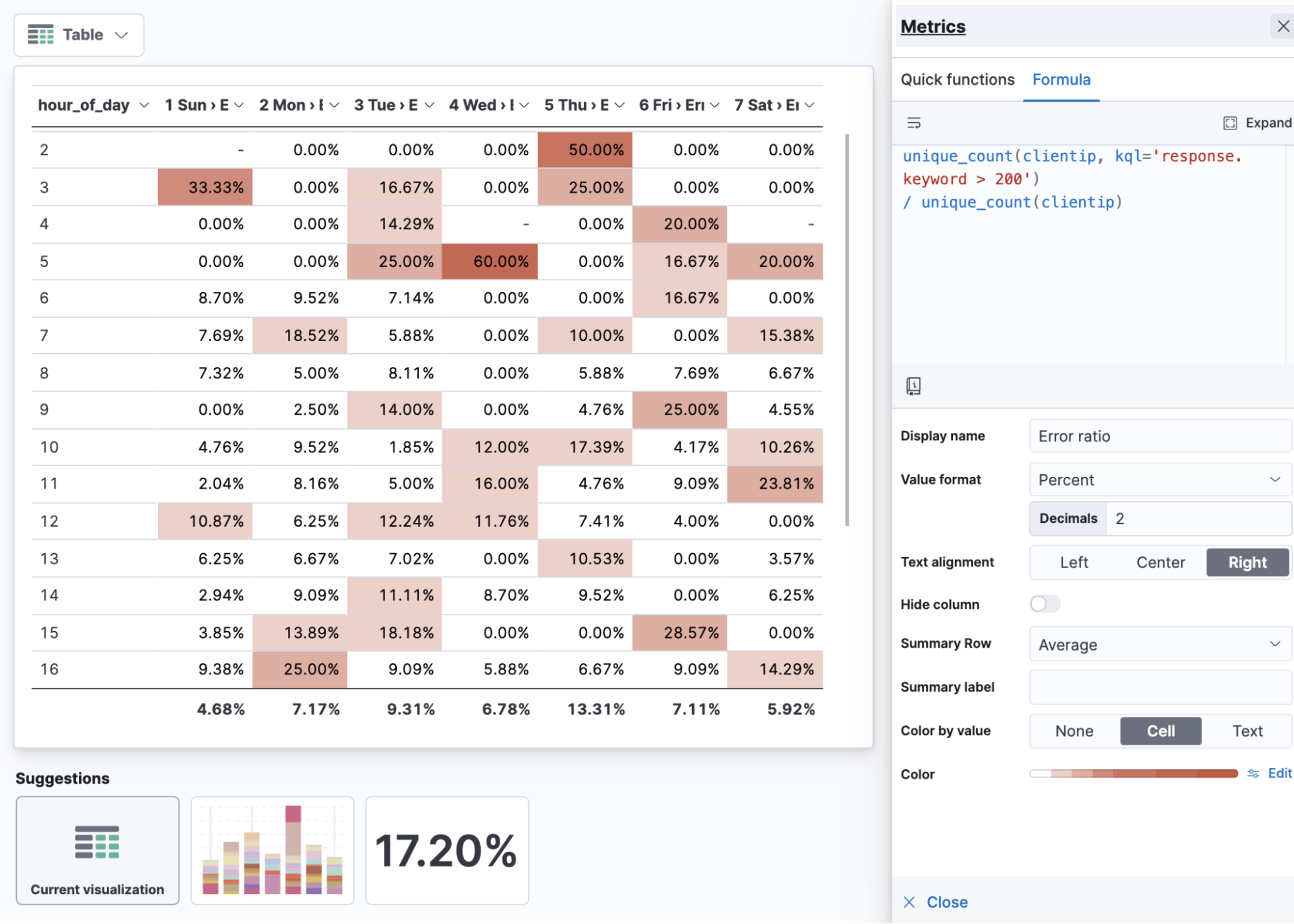
Error ratio table by hour of day and day of week
Visualizing practices: Ratios
When visualizing ratios, apply the percentage value format. Use “ratio” in the name of your metric. If you’re visualizing things like error ratios it can be useful to show it against hour of day and day of week in a table. With ratios, the average can provide column-level insight (in this case, the average error rate for the day of the week).
2) How does performance compare to last week?
Period over period will give you a percentage representation of now compared to the past, where 100% is an exact match.
The example shows a 14X (1400%) increase of bandwidth compared to the previous week.
median(bytes) / median(bytes, shift='1w')
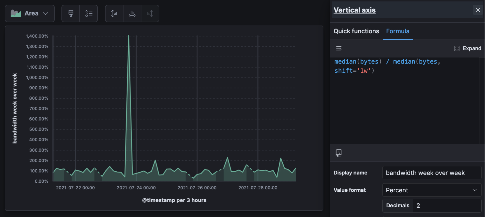
Change in bandwidth week over week over time
Visualizing practices: Period over period
Period over period can be useful for almost any visualization. It can be useful to look at period over period over time to see if period changes themselves are changing over time. This calculation outputs another percentage, so don’t forget the value format, and if your data is sparse on a line graph the “linear” missing values option is the least visually disruptive.
3) How does this data compare to peers?
Using overall sums allows you to show any data as a proportion of the total to make comparisons easier.
In the below example, we can see the “ceph” image generating the most data, and instead of having to look at counts, we can see the value as a percent.
count() / overall_sum( count() )
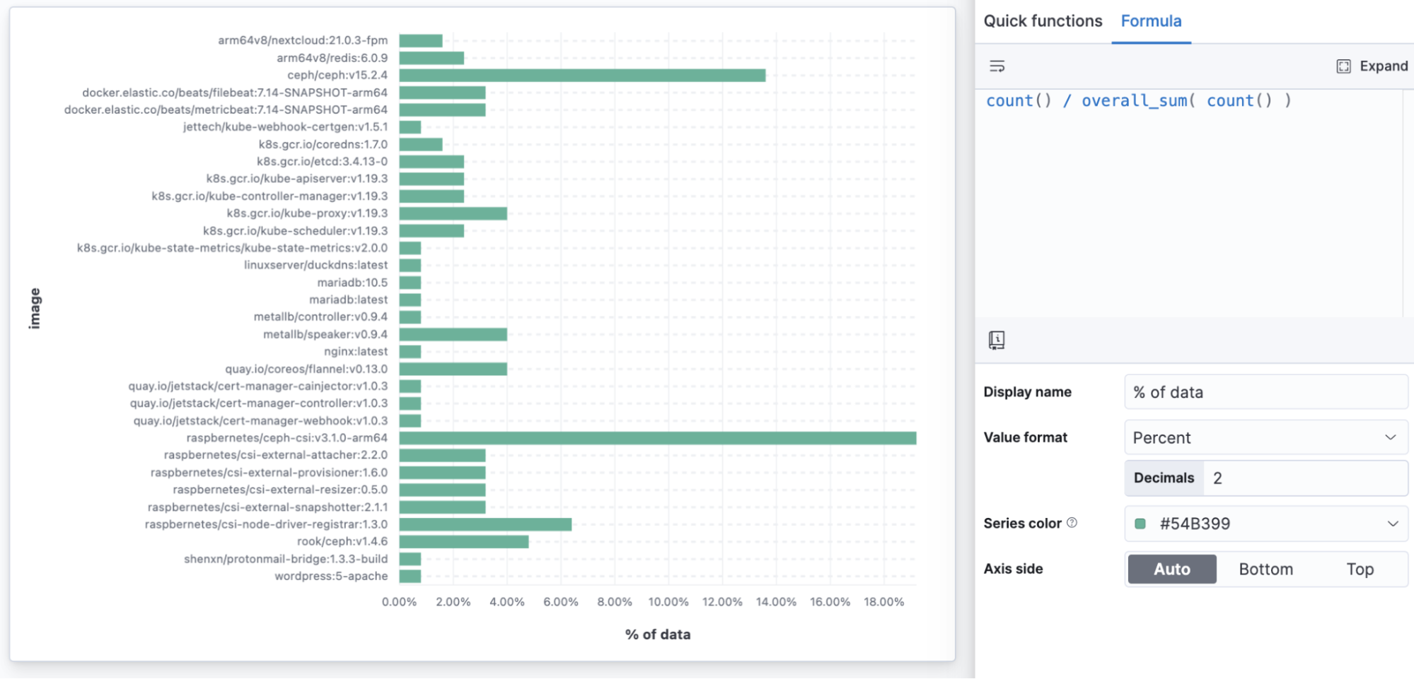
Percent of infrastructure data by container image
Visualization practices: Percent of overall sum
Building a percent of the overall total with a formula allows any visualization to present proportion-to-whole data, where previously only Treemaps, Pies, and Donuts offered this. You might use a horizontal bar to show a percentage of a total when you want to make sure every data point is readable.
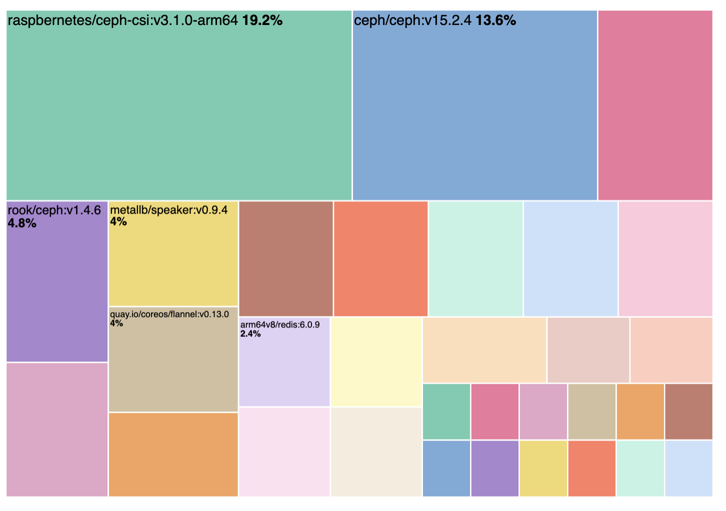 Treemaps, Donuts, and Pie automatically generate percent of data but can miss out on readability
4) What is having the biggest effect on my average?
Functions like overall average allow you to do math comparisons to or from the average of all the values on the full report.
In this example we can see which categories are performing better than the overall average of total sales, with both clothing categories pulling above the overall average.
sum(taxless_total_price) - overall_average(sum(taxless_total_price))
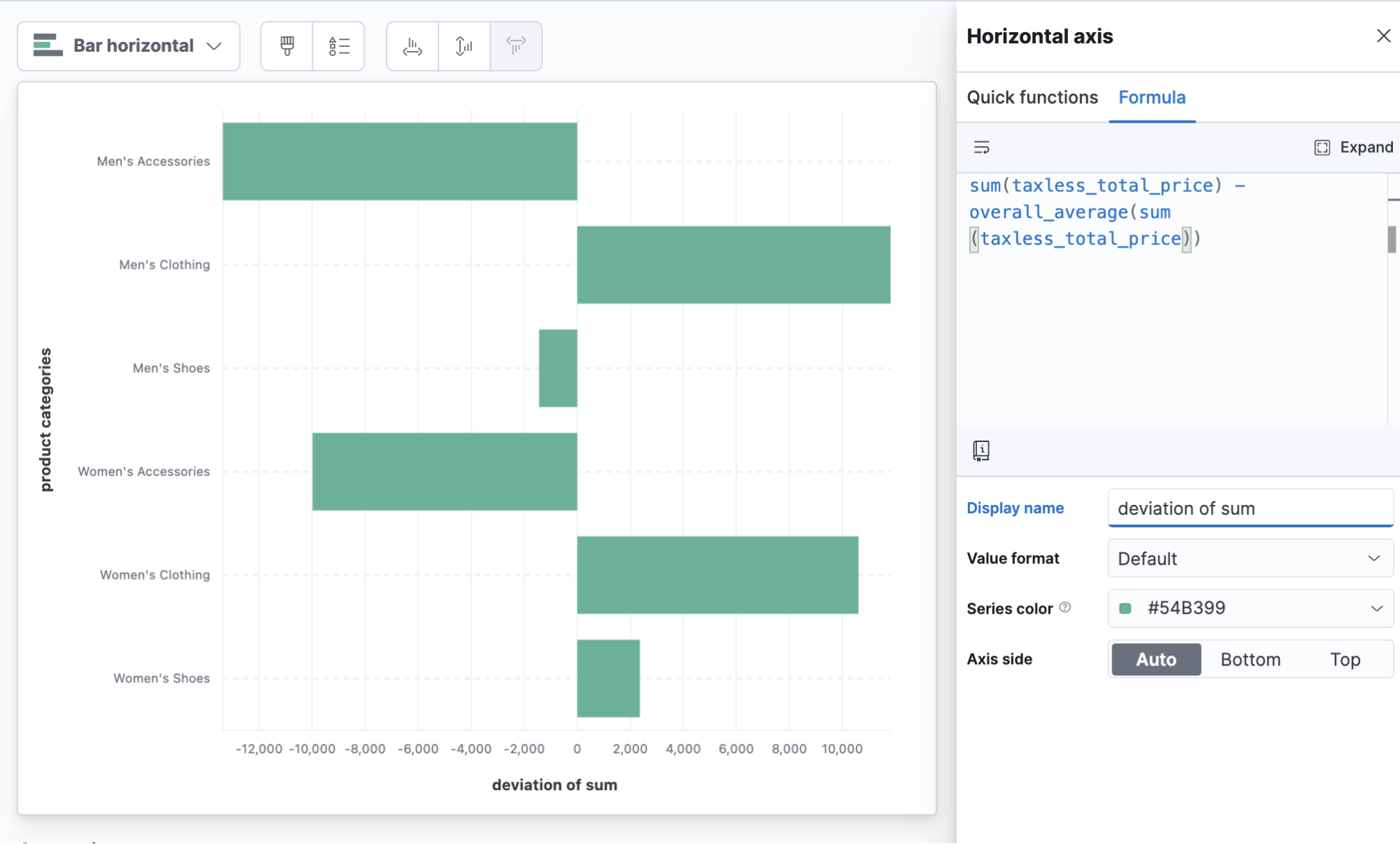
Product category deviation from average sales
Visualizing practices: Deviation
It can be especially useful to use horizontal bars when visualizing a metric that centers over 0. Don’t forget to give a descriptive metric name.
5) What's the raw gain/loss compared historically?
Time-shifted differences make comparisons to the same metric shifted back in time. It can be useful to subtract the past from the present, which gives you a visualization that centers around zero — positive numbers are an increase over the past.
Here we have an example of average CPU usage on Kubernetes nodes compared to 6 hours ago. This example is using division to convert CPU nanocores to cores (note, a runtime field is a good way to add this as an extra metric conversion for other users to find in the field list instead of having to do this in a formula).
(
   average(kubernetes.node.cpu.usage.nanocores)
   - average(kubernetes.node.cpu.usage.nanocores, shift='6h')
) / 1000000000
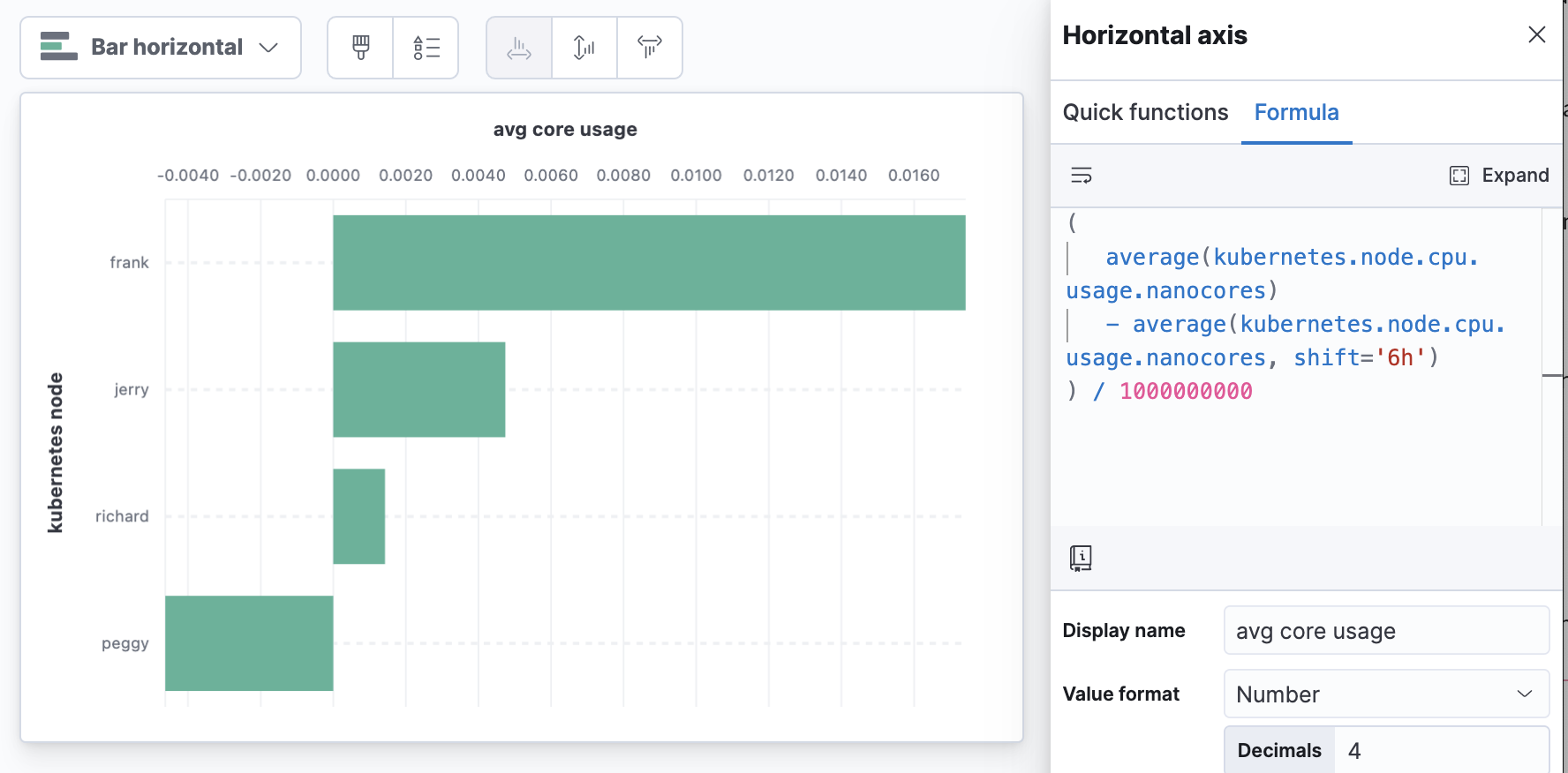
Node CPU core utilization changes compared to 6 hours ago
Visualizing practices: Time shift differences and changing units
Moving the axis to the top of the visualization can help when the most “concerning” number is a large number at the top of the visualization.
6) What's the gain/loss as a percentage of past performance?
A slightly different take on time shift differences, % change, allows you to see an increase as a percent of the value in the past instead of the raw difference. This is popular when talking about growth.
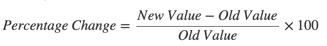
Example percent change calculation
The below example shows the % change in CPU usage by Kubernetes.
(
   (
   average(kubernetes.node.cpu.usage.nanocores)
   - average(kubernetes.node.cpu.usage.nanocores, shift='3d')
   ) /
   (
   average(kubernetes.node.cpu.usage.nanocores, shift='3d')
   )
)
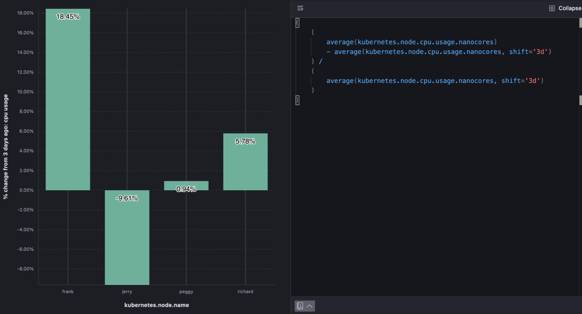
% change in node CPU utilization from 3 days ago
Visualizing practices: % change
If you use the “Percent” value format you don’t need to multiply the value by 100. When there’s room, value labels can help compliment the visualization.
7) How did the data get to where it is now?
A map is the best way to understand the geographic context of your data. A map is just a snapshot, though — it might represent the last 15 minutes or the last year. In fact, your map might tell a different story if you looked at it minute by minute, or day by day. With the time slider, you can play back metrics and see changes over time with each incremental unit of time. You might spot a pattern that went previously undetected or an anomaly requiring further investigation. The time slider shows you how your data arrived at its location today.

Time slider control in Elastic Maps
8) How can I explore a dashboard in space interactively?
Sometimes the answer to your question depends on where. If you’re authoring a dashboard for others, consider enabling the ability to use a map as a filter for the entire dashboard. Try visualizing key metrics on a dashboard alongside a map. This allows anyone to visualize non-spatial metrics while filtering spatially and can be a powerful way to draw comparisons and find anomalies.
Maps as a filter for dashboards
9) What's the efficiency per-unit?
A custom formula can be used to reduce summarized data to get metrics per unit. This is all dependent on how your data comes in, what the metrics are, and what your “unit” is in your data.
The below example shows cloud metric telemetry on a periodic interval (like every 30 seconds). Metric totals (CPU usage, for example) and the number of events the totals represent (requests), with a formula, allow us to determine average CPU usage per request and do things like trend the new metric over time to understand efficiency as load increases. In the resulting visualization, the “valleys” show the system becoming more efficient under heavy load.
average(kubernetes.pod.cpu.usage.node.pct) //average metric
counter_rate(max(nginx.stubstatus.requests)) //per request
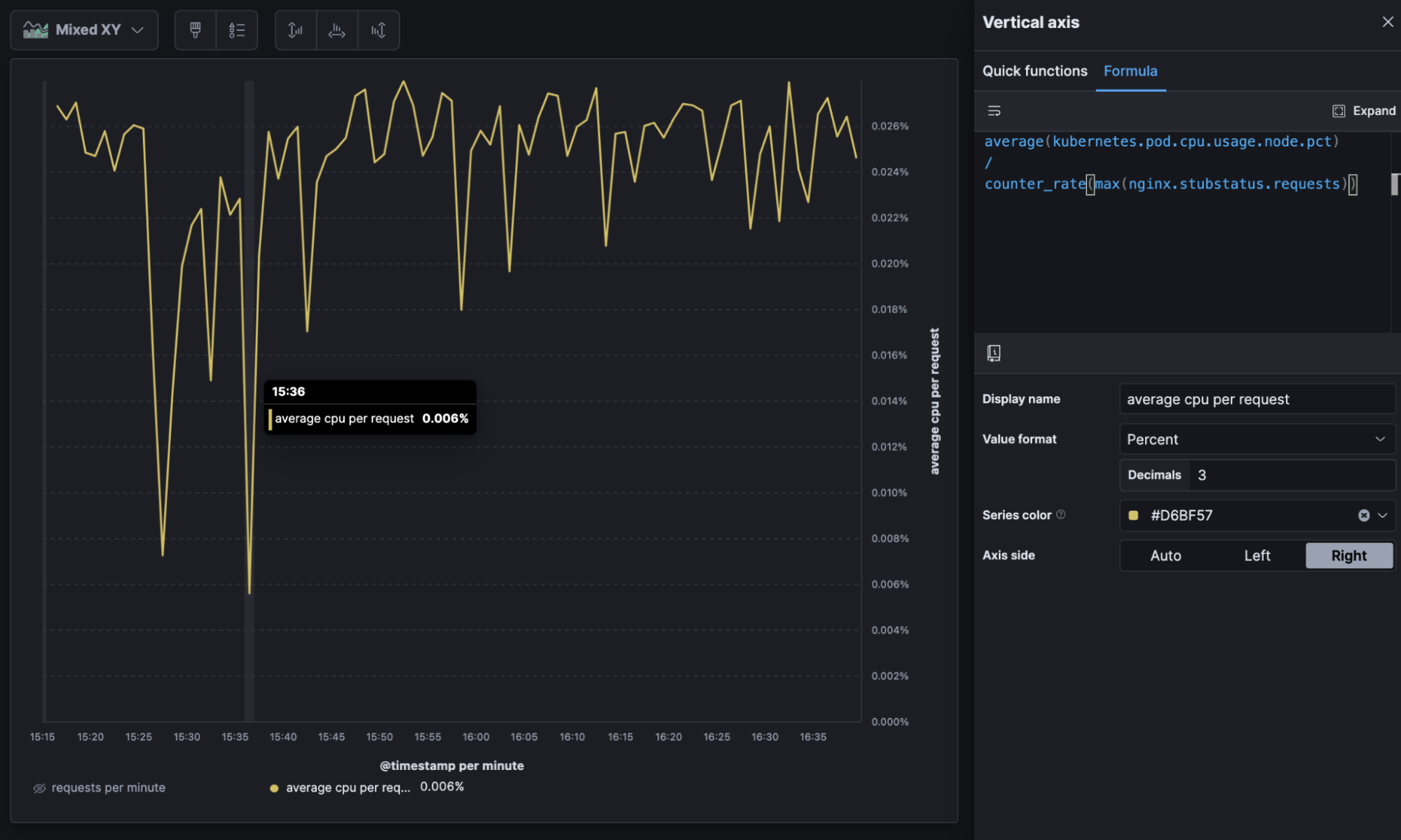 Average CPU per request over time
Visualizing practices: Per unit
If you’re using a per unit metric, make sure you include both the aggregation of the metric being used and the “per unit” in the metric name. It can be useful to visualize the unit that’s in the formula in a separate dashboard panel or series.
10) What's my industry-specific calculation— like a "Net Promoter Score" — for the last period?
Say your organization has adopted a specific metric that’s calculated a specific way. For example, if your data contains survey questions, some organizations like to calculate a “net promoter score” by counting the percentage of those who are “promoters” (score the highest 2 options on scale questions) subtracted from the percentage who are “detractors” (score the lowest 2 options on scale questions) to arrive at a single score between -100% and 100%. This sort of business metric is simple as a formula and, because the formula is calculated at report time, you can easily redefine it as your business evolves its metrics and definitions.
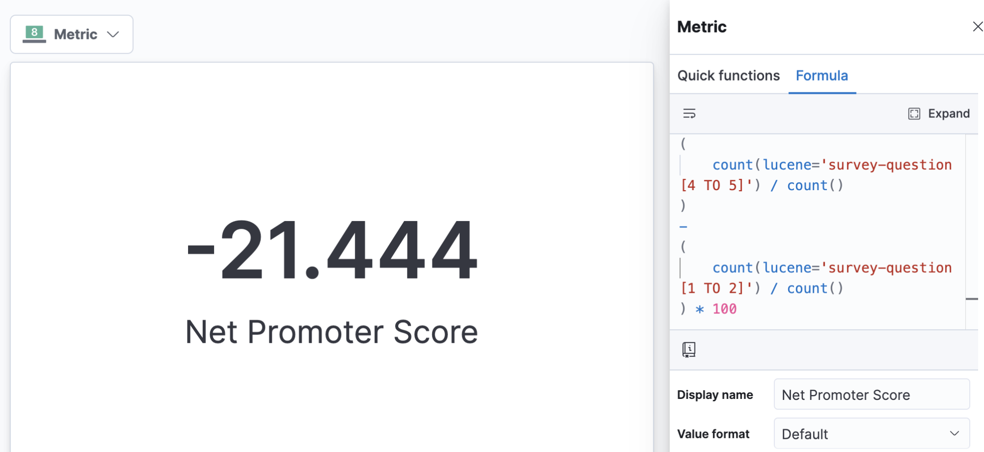
Calculating industry-specific metrics like net promoter score
Got data questions of your own?
Try these examples out for yourself by signing up for a free trial of Elastic Cloud or download the self-managed version of the Elastic Stack for free. If you have additional questions about getting started, head on over to the Kibana forum or check out the Kibana documentation guide. Or you can explore which are the best practices for visualizing time series data with Kibana.