Lens
editLens
editTo create visualization panels with Lens, you drag the data fields you want to visualize to the workspace, then Lens uses heuristics to apply each field and create a visualization for you.
With Lens, you can:
- Create area, line, and bar charts with multiple layers, indices, and visualization types.
- Change the aggregation function and labels to customize the data.
- Perform math on aggregations using Formula.
- Use time shifts to compare data for two time intervals, such as month over month.
Create visualizations
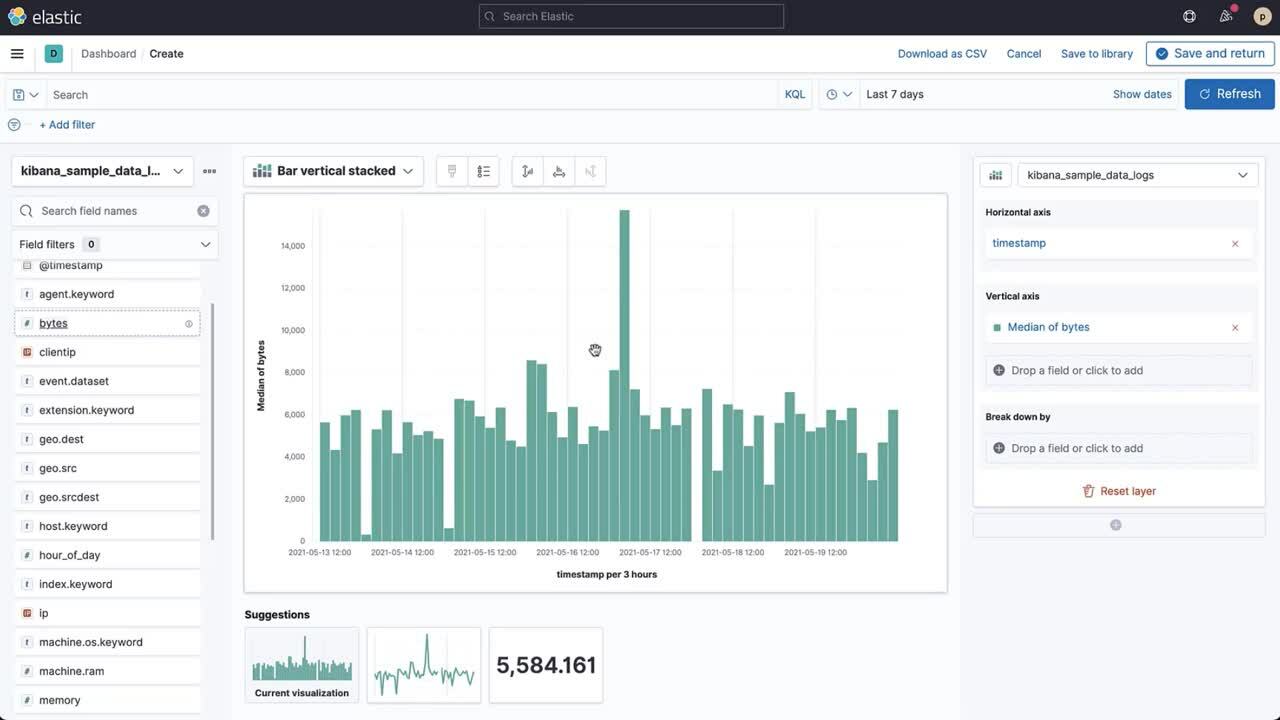
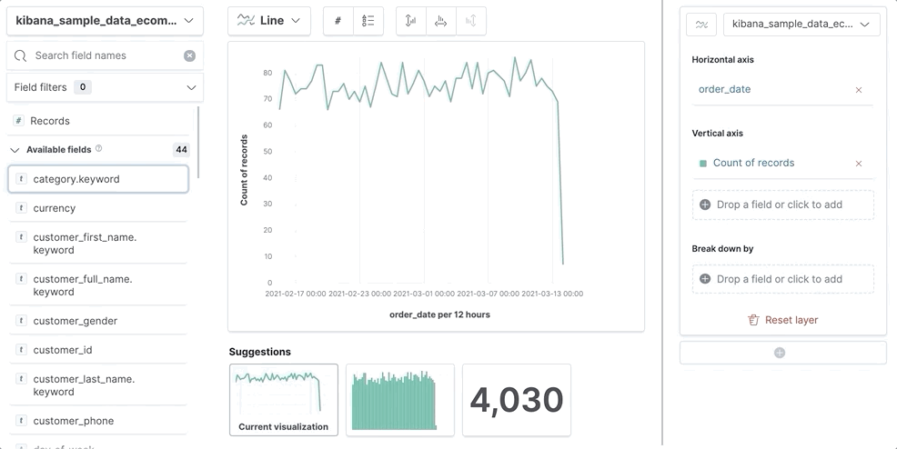
editIf you’re unsure about the visualization type you want to use, or how you want to display the data, drag the fields you want to visualize onto the workspace, then let Lens choose for you.
If you already know the visualization type you want to use, and how you want to display the data, use the following process:
-
Choose the visualization type. Open the Chart type dropdown, then select the visualization type before you drag any fields.
To view more visualizations that Lens automatically created for the fields, click the Suggestions. If one of the Suggestions meets your visualization needs, click Save and return to add it to the dashboard.
-
Choose the data you want to visualize. Drag the fields directly to the layer pane. Lens automatically selects the aggregation function.
If you want to learn more about the data a field contains, click i next to the field.
- Edit and delete. To change the Quick function and display options, click the field in the layer pane. To delete a field, close the configuration options, then click X next to the field.
Change the fields list
editChange the fields list to display a different index pattern, different time range, or add your own fields.
- To create a visualization with fields in a different index pattern, open the Change index pattern dropdown, then select the index pattern.
- If the fields list is empty, change the time filter.
-
To add fields, open the action menu (…) next to the Change index pattern dropdown, then select Add field to index pattern.
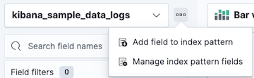
For more information about adding fields to index patterns and examples, refer to Explore your data with runtime fields.
Use formulas to perform math
editFormulas allow you to perform math on aggregated data. The most common formulas divide two values to produce a percent.
- In the layer pane, click a field.
-
Click Formula, then enter the formula.
- Filter ratio example
-
Use
kql=''to filter one set of documents, then compare the document set to other documents within the same grouping:See how the error rate changes over time:
count(kql='response.status_code > 400') / count()
- Week over week example
-
Use
shift='1w'to get the value of each grouping from the previous week. Time shift should not be used with the Top values function.percentile(system.network.in.bytes, percentile=99) / percentile(system.network.in.bytes, percentile=99, shift='1w')
- Percent of total example
-
Formulas can calculate
overall_sumfor all the groupings, which lets you convert each grouping into a percent of total:sum(products.base_price) / overall_sum(sum(products.base_price))
For detailed information on formulas, click
 .
.
- To accurately display the formula, select Percent from the Value format dropdown.
Compare differences over time
editCompare your real-time data set to the results that are offset by a time increment. For example, you can compare the real-time percentage of a user CPU time spent to the results offset by one hour.
- In the layer pane, click the field you want to offset.
- From the Add advanced options dropdown, select Time shift.
- Select the time offset increment.
For a time shift example, refer to Compare time ranges.
Create custom tables
editLens tables are highly customizable, and provide you with text alignment, value formatting, coloring options, and more.
- From the Chart type dropdown, select Table.
- Drag the fields you want to visualize to the workspace.
-
To sort or hide the columns, click the arrow next to the column heading, then select an option.
All columns that belong to the same layer pane group are sorted in the table.
-
To change the display options, click a Metrics field, then configure the following options:
- Display name — Specifies the field display name.
- Value format — Specifies how the field value displays in the table.
- Text alignment — Aligns the values in the cell to the Left, Center, or Right.
- Hide column — Hides the column for the field.
- Summary row — Adds a row that displays the summary value. When specified, allows you to enter a Summary label.
- Color by value — Applies color to the cell or text values. To change the color, click Edit.
Create visualizations with keyboard navigation
editTo use a keyboard instead of a mouse, use the Lens fully accessible and continuously improved drag system.
-
Select the field in the fields list or layer pane. Most fields have an inner and outer select state. The inner state opens a panel with detailed information or options. The outer state allows you to drag the field. Tab through the fields until you get the outer state on the field.
-
Complete the following actions:
- To select a field, press Space bar.
- To select where you want to drop the field, use the Left and Right arrows.
- To reorder the fields on the layer pane, use the Up and Down arrows.
-
To duplicate an action, use the Left and Right arrows, then select the Drop a field or click to add field you want to use.
- To confirm the action, press Space bar. To cancel, press Esc.
Configure the visualization components
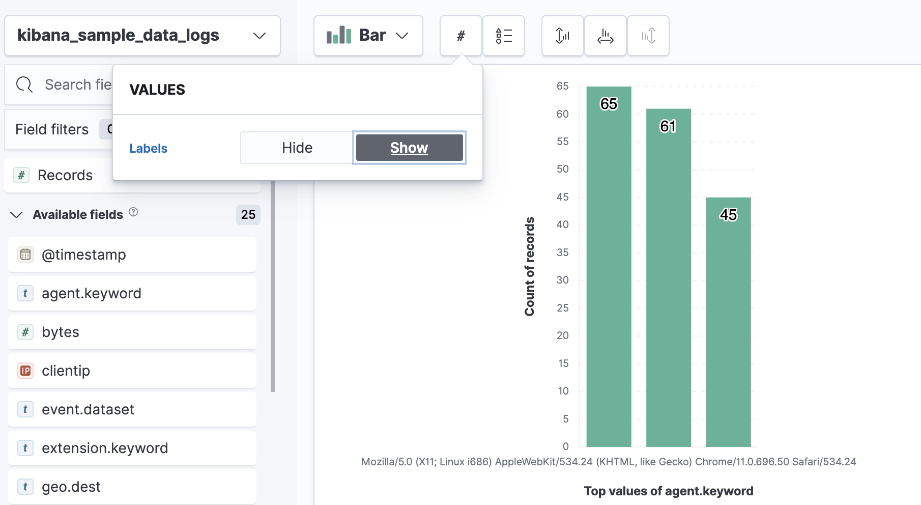
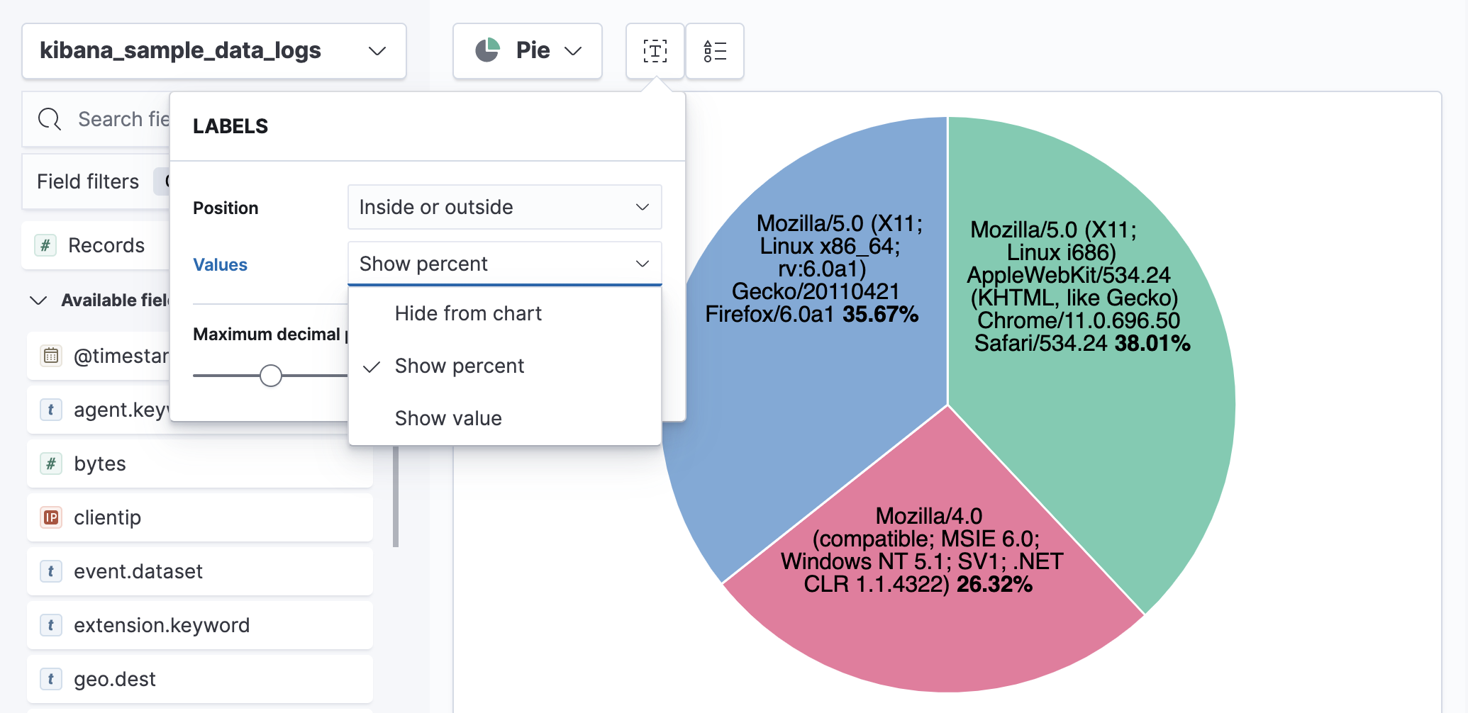
editEach visualiztion type comes with a set of components that you can configure, such as data labels, legend, axes, and more.
For example, to add data labels to bar and horizontal bar charts, use the Values menu.
To add data labels to pie charts, donut charts, or treemaps, use the Labels menu.
Filter the data
editApply filters to visualizations directly from the values in the legend. Only Bar, Line and area, and Proportion visualizations support legend filters.
- In the legend, click the field.
-
Choose one of the following options:
- Filter for value — Applies a filter that displays only the field data in the visualization.
- Filter out value — Applies a filter that removes the field data from the visualization.
Frequently asked questions
editFor answers to common Lens questions, review the following.
When should I use KQL filters, the Filters function, or the Filter by option?
Use the KQL Search field to focus on a known set of data for the entire visualization. You can combine KQL filters with other filters using AND logic.
Use the Filters function to apply:
- More than one KQL filter.
- The KQL filter to a single layer, which allows you to visualize filtered and unfiltered data.
Use the Filter by advanced option to:
- Assign a custom color to each filter group in a bar, line, or area chart.
- Build a complex table. For example, to display the failure rate and overall data.
When should I normalize the data by unit or use a custom interval?
- Normalize by unit — Calculates the average for the interval. When you normalize the data by unit, the data appears less granular, but Lens is able to calculate the data faster.
- Customize time interval — Creates a bucket for each interval. When you customize the time interval, you can use a large time range, but Lens calculates the data slower.
To normalize the interval:
- In the layer pane, click a field.
- Click Add advanced options > Normalize by unit.
- From the Normalize by unit dropdown, select an option, then click Close.
To create a custom interval:
- In the layer pane, click a field.
- Select Customize time interval.
- Change the Minimum interval, then click Close.
What data is categorized as Other?
The Other category contains all of the documents that do not match the specified criteria or filters. Use Other when you want to compare a value, or multiple values, to a whole.
By default, Group other values as "Other" is enabled when you use the Top values function.
To disable Group other values as "Other", click a field in the layer pane, click Advanced, then deselect Group other values as "Other".
How do I add documents without a field?
By default, Lens retrieves only the documents from the fields. For bucket aggregations, such as Top values, you can add documents that do not contain the fields, which is helpful when you want to make a comparison to the whole documentation set.
- In the layer pane, click a field.
- Click Advanced, then select Include documents without this field.
When do I use runtime fields vs. formula?
Use runtime fields to format, concatenate, and extract document-level fields. Runtime fields work across all of Kibana and are best used for smaller computations without compromising performance.
Use formulas to compare multiple Elasticsearch aggregations that can be filtered or shifted in time. Formulas apply only to Lens panels and are computationally intensive.
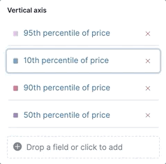
Can I add more than one y-axis scale to a visualization?
For each y-axis, you can select Left and Right, and configure a different scale.
Why is my value the incorrect color when I use value-based coloring?
Here’s a short list of few different aspects to check:
- Make sure the value falls within the desired color stop value defined in the panel. Color stop values are "inclusive".
- Make sure you have the correct value precision setup. Value formatters could round the numeric values up or down.
-
Make sure the correct color continuity option is selected. If the number is below the first color stop value, a continuity of type
BeloworAbove and below rangeis required. -
The default values set by the Value type are based on the current data range displayed in the data table.
-
If a custom
Numberconfiguration is used, check that the color stop values are covering the current data range. -
If a
Percentconfiguration is used, and the data range changes, the colors displayed are affected.
-
If a custom
How do I sort by multiple columns?
Multiple column sorting is unsupported, but is supported in Discover. For information on how to sort multiple columns in Discover, refer to Explore the fields in your data.
Why is my field missing from the fields list?
Fields do not appear in the Available fields in the following scenarios:
- The field is a full-text field.
-
The field is a
geo_pointfield -
The field is a
flattenedfield. -
The field is a
objectfield.
Verify if the field appears in the Empty fields list. Lens uses heuristics to determine if the fields contain values. For sparse data sets, the heuristics are less precise.
What do I do with gaps in time series visualizations?
When you create Area and Line charts with sparse time series data, open Visual options in the editor toolbar, then select a Missing values option.
Can I statically define the y-axis scale?
You can set the scale, or bounds, for area, bar, and line charts. You can configure the bounds for all functions, except Percentile. Logarithmic scales are unsupported.
To configure the bounds, use the menus in the editor toolbar. Bar and area charts required 0 in the scale between Lower bound and Upper bound.
Is it possible to display icons in data tables?
You can display icons with field formatter in data tables.
How do I visualize saved searches?
Visualizing saved searches in unsupported.
How do I change the number of suggestions?
Configuring the Suggestions is unsupported.
Is it possible to have pagination in a data table?
Pagination in a data table is unsupported. To use pagination in data tables, create an aggregation-based data table.
How do I change the color for a single data point?
Specifying the color for a single data point, such as a single bar or line, is unsupported.