Analyze time series data
editAnalyze time series data
editIn this tutorial, you’ll use the ecommerce sample data to analyze sales trends, but you can use any type of data to complete the tutorial. Before using this tutorial, review the Kibana concepts.
Add the data and create the dashboard
editAdd the sample ecommerce data that you’ll use to create the dashboard panels.
- Go to the Kibana Home page, then click Try our sample data.
- On the Sample eCommerce orders card, click Add data.
Create the dashboard where you’ll display the visualization panels.
- Open the main menu, then click Dashboard.
- On the Dashboards page, click Create dashboard.
Open and set up Lens
editOpen Lens, then make sure the correct fields appear.
- From the dashboard, click Create visualization.
-
Make sure the kibana_sample_data_ecommerce index appears.
If you are using your own data, select the index pattern that contains your data.
View a date histogram with a custom time interval
editIt is common to use the automatic date histogram interval, but sometimes you want a larger or smaller
interval. For performance reasonse, Lens lets you choose the minimum time interval, not the exact time interval. The performance limit is controlled by the histogram:maxBars setting and the time range.
If you are using your own data, use one of the following options to see hourly sales over the last 30 days:
- View less than 30 days at a time, then use the time filter to select each day separately.
-
Increase
histogram:maxBarsto at least 720, which is the number of hours in 30 days. This affects all visualizations and can reduce performance.
If you are using the sample data, use Normalize unit, which converts Average sales per 12 hours into Average sales per 12 hours (per hour) by dividing the number of hours:
- Set the time filter to Last 30 days.
- From the Available fields list, drag Records to the workspace.
-
To zoom in on the data you want to view, click and drag your cursor across the bars.
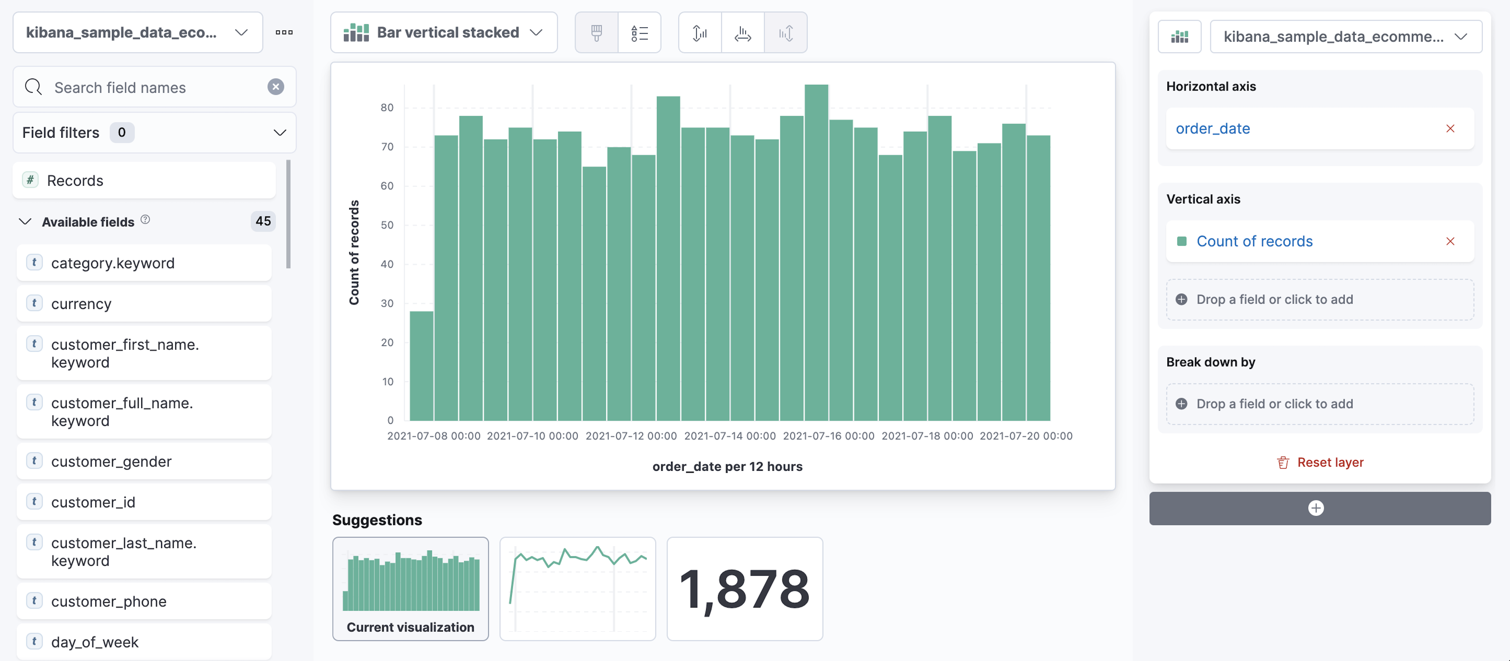
-
In the layer pane, click Count of Records.
-
In the Display name field, enter
Number of orders. - Click Add advanced options > Normalize by unit.
- From the Normalize by unit dropdown, select per hour, then click Close.
-
In the Display name field, enter
-
To hide the Horizontal axis label, open the Bottom Axis menu, then deselect Show.
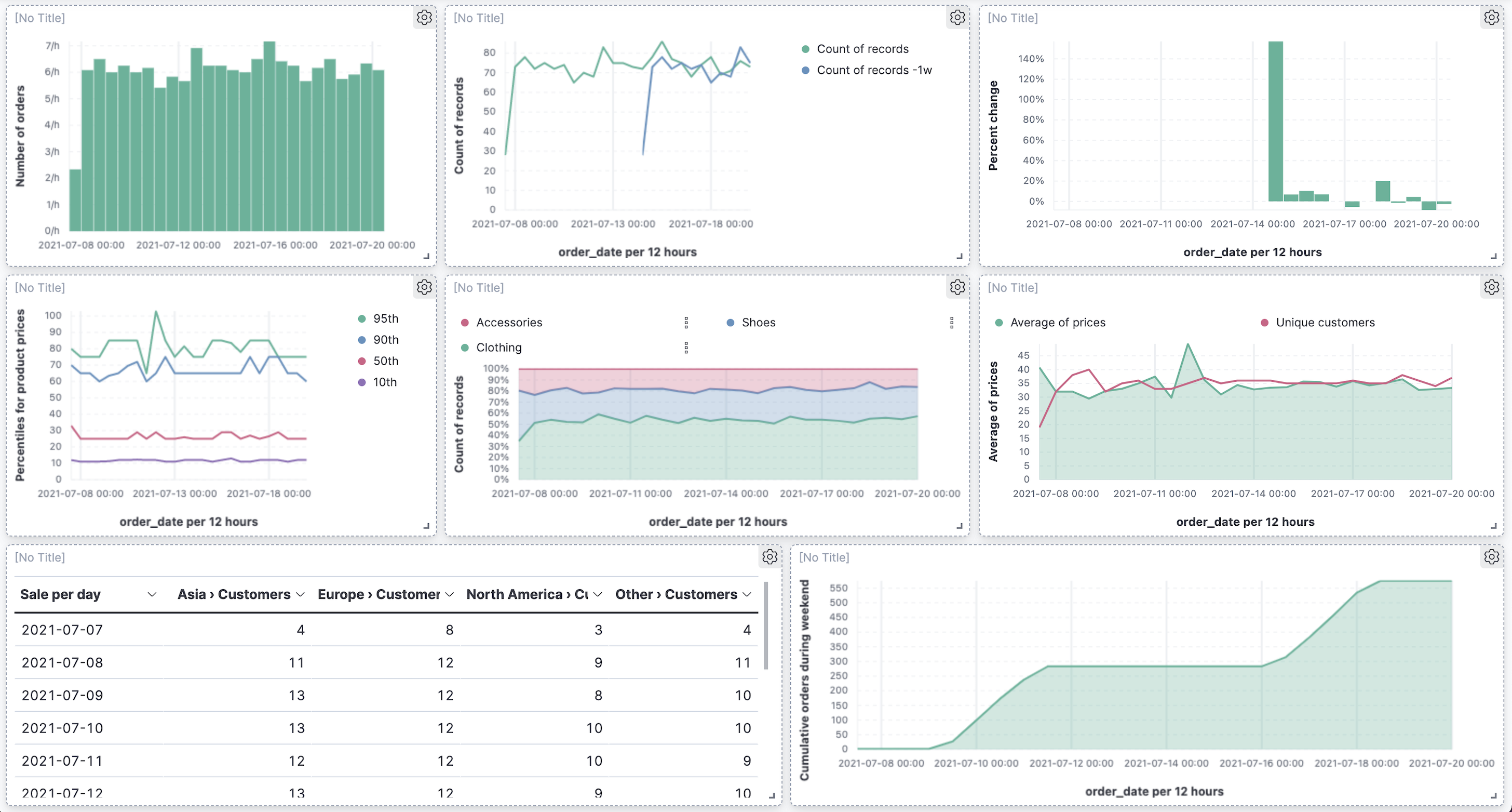
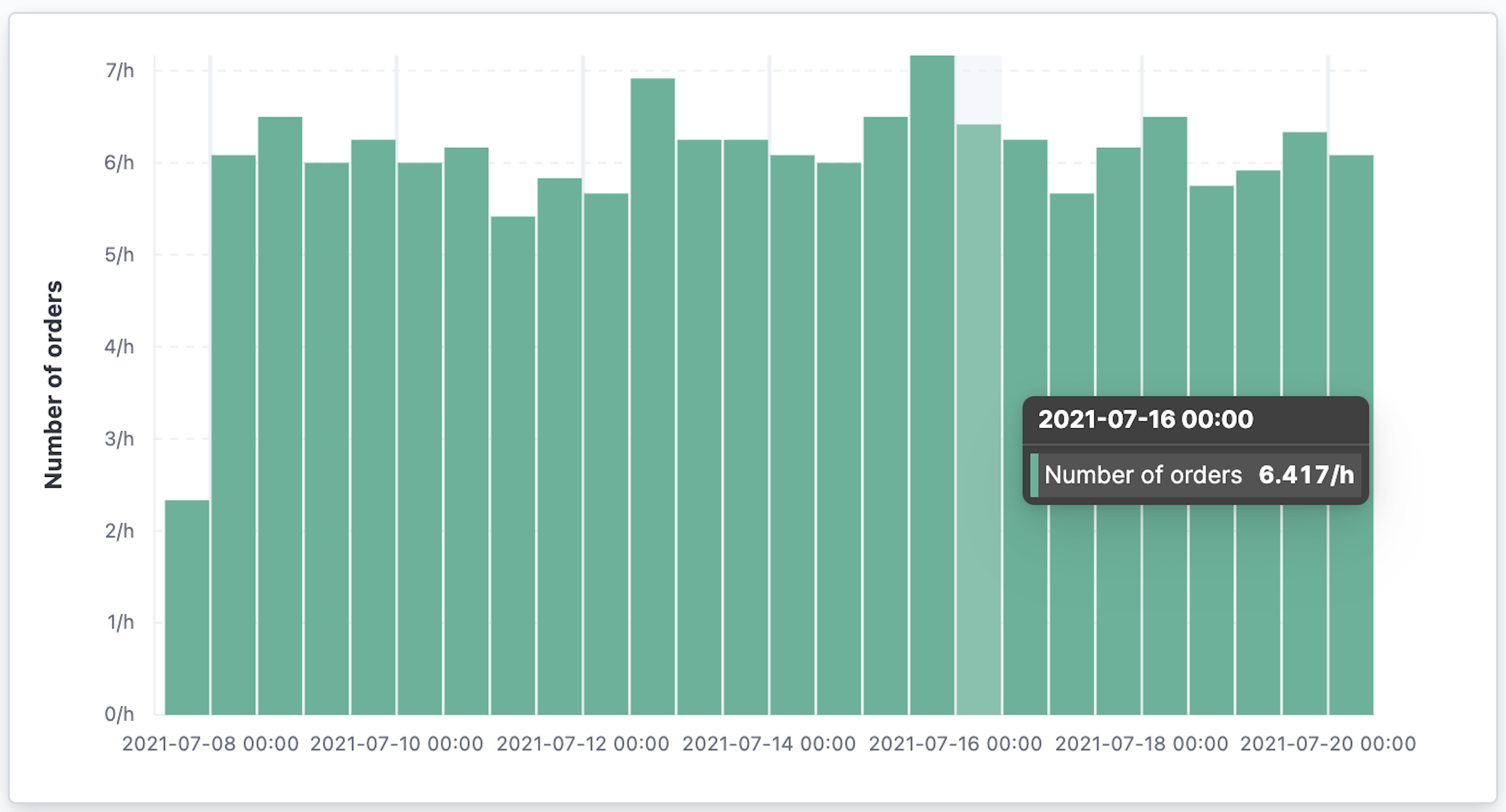
You have a bar chart that shows you how many orders were made at your store every hour.
- Click Save and return.
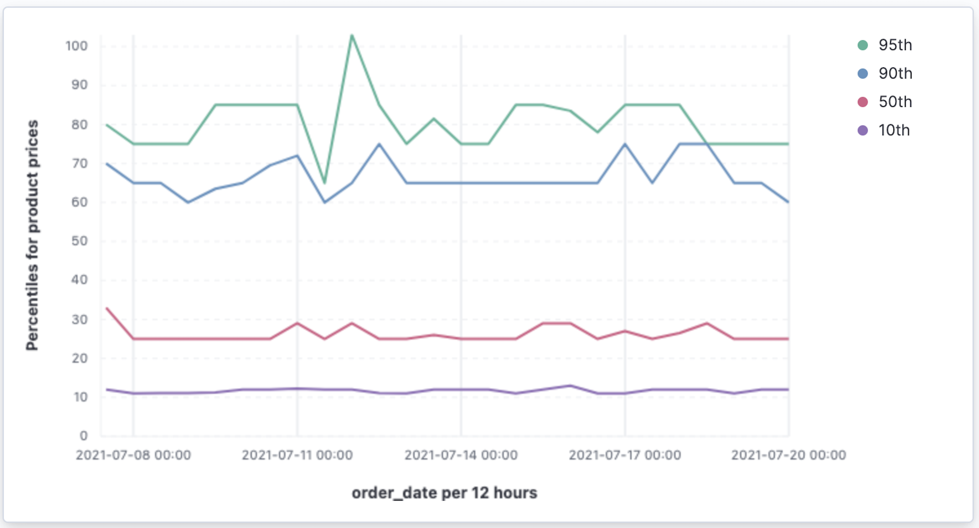
Monitor multiple series
editIt is often required to monitor multiple series within a time interval. These series can have similar configurations with minor differences. Lens copies a function when you drag it to the Drop a field or click to add field within the same group.
To quickly create many copies of a percentile metric that shows distribution of price over time:
- On the dashboard, click Create visualization.
- Open the Chart Type dropdown, then select Line.
- From the Available fields list, drag products.price to the workspace.
Create the 95th percentile.
- In the layer pane, click Median of products.price.
- Click the Percentile function.
-
In the Display name field, enter
95th, then click Close.
To create the 90th percentile, duplicate the 95th percentile.
-
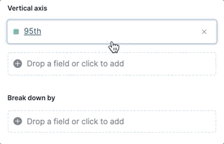
Drag the 95th field to the Drop a field or click to add field in the Vertical axis group.
-
Click 95th [1], then enter
90in the Percentile field. -
In the Display name field enter
90th, then click Close. -
Repeat the duplication steps to create the
50thand10thpercentiles. -
Open the Left Axis menu, then enter
Percentiles for product pricesin the Axis name field.You have a line chart that shows you the price distribution of products sold over time.
- Click Save and return.
Add multiple chart types or index patterns
editTo overlay visualization types or index patterns, add layers. When you create layered charts, match the data on the horizontal axis so that it uses the same scale.
- On the dashboard, click Create visualization.
- From the Available fields list, drag products.price to the workspace.
-
In the layer pane, click Median of products.price.
- Click the Average function.
-
In the Display name field, enter
Average of prices, then click Close.
- Open the Chart Type dropdown, then select Area.
Create a new layer to overlay with custom traffic.
- In the layer pane, click +.
- From the Available fields list, drag customer_id to the Vertical Axis field in the second layer.
-
In the second layer, click Unique count of customer_id.
-
In the Display name field, enter
Unique customers. - In the Series color field, enter #D36086.
- Click Right for the Axis side, then click Close.
-
In the Display name field, enter
- From the Available fields list, drag order_date to the Horizontal Axis field in the second layer.
-
In the second layer pane, open the Chart type menu, then click the line chart.
- Open the Legend menu, then select the arrow that points up.
- Click Save and return.
Compare the change in percentage over time
editBy default, Lens shows date histograms using a stacked chart visualization, which helps understand how distinct sets of documents perform over time. Sometimes it is useful to understand how the distributions of these sets change over time. Combine filters and date histogram functions to see the change over time in specific sets of documents. To view this as a percentage, use a Stacked percentage bar or area chart.
- On the dashboard, click Create visualization.
- From the Available fields list, drag Records to the workspace.
- Open the Chart type dropdown, then select Area percentage.
For each category type, create a filter.
- In the layer pane, click the Drop a field or click to add field for Break down by.
- Click the Filters function.
-
Click All records, enter the following, then press Return:
-
KQL —
category.keyword : *Clothing -
Label —
Clothing
-
KQL —
-
Click Add a filter, enter the following, then press Return:
-
KQL —
category.keyword : *Shoes -
Label —
Shoes
-
KQL —
-
Click Add a filter, enter the following, then press Return:
-
KQL —
category.keyword : *Accessories -
Label —
Accessories
-
KQL —
- Click Close.
-
Open the Legend menu, then select the arrow that points up.
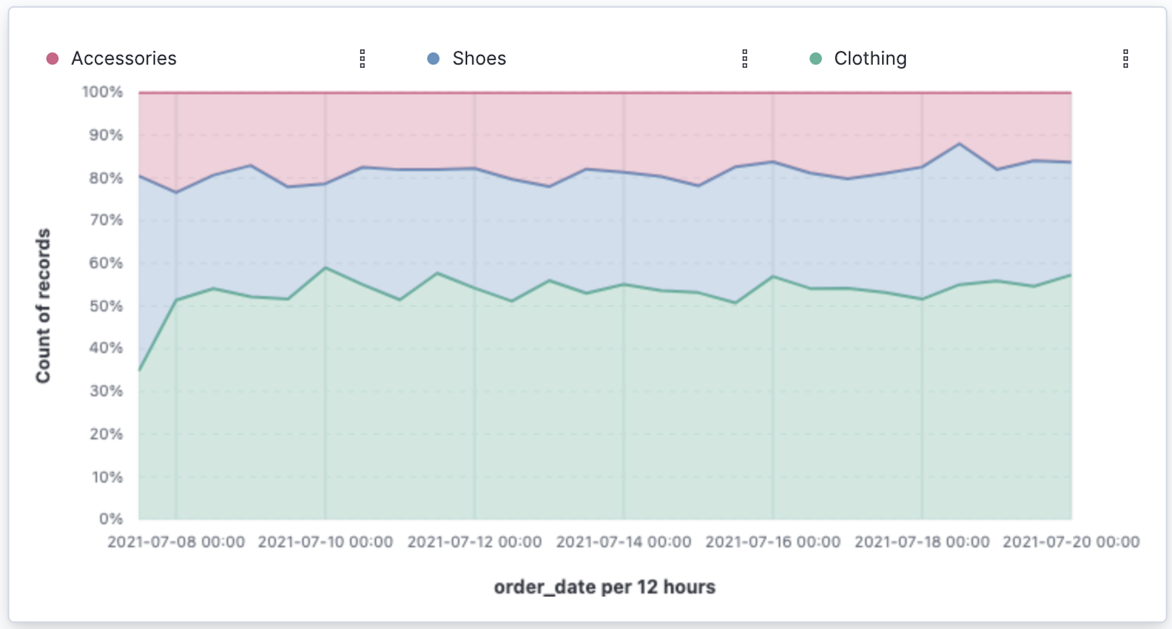
- Click Save and return.
View the cumulative number of products sold on weekends
editTo determine the number of orders made only on Saturday and Sunday, create an area chart, then add it to the dashboard.
- On the dashboard, click Create visualization.
- Open the Chart Type dropdown, then select Area.
Configure the cumulative sum of the store orders.
- From the Available fields list, drag Records to the workspace.
- In the layer pane, click Count of Records.
- Click the Cumulative sum function.
-
In the Display name field, enter
Cumulative orders during weekend days, then click Close.
Filter the results to display the data for only Saturday and Sunday.
- In the layer pane, click the Drop a field or click to add field for Break down by.
- Click the Filters function.
-
Click All records, enter the following, then press Return:
-
KQL —
day_of_week : "Saturday" or day_of_week : "Sunday" -
Label —
Saturday and SundayThe KQL filter displays all documents where
day_of_weekmatchesSaturdayorSunday.
-
KQL —
-
Open the Legend menu, then click Hide.
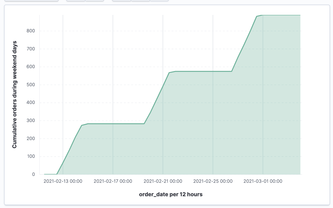
- Click Save and return.
Compare time ranges
editLens allows you to compare the selected time range with historical data using the Time shift option.
If multiple time shifts are used in a single chart, a multiple of the date histogram interval should be chosen, or the data points might not line up and gaps can appear. For example, if a daily interval is used, shifting one series by 36h, and another by 1d is not recommended. You can reduce the interval to 12h, or create two separate charts.
To compare current sales numbers with sales from a week ago, follow these steps:
- On the dashboard, click Create visualization.
- Open the Chart Type dropdown, then select Line.
- From the Available fields list, drag Records to the workspace.
- In the layer pane, drag Count of Records to the Drop a field or click to add field in the Vertical axis group.
To create a week-over-week comparison, shift the second Count of Records by one week.
- In the layer pane, click Count of Records [1].
- Open the Add advanced options dropdown, then select Time shift.
-
Click 1 week ago.
To define custom time shifts, enter the time value, the time increment, then press Enter. For example, to use a one week time shift, enter 1w.
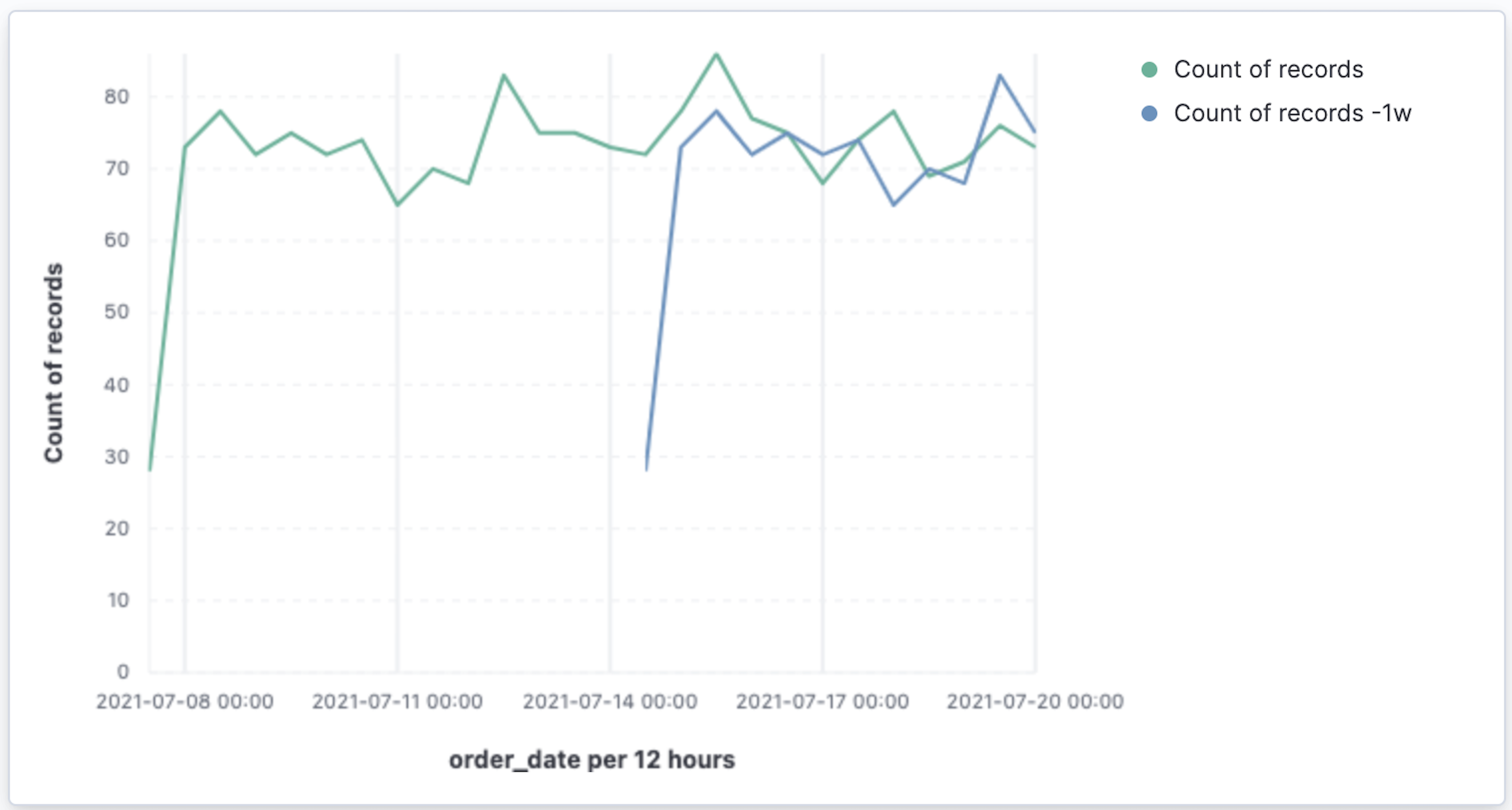
- Click Save and return.
Compare time ranges as a percent change
editTo view the percent change in sales between the current time and the previous week, create a Formula.
- On the dashboard, click Create visualization.
- From the Available fields list, drag Records to the workspace.
-
In the layer pane, click Count of Records.
-
Click Formula, then enter
count() / count(shift='1w') - 1. -
Open the Value format dropdown, select Percent, then enter
0in the D*ecimals field. -
In the Display name field, enter
Percent change, then click Close.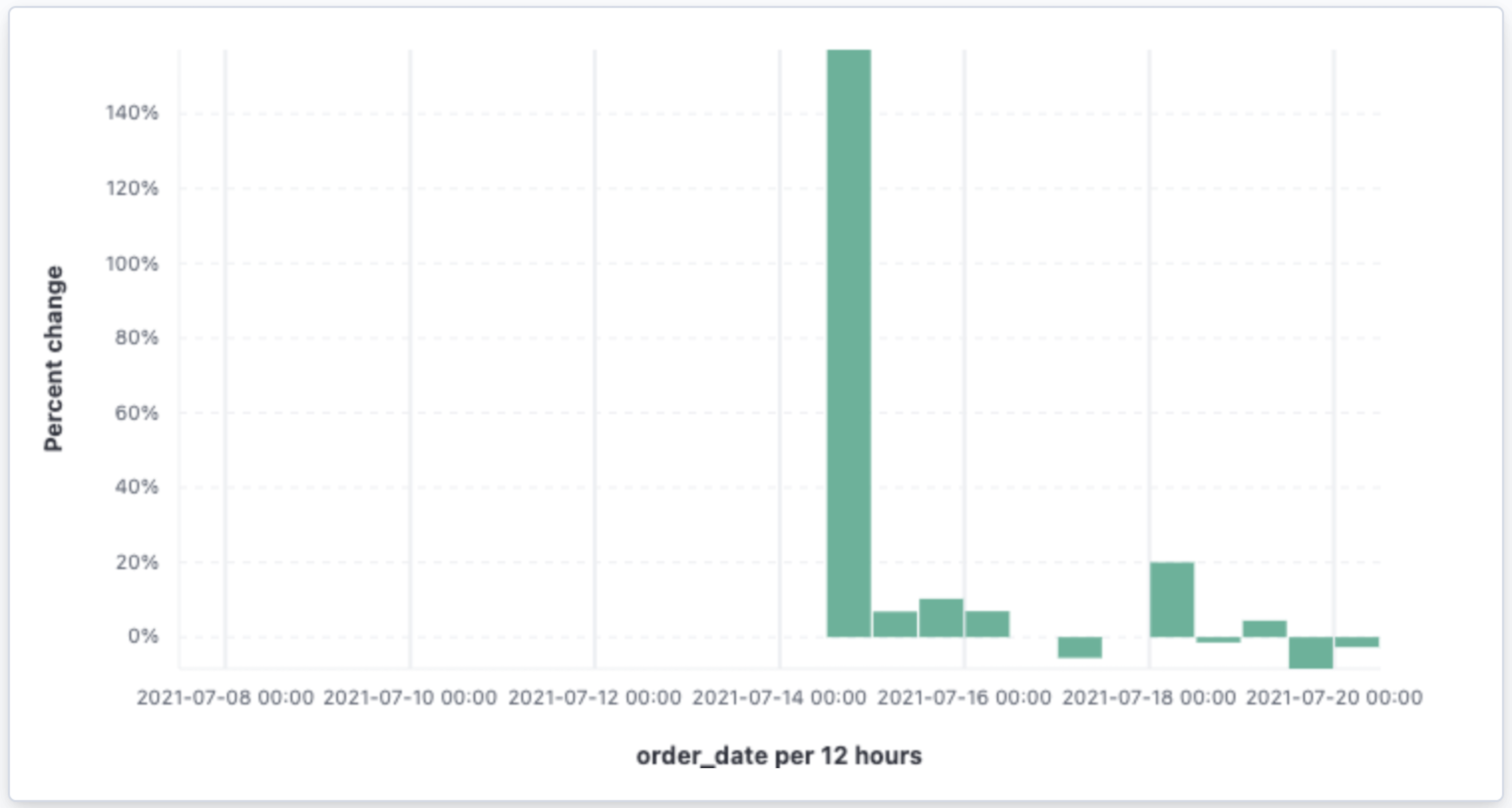
-
Click Formula, then enter
- Click Save and return.
Create a table of customers by category over time
editTables are useful when you want to display the actual field values. You can build a date histogram table, and group the customer count metric by category, such as the continent registered in user accounts.
In Lens you can split the metric in a table leveraging the Columns field, where each data value from the aggregation is used as column of the table and the relative metric value is shown.
- On the dashboard, click Create visualization.
- Open the Chart Type dropdown, then click Table.
- From the Available fields list, drag customer_id to the Metrics field in the layer pane.
- In the layer pane, click Unique count of customer_id.
-
In the Display name field, enter
Customers, then click Close. - From the Available fields list, drag order_date to the Rows field in the layer pane.
-
In the layer pane, click the order_date.
- Select Customize time interval.
- Change the Minimum interval to 1 days.
-
In the Display name field, enter
Sale, then click Close.
Add columns for each continent.
-
From the Available fields list, drag geoip.continent_name to the Columns field in the layer pane.
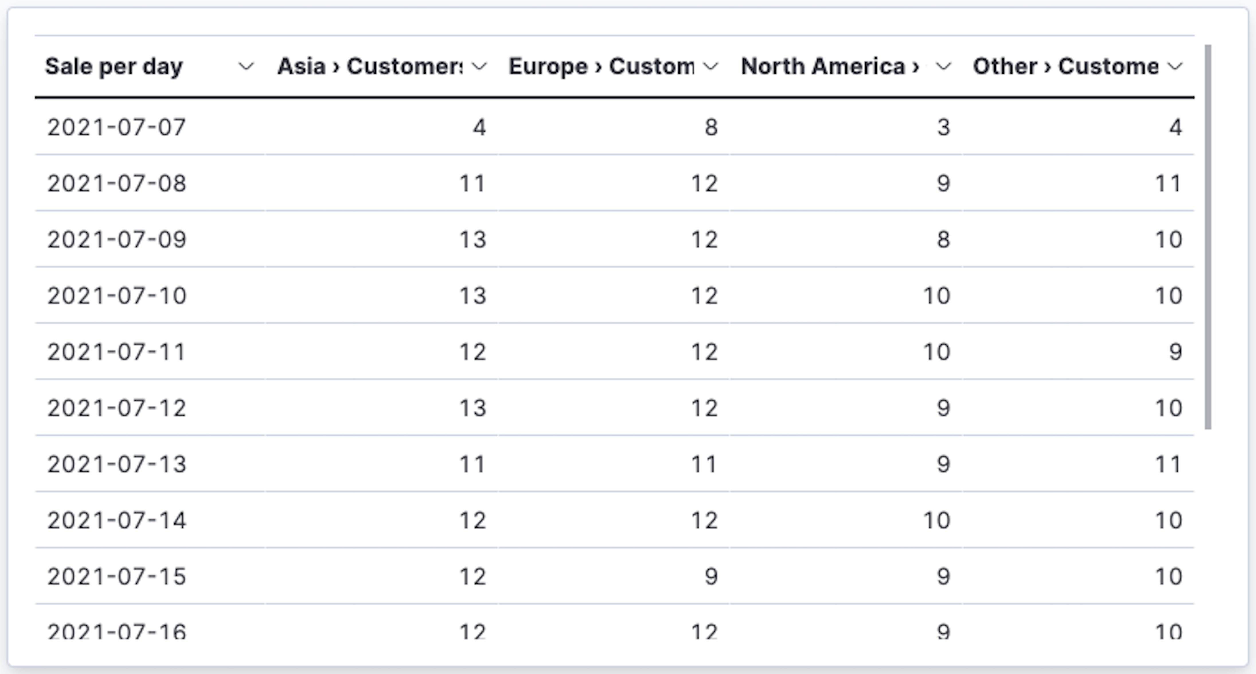
- Click Save and return.
Save the dashboard
editNow that you have a complete overview of your ecommerce sales data, save the dashboard.
- In the toolbar, click Save.
-
On the Save dashboard window, enter
Ecommerce sales, then click Save. - Select Store time with dashboard.
- Click Save.