Build your first dashboard
editBuild your first dashboard
editLearn the most common ways to build a dashboard from your own data. The tutorial will use sample data from the perspective of an analyst looking at website logs, but this type of dashboard works on any type of data. Before using this tutorial, you should be familiar with the Kibana concepts.
Add the data and create the dashboard
editAdd the sample web logs data that you’ll use to create the dashboard panels.
- Go to the Kibana Home page, then click Try our sample data.
- On the Sample web logs card, click Add data.
Create the dashboard where you’ll display the visualization panels.
- Open the main menu, then click Dashboard.
- Click Create dashboard.
- Set the time filter to Last 90 days.
Open Lens and get familiar with the data
edit- On the dashboard, click Create visualization.
-
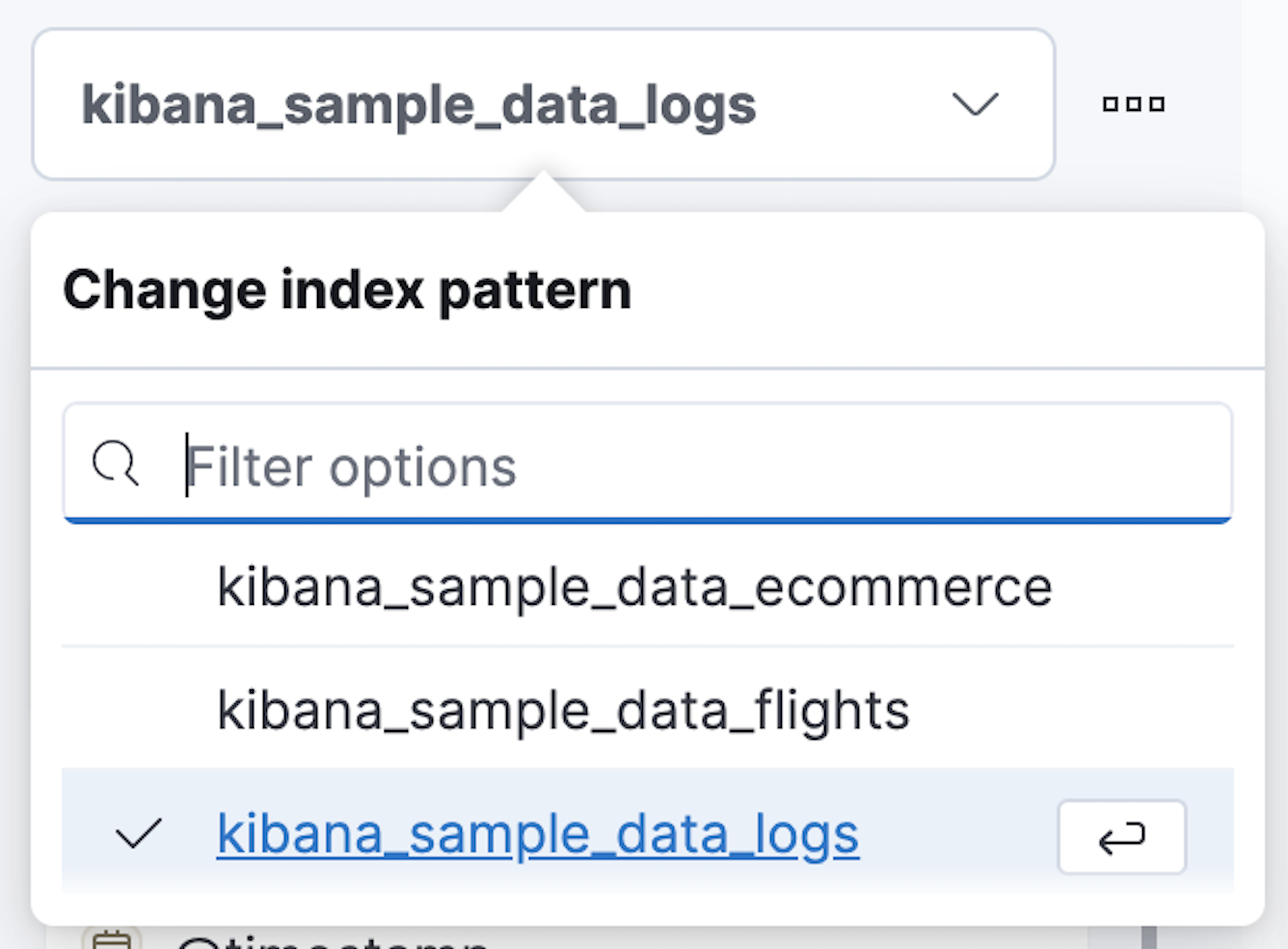
Make sure the kibana_sample_data_logs index appears.
- To create the visualizations in this tutorial, you’ll use the Records, timestamp, bytes, clientip, and referer.keyword fields. To see the most frequent values of a field, hover over the field name, then click i.
Create your first visualization
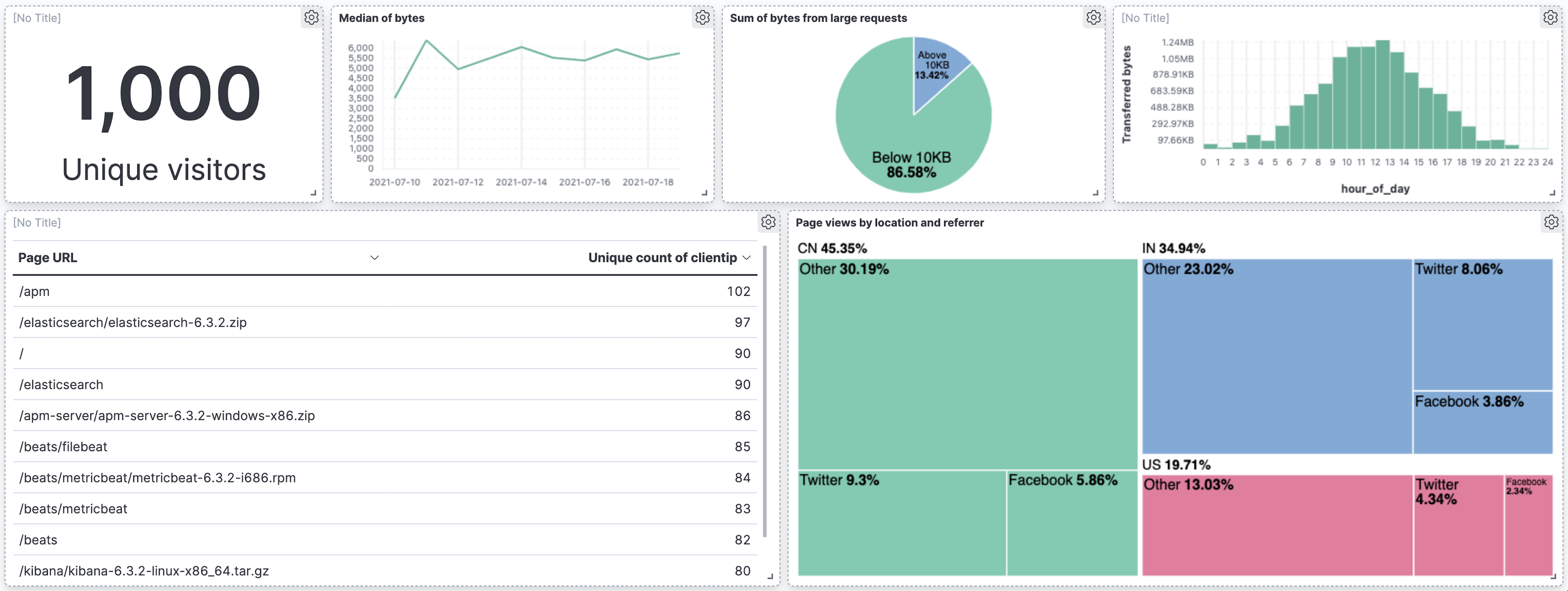
editPick a field you want to analyze, such as clientip. If you want to analyze only this field, you can use the Metric visualization to display a big number. The only number function that you can use with clientip is Unique count. Unique count, also referred to as cardinality, approximates the number of unique values of the clientip field.
-
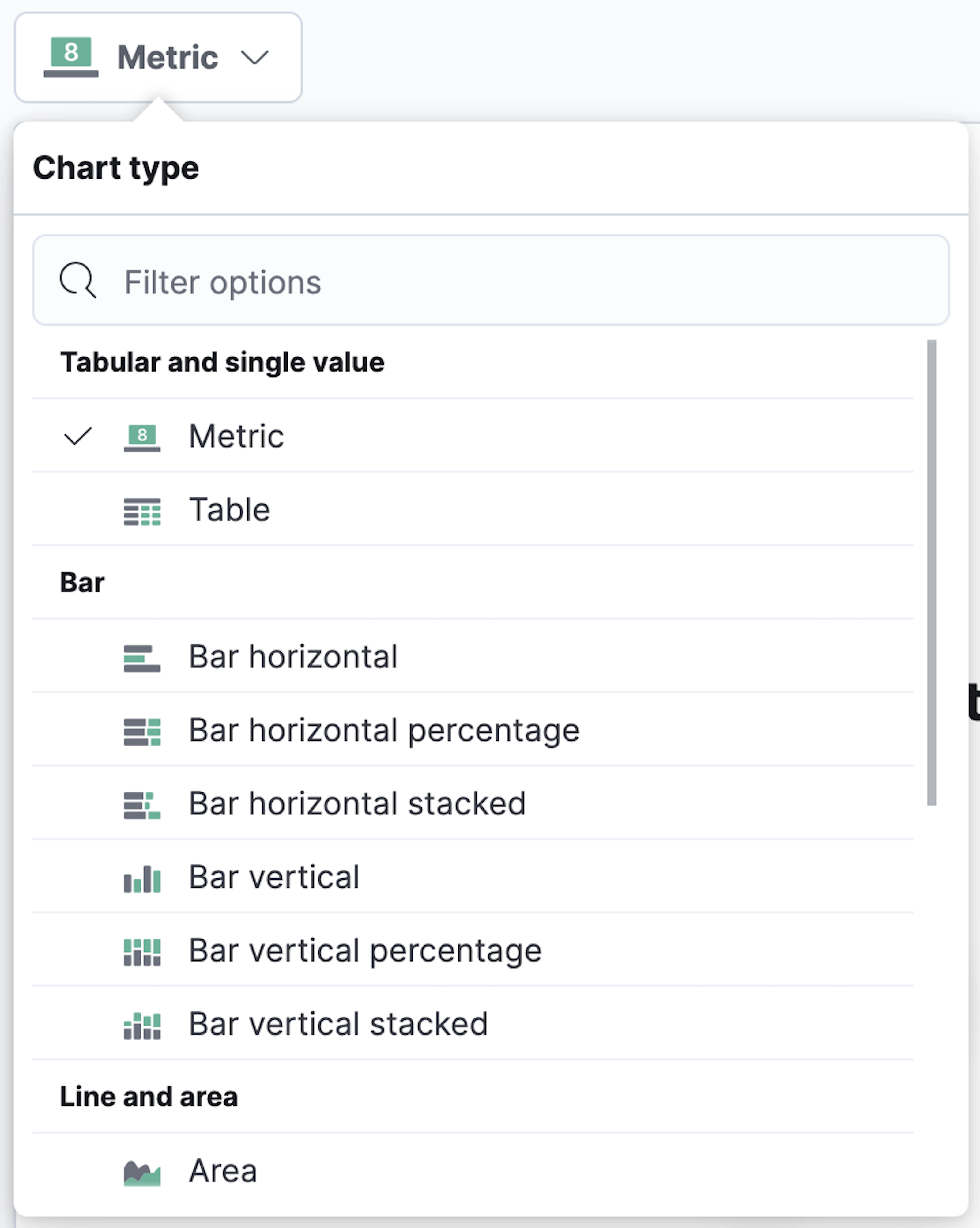
To select the visualization type, open the Chart type dropdown, then select Metric.
-
From the Available fields list, drag clientip to the workspace.
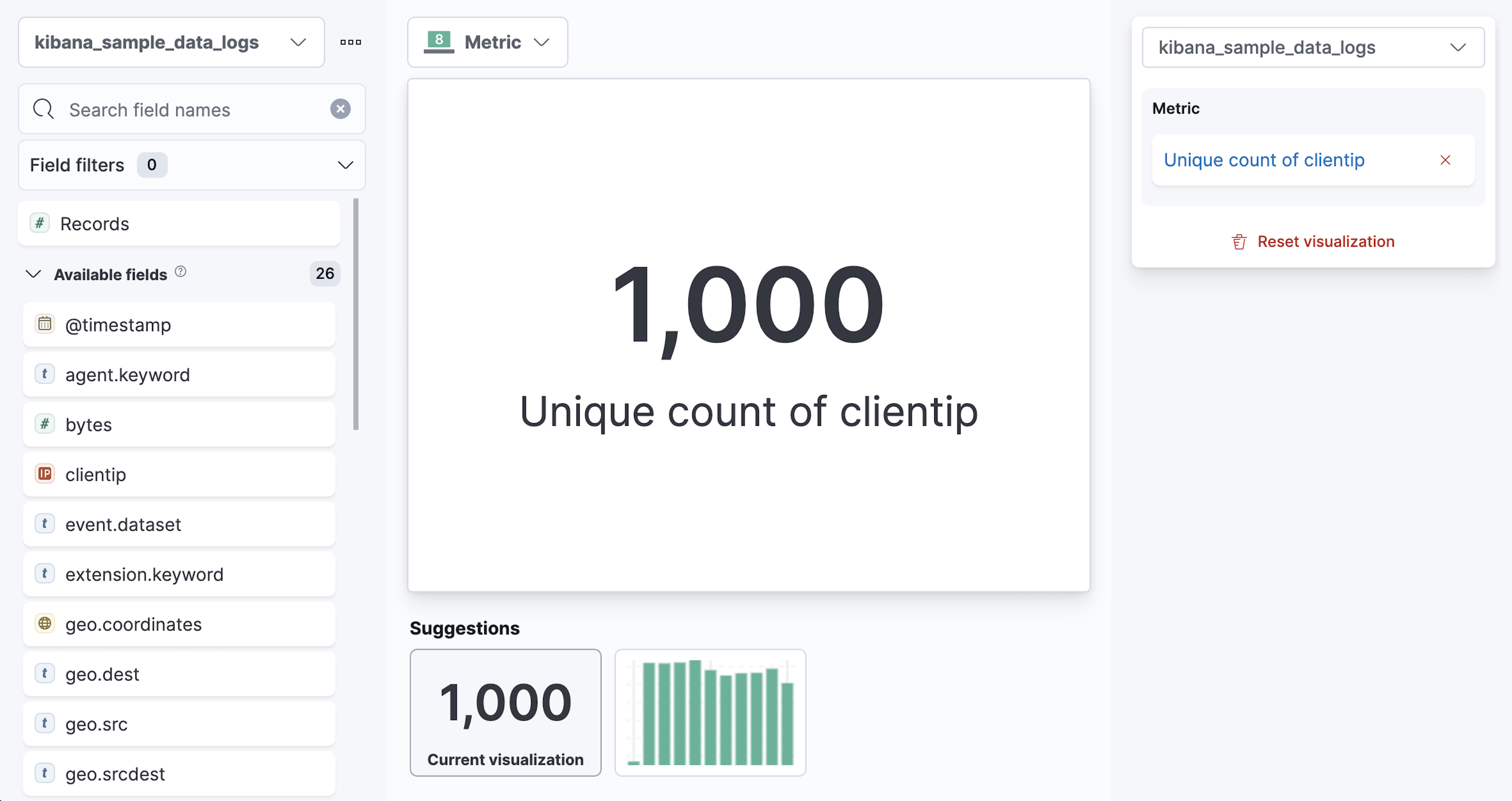
Lens selects the Unique count function because it is the only numeric function that works for IP addresses. You can also drag clientip to the layer pane for the same result.
-
In the layer pane, click Unique count of clientip.
-
In the Display name field, enter
Unique visitors. - Click Close.
-
In the Display name field, enter
-
Click Save and return.
The metric visualization has its own label, so you do not need to add a panel title.
View a metric over time
editLens has two shortcuts that simplify viewing metrics over time. If you drag a numeric field to the workspace, Lens adds the default time field from the index pattern. When you use the Date histogram function, you can replace the time field by dragging the field to the workspace.
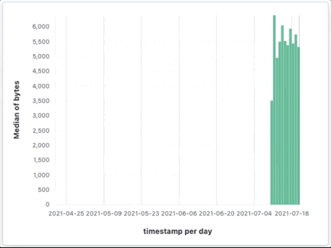
To visualize the bytes field over time:
- On the dashboard, click Create visualization.
-
From the Available fields list, drag bytes to the workspace.
Lens creates a bar chart with the timestamp and Median of bytes fields, and automatically chooses a date interval.
-
To zoom in on the data you want to view, click and drag your cursor across the bars.
To emphasize the change in Median of bytes over time, change to a line chart with one of the following options:
- From the Suggestions, click the line chart.
- Open the Chart type dropdown in the editor toolbar, then select Line.
- Open the Chart type menu in the layer pane, then click the line chart.
You can increase and decrease the minimum interval that Lens uses, but you are unable to decrease the interval below the Advanced Settings.
To set the minimum time interval:
- In the layer pane, click timestamp.
- Select Customize time interval.
- Change the Minimum interval to 1 days, then click Close.
To save space on the dashboard, hide the vertical and horizontal axis labels.
-
Open the Left axis menu, then deselect Show.
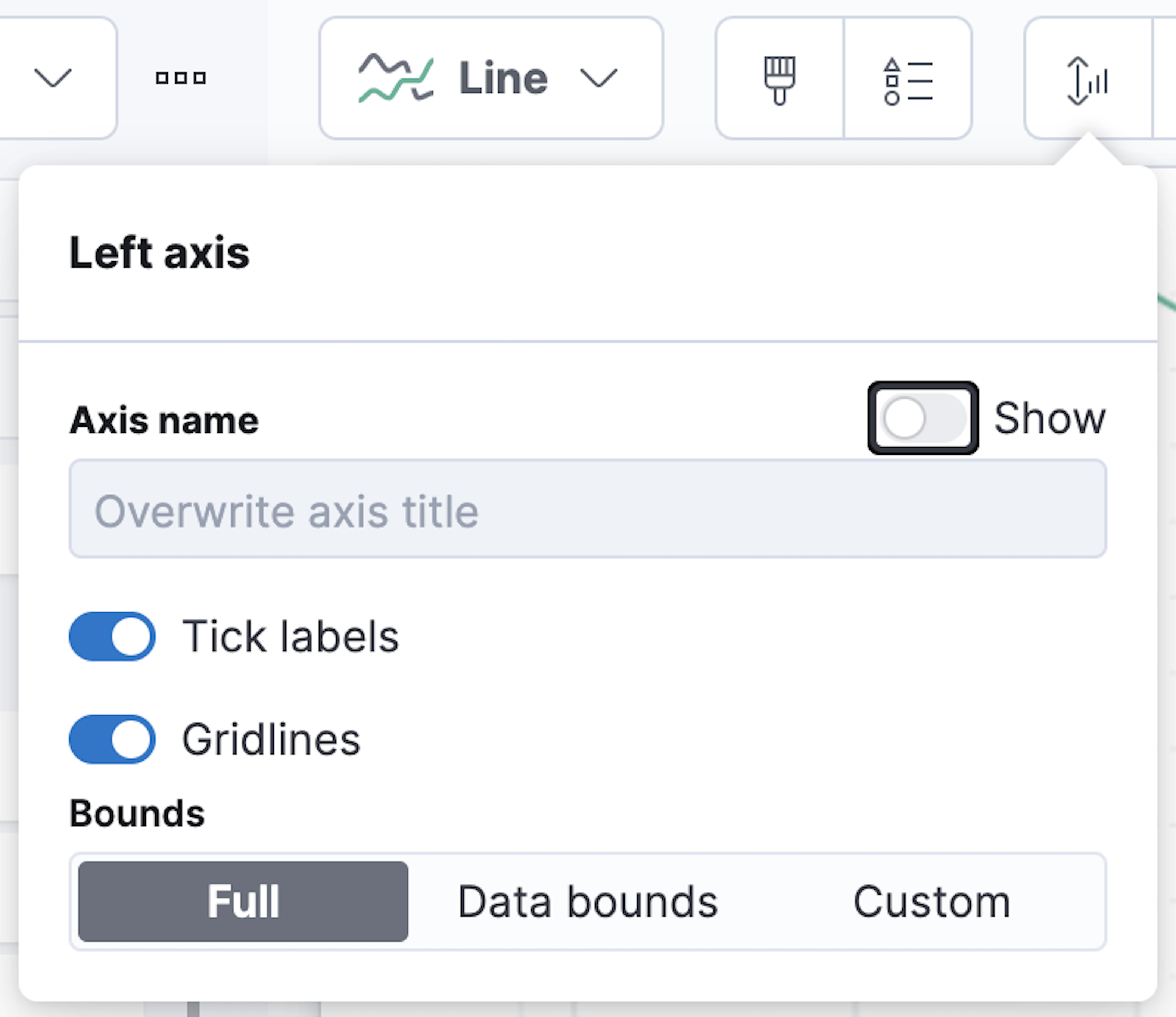
- Open the Bottom axis menu, then deselect Show.
- Click Save and return
Add a panel title to explain the panel, which is necessary because you removed the axis labels.
- Open the panel menu, then select Edit panel title.
-
In the Panel title field, enter
Median of bytes, then click Save.
View the top values of a field
editThe Top values function ranks the unique values of a field by another function. The values are the most frequent when ranked by a Count function, and the largest when ranked by the Sum function.
Create a visualization that displays the most frequent values of request.keyword on your website, ranked by the unique visitors. To create the visualization, use Top values of request.keyword ranked by Unique count of clientip, instead of being ranked by Count of records.
- On the dashboard, click Create visualization.
-
From the Available fields list, drag clientip to the Vertical axis field in the layer pane.
Lens automatically chooses the Unique count function. If you drag clientip to the workspace, Lens adds the field to the incorrect axis.
When you drag a text or IP address field to the workspace, Lens adds the Top values function ranked by Count of records to show the most frequent values.
-
Drag request.keyword to the workspace.
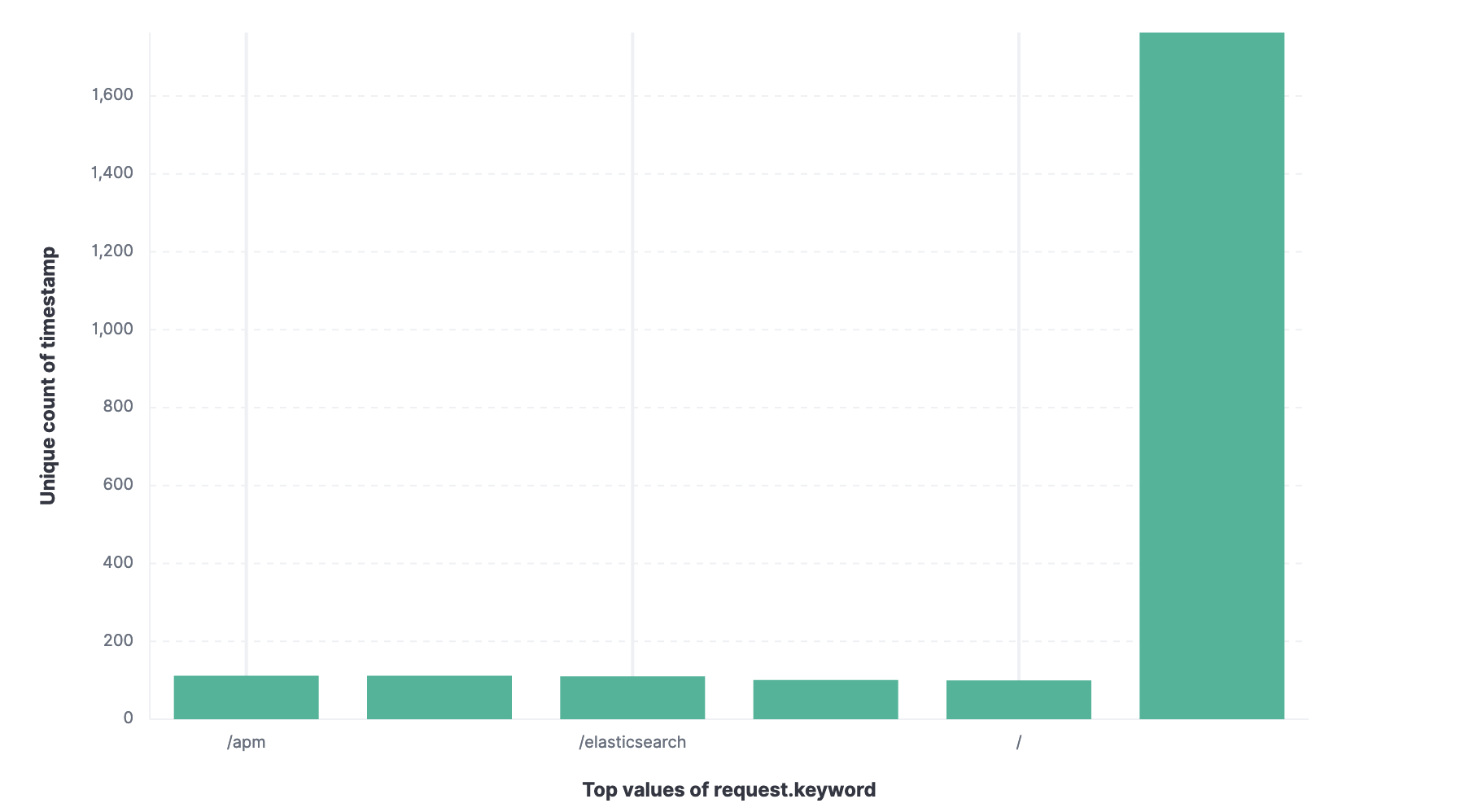
Lens adds Top values of request.keyword to the Horizontal axis.
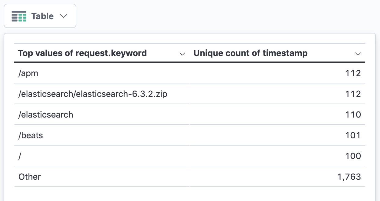
The chart is hard to read because the request.keyword field contains long text. You could try using one of the Suggestions, but the suggestions also have issues with long text. Instead, create a Table visualization.
-
Open the Chart type dropdown, then select Table.
-
In the layer pane, click Top values of request.keyword.
-
In the Number of values field, enter
10. -
In the Display name field, enter
Page URL. - Click Close.
-
In the Number of values field, enter
-
Click Save and return.
The table does not need a panel title because the columns are clearly labeled.
Compare a subset of documents to all documents
editCreate a proportional visualization that helps you to determine if your users transfer more bytes from documents under 10KB versus documents over 10 Kb.
- On the dashboard, click Create visualization.
- From the Available fields list, drag bytes to the Vertical axis field in the layer pane.
- Click Median of bytes, click the Sum function, then click Close.
- From the Available fields list, drag bytes to the Break down by field in the layer pane.
Use the Intervals function to select documents based on the number range of a field. If the ranges were non numeric, or if the query required multiple clauses, you could use the Filters function.
- To specify the file size ranges, click bytes in the layer pane.
-
Click Create custom ranges, enter the following, then press Return:
-
Ranges —
0→10240 -
Label —
Below 10KB
-
Ranges —
-
Click Add range, enter the following, then press Return:
-
Ranges —
10240→+∞ -
Label —
Above 10KB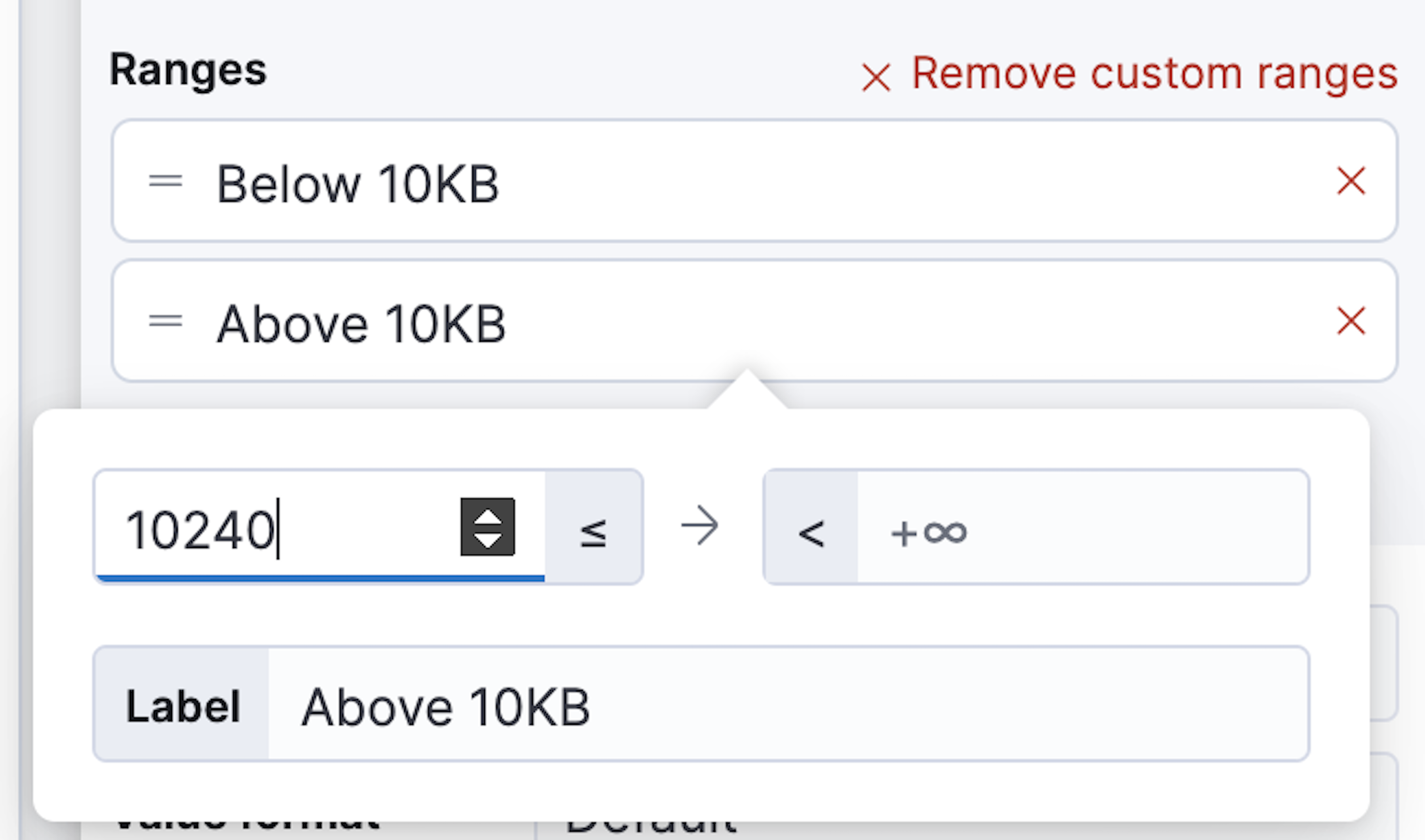
-
Ranges —
- From the Value format dropdown, select Bytes (1024), then click Close.
To display the values as a percentage of the sum of all values, use the Pie chart.
- Open the Chart Type dropdown, then select Pie.
- Click Save and return.
-
Add a panel title.
- Open the panel menu, then select Edit panel title.
-
In the Panel title field, enter
Sum of bytes from large requests, then click Save.
View the distribution of a number field
editKnowing the distribution of a number helps you find patterns. For example, you can analyze the website traffic per hour to find the best time to do routine maintenance.
- On the dashboard, click Create visualization.
- From the Available fields list, drag bytes to Vertical axis field in the layer pane.
-
In the layer pane, click Median of bytes
- Click the Sum function.
-
In the Display name field, enter
Transferred bytes. - From the Value format dropdown, select Bytes (1024), then click Close.
- From the Available fields list, drag hour_of_day to Horizontal axis field in the layer pane.
-
In the layer pane, click hour_of_day, then slide the Intervals granularity slider until the horizontal axis displays hourly intervals.
The Intervals function displays an evenly spaced distribution of the field.
- Click Save and return.
Create a multi-level chart
editYou can use multiple functions in data tables and proportion charts. For example, to create a chart that breaks down the traffic sources and user geography, use Filters and Top values.
- On the dashboard, click Create visualization.
- Open the Chart type dropdown, then select Treemap.
- From the Available fields list, drag Records to the Size by field in the layer pane.
-
In the editor, click the Drop a field or click to add field for Group by, then create a filter for each website traffic source.
- From Select a function, click Filters.
-
Click All records, enter the following, then press Return:
-
KQL —
referer : *facebook.com* -
Label —
Facebook
-
KQL —
-
Click Add a filter, enter the following, then press Return:
-
KQL —
referer : *twitter.com* -
Label —
Twitter
-
KQL —
-
Click Add a filter, enter the following, then press Return:
-
KQL —
NOT referer : *twitter.com* OR NOT referer: *facebook.com* -
Label —
Other
-
KQL —
- Click Close.
Add a geography grouping:
- From the Available fields list, drag geo.src to the workspace.
-
To change the Group by order, drag Top values of geo.src so that it appears first.
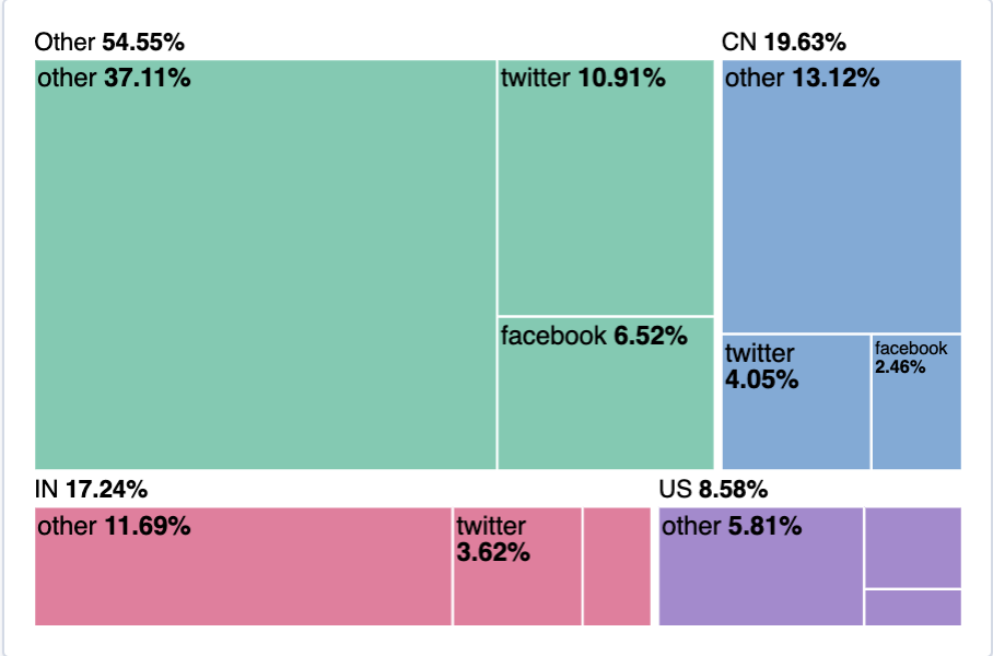
-
To view only the Facebook and Twitter data, remove the Other category.
- In the layer pane, click Top values of geo.src.
- Open the Advanced dropdown, deselect Group other values as "Other", then click Close.
- Click Save and return.
-
Add a panel title.
- Open the panel menu, then select Edit panel title.
-
In the Panel title field, enter
Page views by location and referrer, then click Save.
Arrange the dashboard panels
editResize and move the panels so they all appear on the dashboard without scrolling.
Decrease the size of the following panels, then move them to the first row:
- Unique visitors
- Median of bytes
- Sum of bytes from large requests
- hour_of_day
Save the dashboard
editNow that you have a complete overview of your web server data, save the dashboard.
- In the toolbar, click Save.
-
On the Save dashboard window, enter
Logs dashboardin the Title field. - Select Store time with dashboard.
- Click Save.