Kibana 7.8.0 released
Today we are delighted to announce the availability of Kibana 7.8. With this release we are introducing an updated side navigation designed not only to help you find the apps you care about more quickly, but also to highlight other potential helpful apps for your use case. We are also delivering a number of new features and capabilities designed to make building, iterating, and using both data visualizations and dashboards a fast and powerful experience, including drilldowns for dashboards and new chart types for Kibana Lens. Also in this Kibana 7.8 release, Elastic Maps introduces out-of-the-box layers for Elastic Observability designed to automatically work with your APM data by overlaying things like real user monitoring (RUM) performance and traffic.
Can’t wait to try out these new Kibana 7.8 features? Startup a free trial of Elasticsearch and Kibana on Elastic Cloud — the only hosted Elasticsearch offering to include these new capabilities — or work locally by downloading the latest versions of Kibana and the Elastic Stack.
For a full list of bug fixes and other changes, don’t miss the Kibana 7.8 release notes.
An updated side navigation organized around your use cases
Kibana is designed to get work done. Hard work. Analytical work. Time sensitive “this matters right now” kind of work. We labor constantly to make sure that the people who depend on Kibana to do that critical work — be it keeping vital applications running or safeguarding against digital threats — can do their jobs efficiently. As the number of applications we’ve given a home inside Kibana has grown, we’ve recognized it is time to bring that focus on efficiency to the way you navigate the interface itself. That’s why with Kibana 7.8 we’re introducing an updated side navigation designed to help you quickly locate the apps you need as well as spot other tools that might be useful. Specific changes we’ve made include:
- A cleaner overall Kibana interface with the side navigation hidden by default, accessible in a single click via the top-left hamburger menu
- A simpler organization of the side navigation with new solution headers that group applications together appropriately (e.g., Logs, Metrics, APM, and Uptime are now all grouped under the Observability header, while SIEM lives under Security)
- Easier access to current projects inside Kibana with a more visible “recently viewed” area at the top of the side navigation
- A one-click “Dock Navigation” button at the bottom of the side navigation to keep things in plain sight if that is what you prefer
Uncovering data insights faster
Kibana offers a unique place for users to have a truly interactive experience with their data. Simple gestures like selecting points on a line or clicking on a pie chart give you immediate analytical insights thanks to the speed and power of Elasticsearch running underneath. In 7.8 we are excited to be delivering bold new features designed to make Kibana an even more compelling tool for data analysis and investigation.
A dashboard-first experience
Our goal for some time has been to make the entire experience of visually engaging with data as fast and seamless as possible. In recent releases, we began the journey of minimizing the number of steps it takes to build a visualization and successfully add it to a dashboard. An example of our efforts was the addition of the “create new” button in 7.7 when starting with a blank dashboard. This enhancement allows for the dashboard itself to become an easy starting point for analysis and is also designed to keep you in the authoring flow.
In 7.8 we are streamlining dashboard authoring even further by helping you instantly get back to your original starting point when you choose to edit and then save a visualization already on a dashboard. This new save behavior simplifies the process for updating visuals dramatically by removing the need to ever have to think about navigating away from, or back to, the dashboard you are using. Improving this flow means that, for example, a WebOps specialist who is hurriedly analyzing server logs in order to get to the bottom of a site outage doesn’t have to stop focusing on solving that problem in order to remember how to click back to the dashboard they were looking at in the first place.
Dashboard-to-dashboard drilldowns are here!
On the topic of dashboards, we are thrilled to deliver with Kibana 7.8 our first step in providing drilldown capabilities that let you quickly create custom analytical navigation paths for viewers between dashboards. These drilldown paths become available to all viewers of a dashboard and not only serve to inform them of additional views of data, but can also act as repeatable workflows to guide viewers in certain directions. A scenario where this is highly useful might be if you wanted to provide drilldown paths from a high-level observability dashboard to more granular analyses that incorporated additional data from APM, logs, or uptime. With Kibana 7.8 you can now provide three different drilldown options for your viewers (e.g., “click here to drilldown to application traces,” etc.). Even better, you can also provide drilldown paths from those granular dashboards that drill back up to the higher-level view so no matter where a viewer starts their journey they have built-in ways to expand their perspective of the data.
For 7.8, the option to create a drilldown is available on traditional charts created in Visualize. Drilldowns for charts created in Kibana Lens and Elastic Maps will be coming soon.
New chart types in Kibana Lens
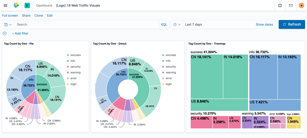
Introducing three new visualization types for Kibana Lens in 7.8: pie charts, donut charts, and treemaps. These new visualizations are great for rapidly getting a picture of how your data breaks down into discrete categories and for spotting outliers (both large and small). For instance, let's say you're asking, “of all the portscans of my website, what percentage came from what countries?” Now with Lens, answering that question is as simple as a two drag and drops and then a click. Even better though is that these charts can go a level deeper when you add a second discrete field to the view. Using our port scans example, with just one additional drag and drop in Lens you could expand your analysis to see portscans by origin country and then further subdivided by something like origin city or domain — all while not losing sight of the whole picture. The ease and flexibility of Kibana Lens to do ad hoc visual data analysis and the powerful views these new chart types unlock mean your ability to slice and dice your data in 7.8 just reached a whole new level.
Embed Anomaly Explorer visuals directly into dashboards
Machine learning in the Elastic Stack offers a wide range of native capabilities for extracting unseen insights from your data in Elasticsearch. Anomaly detection in particular can surface unusual behaviors that might normally go unnoticed when performing a more straightforward data analysis project. That is why we are so excited in 7.8 to take our first step towards bringing the power of anomaly detection into Kibana dashboards with the ability to embed Anomaly Explorer visuals.
Imagine a use case where you are responsible for tracking user behavior on a website and have a Kibana dashboard where you’ve built the standard views for everything from pageviews and sessions to service response times broken down by geography. These are all critical metrics to track, but they only represent the things you know to pay attention to and build analytics for. If someone tasked you with expanding your dashboard to include a visual that highlighted the top users exhibiting “unusual” behavior, it raises a big question: What counts as unusual and which patterns in the data do we need to define so that you can then turn around and look for “unusual” points that fall out of those bounds? This is the exact problem anomaly detection addresses by doing that work for you. Now the task of updating your dashboard to incorporate those results is as easy as simply selecting which machine learning jobs you want to be displayed. The end state is a visual that highlights the unusual behavior you wouldn’t necessarily think to look for alongside and in the context of the core metrics that matter to you, making comparison and investigation easy.
Click more, dive deeper
As if Kibana 7.8 didn’t already have a staggering number of great new things, we’ve also added enhancements for filtering behavior when you click or drag your mouse cursor on a chart that lives in a dashboard. With this release, clicking on a portion of a chart now yields the same filter behavior no matter if the visual was created using Kibana Lens or Visualize. You’ll be presented with the same option for applying a filter to the rest of the views on the dashboard. Likewise, for time series analysis, in 7.8 using a click-drag motion (brushing) to select an area will prompt the same filtering experience for both Visualize and Kibana Lens charts.
Canvas: From data discovery to data masterpiece even faster
In 7.8 we’re making it even easier for you to create stunning presentations with your data by introducing a new menu for Canvas designed to help you find the actions you need. As we continue to make Canvas the fastest way to craft beautiful representations of your live Elasticsearch data, you’ll notice the updated menu gives you simpler access to already created charts and maps so you can rapidly embed them into your formatted Canvas workpads. Swiftly move from ad hoc idea to fully designed data display while also helping promote the metrics that matter to your company. And for those of you that regularly create and share PDFs of Canvas creations, it's not your imagination that things suddenly feel snappier. For 7.8 we reduced the overall time it takes to generate the PDF export of a Canvas workpad, meaning you can get beautiful data reports into the hands of more people even faster.
Elastic Maps
Out-of-the-box maps for real user monitoring (RUM) performance and traffic
In the world of observability and application performance monitoring, the ability to know what a user’s actual frontend experience is like (real user monitoring, or RUM) is critical. While backend request and response times are important, those metrics don’t, by themselves, guarantee that people interacting with your application are being served quickly and without errors. And when you’re tracking people as opposed to processes, the issue of their location geographically absolutely matters for understanding RUM traffic and performance.
To help teams who deeply care about RUM and are responsible for application performance SLAs, we’re rolling out a brand new feature in Elastic Maps specifically designed to support observability practitioners working with RUM data. In Elastic Maps 7.8, when adding a layer to a map, you’ll now be presented with a new Elastic Observability option if you have APM indices in the Elastic Common Schema. Within this new option you’ll be able to quickly select either APM RUM performance or APM RUM traffic as a layer and automatically have Elastic Maps overlay it on your geoanalysis. With this new capability, application monitoring teams will be able to build invaluable map-based user monitoring tools in just a few clicks that help them serve their own users better — wherever they may be.
To read more about this new capability and other awesome APM developments, check out the 7.8 Elastic APM blog.
Center your world with the new fit-to-data button
Whether you’re sifting through suspicious IP locations as a security practitioner or trying to understand why users hitting your site from a certain part of the world are experiencing performance issues, the need to quickly zero in on specific locations is real. As part of our 7.8 release, Elastic Maps is adding a powerful way to accomplish this goal with the fit-to-data button. Located under the left-hand zoom controls, this new button makes centering and zooming in on just the visible data points as easy as clicking your mouse one time. When used in combination with spatial filters, the result is a lightning-fast way to inspect the exact location data you are interested in.
Pro tip: Zooming back out to your original unfiltered map view is equally easy — simply remove the first filter you created, then click the fit-to-data button again.
Upload 10x larger files into the Elastic Stack
No, that is not a misprint. In 7.8 we have added the ability to edit the upload limit for the file data visualizer from 100MB to 1GB. Combine this with the 7.7 enhancement for the file data visualizer UI to recommend a filebeat config to streamline uploading files structured in the same way, and you’ve got a recipe for ingesting large files much faster. Equally exciting though is the file data visualizer’s new ability to generate an analysis explanation of how it successfully or unsuccessfully mapped data fields as part of the upload process. This new feature is invaluable if you are just getting started with uploading files into the Elastic Stack and want to understand why the file data visualizer isn’t able to successfully ingest your data due to something like an unsupported date format. Whether you’re trying to bring in more data to support training machine learning models or even just loading custom sample data to try out an observability or security app for the first time, we’re making moving data into the Elastic Stack even easier in 7.8.
Ingest made (even) easier
It stands to reason that nothing is more important than being able to easily get data into the Elastic Stack. If you’ve been using Elasticsearch for a while you’ve likely configured Beats and/or Logstash to help move and transform your data during ingest. And over the last three (or so) years you know that Elasticsearch ingest nodes, ingest processors (like the enrich processor we introduced with Elasticsearch 7.5), and custom ingest pipelines have become incredibly powerful tools for getting data into the Elastic Stack at scale.
With the release of 7.8 we’re making the ability to ingest data into the Elastic Stack even easier with the introduction of the ingest node pipeline builder.
The ingest node pipeline builder allows you to view all of your data pipelines in a single table. In addition, you can create, delete, and edit pipelines using a JSON editor. Now you can easily test how a pipeline and its various (ingest) processors transform data / documents before putting it into production, saving you configuration time and speeding up your ability to get new data into the Elastic Stack.
Transforming your data for better analysis
Being able to shape data and alter its level of granularity is an important capability in the world of data analytics since it can impact everything from storage to the level of insight you can glean. From security analytics to logs investigation to machine learning model training — manipulating data aggregation and orientation is key. At Elastic we’ve made it easy and scalable to house, search, and analyze vast amounts of raw granular data while at the same time giving you the option to do powerful data summarizations and pivots by performing transforms directly from within the Kibana interface on Elasticsearch indices.
The ability to do transforms became generally available in the 7.7 release, but that doesn’t mean we’ve slowed down the innovation. In 7.8, the interface for building transforms has been updated to provide you with a more flexible layout for rapidly building and previewing the results of transformed data.
In addition, in 7.8 we’ve added a new ability when creating or updating a transform that allows you to define a rate at which it performs search and index requests. This gives you the flexibility to control the impact the transforms process actually has from a resource perspective on your Elastic Stack cluster.
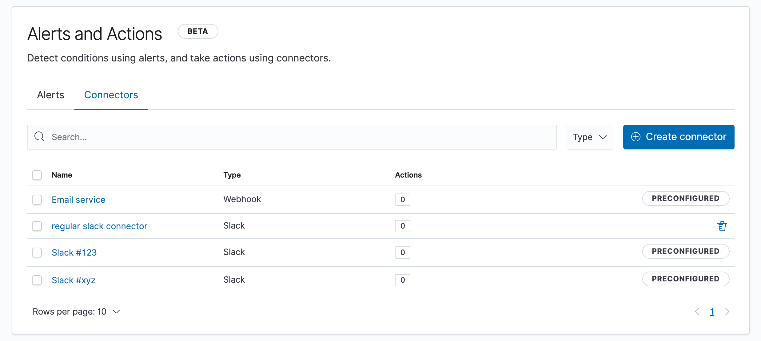
Pre-configured connectors for alerting
In the previous release of Kibana we unveiled a wholly new system for how the Elastic Stack handles alerting. This new alerting framework introduced several core components that help us with our vision of not only making alert creation ubiquitous and alerts themselves easy to make sense of, but also seamlessly drive action. In support of this, we included built-in third-party connectors to PagerDuty and Slack as well as the ability to quickly integrate with email clients and use webhooks.
In 7.8 we are going even further to make alerting in the Elastic Stack actionable by introducing the ability to build pre-configured connectors that automatically start up with Kibana, are globally available in every Kibana space, and require zero configuration after initialization. This capability allows Kibana administrators to pre-plumb alert connections directly into things like specific Slack channels or designated email services so that users of Kibana aren’t forced to hunt for things like webhook URLs and can simply tie their alerts to the systems they want. Pre-configured connectors also include the ability to securely handle sensitive properties (e.g., passwords, etc.) by using the Kibana keystore.
Logging into Kibana
Configurable pre-access screen
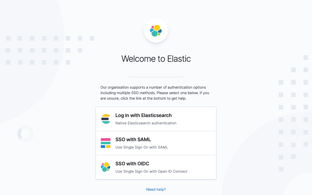
The Elastic Stack is used globally by a wide variety of companies, government agencies, and other entities — many with their own unique requirements, especially when it comes to access and security. Our ongoing goal is to offer flexible and customizable capabilities on this front that allow anyone to use Elastic’s products in accordance with the security standards and policies they need to follow. In 7.8 we are pleased to provide another fantastic feature to help meet these needs with the ability to configure a pre-access screen that is shown before a user is allowed to authenticate into Kibana. This screen supports customizable text as well as a completion button that indicates a viewer has read and accepted the written terms.
Sign in to Kibana how you want. Now with more customizations.
In 7.7 we released a configurable sign-on experience for anyone using SSO authentication solutions that let them have flexibility over what that doorway into Kibana felt like. In 7.8 we're expanding this experience by offering additional fine-grained customization options including the ability to control the text for password hints, customize the icons for SSO options, and use markdown for additional messages and prompts on the page.
Get hands-on with Kibana 7.8
Spin up an Elasticsearch cluster on Elastic Cloud and you could be checking out these exciting new Kibana features in less than 3 minutes. Or download the latest builds today and start exploring locally. And be sure to let us know what you think on Twitter (@elastic) or in our forum. You can report any problems on the GitHub issues page.
Related blogs: