Data Visualization For Machine Learning
Editor’s Note: Elastic joined forces with Endgame in October 2019, and has migrated some of the Endgame blog content to elastic.co. See Elastic Security to learn more about our integrated security solutions.
Building a machine learning model for a data product is a difficult task involving many steps from data collection and management all the way to integration and presentation of results. One of the most important steps in the process is validating that your model is providing useful predictions in the way you intended. Normally, model validation occurs through onerous data munging processes and analyses and can take a significant amount of time. Instead, simple data visualizations can greatly expedite the validation process while also helping bridge the gap between data scientists and engineering and product managers.
At Endgame, we needed a faster and easier way to receive feedback on our malware model, MalwareScore (TM), so I created an internal tool called Bit Inspector. The tool provides this feedback in the form of data visualizations, and itself was originally meant for only the developers of MalwareScoreTM. Since its original implementation, the audience has expanded to include subject matter experts, internal red teamers, and managers. Building upon my talk last month at BSidesLV (video and slides available), I will first discuss the value of data visualization for machine learning, and then dive into the technical details of Bit Inspector. Data visualization is an under-utilized tool for validating research and development efforts, while also providing great explanatory powerful across teams to help translate the intricacies of machine learning models.
The Value of Data Visualization
Data visualizations have different levels of explainability, trustworthiness, and beauty. Each visualization has a limited time and resource budget and so sometimes one of these aspects of a visualization won’t be prioritized. As the audiences for your visualizations change, the relative importance of spending time on these qualities will also change. The categories aren’t rigorous, but they do provide some rough guidelines I follow when crafting data visualizations.
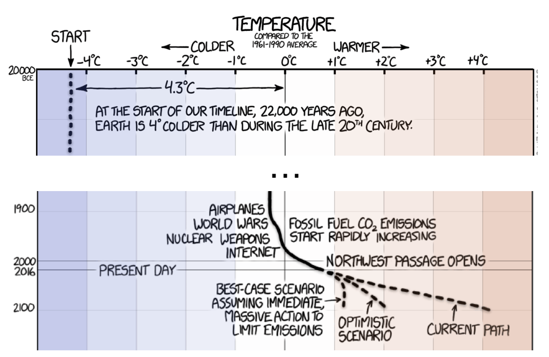
Let’s first define each category. Explainability refers to the ability of the visualization to stand on its own, requiring little or no explanation to the viewer. There are several obvious factors that can enhance a visualization including labels, units of measurement, and a title. But beyond that, annotations and explanations can go a long way towards making a visualization truly understandable. This Earth temperature timeline done by XKCD is an excellent example of annotations adding to the viewer’s understanding. Relatively short timeframes such as years or decades are easy for us to understand, but when we increase the scope to many thousands or millions of years our ability to conceptualize it breaks down. By annotating human accomplishments along the y-axis, the reader is better able to understand and appreciate these human events.
Another way to improve a visualization is to make it more professional looking in order to increase its trustworthiness. Credibility can be gained by citing sources of the data, explaining methods, and citing the author’s expertise. Media companies will also attempt to maintain a strong brand that audiences trust and then communicate that brand through consistent styling in their data visualizations. FiveThirtyEight and The Economist are both good examples of this.
Beauty is, of course, in the eye of the beholder and so I’m not going to try and define it here. Needless to say, a visualization must be more than eye candy, but those that are visually striking are going to leave a lasting impression when information is conveyed well. Below are internal and external examples of what I believe are beautiful visualizations.
What is Bit Inspector?
At Endgame, I wanted to explore how data visualization could help during the R&D process itself to support model validation. The early versions of Bit Inspector were really just plots I made to convince myself that a proof of concept malware model was actually accomplishing something and that it was worth further engineering effort. Model metrics such as area under a ROC curve and false positive rates were really important at this point to tell me if the model was effective at discriminating between benign and malicious software. At this level, Bit Inspector was effective even without spending time improving the data visualizations.
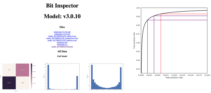
Over time, Bit Inspector has evolved and is now a flask app that makes visualizations built with D3js, matplotlib, and seaborn internally available. There are two main routes for Bit Inspector: viewing information related to a single PE file (a sample) and viewing information related to one version of the MalwareScore TM model. On sample pages, contextual information is listed and visualized including model features, section information, and links to outside resources like VirusTotal. A history of MalwareScore TM predictions for the sample over time are also visualized, allowing the viewer to quickly diagnose if the model is improving or worsening on this sample.
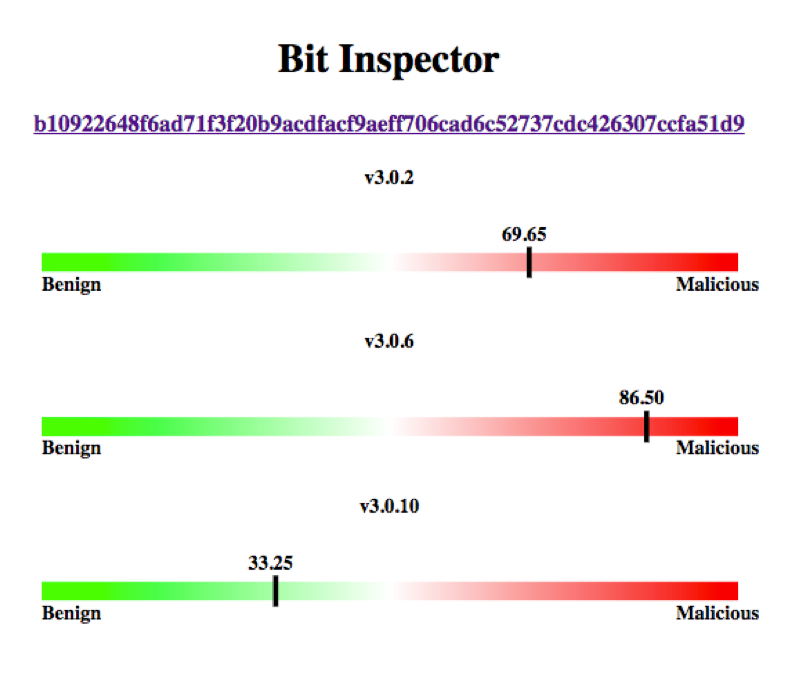
The model page displays model specific metrics like false positive rates, false negative rates, and also ROC curve plots. Plots also display the confusion matrix and distribution of scores for various subsets of our training data. By tracking problem areas after they’ve been fixed, the MalwareScoreTM team can quickly verify after training each model that problems remain or have been fixed. The other model metrics can help us decide if a model is an improvement over the last iteration.
Data Visualization to Inform R&D
As MalwareScoreTM increasingly proved effective, more people became interested in it and in Bit Inspector, including other Endgame data scientists and malware researchers. Soliciting feedback on problem areas and generally red teaming the model were most important at this point. To that end, it was necessary to add context in the form of data sources and model parameters for the data scientists and hashes, PE header information, and links to VirusTotal for the malware researchers. This required a focus on explainability over trustworthiness to quickly convey information. Because of this, Bit Inspector was easier to understand for the majority of users, but there was still work to do related to increasing user confidence and simplification.
Eventually, the audience of Bit Inspector expanded to managers and executives. This audience was interested not only in the performance of the models, but also the progress in training new models and fixing problem areas. The explainability of the plots was tested at this level and Bit Inspector would benefit from additional focus and design to make it understandable to the widest audience possible.
Looking Ahead
Fortunately, there are great resources for data visualization, including the new Facets tool for exploratory data analysis. If the BSidesLV Ground Truth track on data and visualizations is any indicator, infosec is beginning to embrace the value of data visualization. This is a valuable trend that will help increase data literacy across the industry. I thoroughly enjoyed all the talks and I hope that I sparked more interest and ideas in data visualization for other researchers.