Observe, protect, and search your data with a single solution. From application monitoring to threat detection, Kibana is your versatile platform for critical use cases. Start your free 14-day trial now.
Building a time series in Kibana Dashboards used to take 14 clicks. In 9.4, it takes three. Beyond the headline features in this release — a brand new API and natural-language dashboard creation with the AI Chat — we are also shipping a collection of focused changes: improved defaults, freely placed controls, a cleaner visual design. Together, they compound into dashboards faster to set up and easier to scan.
Place controls anywhere in the dashboard
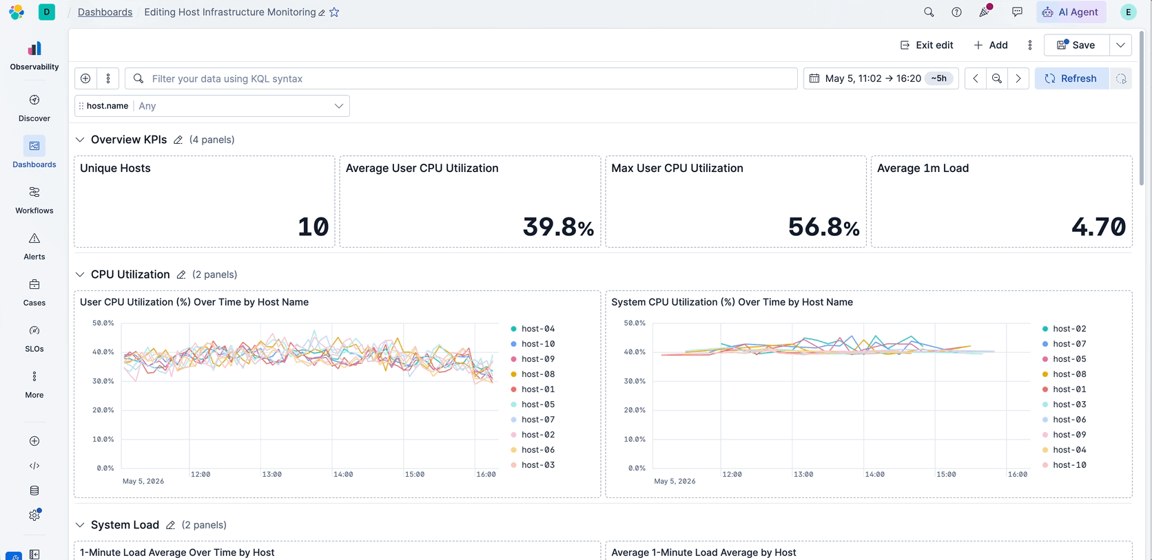
Most dashboarding tools lock filters into a fixed bar at the top of the page. Kibana 9.4 breaks that constraint: controls are now regular panels you can drag anywhere to place them where you need them. Pin them to the top so they stay visible while you scroll, or place them inside a collapsible section where they automatically scope their filters to that section only — so a single dashboard can serve multiple use cases without one filter resetting all the panels.
Fewer clicks to a readable chart
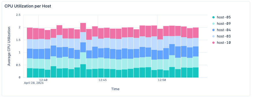
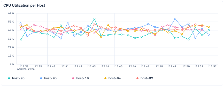
Building a time series in Kibana Dashboards used to take 14 clicks. Now, it takes three. The new defaults give you a line chart with a bottom legend and cleaner x-axis labels — the way you'd configure them by hand. A right-hand legend still makes sense past ten series, but for fewer, the bottom list avoids the empty margin a side legend leaves behind. For top-value breakdowns, the default jumps from three series to nine — matching how many distinct colors the eye can parse at once — and the colors themselves are darker and more separated, so series stand out at a glance
Before (bar chart by default, legend to the right, redundant x-axis label):
Now (line chart by default, list legend at the bottom, more contrasted color palette for lines readability):
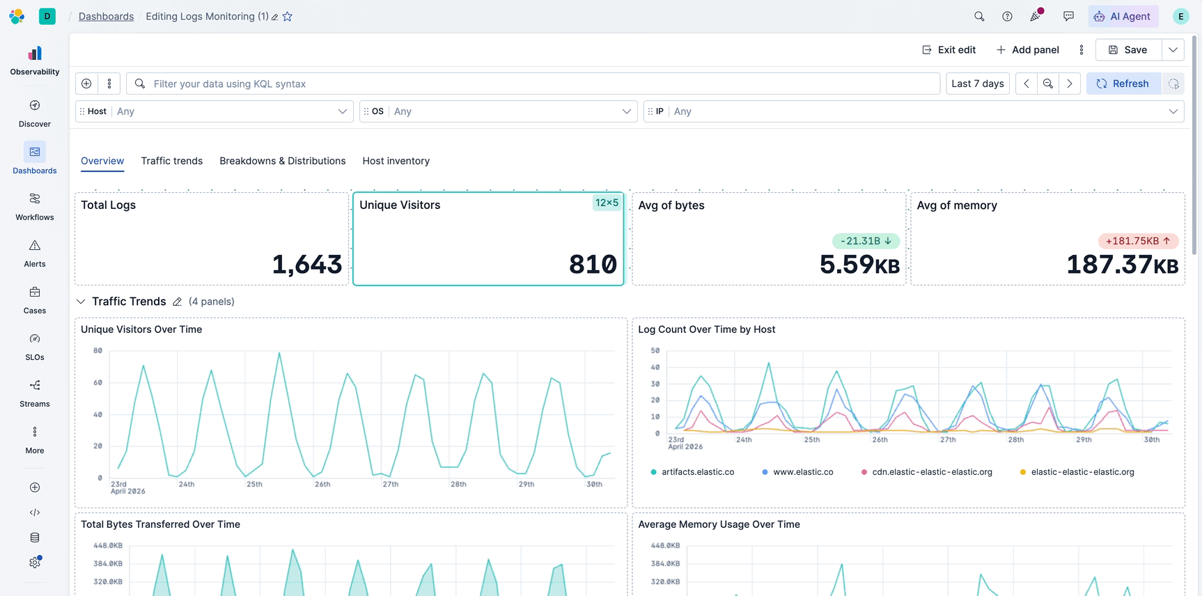
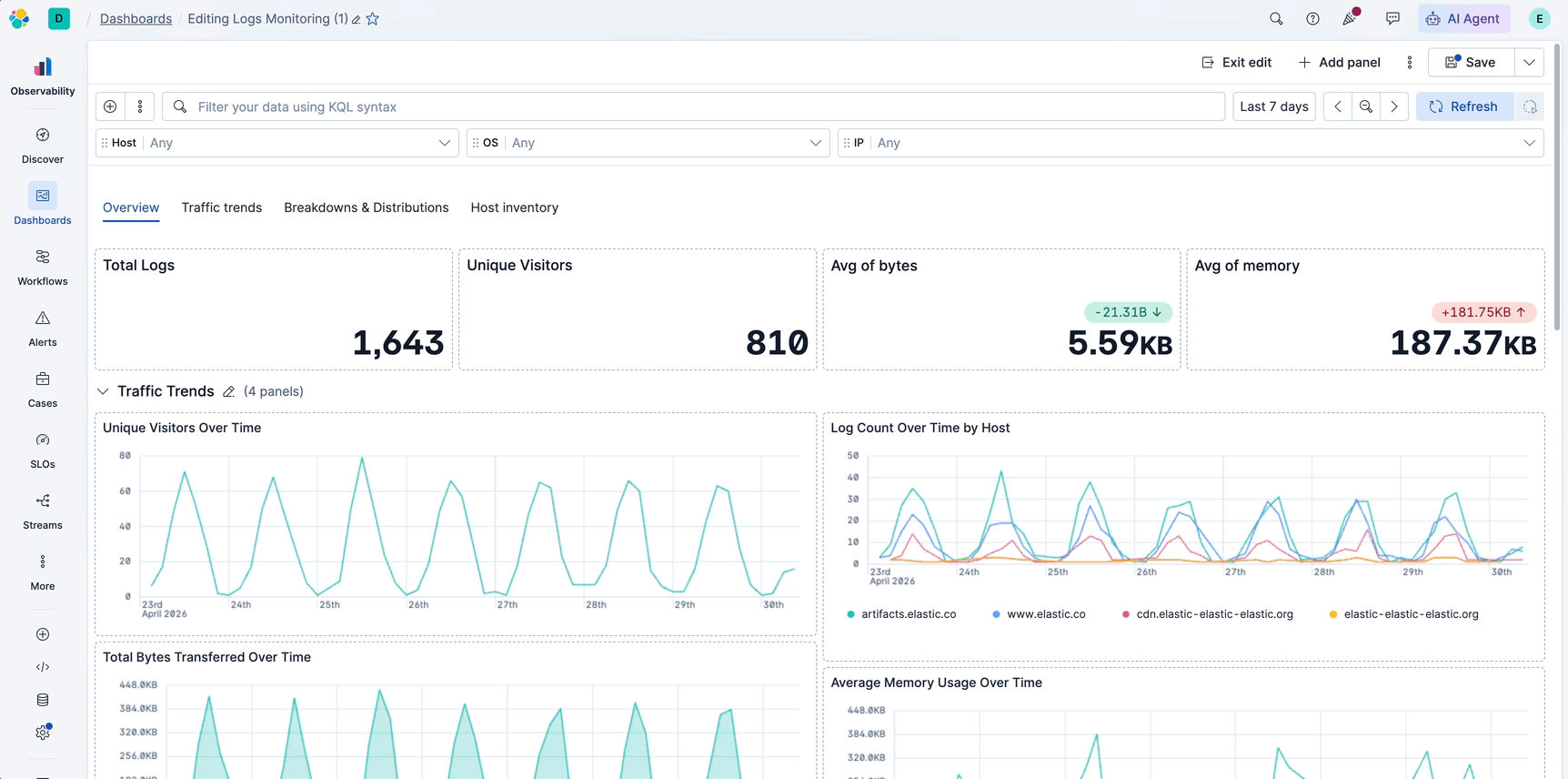
A calmer look for dense dashboards
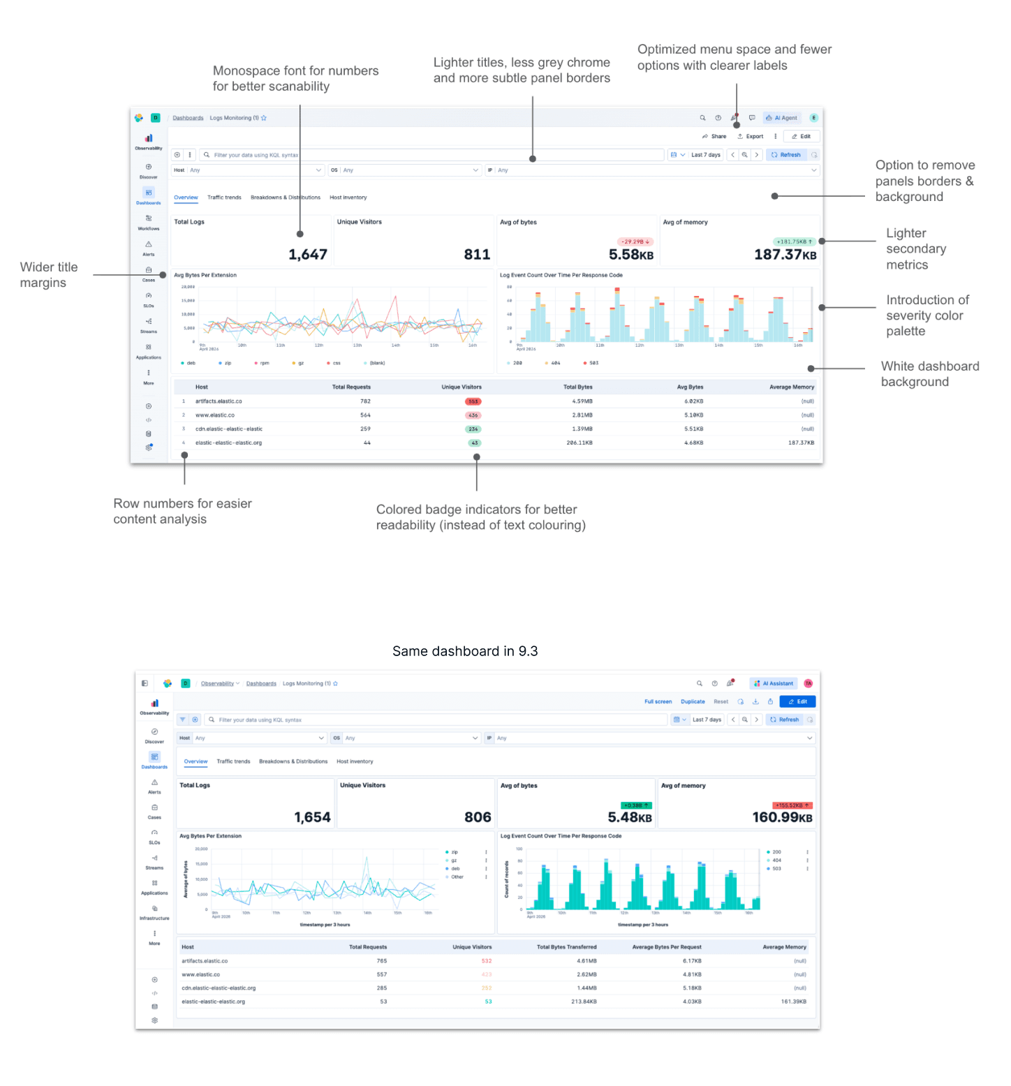
Dense dashboards in most tools still look like a wall of boxes. We redesigned Kibana's dashboard visuals to feel flatter and more cohesive — more like a single page than a grid of disconnected panels. See some of these changes highlighted in the picture below compared to what the same dashboard looks like in 9.3.
Other improvements
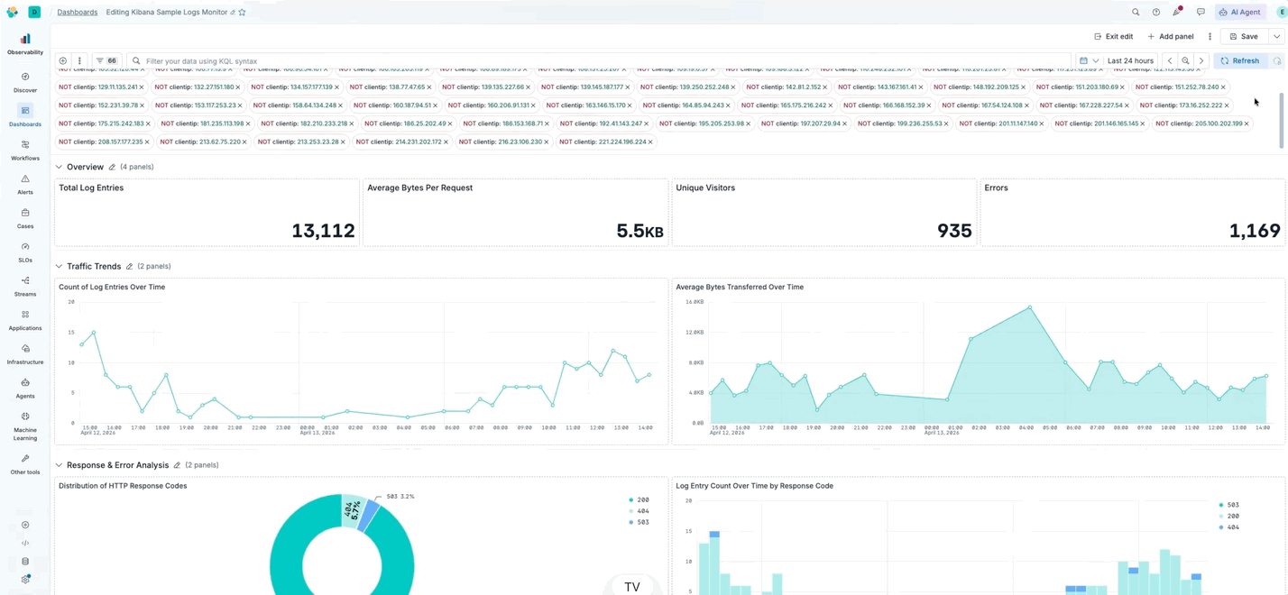
Collapse filter pills
Another common filtering approach is using filter pills at the top of the dashboard. When you stack many pills, they used to consume vertical space; they now scroll automatically after a threshold, and you can collapse the row to reclaim the space.
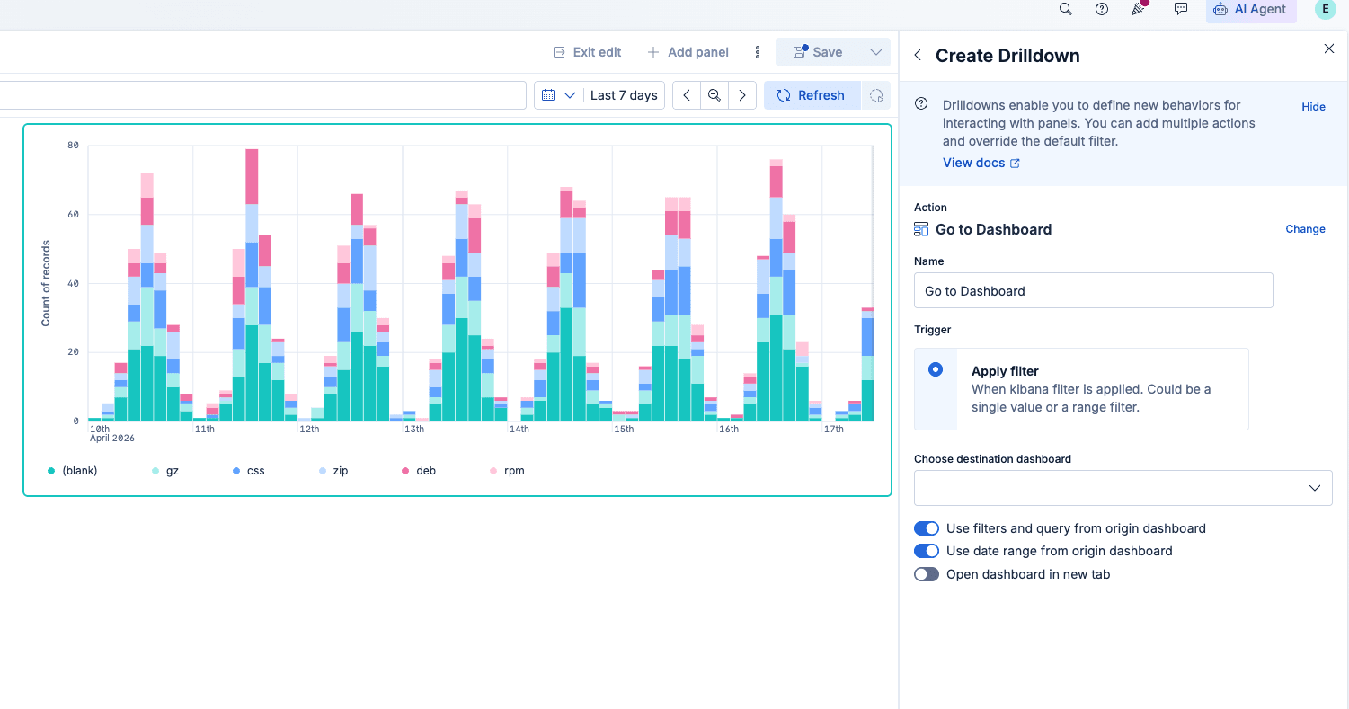
Closing the gap for ES|QL panels
Elasticsearch Query Language (ES|QL) panels are closer to parity with the rest of dashboards: Drilldowns between dashboards work for ES|QL visualizations, and click-to-filter from the chart keeps improving. Upcoming releases aim to close remaining gaps, such as annotations and saving ES|QL visualizations to the library.
Panel size visibility
Before 9.4, it was hard to match panel height and width because there was no readout for panel size. Panel sizing is now shown while you resize, so you can align dimensions across panels for a more harmonious layout.
Easier section reordering
Collapsible sections picked up usability fixes, too: You can reorder sections while they’re expanded, and you can drag a section from its header without hunting for the small drag handle.
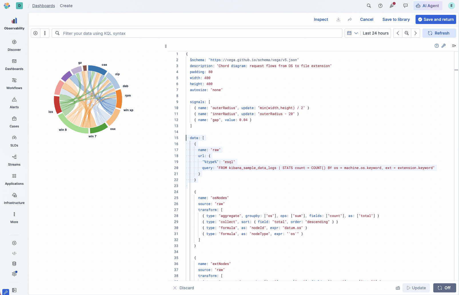
ES|QL support for Vega visualizations
Vega lets you build custom visualizations beyond what built-in chart types — radar charts, chord diagrams, or anything the grammar supports. The hardest part has always been the data query: writing verbose Elasticsearch Query DSL with nested aggregations and format paths just to feed data into the chart. Vega now accepts ES|QL as a data source, so you can get the data with a single readable query. Less time wiring up the data, more time on the visualization itself.
ES|QL support for Vega visualizations
What’s next
This is just the start. Upcoming releases will keep pushing on smarter defaults and closing the gap between ES|QL and data-view visualizations so the two feel interchangeable.
Got a pain point or a feature request? Hit Submit feedback in the top menu — we're listening.
How to try it
If you use Elastic Cloud Serverless, you may already be on these changes. Otherwise, upgrade to 9.4 and then create a dashboard or open an existing one. Many updates apply automatically to new visualizations, while layout and panel options appear in edit mode. If you aren’t on Elastic Cloud yet, start a trial and explore the latest Kibana Dashboards there.
The release and timing of any features or functionality described in this post remain at Elastic's sole discretion. Any features or functionality not currently available may not be delivered on time or at all.
Zugehörige Inhalte

4. Juni 2026
137,000 people, zero human decisions: agentic disaster response with Elasticsearch
Find out how a Kibana detection rule, a workflow and an AI agent automatically relocated 137,000 military personnel across seven installations when a hurricane hit, no dispatcher required.
26. Mai 2026
Kibana dashboards as code: GitOps, drift detection and Terraform for Kibana dashboards in Elastic 9.4
Elastic 9.4 ships a typed Dashboards API and a native Terraform resource that bring drift detection, PR-reviewable diffs and git-based rollback to Kibana dashboards for the first time.
22. Mai 2026
Kibana cuts dashboard load time by up to 25% - here's the polling strategy behind it
Find out how Kibana uses continuous polling and browser-side HTTP/2 detection to cut dashboard load times by up to 25%, with automatic fallback on HTTP/1.

Describe it, don't draw it: AI-native Kibana dashboards via MCP and ES|QL
From prompt to dashboard. Learn how to build Kibana dashboards with natural language, using example-mcp-dashbuilder: an open source MCP application that writes ES|QL queries, creates interactive charts and exports fully functional dashboards directly to Kibana.

25. Mai 2026
AI Chat in Kibana now natively renders dashboards
The Elastic AI Chat in Kibana now builds dashboards from natural language, keeping your visuals and analysis in one thread and letting you save them as reusable Kibana objects.