How the Elastic APM team does design
Since Elastic APM was introduced in June 2017, it has quickly grown into a full-fledged APM solution. With Elastic APM, we’re consistently progressing and building valuable new features for our customers.
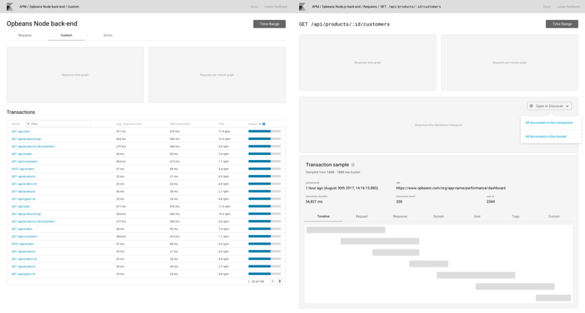
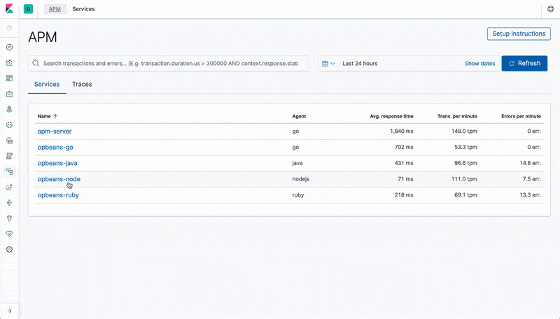
The APM UI is designed to provide developers and operations with a highly curated and user-friendly dashboard to quickly analyze and debug the vast amounts of data coming from the APM agents.
When Elastic APM joined the fold, Kibana was in the middle of a massive redesign. A whole new UI design language, Elastic UI (EUI), was created and with it came a React framework for building interfaces in Kibana. Since most of this wasn’t readily available at the time, we had to make some considerations in how we wanted to build the application.
We started by fleshing out the basic components and variables of the UI, like colours, units for spacing and sizing, typography etc. We could continue to use the existing Kibana UI components where needed, but mixed in our own flavors for custom designs like the Transaction Timeline. Today, the basic components and variables have been removed by the introduction of EUI which is a testament to how far we’ve come in Elastic to provide such a comprehensive and strong framework.
A recipe for design
When we set out to design new features, we typically research and dive deep on what will make this feature great. We regularly have discussions on how to create them within the existing application and how it builds on top of the work that is implemented in the agent or server components. Not all features require us to factor in the entire solution, but in order to build something that feels native to most customers using any language, we consider carefully how features apply in the application. We know that over time experiences for languages may convert into their own, but so far it has helped us shape the foundation of the UI.
Once we’ve settled on a design, we start with discussing how the feature looks in the UI. Which components and areas are affected and perhaps what new additions we have to build. Typically we’ll make simple wireframes and once we’re happy with the direction, turn those into more high fidelity mock-ups in Sketch and Marvel by utilizing the component libraries supplied in EUI. This makes building out larger pages quite easy, but sometimes we need to build custom components which requires a little more time and effort in the design phase. All throughout the process, decisions are shared and discussed with the team at large. This ensures that we design for both the common case, but also the edge scenarios that are bound to bubble up. We typically also want to reach the implementation phase as quickly as possible, because usually when we’re able to test it out with actual data, new challenges come up that need solutions. This is before any rigorous testing is performed, but just to check that the feature is solved in the appropriate way through all of our agents and scenarios.
It’s also not uncommon that we’ll choose to get a small but functional feature out so it can be used by the majority of our customers, and then iterate once we’ve heard some of the feedback. This helps us ship feature faster and not commit to larger complex releases every time that might not have been needed in the first place.
From that glimpse into our design process we thought it was in order to commemorate that we’ve been a part of the Elastic solutions for almost 2 years, this is a timeline of our releases in the last 16 months. We can’t wait to share what we still have in store for future releases!
6.2 – APM goes GA
The first version released included the main views that are included today. Users could analyze their transactions and errors information through the overview list and detail views. The first iteration of the Timeline that display the waterfall of events in each transaction was also included. Prior to the GA release, we had a beta release that allowed us to share the vision and get valuable feedback from the community.

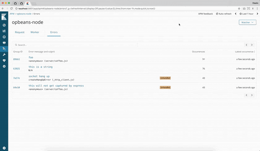
6.3 – The Watcher edition
The intention with this release was to add more integration with Kibana features, such as alerting (Watcher), enabling users to get error reports with the most occurring errors. We set out to build a very easy-to-use wizard to assist users in creating the watch from scratch and configure their notification settings.
6.4 – You know, for search.
Search is at the heart of everything we do at Elastic. It took a lot of effort behind the scenes to adapt the existing Kibana Kuery bar, but searching across your transactions and errors makes the process of performance analyzing a particular bottleneck much faster and easier when you can filter down the data to fit your needs. As icing on the cake, we also added the machine learning integration that enables customers to create anomaly detection on their services and have them show up in the APM UI charts.
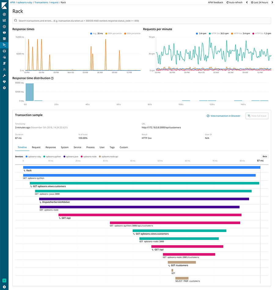
6.5 – Distributed tracing support
When we introduced the concept of distributed tracing, we knew we had to rethink a lot of the UI to fit with the new use cases and user experience of analyzing across multiple services. The timeline specifically was redesigned to visualize not only spans, but also transactions, as we switched to display full traces which consists of transactions and spans from multiple services. There was a lot of work put into finalizing the timeline redesign with its new components and use cases.
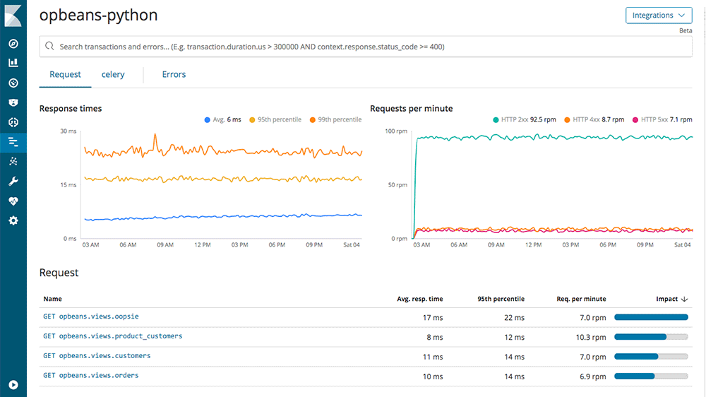
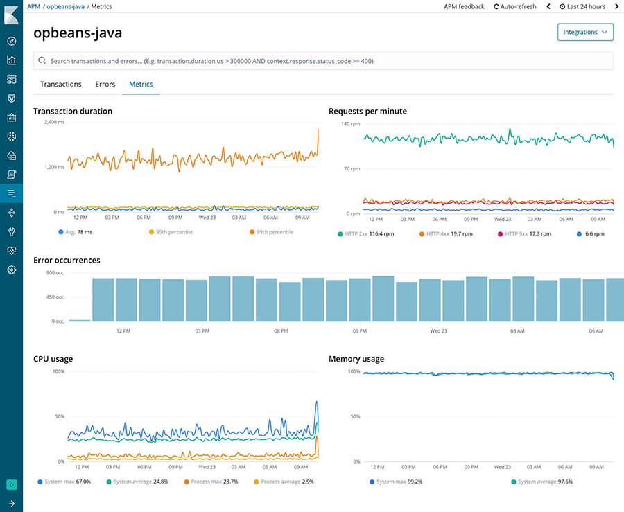
6.6 – Metrics
The introduction of metrics in the APM UI was a larger solution-wide implementation. The feature really shines when used in conjunction with the search capability. Implementing a reasonably small design change because we already had the charting library and clear structure for where to place it. This is a first iteration of metrics and we continue to work on improving the view and the data we display.
7.x – Kibana redesign and what’s next
Kibana 7.0 introduced the global redesign that had been in the works since around our first introduction. Deep-linking to Logs and Infrastructure UI means users are able to quickly dive deep on a performance problem they’re investigating. Showing related errors on transactions in the timeline helps discover exceptions in traces.
Help us get even better
As we continue to improve the existing experience and introduce new features going forward, we’d love to hear about your experiences and get your feedback. Open a thread in our Discuss forum and tell us what you think.
If this is the sort of work you love to do, we’re always looking for talented designers to help build the solutions of tomorrow, so have a look at our open UX design positions.