Hiking the Pacific Crest Trail with the Elastic Stack - Part 3: Mission Complete
This is Part 3 of the Hiking the Pacific Crest Trail with the Elastic Stack blog series. If you haven't read Part 1 or Part 2, I'd recommend you check them out before continuing.
Mission, complete.
First and foremost, a couple of quick words directly to my brother:
Mike, words cannot describe how proud I am of you for completing the Pacific Crest Trail. It’s official, you made it further than Reese Witherspoon in Wild! (Sorry, I had to - it was too easy.) In all seriousness, I am absolutely in awe at what you’ve accomplished. There were a number of times along the trail when it seemed like that stop into town may have been your last. You persevered through injuries, forest fires, bears, freezing rain, mountain lions, below zero (F) temperatures, 30-40 mile days on foot, rattlesnakes, food and water shortages, and on occasion, extreme solitude in the wilderness. It takes a certain type of strength and willpower to walk the 2,650 miles from Mexico to Canada and I have been continually amazed and impressed by your accomplishments this year. I love you and am very proud to call you my brother.
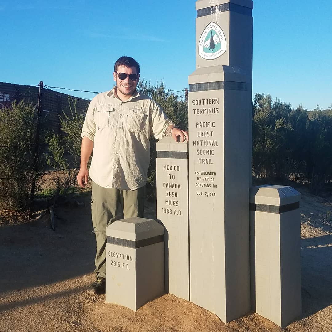
If you haven’t guessed by now my brother has completed the Pacific Crest Trail. He started his journey on March 29, 2018, baby face and all.
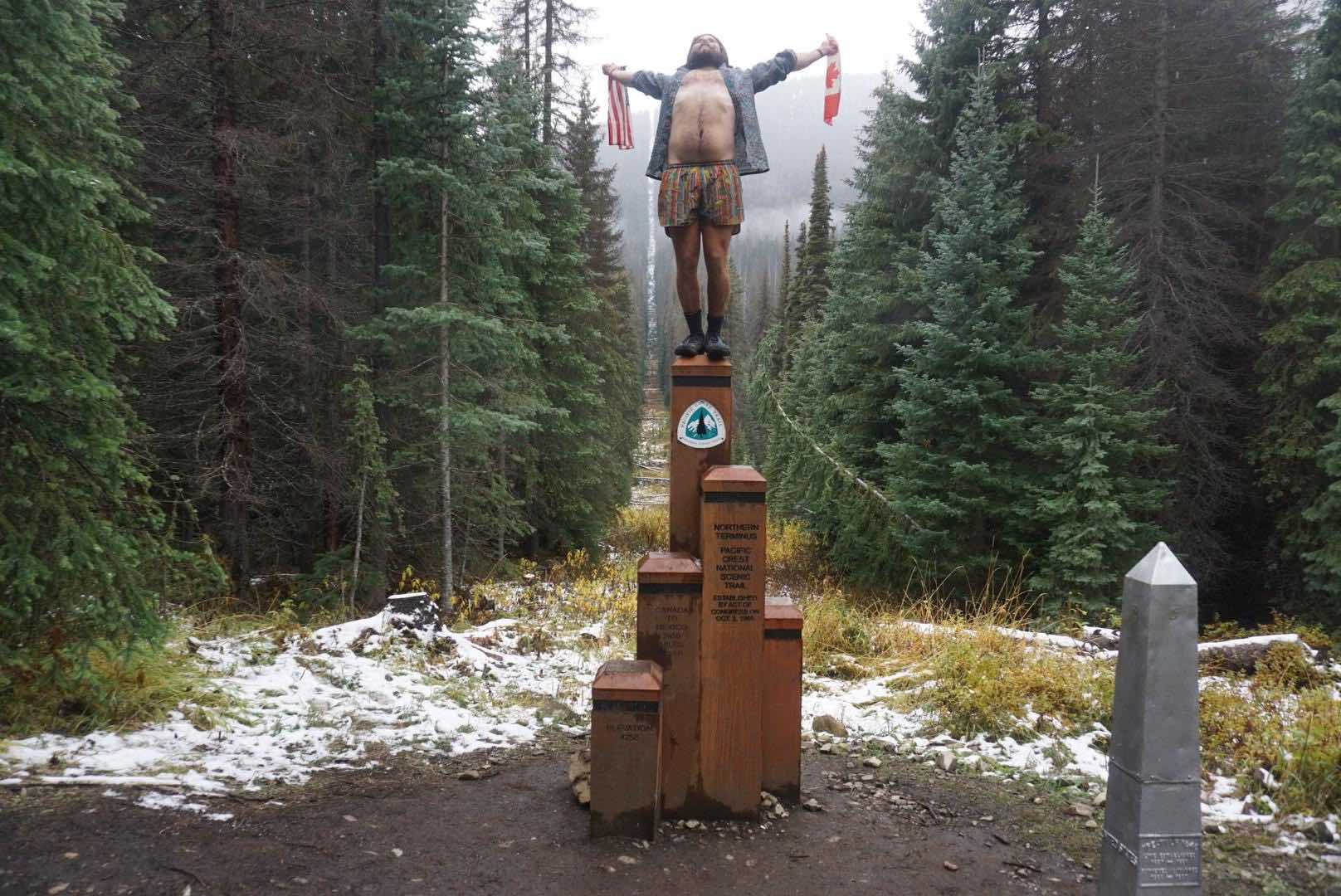
And 190 days and 2,650 miles later, he stood on top of the trails northern terminus in Canada with both flags in hand celebrating his visceral victory.
The last few months of Mike’s hike included some of the most treacherous weather, challenging moments and breathtaking views. When we last left you, he was just getting into Oregon and needed to pass through it quickly in order to beat the cold up North. There were days where he was hiking 40+ miles. To put that in perspective that’s about a marathon and half with 50 pounds on your back, every day. He passed through the state in record time, finishing in 14 days.
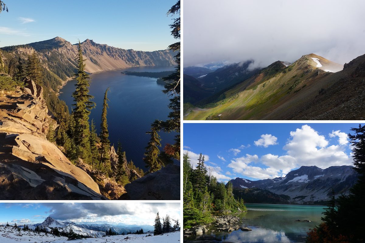
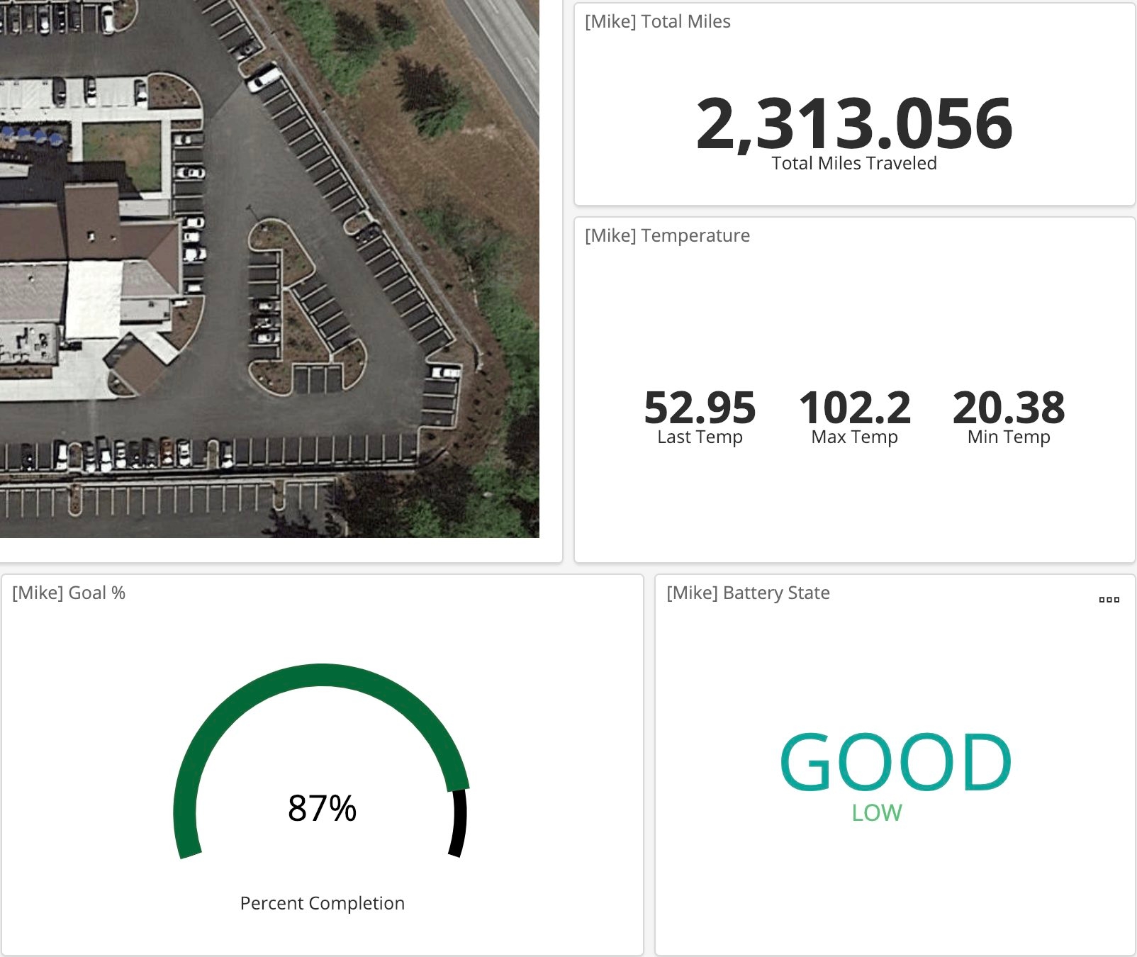
Washington was not easy. There were long stretches of time where Mike was hiking without a group. It was really wet. It was really cold. But it was beautiful. If you take a look at my dashboard (Elastic_PCT / whereismike) this is reflected in the data. The weather is much more rainy, the temperature drops and his daily mileage on average decreases. That being said, this was Mike’s favorite part of the trail. If you can't tell from the pictures above, it was absolutely beautiful (when it wasn’t pouring). If you’d like to see more, be sure to check out my brother’s instagram account.
The landscapes are beautiful, but they can be dangerous. Sometimes there would be 5 or 6 days where my family and I did not hear from him, fortunately our daily report from Elastic and text messages (automatically sent using the Elastic alerting functionality) helped us make sure he was OK. In a day and age like today, he’s found the rare opportunity to truly disconnect from our very connected world. I think the image below perfectly encompasses the transformation my brother went through on the Pacific Crest Trail. I truly feel that he can do anything. I think it’s fair to say the trail changed my brother. He’s already dreaming about his next big hike.

You may not have noticed, but Mike’s completion date was on October 5, 2018. If you follow Elastic at all, that date might ring a (ze?) bell. That very same day Elastic went public. Given the nature and positive feedback from the Elastic community around my brother’s journey, I don’t think his completion date could have been more perfect. Let’s just say, we did a lot of celebrating in this household that morning.
The PCT by the Numbers (the fun part)
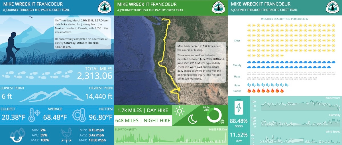
Just because my brother’s trek is over doesn’t mean the fun has to stop. For his analytical brother, it means I finally have a complete data set to work with. At the end of the day, we ended up with 2,282 documents for the entire trip. I will totally blame my brother for not turning on his GPS tracker enough for that. In the world of Elasticsearch, that is nothing. But there is still some analysis and summary we can do on the data using some the Elastic Stack.
Mileage analysis with Elastic machine learning
Around the 6.4 timeframe, we introduced machine learning nodes to our Elastic Cloud offering. Even though I’m working with a limited data set, because Mike’s check-ins were over an extended period of time I can still gain some insights and detect anomalous behavior in the data set.
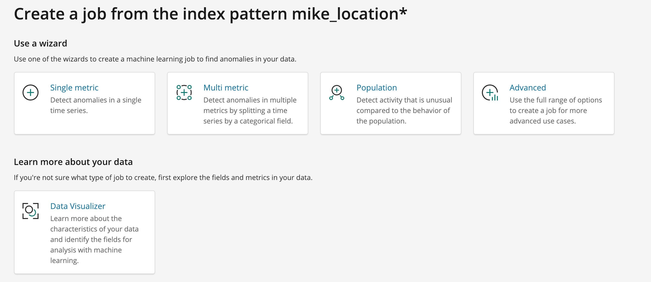
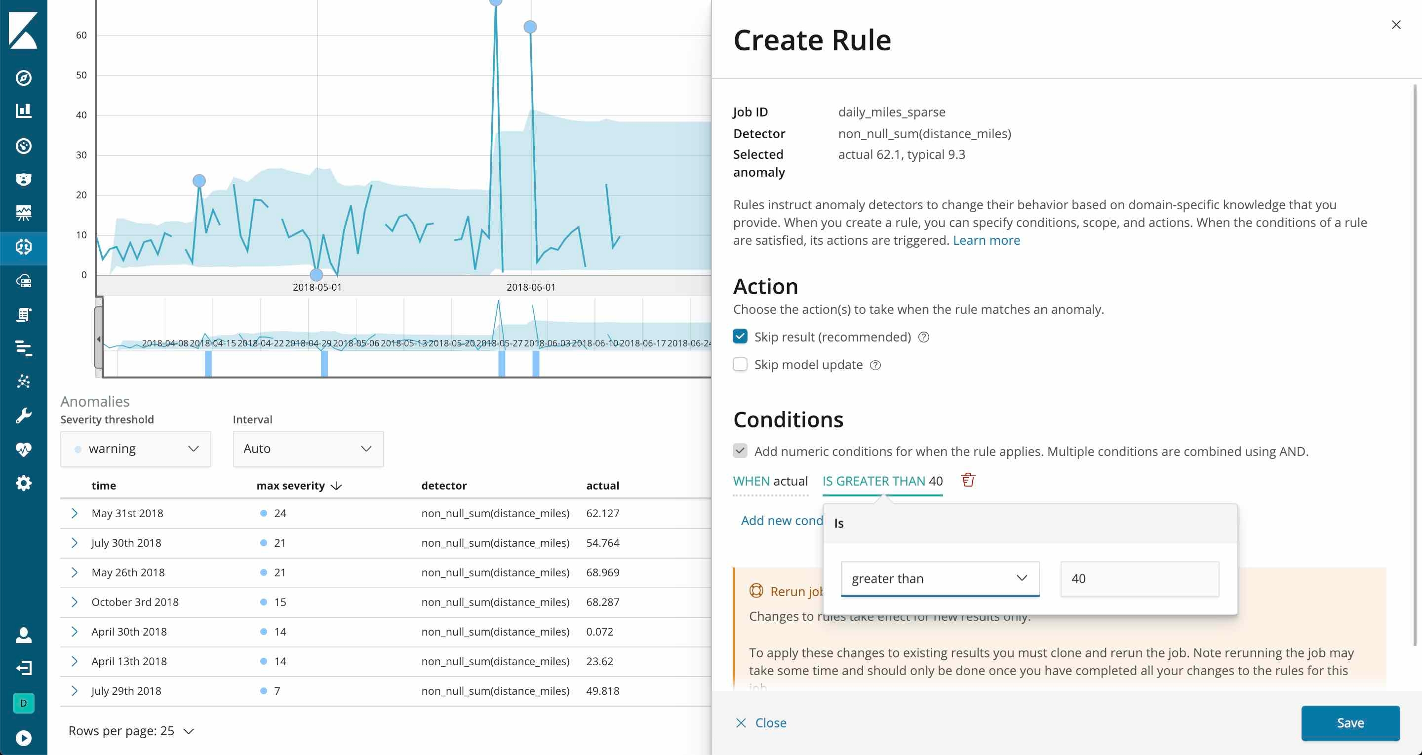
The first thing I was really interested in was if there were any anomalies in his daily miles hiked. Because Elastic machine learning is extremely approachable, I was able to quickly plug in my data and have our algorithms comb through the historic data set to determine the normal upper and lower bounds. There are a few options for spinning up an ML job, but for my sake all I needed was a single metric job.
In a matter of seconds (because the data set is so small) I was easily able to detect anomalies based on the simple configuration shown below.
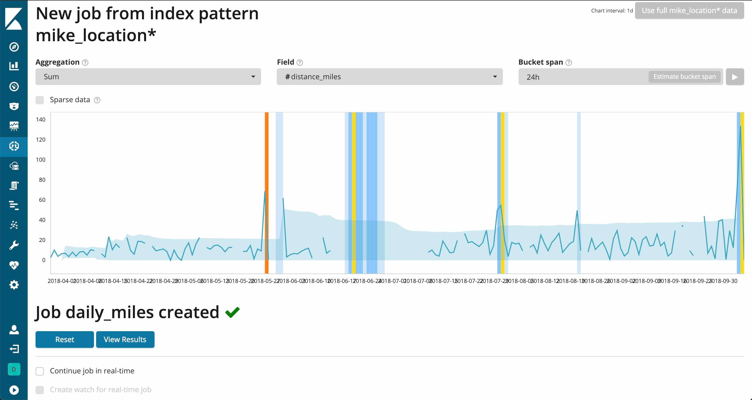
You’ll notice that a majority of the anomalies detected were during the gap where my brother took time off to heal his achilles tendon. Luckily, there is a configuration option for sparse data that will ignore any empty buckets.
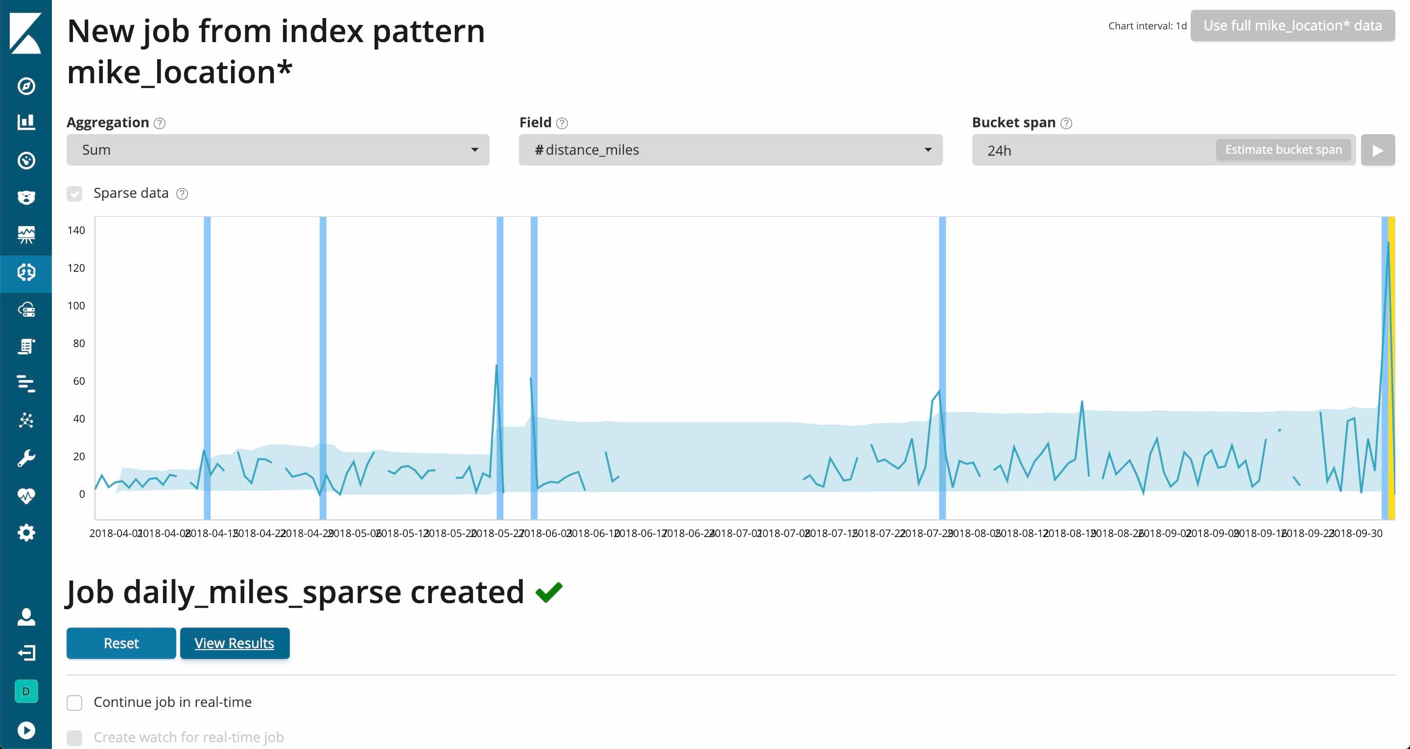
Now that looks much better. Let’s see if there are any interesting results.
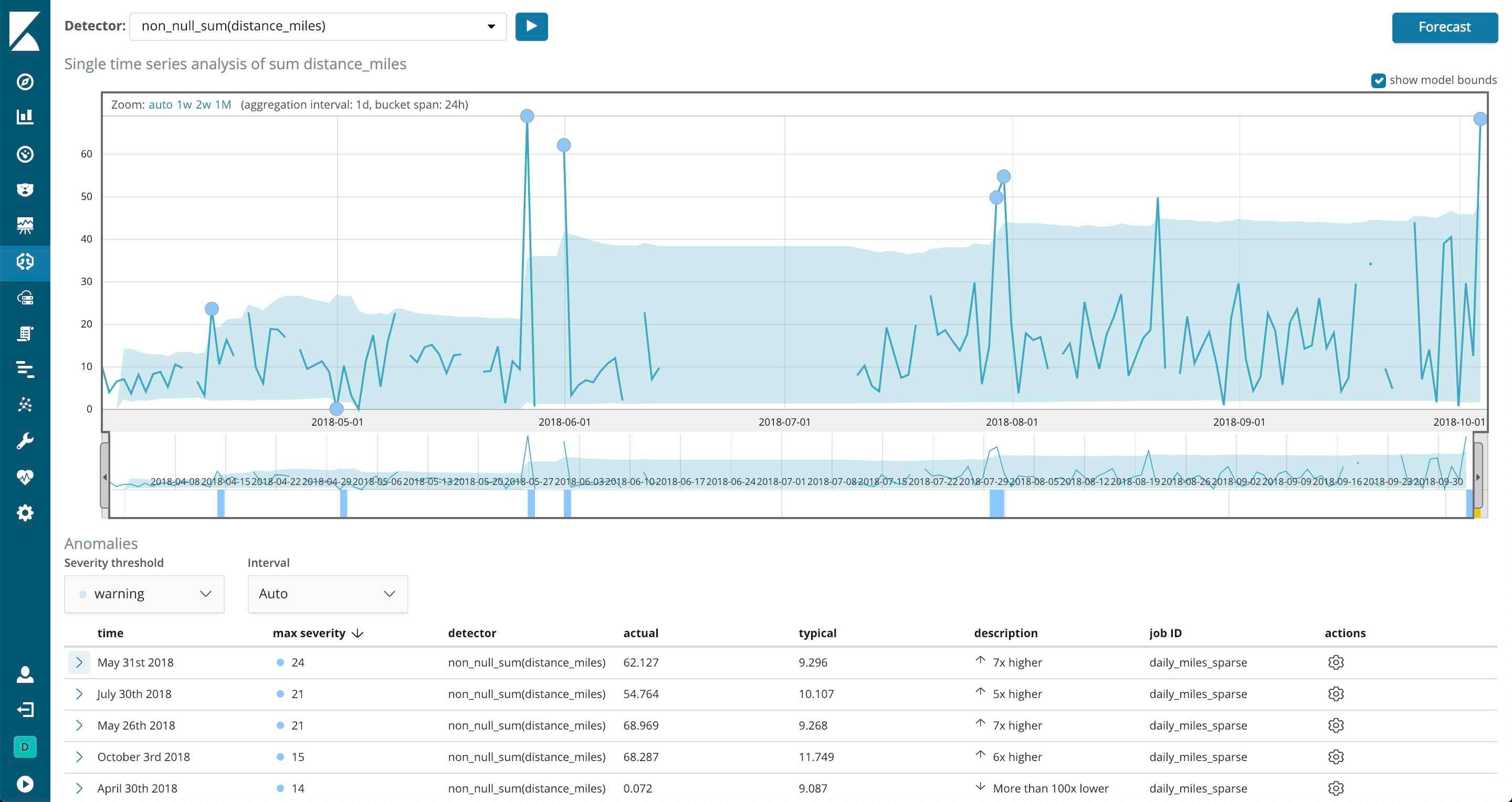
If you look at the anomalies detected, there are days where my brother hiked nearly 70 miles. Mike, that is pretty impressive but let’s just say, I don’t believe you. You definitely got stronger, but you’re not superman.
There were certainly days where he actually did hike 30 or 40 miles if it was flat enough and the conditions were good, but this is confirming one of the suspicions I’ve had for a while now. I’m not sure how much I trust the Google Distance Matrix API on the trail. For instance, every once in a while the count on my daily report would be a bit off from what my brother actually hiked. Also, his total miles never hit 2,650 and percentage complete was pretty far off from 100%.
Digging a little deeper, I took one of these anomalous days and started to map out some of the latitude and longitude between check-ins. Let’s just say my concerns were warranted for some of these spikes.
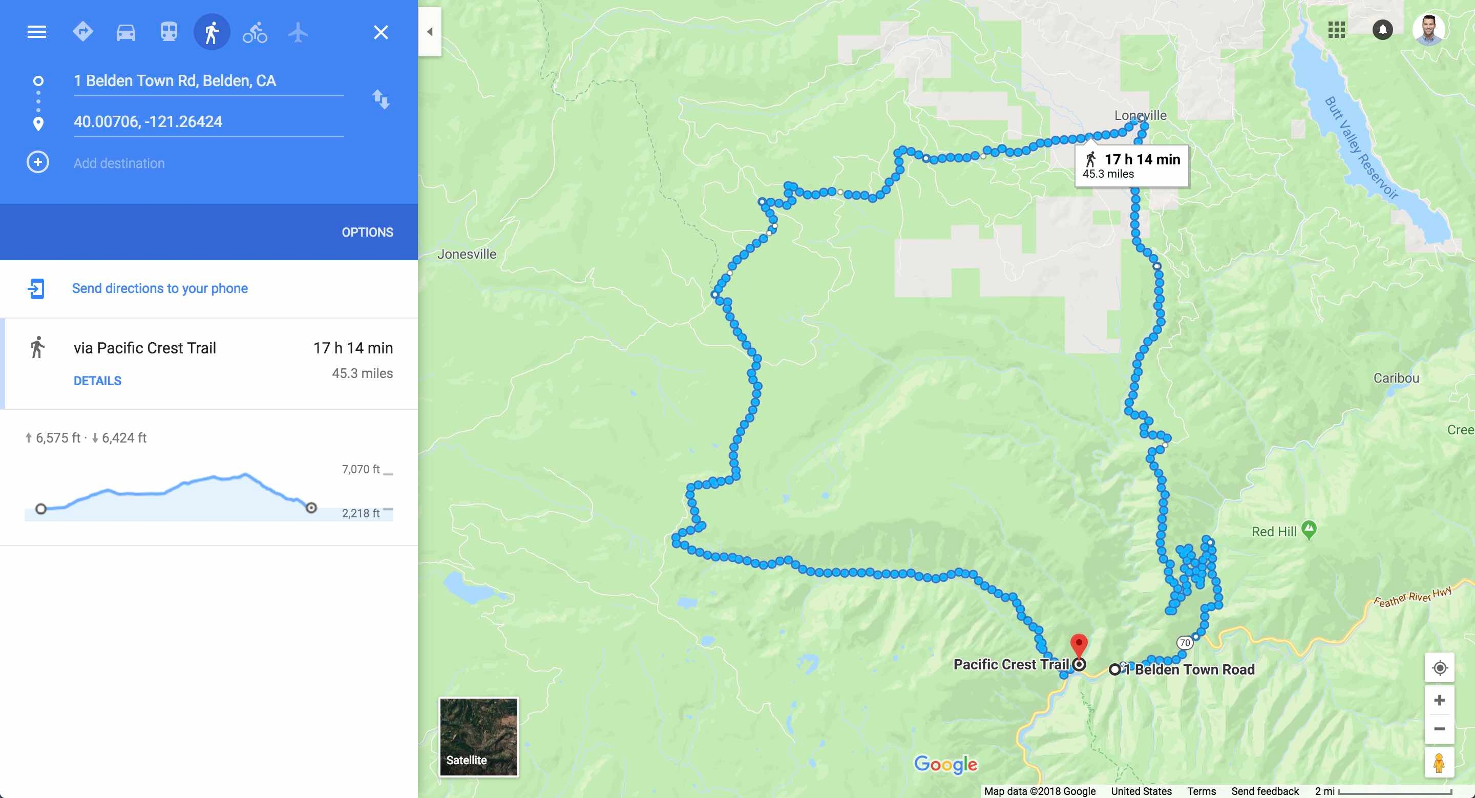
For what looks like maybe a mile between points, Google’s API automatically took him the scenic route. So in a day where he actually walked about 20 minutes, we tacked on an extra 45 miles. When creating my ingest script, I opted to use the walking travel mode. The default is driving and given the fact that he didn’t spend much time on the roads (though there was a bit of hitch hiking), I felt the walking mode was our best option.
I will say, not all of the anomalies here were because of the API. Towards the end of the trip the weather was getting colder and my brothers GPS tracker battery would die more frequently. With less check-ins, the distance between two points would sometimes be a summation of multiple days. You’ll notice more spikes in the amount of miles traveled towards the end of his trip.
If my brother continued hiking through Canada and up to Alaska (you laugh, but I wouldn’t put it past him) I would have been able to use my historic data to alert on anomalies detected as they occurred. If this hypothetical situation actually happened, I’d be able to configure a custom rule to ignore any mileage over 50 as an anomaly in real time. Mike, maybe you’ll just have to keep going to Alaska to prove my point.
Outside of these results, I ran a number of other machine learning jobs on the amount of check-ins, the temperature, how weather affected my brothers battery or mileage, elevation anomalies and more. Even with such a small amount of data, Elastic's machine learning capabilities were able to provide invaluable insight into my brothers hike.
Taking visualizations the extra mile Canvas
Ah, Canvas. I absolutely love this tool. As the Product Manager for it, maybe I’m a bit biased but I’ve had so much fun using it during its technology preview. We are extremely happy our beta release in 6.5 so that the community at large can begin to use this awesome product. Canvas is a brand new way to showcase your data and tell the story you want told (like presentations with real-time data and designer-level graphics). I won’t go into too much detail here, but if you’re intrigued after reading this blog post I’d recommend looking at out our Canvas feature page for more info, watching an introductory webinar to dive into the weeds a bit, checking out our blog series about getting started with Canvas, reading up on how real users are using Canvas in production, and viewing our docs to get started.
Fun fact: If you want to try out the new navigation coming in Kibana 7, there is a new advanced setting in 6.5 called k7design. Alternatively, you can be part of our Pioneer Program for 7.0. We’d love feedback :-)
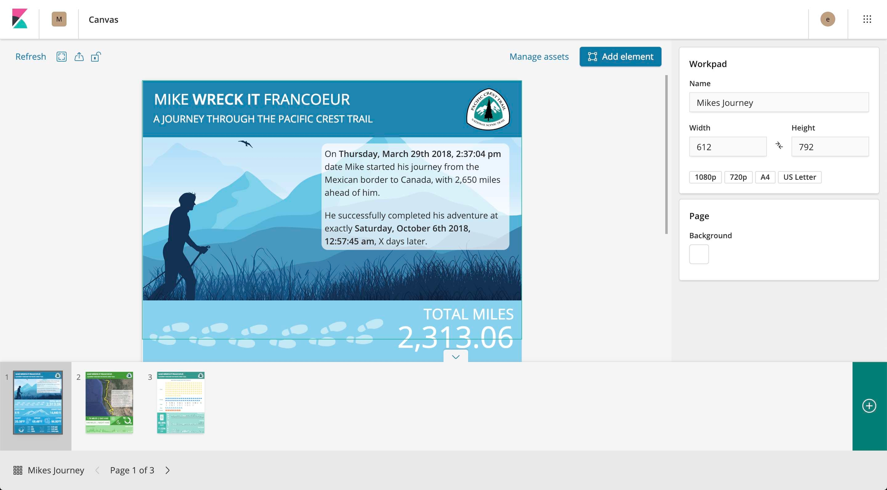
I took the time to build out a workpad that could be used for print some day so my brother to hang in his future home. He’s pretty nomadic at the moment, so I think I have some time to make sure the mileage is correct before I actually print.
In a lot of Canvas examples we provide, they are usually in a 16:9 ratio, but you have the ability to define any width and height you’d like. My final workpad can be seen in the screenshots below. This workpard consists of three pages and is using the standard letter size and dimensions. I’ll walk through some of the technical details of the more interesting aspects of this workpad.
First, you’ll notice a striking difference between these screenshots and those of the dashboard I presented in my previous blog posts. That is because Canvas was built for customization and storytelling. Because of the flexibility it offers, I can create a brand for Mike and his PCT journey as well as some fun infographics to get my point across to those who may not necessarily be familiar with the data set.
Canvas utilizes Elasticsearch SQL syntax and makes it very easy to begin crafting datasets. Each one of the metrics you see is backed by a very simple query. The workpad may look fancy, but it’s really just a lot of SVG images (they’re the best for workpads), metric elements and a hint of creativity.
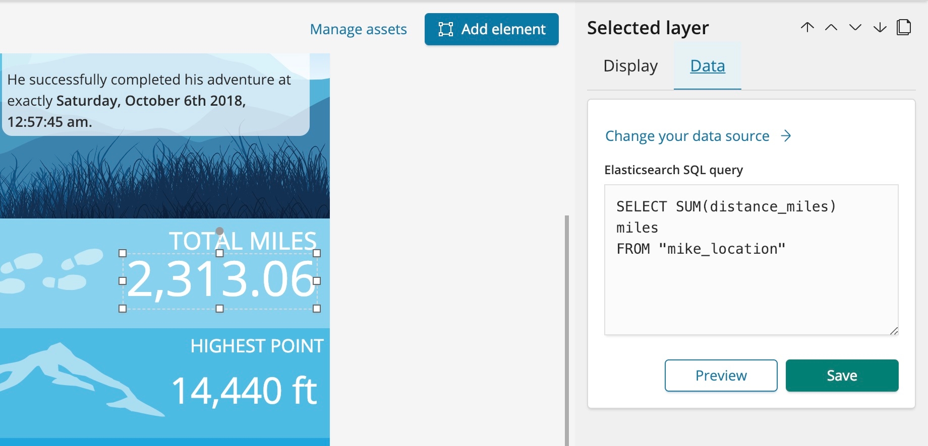
Speaking of creativity, I really wanted to show off my map to this audience. At the moment, Canvas currently does not support geo, so I had to use a similar trick that I did with the satellite imagery on my dashboard.
In this case, I used the same static maps API from Google and used an encoded polyline as a parameter. So rather than individually inputting each and every lat/lon in the URL (which has its own size limitations), I simply used an algorithm to encode these points to be shown on the map. I’d like to say I coded up a reusable way to do this for you, but I simply exported all the coordinates in CSV format and found a tool that build it for me from the CSV. The result essentially ends up being a static map with my brothers coordinates on them. That being said, support for geo is on the roadmap for Canvas but there are some interesting workarounds in the meantime. Canvas is also completely pluggable, so if you have your own custom solution we encourage you to create a plugin and share with the community.
Remember those machine learning jobs I had created earlier in the blog post? Well, I thought we could reuse the findings and provide some context in my workpad.
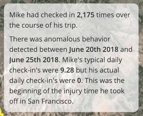
Those results were pulled completely from the .ml-anomalies* index. Using a little bit of the Canvas expression language to build out some dynamic markdown backed by a data source, I was able to add some context to this anomaly. I did so in a static way, but it’s quite possible to add some conditional logic in Canvas so that the context is dynamic as well. The expression I used can be found below:
filters
filters
| essql
  query="SELECT MIN(timestamp) AS start, MAX(timestamp) as end, AVG(typical) as typical, AVG(actual) as actual
FROM \".ml-anomalies*\"
WHERE job_id = 'check_in_frequency'
AND result_type = 'record'"
| markdown "There was anomalous behavior detected between **" {getCell start | formatDate "MMMM Do YYYY"} "** and **" {getCell end | formatDate "MMMM Do YYYY"} "**. Mike's typical daily check-in's were **" {getCell typical | formatNumber "0.00"} "** but his actual daily check-in's were **" {getCell actual | formatNumber "0"} "**. This was the beginning of the injury time he took off in San Francisco."
| render
There is one more trick I’d like to point out that I use regularly. There are two “infographic” elements available in Canvas today. These are Image Reveal and Image Repeat. You can see both of them in the example screenshot below.
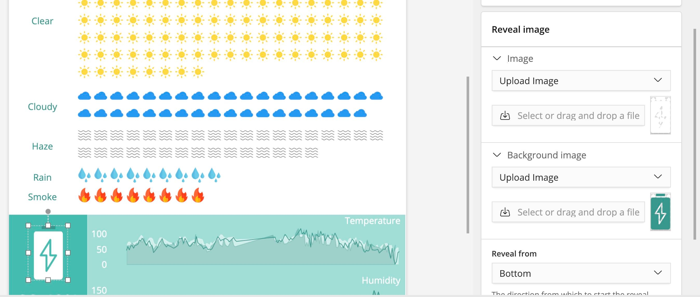
A friendly tip for anyone planning to use Canvas. SVG’s are your best friend. They are easy to manipulate and fairly light weight. In this Image Reveal element, I’m showing off the percentage of time my brother’s battery was in a good state. To do so, I found a battery SVG online and tweaked the color of it to provide both and “empty” and “full” state. This is a powerful way to show a percentage value.
There is so much more I could write about with Canvas. But rather than listen to me blabber and attempt to win the award for the longest blog post ever, I figured it’d be easier to share this workpad along with the data set. Feel free to check out both of these hosted on my repo with instructions to install.
A sneak peek of what’s to come
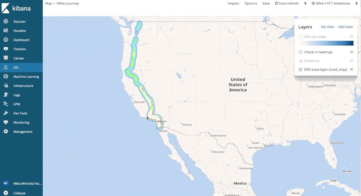
Oh, you thought I was done? Almost, but not quite yet. There is on more thing I’d like to show off. If you were at our big Elastic{ON} conference earlier this year, you may have seen this prototype of our upcoming Maps application. Running off of master in the Kibana repo, I’ve taken my brothers geo_points and utilized the new functionality available in the application.
In the GIF below, you can see support for multiple layers, custom client side styling, single points on a map and additional fields in the tooltip for context. I won’t spoil too much of what’s to come, but enjoy the preview!
Thank you for following
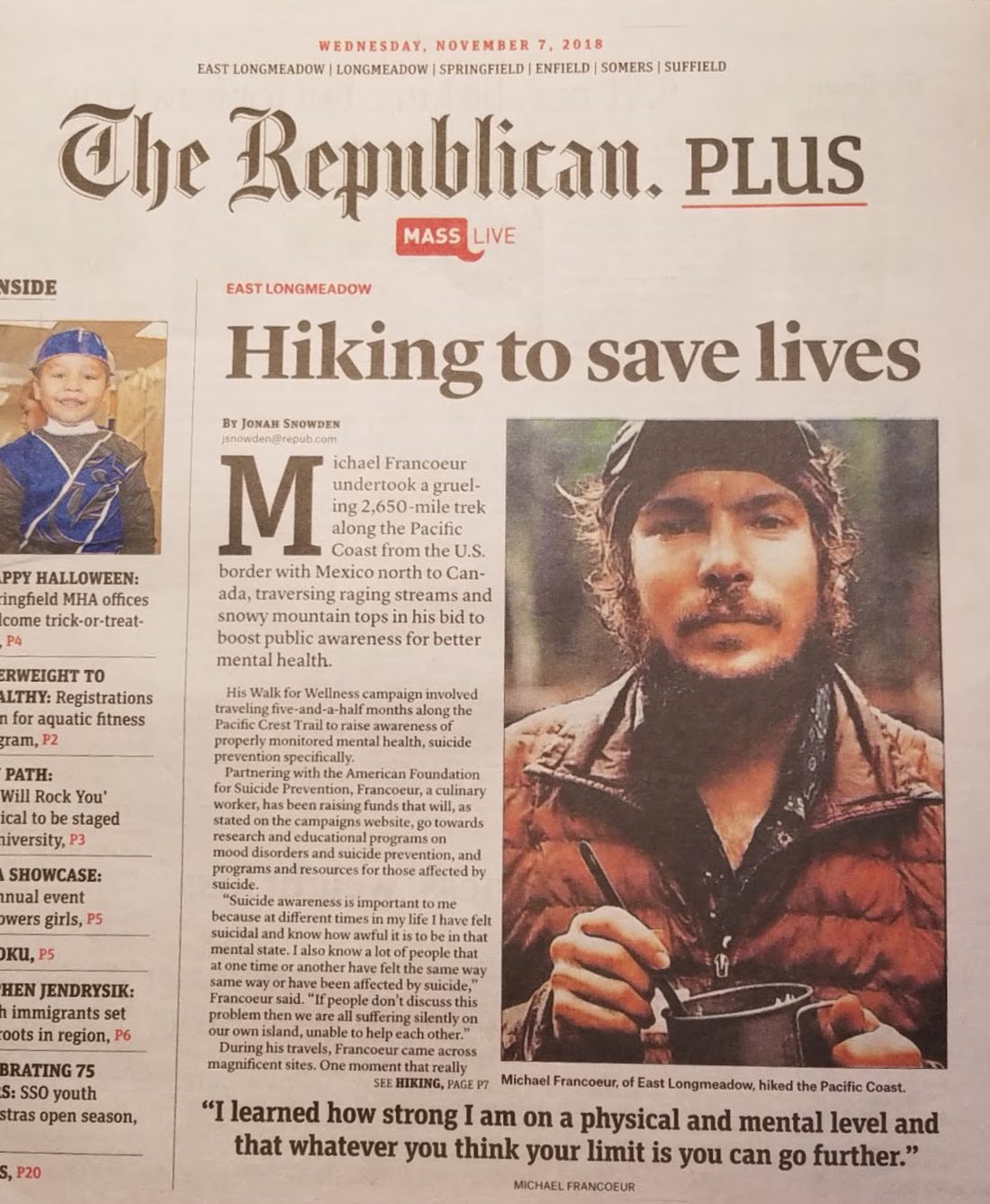
I truly hope you enjoyed this blog series. I’ve certainly had a great time writing each one and using the Elastic Stack to keep tabs on my younger brother. I have to admit, my brother’s hike garnered way more attention than I ever expected. This story has even hit the newspapers. Mikes become a bit of a local celebrity in our hometown of East Longmeadow, Massachusetts. My parents were shocked to see his face in the newspaper one Wednesday morning.
The outreach and support for my brother has been overwhelming. Elasticians and the Elastic community have been absolutely amazing over the past year, I applaud you all. Whether it was through social media or in passing, your kind words in support for my brother were very much appreciated. I always made sure that Mike knew he had an entire community behind him.
My brother and I would like to thank you all personally for following along and enjoying the ride. We hope you have a wonderful holiday season and a happy new years, cheers!