Improving Quality Assurance Automation at Ramsey Solutions with the Elastic Stack
Ensuring extraordinary quality for customers while reducing risk is a passion of the Quality Assurance Team at Ramsey Solutions, and it’s my privilege to lead our Test Automation efforts here. My role includes identifying areas of opportunity where test automation can bring its most significant benefits. While still a reasonably young engineering field, I’ve been working in some form of testing and automation for over 35 years. During this adventure, I’ve recognized many challenges that surface in the craft of quality, regardless of technology or development philosophy.
One of the most common challenges for Quality Engineers is making the mental shift from merely pursuing pass or fail test results to understanding the characteristics and trends of tests. How often does it pass or fail? What's the duration aspects of a test that executes tirelessly? How can we create tests that are accurate and actionable?
In 2016, Ramsey Solutions sent me to attend the Google Test Automation Conference (GTAC) in Mountain View, California, to learn from some of the top automation engineers in the world. At the conclusion of that conference, Google Test Engineers imparted the following challenge to us. They said, "find a way to measure everything." These simple words planted a seed, leading to a journey of pursuing and expecting more from our testing data than ever before. You can imagine my excitement when I returned from the GTAC conference, to learn that our architecture team was working on something called a "data lake" built on top of the Elastic Stack.
As I discovered more about what a data lake was and the opportunities it offered, the dots began to connect. Would this "data lake" allow us to start our journey to measuring everything as the Google Test Engineers had encouraged? For a little background, Ramsey Solutions first looked at the Elastic Stack to help understand customer engagement details. It was determined that Elasticsearch could outperform a database solution, and it shipped with Kibana for data visualization. But what caught my attention about Elastic was that it could be a great place to capture and analyze test automation metrics. I wanted to push our automation technology efforts beyond the temporal knowledge of did the test pass or fail and instead, look at metrics such as duration of test execution over time.
With the help of our team and some experimentation, our small crew of two Test Automation Engineers began populating test metrics into the data lake. These metrics included; the business unit name, application id's, test case names, the execution environment, test duration times, test results, and the exception details of why a test failed. Altogether, over a dozen metrics related to each test case were ingested into the data lake. We were now gathering meaningful data into a place that would enable us to gain new insights across our software development lifecycle. (Not to get too far ahead of myself, but having access to the Elastic Stack has enabled my team to capture nearly 2 million automated test case results in the past year, equipping our leaders and test engineers with amazing metrics related to the quality of our products and the quality of our processes.)
Visualizing QA Test Data in Kibana
With test data now going into the data lake, it was time to build our first visualization using Kibana. Even at this early stage of visualizing simple test duration over time, I knew we were on to something. Let’s face it, a test merely passing or failing is only one of many attributes that might give insight into the health of a software application. As an example of how pass/fails can be misleading, I discovered that a test which completes within a few seconds one moment and nearly a minute longer the next does not necessarily mean both had passed with flying colors. Technically, they both produced green (passing) test results, but the duration of the long-running test was an indicator that something was up.
Let's take a look at some of the dashboards I've been able to create:
Test Run Overview Dashboard
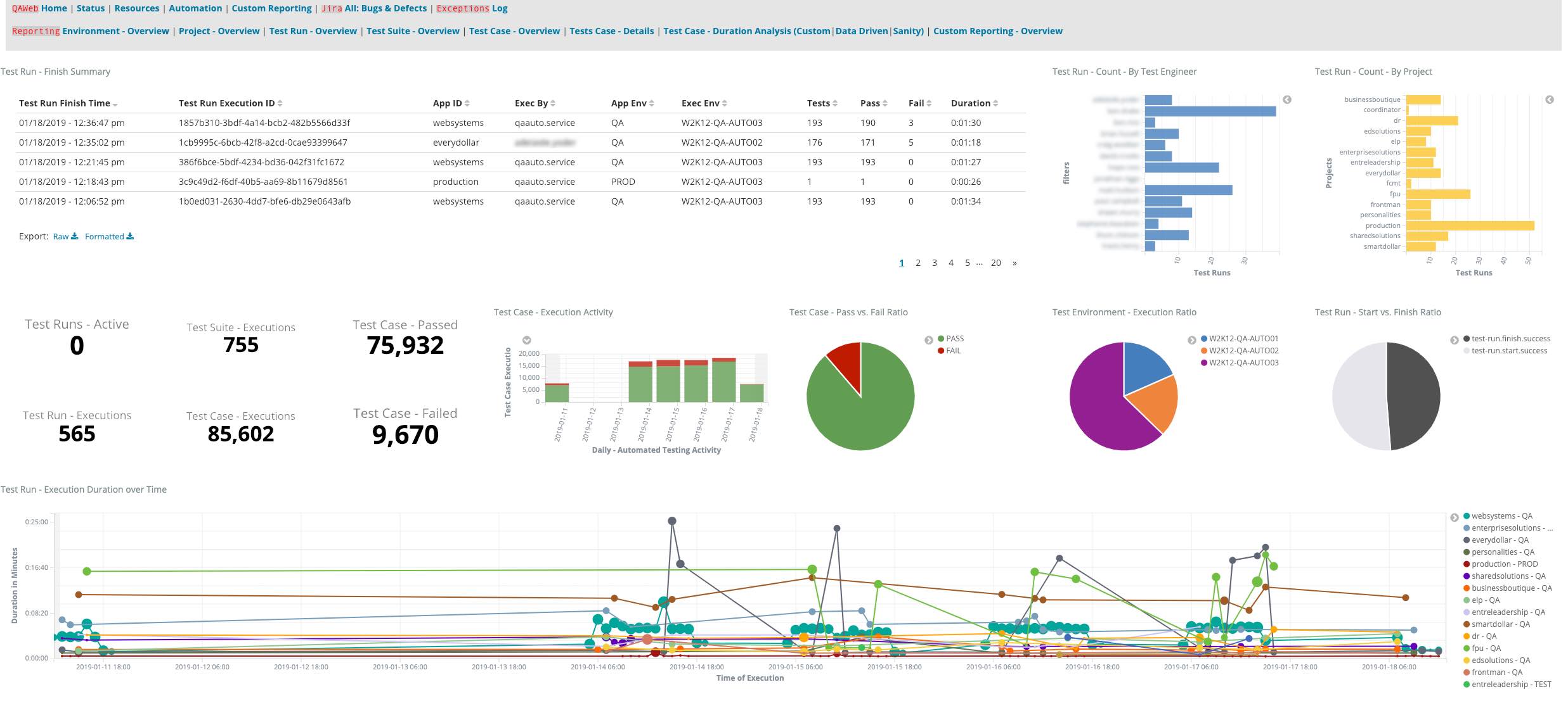
The "Test Run - Overview" dashboard was the first I created. Its purpose is to bring a high-level understanding of the automated tests the team has executed over the last week. This dashboard gives insights to individual team member usage of the automation built for their projects along with overall pass/fail and health ratios of the automated test. It also provides a unique trend analysis view based on test run duration. With this information, we can identify outliers and correlations giving us quality insights into common, shared services.
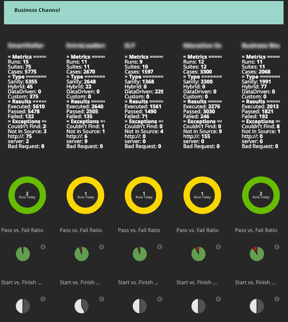
Project Overview Dashboard
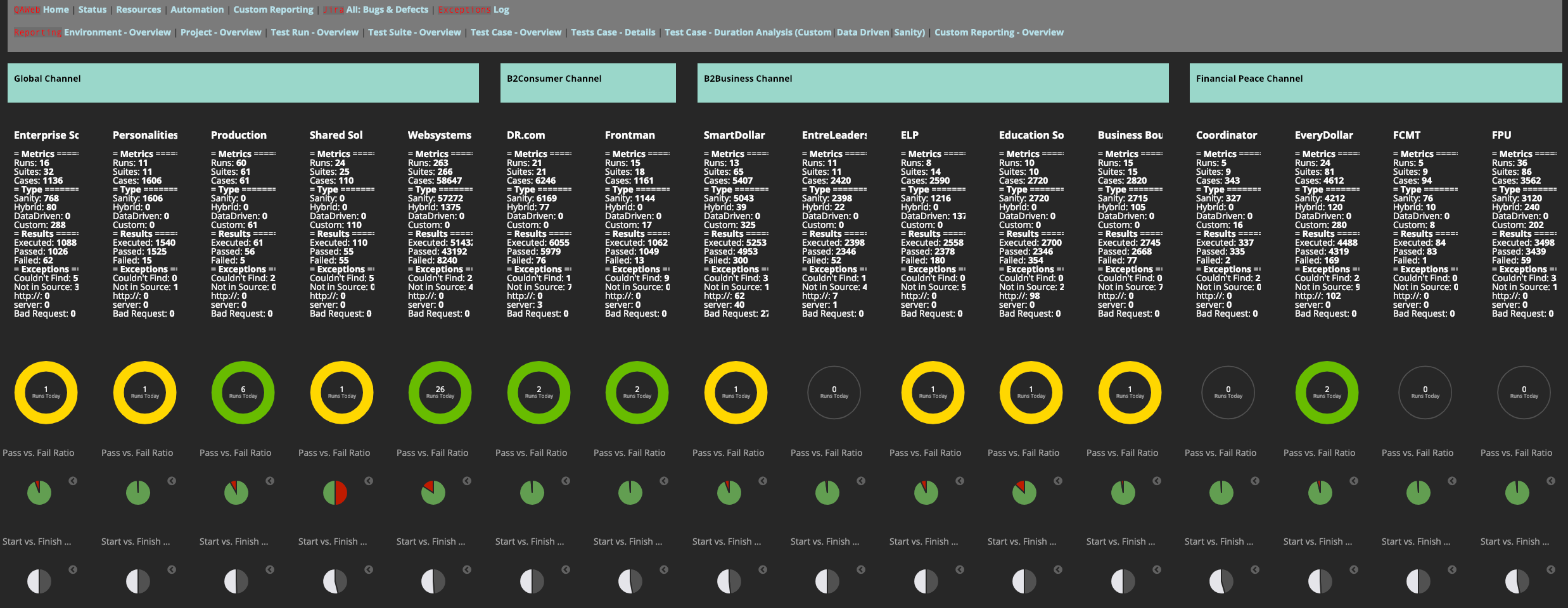
The "Project - Overview" dashboard, created for our Quality Assurance Leadership, was developed to give an overview of the health of individual products by business unit. The yellow and green circles reset to black each morning and reflect (first yellow then green) the usage of test automation. These insights allow leaders to know team members are leveraging the test automation tools developed to assist them. The breakdown summaries related to automation types, result details, and exceptions encountered make this a very concise and invaluable tool for our leaders.
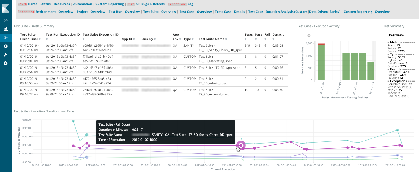
Environment Overview Dashboard
The "Environment - Overview" dashboard was created to give insights into the health and state of our testing environments. Unassuming at first glance, this dashboard has the potential to save us downtime and expense weekly. Each line represents one system monitored on a 15-minute cycle. Any dot appearing on a line indicates a system that is either down or not available to our team members. The "Environment - Overview" dashboard is one of the first we check each morning, ensuring our team has everything they need to do their jobs well.
Custom Reporting Overview Dashboard
The "Custom Reporting - Overview" dashboard provides an easy way to give specific insights to a specific product team. This dashboard coupled with custom filters allows product teams to have a simple overview of automated test metrics, trends, and results.
Mastering Kibana with Training
As a quick note to the reader, I am a big believer of "use a tool as designed not as discovered" (I've even dedicated a chapter in my book — Test Automation In The Real World — to this topic because it ensures you get the maximum benefits from most tools). In early 2018, I took the Kibana Data Analysis virtual training class which was very helpful in getting my dashboards to the point where they are today.
Information Visualization is a Communications Art
From these early learnings, we developed some basic philosophies about visualizing test data and how to obtain fine-grain, more informative data in the future. (Some of these philosophies were based on the teachings of Edward Tufte, among others.)
Build effective communication
Regardless of its form, build your communication upon these two, essential principals:
- Know your audience: Are you communicating your information to business executives or factory workers? Will they be consuming your content in a boardroom or a dashboard mounted on the lunchroom wall? Does your audience understand the dialect of your information or does it need to be translated into something more understandable?
- What to take away: What should your audience take away from the information you’re presenting? Too many dashboards and visualizations may be nothing more than flashy wall art with no real actionable information. Ensure your audience can understand the information and respond appropriately. The take away could include areas that are performing well and others that need specific attention.
An example of these principles in action is the "Project - Overview" Kibana dashboard (shown above) that was created for our Quality Assurance Leaders. It gives them quick insight into our test automation usage with the results broken down by product name and business channel in a language they can understand. Here's a quick zoom in:
Be Intuitive
Proceed with the most intuitive way to present your visualized data. Initially, it may require putting something together that is later reworked. Never stop asking, “will this information, in this format, make sense to my audience?”
Be Informative
It may seem obvious, but the data you present should be informative. Don’t merely create pretty pictures with your data — create informative visualizations. For example, this simple pie chart from the "Custom Reporting - Overview" dashboard provides essential information to our Test Automation Engineers:
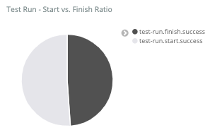
One half represents automated test runs that were started, and the other half represents automated test runs that have finished. Anything other than a 50/50 split in this pie chart indicates that we have what is known as a "flaky test" (or a test that’s not working properly), which requires our attention. Simply put, this chart visualizes in an easy to digest way whether our automation team is building reliable automated tests.
Align Your Terminology
When creating legends, titles, and details within your dashboards, Kibana allows for custom labels and colors — utilize them to present data in a way that makes sense to your audience.
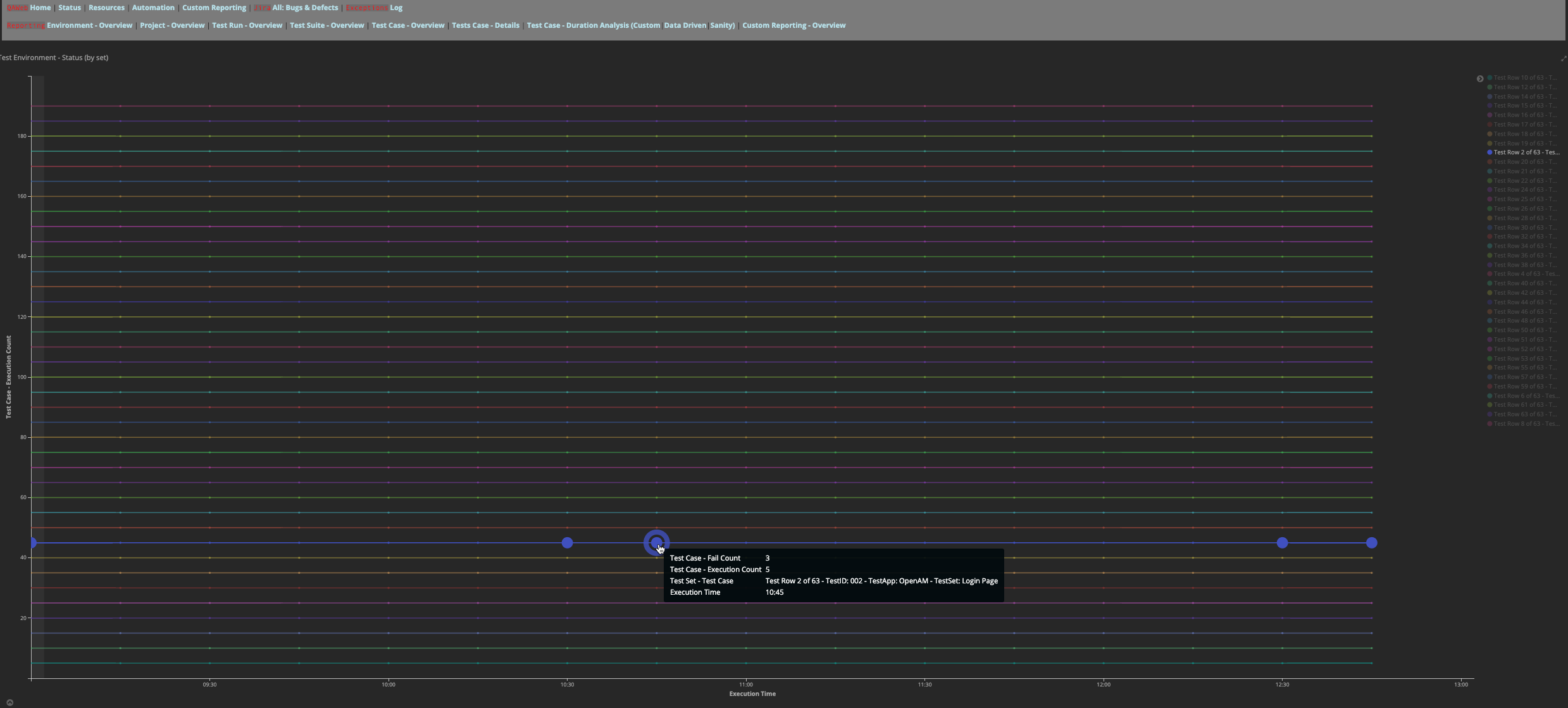
Present Actionable Information
Information in your dashboards should be actionable. We use our data to help our Test Engineers identify risk and understand where to focus their attention. As another example from the "Custom Reporting - Overview" dashboard, the large dot in the below image indicates an accumulation of failed tests results:
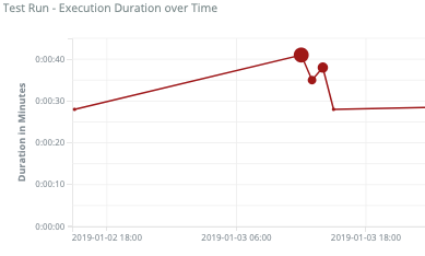
We designed this visualization to make it easy for Test Engineers to know precisely where to drill into the test case, and to see exception results that describe what failed within an automated test.
Begin Your Journey
Our utilization of Kibana comes with significant advantages. Our Kibana dashboards give us near real-time insights into the health and availability of the applications we test. We can easily detect discrepancies in application performance well before issues arise. These things, and much more, were not easily observable before we implemented Kibana and the data lake.
You can see from our use of these tools, how the Elastic Stack, and especially Kibana, can provide new insights into your processes, but there is still much more that we can do. Our work with the Elastic Stack is raising interest throughout Ramsey Solutions, leading to requests to share what we’ve done. Following our philosophy, we'll allow real needs and opportunities to lead us to develop our next visualizations. Just as we innovate in our automated efforts, I anticipate we'll look for ways to innovate in actionable, visualized data.
So get started with filling your data lake. Then consider all the creative possibilities of visualizing your data. I hope this article has inspired you to try new approaches to visualizing your data and advance these incredible tools to the next level.
Greg Paskal is an innovation enthusiast that utilizes his technical talents to dream up new ways to help meet the needs of people around the world. You can learn more about Greg by checking out his blogs and websites including Real World Test Automation, Minimal Essential Testing Strategy, and Platform with Purpose.