Time series analysis with Lens
editTime series analysis with Lens
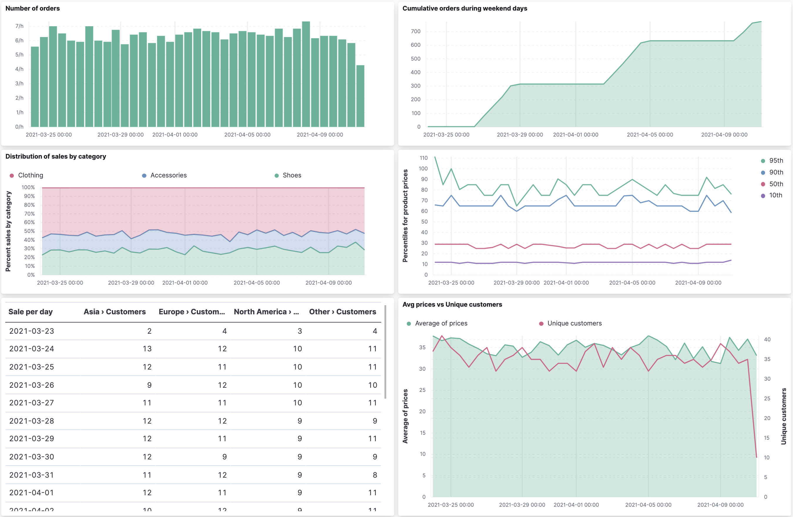
editThe tutorial uses sample data from the perspective of a shop owner looking at sales trends, but this type of dashboard works on any type of data. To create dashboard panels of the data, open the Lens visualization builder, then create the visualization panels that best display the data. Before using this tutorial, you should be familiar with the Kibana concepts.
Add the data and create the dashboard
editIf you are working with your own data, you should already have an index pattern. To install the sample sales data:
- From the Kibana Home page, click Try our sample data.
- From Sample eCommerce orders, click Add data.
Then create a new dashboard:
- Open the main menu, then click Dashboard.
- On the Dashboards page, click Create dashboard.
- Set the time filter to Last 30 days.
Open and set up Lens
editLens is designed to help you quickly build visualizations for your dashboard, as shown in Build your first dashboard, while providing support for advanced usage as well.
Open the Lens editor, then make sure the correct fields appear.
- From the dashboard, click Create visualization.
- Make sure the kibana_sample_data_ecommerce index appears.
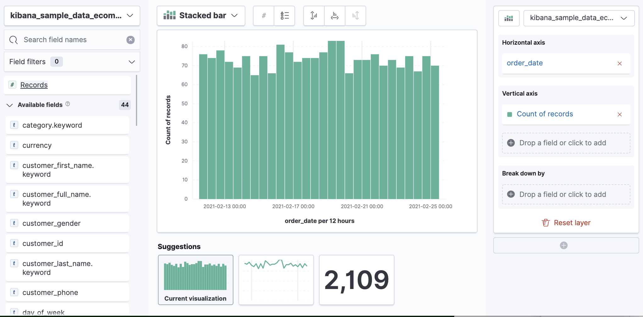
View a date histogram with a custom time interval
editIt is common to use the automatic date histogram interval, but sometimes you want a larger or smaller
interval. Lens only lets you choose the minimum time interval, not the exact time interval, for
performance reasons. The performance limit is controlled by the histogram:maxBars
advanced setting and the overall time range. To see hourly sales over a 30 day time period, choose
one of these options:
- View less than 30 days at a time, then use the time picker to select each day separately.
-
Increase
histogram:maxBarsfrom 100 to at least 720, which the number of hours in 30 days. This affects all visualizations and can reduce performance. - If approximation is okay, use the Normalize unit option. This can convert Average sales per 12 hours into Average sales per 12 hours (per hour) by dividing the number of hours.
For the sample data, approximation is okay. To use the Normalize unit option:
- Set the time filter to Last 30 days.
-
From the Available fields list, drag and drop Records to the visualization builder.
-
Change the Vertical axis title and display the number of orders per day.
- In the editor, click Count of Records.
-
In the Display name field, enter
Number of orders. - Click Add advanced options > Normalize by unit.
- From the Normalize by unit dropdown, select per hour, then click Close.
-
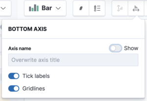
To hide the Horizontal axis label, open the Bottom Axis menu, then deselect Show.
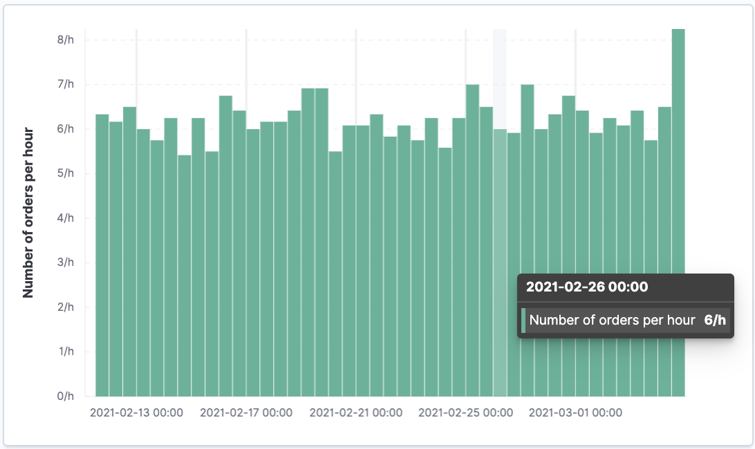
You have a bar chart that shows you how many orders were made at your store every hour.
- Click Save and return.
Monitor multiple series within a date histogram
editIt is often required to monitor multiple series within a time interval. These series can be have similar configurations with few changes between one and another. Lens copies a function when you drag and drop it to the Drop a field or click to add field within the same group, or when you drag and drop to the Duplicate field on a different group. You can also drag and drop using your keyboard. For more information, refer to Create visualization panels with keyboard navigation.
To quickly create many copies of a percentile metric that shows distribution of price over time:
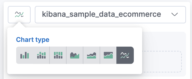
-
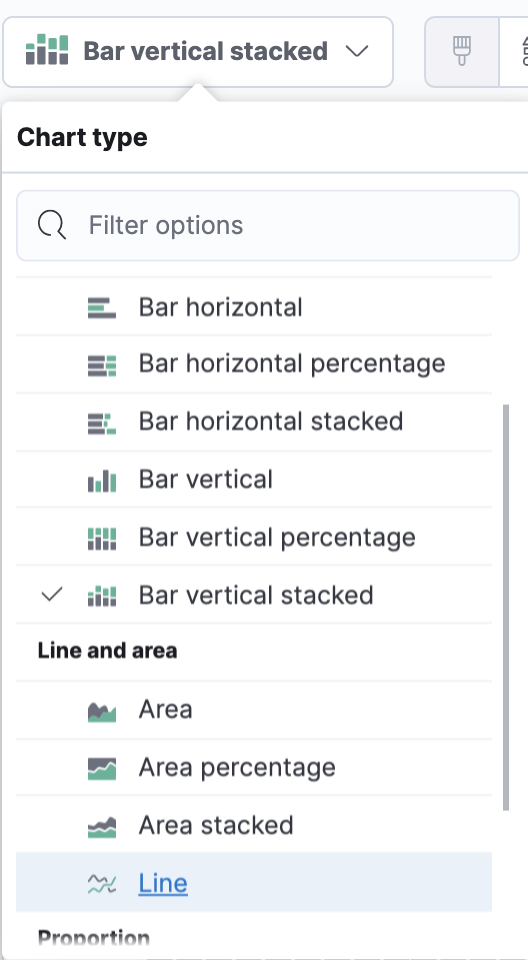
From the Chart Type dropdown, select Line.
- From the Available fields list, drag and drop products.price to the visualization builder.
-
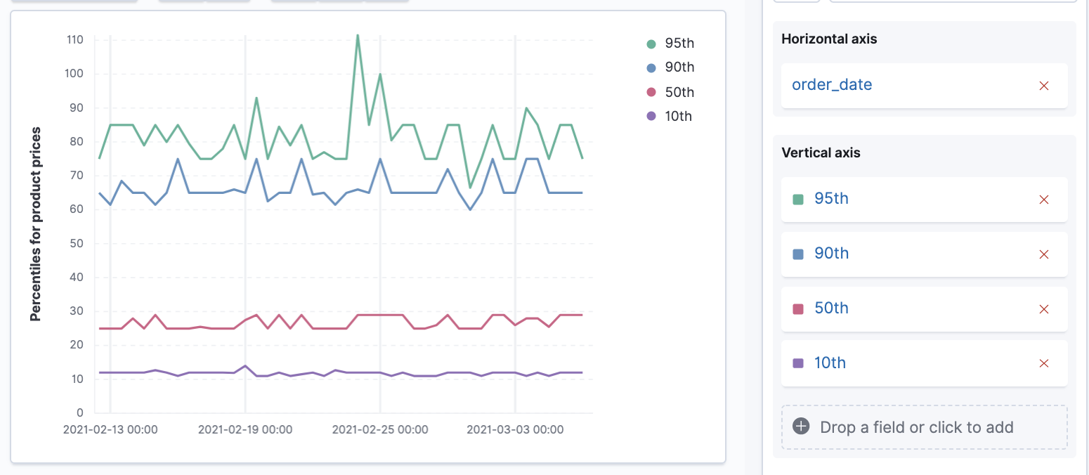
Create the 95th percentile.
- In the editor, click Median of products.price.
- From Select a function, click Percentile.
-
In the Display name field, enter
95th, then click Close.
-
To create the 90th percentile, duplicate the
95thpercentile.- Drag and drop 95th to Drop a field or click to add.
-
Click 95th [1], then enter
90in the Percentile field. -
In the Display name field enter
90th, then click Close.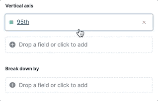
-
Repeat the duplication steps to create the
50thand10thpercentile, naming them accordingly.
-
To change the left axis label, open the Left Axis menu, then enter
Percentiles for product pricesin the Axis name field.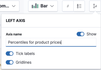
You have a line chart that shows you the price distribution of products sold over time.
- Add the filter for the redirect codes.
Multiple chart types or index patterns in one visualization
editYou can add multiple metrics to a single chart type, but if you want to overlay multiple chart types or index patterns, use a second layer. When building layered charts, it is important to match the data on the horizontal axis so that it uses the same scale. To add a line chart layer on top of an existing chart:
To compare product prices with customers traffic:
-
From the Available fields list, drag and drop products.price to the visualization builder.
-
In the KQL field, enter
response.keyword>=500 AND response.keyword<600. - From Select a function, click Average.
-
In the Display name field, enter
Average of prices, then click Close.
-
In the KQL field, enter
- From the Chart Type dropdown, select Area.
- Create a new layer to overlay with custom traffic.
-
In the editor, click +.
-
From the Available fields list, drag and drop customer_id to the Vertical Axis of the newly created layer.
- In the editor, click Unique count of customer_id.
-
In the Display name field, enter
Unique customers, then click Close.
- In the Series color field, enter #D36086, then click Close.
- For Axis side, click Right, then click Close.
- From the Available fields list, drag and drop order_date to the Horizontal Axis of the newly created layer.
-
From the new layer editor, click the Chart type dropdown, then click the line chart.
The visualization is done, but the legend uses a lot of space. Change the legend position to the top of the chart.
- From the Legend dropdown, select the top position.
- Click Save and return.
Compare the change in percentage over time
editBy default, Lens shows date histograms using a stacked chart visualization, which helps understand how distinct sets of documents perform over time. Sometimes it is useful to understand how the distributions of these sets change over time. Combine filters and date histogram functions to see the change over time in specific sets of documents. To view this as a percentage, use a stacked percentage bar or area chart.
To see sales change of product by type over time:
- From the Available fields list, drag and drop Records to the visualization builder.
- Click Bar vertical stacked, then select Area percentage.
For each category type that you want to break down, create a filter.
- In the editor, click the Drop a field or click to add field for Break down by.
- From Select a function, click Filters.
-
Add the filter for the clothing category.
- Click All records.
-
In the KQL field, enter
category.keyword : *Clothing. -
In the Label field, enter
Clothing, then press Return.
-
Add the filter for the shoes category.
- Click Add a filter.
-
In the KQL field, enter
category.keyword : *Shoes. -
In the Label field, enter
Shoes, then press Return.
-
Add the filter for the accessories category.
- Click Add a filter.
-
In the KQL field, enter
category.keyword : *Accessories. -
In the Label field, enter
Accessories, then press Return.
Change the legend position to the top of the chart.
-
From the Legend dropdown, select the top position.
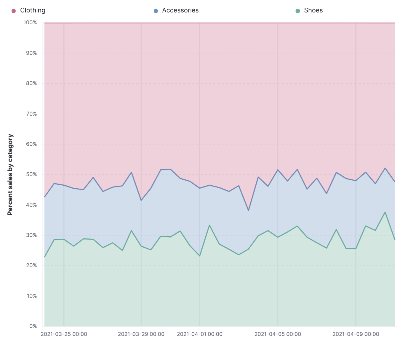
Click *Save and return*.
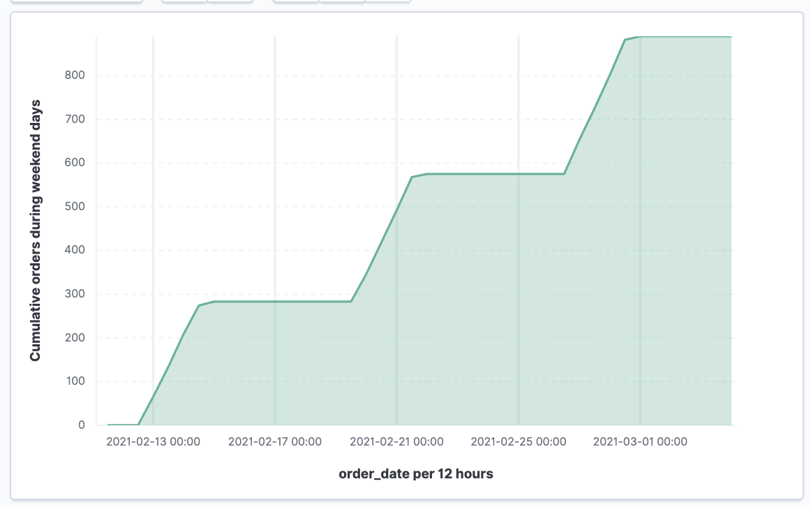
View the cumulative number of products sold on weekends
editTo determine the number of orders made only on Saturday and Sunday, create an area chart, then add it to the dashboard.
- Open Lens.
- From the Chart Type dropdown, select Area.
-
Configure the cumulative sum of the store orders.
- From the Available fields list, drag and drop Records to the visualization builder.
- From the editor, click Count of Records.
- From Select a function, click Cumulative sum.
-
In the Display name field, enter
Cumulative orders during weekend days, then click Close.
-
Filter the results to display the data for only Saturday and Sunday.
- From the editor, click the Drop a field or click to add field for Break down by.
- From Select a function, click Filters.
- Click All records.
-
In the KQL field, enter
day_of_week : "Saturday" or day_of_week : "Sunday", then press Return.The KQL filter displays all documents where
day_of_weekmatchesSaturdayorSunday.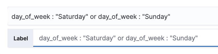
-
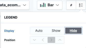
To hide the legend, open the Legend menu, then click Hide.
You have an area chart that shows you how many orders your store received during the weekend.
-
Click Bar vertical stacked, then select Area.
- Click Save and return.
View table of customers by category over time
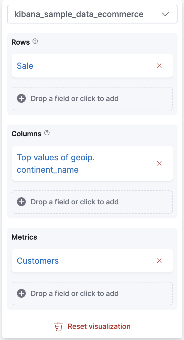
editTables are an alternative type of visualization for time series, useful when you want to read the actual values. You can build a date histogram table, and group the customer count metric by category, like the continent registered in their profile.
In Lens you can split the metric in a table leveraging the Columns field, where each data value from the aggregation is used as column of the table and the relative metric value is shown.
To build a date histogram table:
- Open Lens.
-
From the Chart Type dropdown, select Table.
- From the Available fields list, drag and drop customer_id to the Metrics field of the editor.
- From the editor, click Unique count of customer_id.
-
In the Display name field, enter
Customers, then click Close. - From the Available fields list, drag and drop order_date to the Rows field of the editor.
- From the editor Rows, click the order_date field just dropped.
- Select Customize time interval.
-
Change the Minimum interval to
1 days, then click Close.-
In the Display name field, enter
Sale, then click Close.
-
In the Display name field, enter
To split the customers count by continent:
-
From the Available fields list, drag and drop geoip.continent_name to the Columns field of the editor.
- Click Save and return.
Save the dashboard
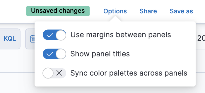
editBy default the dashboard attempts to match the palette across panels, but in this case there’s no need for that, so it can be disabled.
Now that you have a complete overview of your ecommerce sales data, save the dashboard.
- In the toolbar, click Save.
-
On the Save dashboard window, enter
Ecommerce sales data, then click Save.