Build your first dashboard
editBuild your first dashboard
editLearn the most common ways to build a dashboard from your own data. The tutorial will use sample data from the perspective of an analyst looking at website logs, but this type of dashboard works on any type of data. Before using this tutorial, you should be familiar with the Kibana concepts.
Add the data and create the dashboard
editInstall the sample web logs data that you’ll use to create your dashboard.
- On the Kibana Home page, click Try our sample data.
- From Sample web logs, click Add data.
Then create a new dashboard:
- Open the main menu, then click Dashboard.
- Click Create dashboard.
- Set the time filter to Last 90 days.
Open Lens and get familiar with the data
edit- On the dashboard, click Create visualization.
-
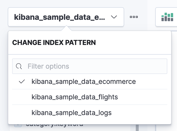
Make sure the kibana_sample_data_logs index appears. You might need to select a different index pattern from the dropdown:
This tutorial uses Records, timestamp`, bytes, clientip, and referer.keyword.
To see the most frequent values of a field, click the field name to view a summary.
The main elements of Lens are named:
- Workspace panel
- Displays your visualization. You can drag and drop onto this area.
- Dimensions
- Each dimension is a function with extra options. Dimensions are grouped for each visualization type, for example the Vertical axis is a group that allows multiple dimensions. Each dimension starts empty with the label Drop a field or click to add.
- Functions
- There are two main types of functions: buckets and metrics, which are equivalent to what Elasticsearch provides.
Create your first visualization
editEvery time you build a visualization in Lens, you need to:
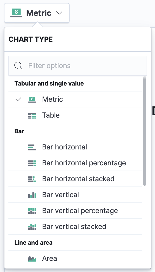
- Choose your visualization. Do you know the type of visualization you’d like to use? If you do, select the type before dragging any fields. If you don’t, you can change the visualization type after configuring your functions.
- Choose your field. Do you know the dimension group you want to use the field in? If you do, drag and drop the field from the field list to your chosen dimension and Lens will pick a function for you. If you don’t, drag and drop the field onto the workspace panel. Skip this step if you are using the Filters function.
- Edit and delete. To change the function or styling options, click the dimension to open the configuration panel. To delete a specific dimension, close the configuration panel and click the delete button. To reset the entire visualization, click Reset layer.
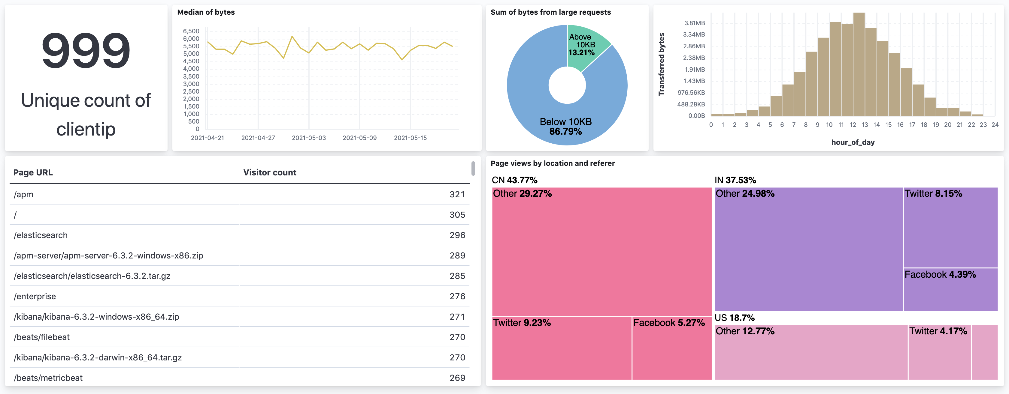
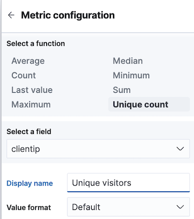
To put this into practice, pick a field you want to analyze, such as clientip. If you want
to analyze only this field, you can use Metric to show a big number.
The only number function that you can use with clientip is Unique count.
Unique count, also known as cardinality, approximates the number of unique values
of the clientip field.
-
To select the visualization type, click Bar vertical stacked to open the chart type dropdown, then select Metric.
-
From the Available fields list, drag and drop
clientipto the workspace panel. Lens selects Unique count because it is the only numeric function that works for IP addresses. You can also drag and dropclientiponto the empty dimension for the same result.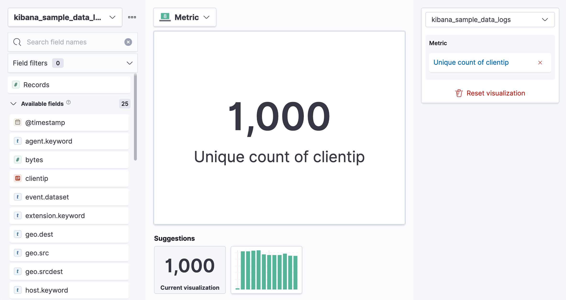
-
In the editor, click Unique count of clientip.
-
In the Display name field, enter
Unique visitors. -
Click Close.
-
In the Display name field, enter
- Click Save and return.
-
Customize the newly added panel:
- Drag the bottom corner of the panel until the metric takes up one quarter of the screen width. The row for the metric will have 4 items on it later.
- The metric visualization has its own label, so you do not need to add a panel title.
- Click Save on the dashboard menu
-
In the Title field, enter
Logs dashboard. - Select Store time with dashboard box, then click Save.
- After the dashboard refreshes, click Edit again.
View a metric over time
editLens has two shortcuts that simplify viewing metrics over time. If you drag and drop a numeric field to the workspace panel, Lens adds the default time field from the index pattern. If the Date histogram function is being used, quickly replace the time field by dragging and dropping on the workspace panel.
To visualize the bytes field over time without choosing a visualization type or function:
-
From the Available fields list, drag and drop
bytesonto the workspace panel to have Lens automatically create a chart. Lens creates a bar chart with two dimensions, timestamp and Median of bytes. - Lens automatically chooses a date interval. To zoom in on the data you want to view, click and drag your cursor across the bars.
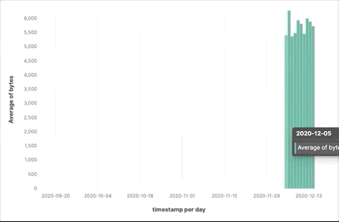
To emphasize the change in Median of bytes over time, use a line chart. To change the visualization type, use one of the following ways:
- From the Suggestions, click the line chart.
- Click Bar vertical stacked, then select Line.
- Click the chart type icon above Horizontal axis, then click the line icon.
Most users use the automatic time interval. You can increase and decrease the minimum interval that Lens uses, but you cannot decrease the interval below the Kibana advanced settings. To set the minimum time interval:
- In the editor, click timestamp.
- Click How it works to learn about the Lens minimum interval
- Select Customize time interval.
-
Increase the Minimum interval to
1 days, then click Close.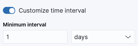
To save space on the dashboard, so to save space, hide the vertical and horizontal axis labels.
-
Open the Left axis menu, then deselect Show.
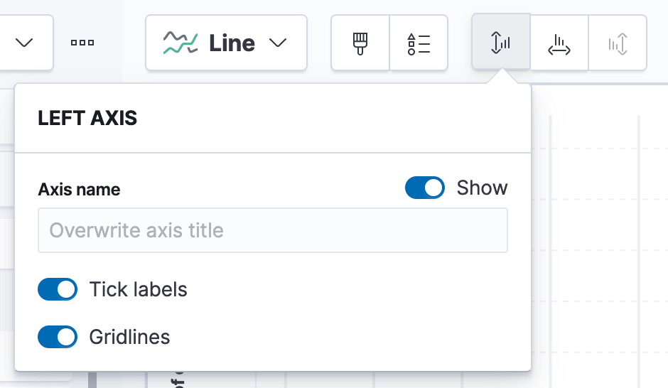
- Open the Bottom axis menu, then deselect Show.
- Click Save and return
- On the dashboard, move the panel so that it is in the same row as the Metric visualization panel. The two should take up half the screen width.
-
Add a panel title to explain the panel, which is necessary because you removed the axis labels.
- Open the panel menu and choose Edit panel title.
-
In the Title field, enter
Median of bytes, then click Save.
- In the toolbar, click Save.
View the top values of a field
editThe Top values function ranks the unique values of a field by another dimension. The values are the most frequent when ranked by a Count dimension. The values are the largest when ranked by a Sum dimension.
When you drag and drop a text or IP address field onto the workspace panel, Lens adds a Top values function ranked by Count of records to show the most frequent values.
For this tutorial, you have picked a field and function, but not a visualization type.
You want to see the most frequent values of request.keyword on your website, ranked by the unique visitors.
This means that you want to use Top values of request.keyword ranked by Unique count of clientip, instead of
being ranked by Count of records.
-
From the Available fields list, drag and drop
clientiponto the Vertical axis. Lens chooses the function for you when you drop onto a dimension, which is Unique count here. Do not drop the field into the main workspace becauseclientipwill be added to the wrong axis. -
Drag and drop
request.keywordto the main workspace. Lens adds Top values of request.keyword to the Horizontal axis.
This chart is hard to read because the request.keyword field contains long text. You could try
using one of the Suggestions, but the suggestions also have issues with long text. Instead, switch
to the Table visualization.
Click Bar vertical stacked, then select Table.
+
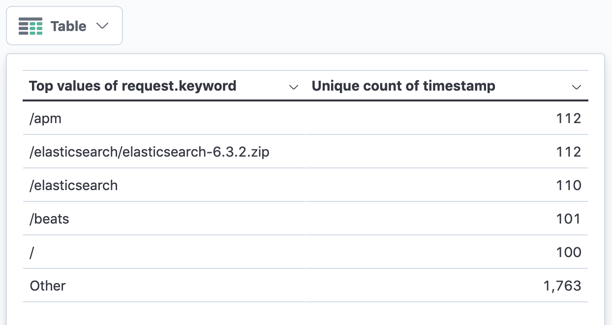
Next, customize the table.
-
Click the Top values of request.keyword dimension.
- Increase the Number of values. The maximum allowed value is 1000.
-
In the Display name field, enter
Page URL, then click Close.
- Click Save and return.
- Move the table panel so that it has its own row, but do not change the size.
You do not need a panel title because the table columns are clearly labeled.
Compare a subset of documents to all documents
editTo compare a field on subset of documents to all documents, you need to select two or more sets of documents that add up to 100%.
For this example, we are comparing documents where the bytes field is under 10 Kb to documents where bytes is over 10 Kb,
which are two sets that do not overlap.
Use Intervals to select documents based on the number range of a field. Use Filters when your criteria is not numeric, or when your query needs multiple clauses.
Use a proportion chart to display the values as a percentage of the sum of all values. Lens has 5 types of proportion charts: pie, donut, treemap, percentage bar and percentage area.
To determine if your users transfer more bytes from small files versus large files,
configure dimensions with Intervals and Sum, then switch to a pie chart to display as a percentage:
-
From the Available fields list, drag and drop
bytesto Vertical axis in the editor. - Click Median of bytes, select Sum, then click Close.
-
From the Available fields list, drag and drop
bytesto Break down by in the editor, then specify the file size ranges.- In the editor, click bytes.
-
Click Create custom ranges, enter the following, then press Return:
-
Ranges —
0→10240 -
Label —
Below 10KB
-
Ranges —
-
Click Add range, enter the following, then press Return:
-
Ranges —
10240→+∞ -
Label —
Above 10KB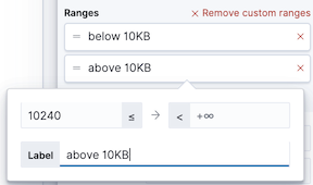
-
Ranges —
- From the Value format dropdown, select Bytes (1024), then click Close.
- From the Chart Type dropdown, select Pie.
- Click Save and return.
View a the distribution of a number field
editKnowing the distribution of a number helps to find patterns. For example, you could look at the website traffic per hour to find the best time to do routine maintenance. Use Intervals to see an evenly spaced distribution of a number field.
-
From the Available fields list, drag and drop
bytesto Vertical axis in the editor. - Click Median of bytes, then select Sum.
-
In the Display name field, enter
Transferred bytes. -
From the Value format dropdown, select
Bytes (1024), then click Close. - From the Available fields list, drag and drop hour_of_day to Horizontal axis in the editor.
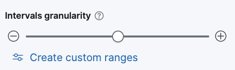
-
Click hour_of_day, and then slide the Intervals granularity slider until the horizontal axis displays hourly intervals.
- Click Save and return.
-
Decrease the panel size, then drag and drop it to the first row next to the
Median of bytespanel. There should be four panels in a row. - You do not need a panel title because the axis labels are self-explanatory.
Create a multi-level chart
editLens lets you use multiple functions in the data table and proportion charts. For example, to create a chart that breaks down the traffic sources and user geography, use Filters and Top values.
- Click Bar vertical stacked, then select Treemap.
- From the Available fields list, drag and drop Records to the Size by field in the editor.
-
In the editor, click the Drop a field or click to add field for Group by, then create a filter for each website traffic source.
- From Select a function, click Filters.
-
Click All records, enter the following, then press Return:
-
KQL —
referer : *facebook.com* -
Label —
Facebook
-
KQL —
-
Click Add a filter, enter the following, then press Return:
-
KQL —
referer : *twitter.com* -
Label —
Twitter
-
KQL —
-
Click Add a filter, enter the following, then press Return:
-
KQL —
NOT referer : *twitter.com* OR NOT referer: *facebook.com* -
Label —
Other
-
KQL —
- Click Close.
Add the next break down by geography:
- From the Available fields list, drag and drop geo.src to the main workspace.
-
To change the Group by order, click and drag Top values of geo.src so that it appears first in the editor.
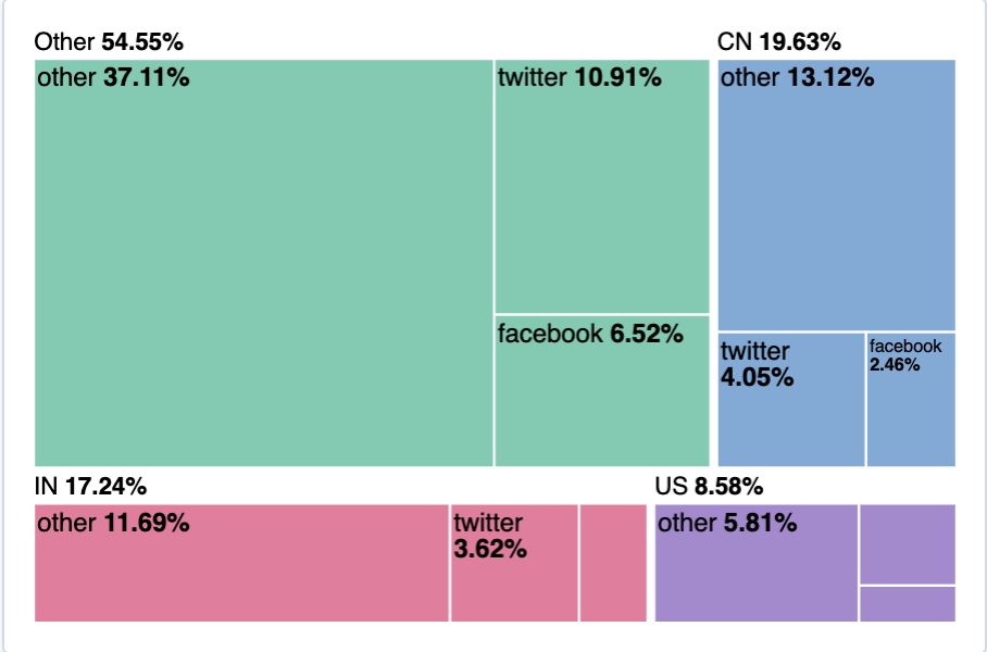
-
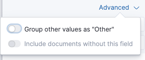
To view only the Facebook and Twitter data, remove the Other category.
- In the editor, click Top values of geo.src.
-
From the Advanced dropdown, deselect Group other values as "Other", then click Close.
- Click Save and return.
-
Arrange the panel so that it is in the same row as the table.
- Click the gear icon and choose Edit panel title.
- Enter "Page views by location and referer" as the panel title, then click Save.
Save the dashboard
editNow that you have a complete overview of your web server data, save the dashboard.
- In the toolbar, click Save.
-
On the Save dashboard window, enter
Web server data, then click Save. - If this was not the first time you saved the dashboard, click Switch to view mode