Lens
editLens
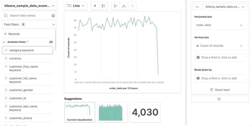
editTo create visualizations with Lens, you drag and drop data fields onto the visualization builder, then Lens uses heuristics to apply each field.
Open and set up Lens
editOpen Lens, then explore the fields in your data. The list of fields are determined by the index pattern and time filter.
- On the dashboard, click Create visualization.
- In Lens, set the time filter.
- To view the fields in the a different index pattern, click the index pattern, then select a different index pattern from the dropdown.
-
Scan through the list of fields to see what’s in your data.
For sparse datasets, Empty fields can contain data, which you can use to create visualizations.
-
To filter the data fields, use the following options:
- Enter the field name in the Search field names field.
- Click Field by type, then select the filter. To show all fields in the index pattern, deselect Only show fields with data.
View the data summaries
editFor each field, Lens displays a summary depending on the type of data. To analyze the fields, Lens uses a sample of 5,000 documents. Each summary displays the percentage of sampled documents over all available documents.
To view a data summary, click i next to the field.
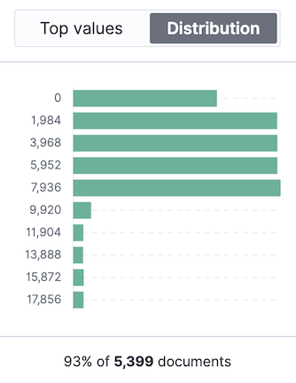
Each data type display the following summaries:
- Date — Displays the time distribution.
- String — Displays the top 10 values.
- Numeric — Displays the top 10 values and a value distribution. When Lens displays the top 10 values distribution, the percentage of Other values is also displayed. For array value fields, the percentage distribution considers each value in the array as separate.
Other can equal more than 100% by a small amount.
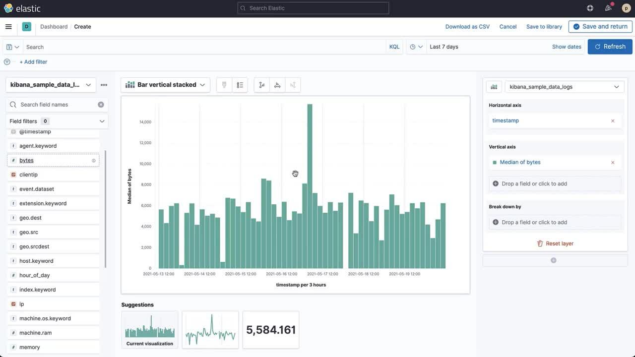
Create visualizations
editDrag and drop the fields on to the visualization builder, then customize the visualization.
- Drag and drop the fields on to the visualization builder.
-
To change the visualization type, use the following options:
- Click the Suggestions.
- From the Chart Type dropdown, click the visualization.
- To configure the data, use the editor, then click Close.
-
To configure the visualization, use the dropdown menus.
Add fields
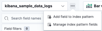
editAdd and define fields to the index pattern that you want to visualize using the Painless scripting language. The fields that you are add are saved to the index pattern and appear in all visualizations, saved searches, and saved objects that use the index pattern.
-
Click …, then select Add field to index pattern.
- Enter a Name for the field, then select the field Type.
- Select Set value, then define the field value by emitting a single value using the Painless scripting language.
-
Click Save.
To manage the field, click the field, then click Edit index pattern field or Remove index pattern field.
For more information about adding fields to index patterns and Painless scripting language examples, refer to Runtime fields.
Create visualizations with keyboard navigation
editLens has a fully accessible, continuously improved drag and drop system, which allows you to use a keyboard instead of a mouse.
-
Set a focus on the chosen item. Most of the draggable elements have two focus states. The inner focus state opens a panel with detailed information or options. The outer focus state allows you to drag an item. Tab through the page until you get the outer focus state on the chosen item:
-
Complete the following actions:
- To start dragging an item, press Space bar.
- To select where you want to drop the item, use the Left and Right arrows.
- To reorder the fields in the group, use Up and Down arrows.
-
To duplicate an operation, use the Left and Right arrows to select the
Drop a field or click to addin the same group.
- Press Space bar to confirm, or to cancel, press Esc.
Frequently asked questions
editFor the answers to common Lens questions, review the following.
When should I use the top filter bar, filters function, or "Filter by"?
editUsing the top Semi-structured search bar is best when you want to focus on a known set of data for all the visualization results. These top level filters are combined with other filters using AND logic.
Use the Filters function in the following scenarios:
- When you want to apply more than one KQL filter to the visualization.
- When you want to apply the KQL filter to a single layer, which allows you to visualize filtered and unfiltered data.
Use the Filter by advanced option in the following scenarios:
- When you want to assign a custom color to each filter in a bar, line or area chart.
- When you want to build a complex table, such as showing both failure rate and overall.
When should I normalize the data by unit or use a custom interval?
edit- Normalize by unit — Calculates the average for the specified interval. When you normalize the data by unit, the data appears less granular, but Lens is able to calculate the data faster.
- Customize time interval — Creates a bucket for each specified interval. When you customize the time interval, you can use a large time range, but Lens calculates the data slower.
To normalize the interval:
- In the editor, click a field.
- Click Add advanced options > Normalize by unit.
- From the Normalize by unit dropdown, select an option, then click Close.
To create a custom interval:
- In the editor, click a field.
- Select Customize time interval.
- Change the Minimum interval, then click Close.
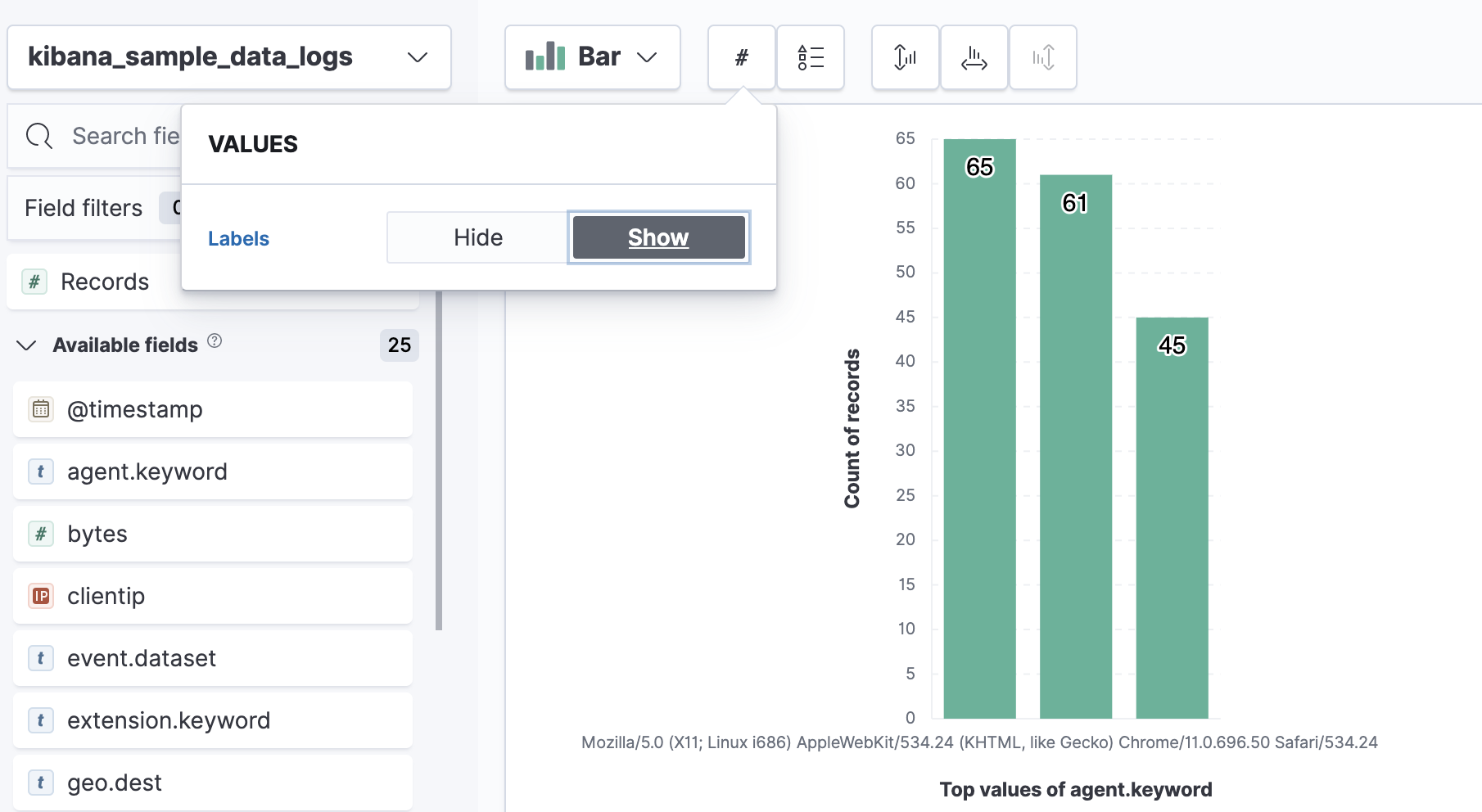
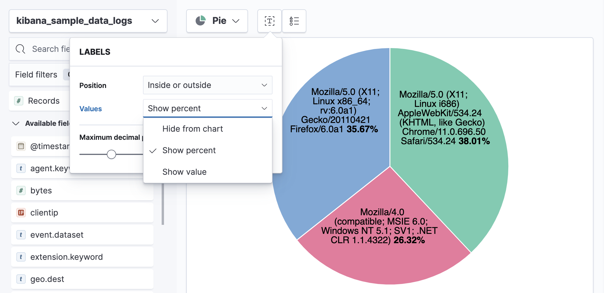
How do I display value labels?
editA subset of Lens visualizations support value labels.
-
Bar and Horizontal Bar
-
Pie, Donut, and Treemap
What data is categorized as Other?
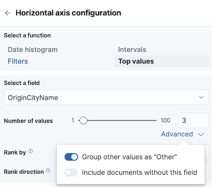
editThe Other category contains all of the documents that do not match the specified criteria or filters. Use Other when you want to compare a value, or multiple values, to a whole. By default, Group other values as "Other" is enabled when you select the Top values function.
To disable Group other values as "Other":
- In the editor, click Advanced.
- Deselect Group other values as "Other".
How can I include documents without the field?
editBy default, Lens retrieves only the documents from the specified field. For bucket aggregations, such as Top values, you can choose to include documents that do not contain the specified field, which is helpful when you want to compare to the whole documentation set.
- In the editor, click Advanced.
-
Select Include documents without this field.
How do I change the color for a single data point?
editLens provides you with color pallettes that you can apply to the entire visualization, but you are unable to change the color for a single data point, such as a bar or line.
How do I sort by multiple columns?
editMultiple column sorting is unsupported in Lens, but is supported in Discover. For information on how to sort multiple columns in Discover, refer to Explore the fields in your data.
How do I sort the dimensions in a chart?
editSorting dimensions in visualizations is unsupported in Lens.
How do I visualize saved searches?
editVisualizing saved searches in unsupported in Lens.
How do I change the number of suggestions?
editConfiguring the Suggestions that Lens automatically populates is unsupported.