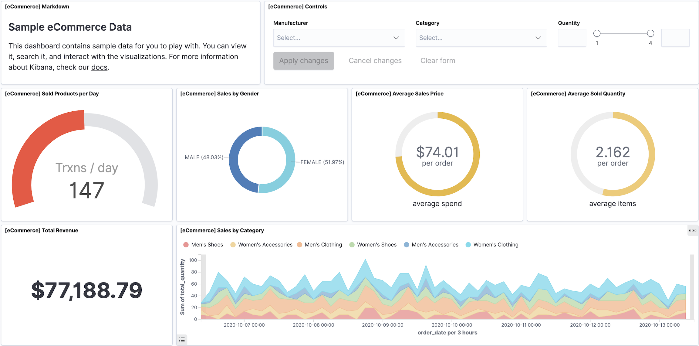
Dashboard
editDashboard
editA dashboard is a collection of panels that you use to analyze your data. On a dashboard, you can add a variety of panels that you can rearrange and tell a story about your data. Panels contain everything you need, including visualizations, interactive controls, markdown, and more.
With Dashboard, you can:
- Add multiple panels to see many aspects and views of your data in one place.
- Arrange panels for analysis and comparison.
- Add text and images to provide context to the panels and make them easy to consume.
- Create and apply filters to focus on the data you want to display.
- Control who can use your data, and share the dashboard with a small or large audience.
- Generate reports based on your findings.
To begin, open the main menu, click Dashboard, then click Create dashboard.
Read only access
editIf you see the read-only icon in the application header, then you don’t have sufficient privileges to create and save dashboards. The buttons to create and edit dashboards are not visible. For more information, see Granting access to Kibana.
Types of panels
editPanels contain everything you need to tell a story about you data, including visualizations, interactive controls, Markdown, and more.
|
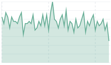
Area Displays data points, connected by a line, where the area between the line and axes are shaded. Use area charts to compare two or more categories over time, and display the magnitude of trends. |
|
|
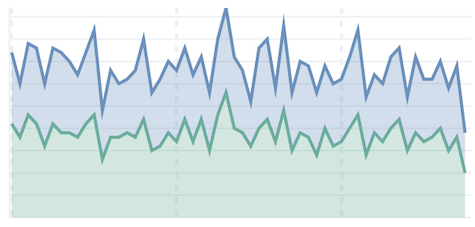
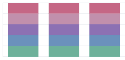
Stacked area Displays the evolution of the value of several data groups. The values of each group are displayed on top of each other. Use stacked area charts to visualize part-to-whole relationships, and to show how each category contributes to the cumulative total. |
|
|
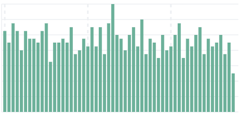
Bar Displays bars side-by-side where each bar represents a category. Use bar charts to compare data across a large number of categories, display data that includes categories with negative values, and easily identify the categories that represent the highest and lowest values. Kibana also supports horizontal bar charts. |
|
|
Stacked bar Displays numeric values across two or more categories. Use stacked bar charts to compare numeric values between levels of a categorical value. Kibana also supports stacked horizontal bar charts. |
|
|
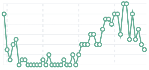
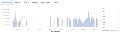
Line Displays data points that are connected by a line. Use line charts to visualize a sequence of values, discover trends over time, and forecast future values. |
|
|
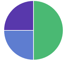
Pie Displays slices that represent a data category, where the slice size is proportional to the quantity it represents. Use pie charts to show comparisons between multiple categories, illustrate the dominance of one category over others, and show percentage or proportional data. |
|
|
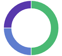
Donut Similar to the pie chart, but the central circle is removed. Use donut charts when you’d like to display multiple statistics at once. |
|
|
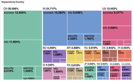
Tree map Relates different segments of your data to the whole. Each rectangle is subdivided into smaller rectangles, or sub branches, based on its proportion to the whole. Use treemaps to make efficient use of space to show percent total for each category. |
|
|
Heat map Displays graphical representations of data where the individual values are represented by colors. Use heat maps when your data set includes categorical data. For example, use a heat map to see the flights of origin countries compared to destination countries using the sample flight data. |
|
|
Goal Displays how your metric progresses toward a fixed goal. Use the goal to display an easy to read visual of the status of your goal progression. |
|
|
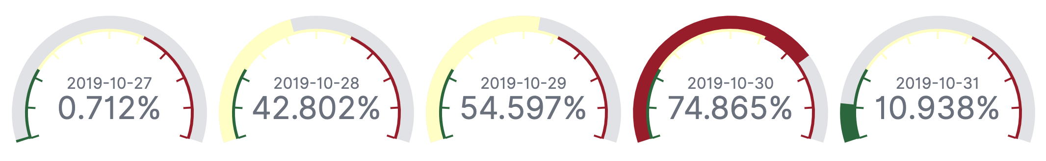
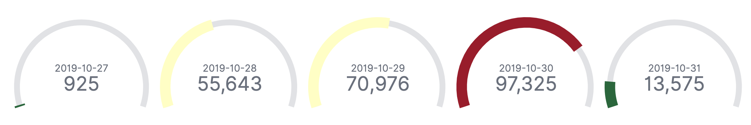
Gauge Displays your data along a scale that changes color according to where your data falls on the expected scale. Use the gauge to show how metric values relate to reference threshold values, or determine how a specified field is performing versus how it is expected to perform. |
|
|
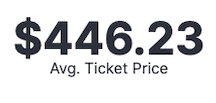
Metric Displays a single numeric value for an aggregation. Use the metric visualization when you have a numeric value that is powerful enough to tell a story about your data. |
|
|
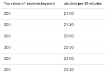
Data table Displays your raw data or aggregation results in a tabular format. Use data tables to display server configuration details, track counts, min, or max values for a specific field, and monitor the status of key services. |
|
|
Tag cloud Graphical representations of how frequently a word appears in the source text. Use tag clouds to easily produce a summary of large documents and create visual art for a specific topic. |
|
|
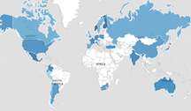
Maps For all your mapping needs, use Maps. |
|

Create panels
editTo create a panel, make sure you have data indexed into Elasticsearch and an index pattern to retrieve the data from Elasticsearch. If you aren’t ready to use your own data, Kibana comes with several pre-built dashboards that you can test out. For more information, refer to Explore Kibana using sample data.
To begin, click Create new, then choose one of the following options on the New Visualization window:
- Click on the type of panel you want to create, then configure the options.
- Select an editor to help you create the panel.
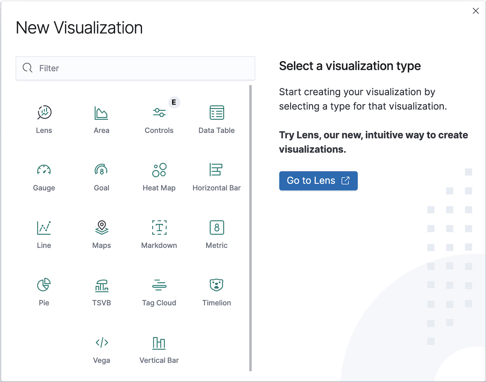
Kibana provides you with several editors that help you create panels.
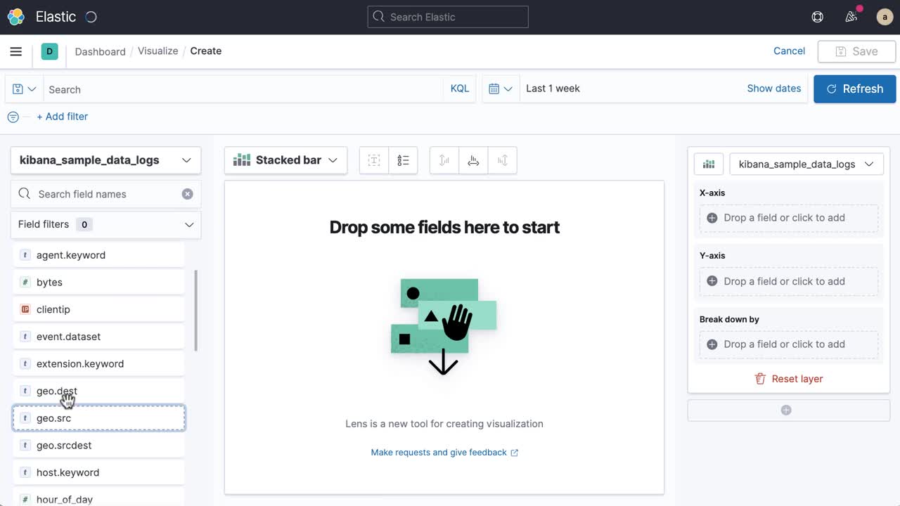
Create panels with Lens
editLens is the simplest and fastest way to create powerful visualizations of your data. To use Lens, you drag and drop as many data fields as you want onto the visualization builder pane, and Lens uses heuristics to decide how to apply each field to the visualization.
With Lens, you can:
- Use the automatically generated suggestions to change the visualization type.
- Create visualizations with multiple layers and indices.
- Change the aggregation and labels to customize the data.
Drag-and-drop capabilities are available only when Lens knows how to use the data. If Lens is unable to automatically generate a visualization, configure the customization options for your visualization.
Filter the data fields
editThe data fields that are displayed are based on the selected index pattern and the time filter.
To view the data fields in a different index pattern, click the index pattern, then select a new one. The data fields automatically update.
To filter the data fields:
- Enter the name in the Search field names.
- Click Field by type, then select the filter. To show all fields in the index pattern, deselect Only show fields with data.
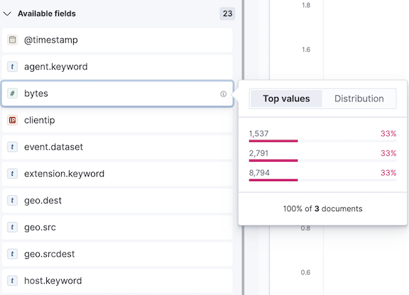
View data summaries
editTo help you decide exactly the data you want to display, get a quick summary of each field. The summary shows the distribution of values within the specified time range.
To view the data field summary information, navigate to the field, then click i.
Change the visualization type
editUse the automatically generated suggestions to change the visualization type, or manually select the type of visualization you want to view.
Suggestions are shortcuts to alternative visualizations that Lens generates for you.
If you’d like to use a visualization type outside of the suggestions, click the visualization type, then select a new one.
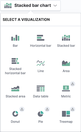
When there is an exclamation point (!) next to a visualization type, Lens is unable to transfer your data, but still allows you to make the change.
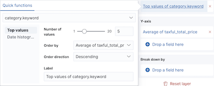
Customize the data
editFor each visualization type, you can customize the aggregation and labels. The options available depend on the selected visualization type.
- Click a data field name in the editor, or click Drop a field here.
-
Change the options that appear.
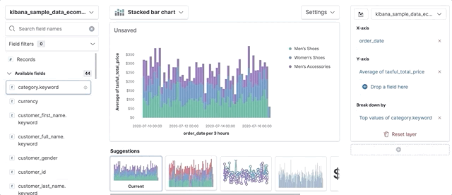
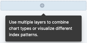
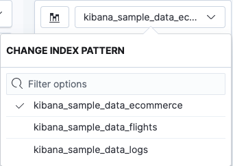
Add layers and indices
editTo compare and analyze data from different sources, you can visualize multiple data layers and indices. Multiple layers and indices are supported in area, line, and bar charts.
To add a layer, click +, then drag and drop the data fields for the new layer.
To view a different index, click the index name in the editor, then select a new one.
Ready to try out Lens? Refer to the step-by-step tutorial.
Create panels with TSVB
editTSVB is a time series data visualizer that allows you to use the full power of the Elasticsearch aggregation framework. To use TSVB, you can combine an infinite number of aggregations to display your data.
With TSVB, you can:
- Create visualizations, data tables, and markdown panels.
- Create visualizations with multiple indices.
-
Change the aggregation and labels to customize the data.
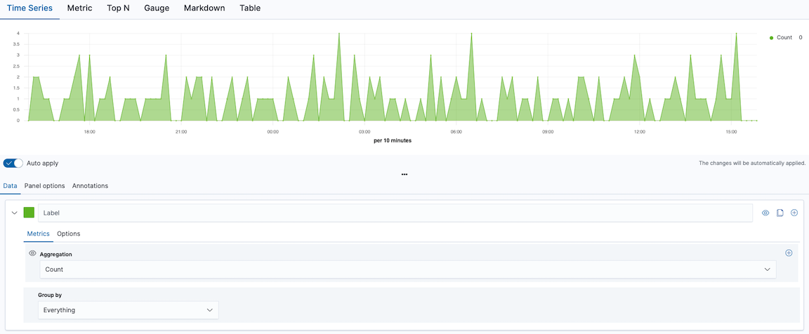
Configure the data
editWith TSVB, you can add and display multiple data sets to compare and analyze. Kibana uses many types of aggregations that you can use to build complex summaries of that data.
- Select Data. If you are using Table, select Columns.
-
From the Aggregation drop down, select the aggregation you want to visualize.
If you don’t see any data, change the time filter.
To add multiple aggregations, click +.
- From the Group by drop down, select how you want to group or split the data.
-
To add another data set, click +.
When you have more than one aggregation, the last value is displayed, which is indicated by the eye icon.
Change the data display
editTo find the best way to display your data, TSVB supports several types of panels and charts.
To change the Time Series chart type:
- Click Data > Options.
- Select the Chart type.
To change the panel type, click on the panel options:
Customize the data
editView data in a different index pattern, and change the data label name and colors. The options available depend on the panel type.
To change the index pattern, click Panel options, then enter the new Index Pattern.
To override the index pattern for a data set, click Data > Options. Select Yes to override, then enter the new Index pattern.
To change the data labels and colors:
- Click Data.
- Enter the Label name, which TSVB uses on the legends and data labels.
-
Click the color picker, then select the color for the data.
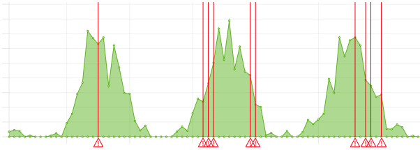
Add annotations
editYou can overlay annotation events on top of your Time Series charts. The options available depend on the data source.
To begin, click Annotations, click Add data source, then configure the options.
Filter the panel
editThe data that displays on the panel is based on the index pattern and time filter. You can filter the data on the panels using the Lucene query syntax.
Click Panel options, then enter the syntax in the Panel Filter field.
If you want to ignore filters from all of Kibana, select Yes for Ignore global filter.
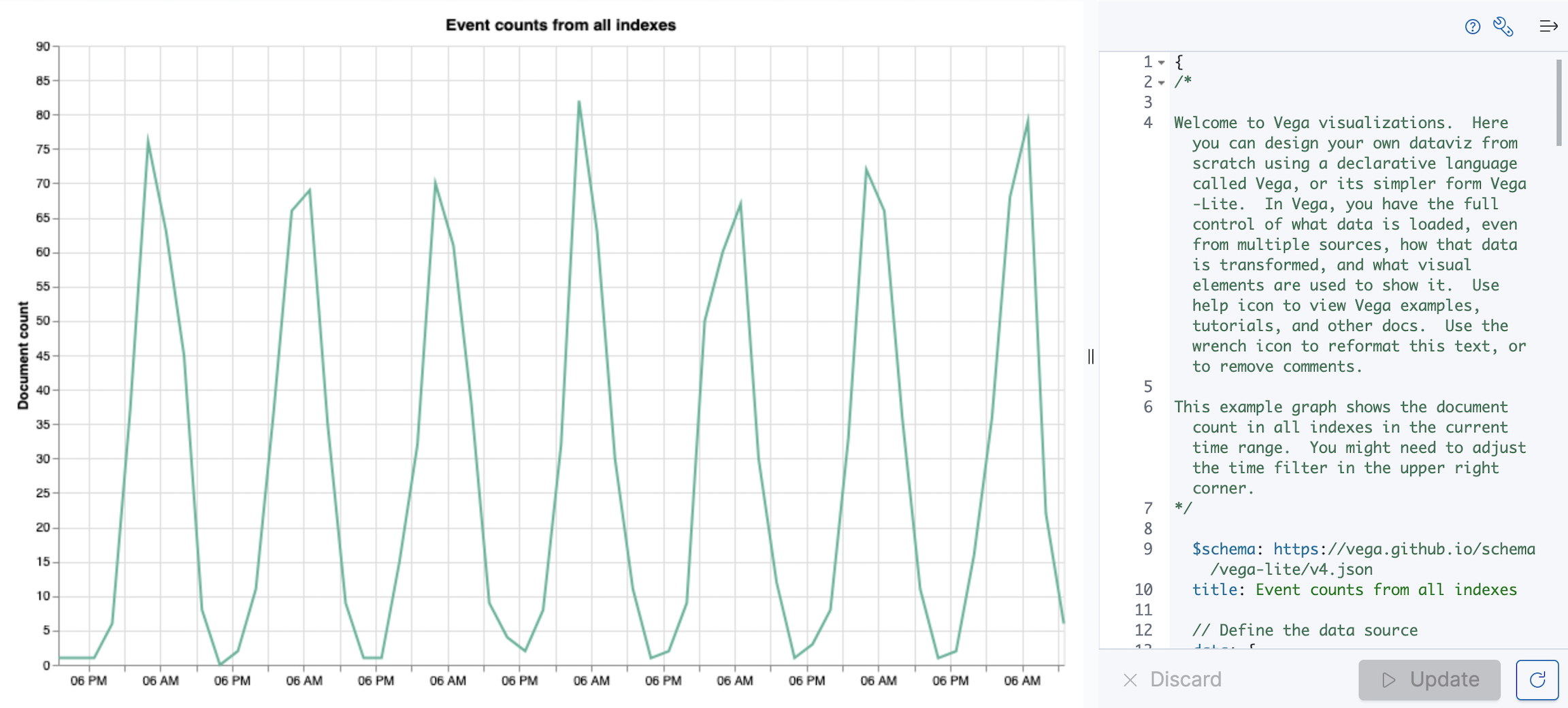
Create custom panels with Vega
editBuild custom visualizations using Vega and Vega-Lite, backed by one or more data sources including Elasticsearch, Elastic Map Service, URL, or static data. Use the Kibana extensions to embed Vega in your dashboard, and add interactive tools.
Use Vega and Vega-Lite when you want to create a visualization for:
-
Aggregations that use
nestedorparent/childmapping - Aggregations without an index pattern
- Queries that use custom time filters
- Complex calculations
- Extracting data from _source instead of aggregations
- Scatter charts, sankey charts, and custom maps
- Using an unsupported visual theme
Vega and Vega-Lite are declarative formats that:
- Create complex visualizations
- Use JSON and a different syntax for declaring visualizations
- Are not fully interchangeable
For more information about Vega and Vega-Lite, refer to:
Create panels with Timelion
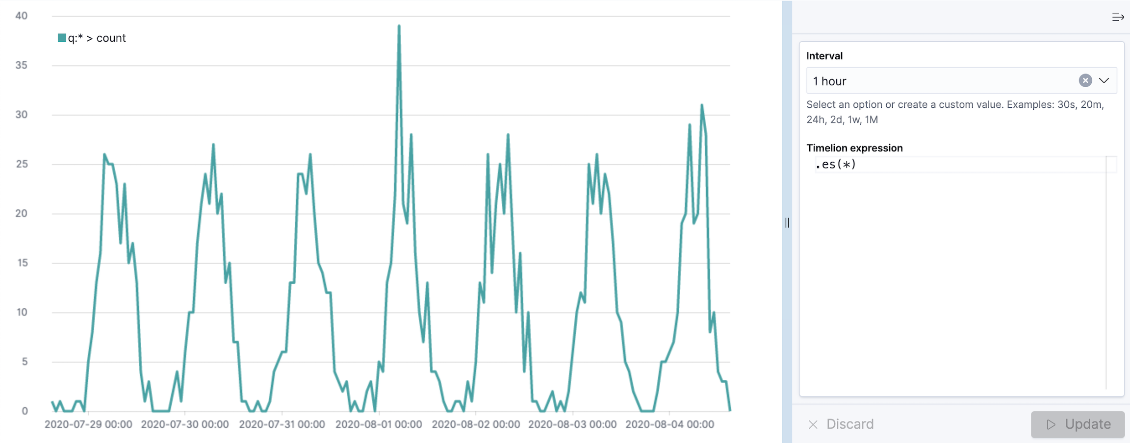
editTimelion is a time series data visualizer that enables you to combine independent data sources within a single visualization.
Timelion is driven by a simple expression language that you use to:
- Retrieve time series data
- Perform calculation to tease out the answers to complex questions
- Visualize the results
In 7.0 and later, Timelion app is deprecated. In 8.0 and later, Timelion app is removed from Kibana. To prepare for the removal of Timelion app, you must migrate Timelion app worksheets to a dashboard. For migration information, refer to Deprecations. Only Timelion app is deprecated. Kibana continues to support Timelion visualizations in Dashboard, Visualize, and Canvas.
Ready to try out Timelion? For step-by-step tutorials, refer to:
Save panels
editWhen you’ve finished making changes, save the panels.
- In the toolbar, click Save.
- Add the Title and optional Description.
- Click Save and return.
Add existing panels
editAdd panels that you’ve already created to your dashboard.
On the dashboard, click Add an existing, then select the panel you want to add.
When a panel contains a stored query, both queries are applied.
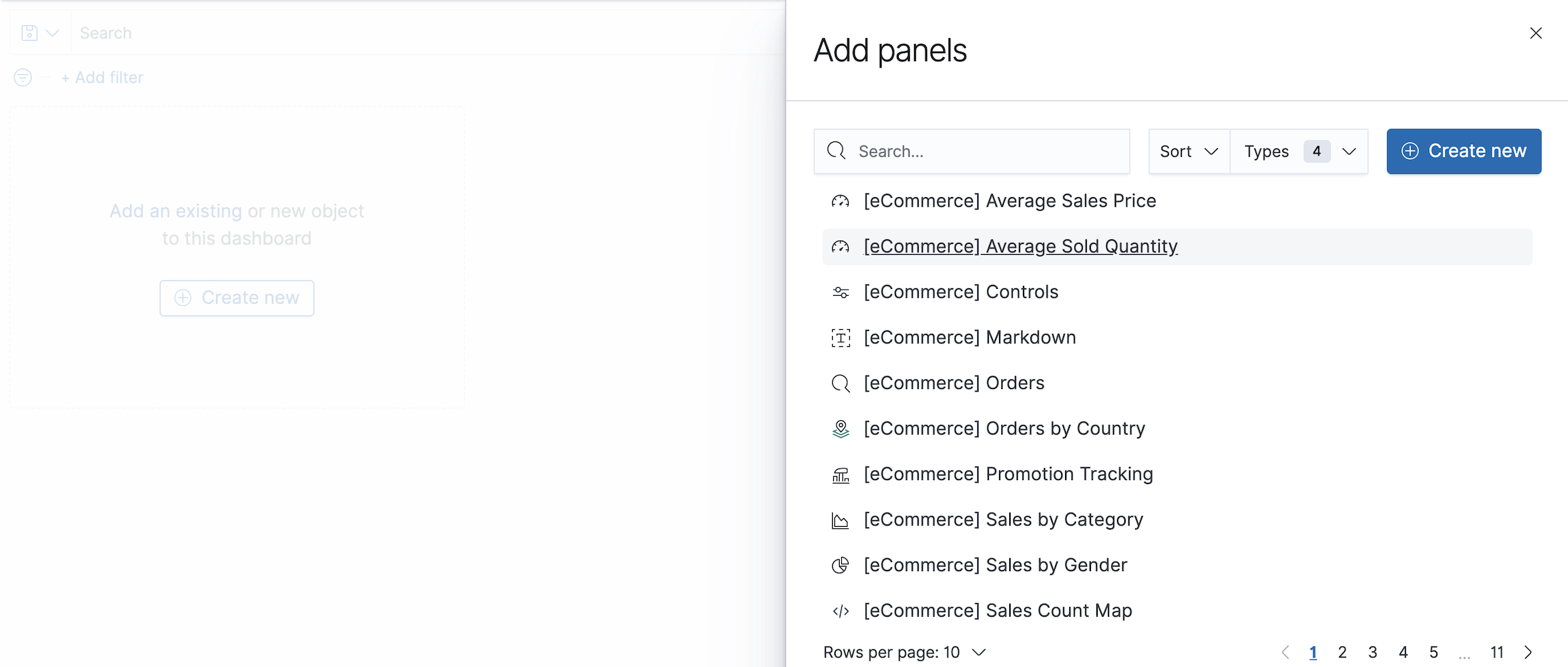
To make changes to the panel, put the dashboard in Edit mode, then select the edit option from the panel menu. The changes you make appear in every dashboard that uses the panel, except if you edit the panel title. Changes to the panel title appear only on the dashboard where you made the change.
Save dashboards
editWhen you’ve finished adding the panels, save the dashboard.
- In the toolbar, click Save.
- Enter the dashboard Title and optional Description, then Save the dashboard.