Compare sales over time with Lens
editCompare sales over time with Lens
editReady to create your own visualization with Lens? Use the following tutorial to create a visualization that lets you compare sales over time.
Before you begin
editTo start, you’ll need to add the sample ecommerce data.
Build the visualization
editDrag and drop your data onto the visualization builder pane.
- Select the kibana_sample_data_ecommerce index pattern.
-
Click
 , then click Last 7 days.
The fields in the data panel update.
-
Drag and drop the taxful_total_price data field to the visualization builder pane.
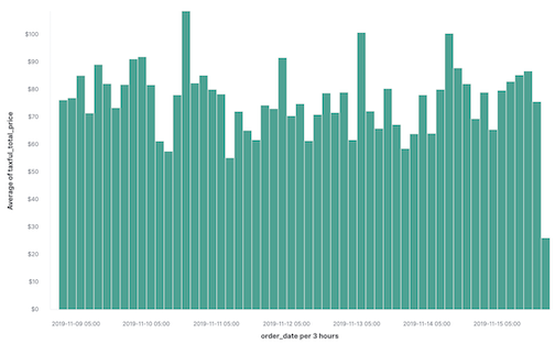
To display the average order prices over time, Lens automatically added in order_date field.
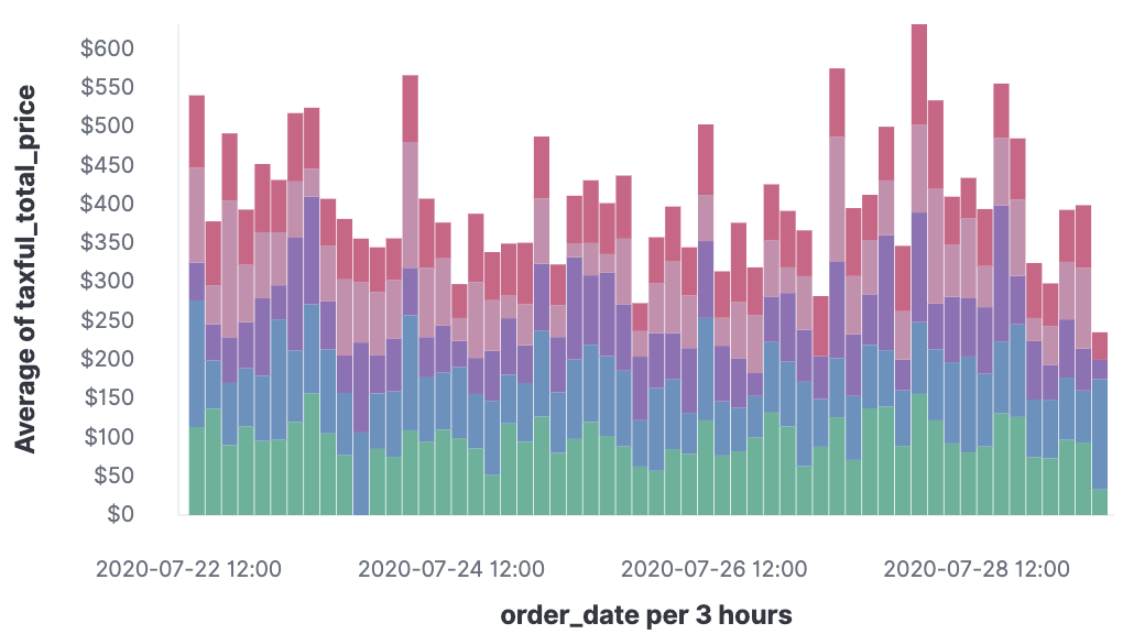
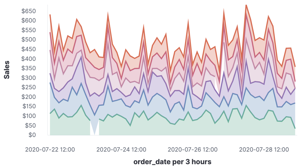
To break down your data, drag the category.keyword field to the visualization builder pane. Lens knows that you want to show the top categories and compare them across the dates, and creates a chart that compares the sales for each of the top three categories:
Customize your visualization
editMake your visualization look exactly how you want with the customization options.
-
Click Average of taxful_total_price, then change the Label to
Sales.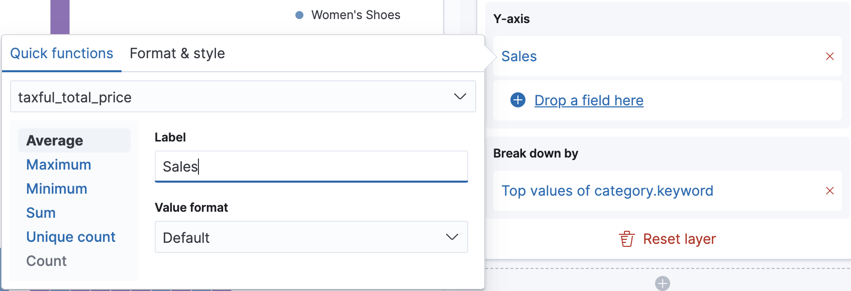
-
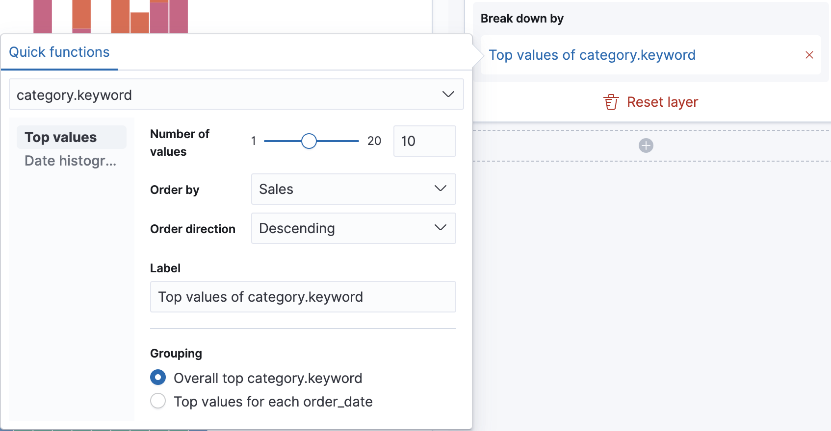
Click Top values of category.keyword, then change Number of values to
10.
The visualization updates to show there are only six available categories.
Look at the Suggestions. An area chart is not an option, but for the sales data, a stacked area chart might be the best option.
-
To switch the chart type, click Stacked bar chart in the column, then click Stacked area from the Select a visualizations window.
Next steps
editNow that you’ve created your visualization, you can add it to a dashboard or Canvas workpad.