Timelion tutorial: Create visualizations with mathematical functions
editTimelion tutorial: Create visualizations with mathematical functions
editTo create a visualization for inbound and outbound network traffic, use mathematical functions.
Define the functions
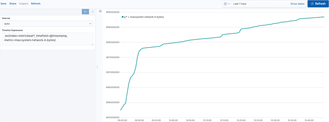
editTo start tracking the inbound and outbound network traffic, enter the following in the Timelion Expression field:
.es(index=metricbeat*,
    timefield=@timestamp,
    metric=max:system.network.in.bytes)
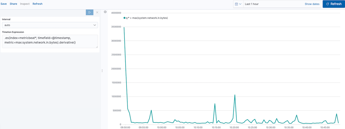
Plot the rate of change
editChange how the data is displayed so that you can easily monitor the inbound traffic:
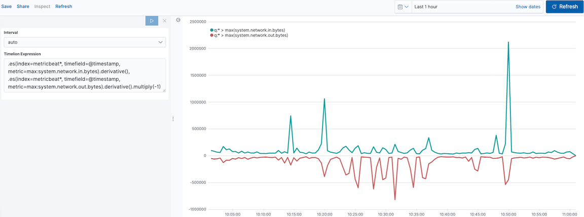
Add a similar calculation for outbound traffic:
.es(index=metricbeat*,
    timefield=@timestamp,
    metric=max:system.network.in.bytes)
.derivative(),
.es(index=metricbeat*,
timefield=@timestamp,
metric=max:system.network.out.bytes)
.derivative()
.multiply(-1)
|
|
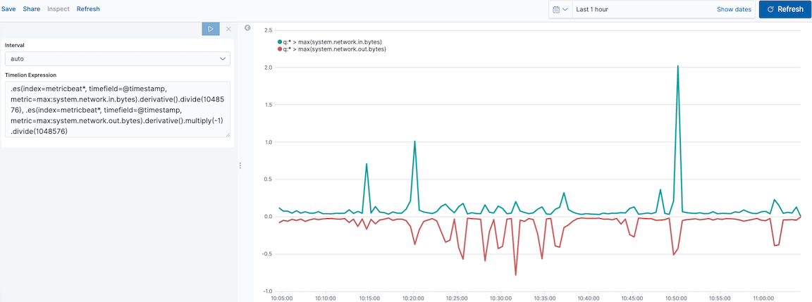
Change the data metric
editTo make the visualization easier to analyze, change the data metric from bytes to megabytes:
.es(index=metricbeat*,
    timefield=@timestamp,
    metric=max:system.network.in.bytes)
  .derivative()
  .divide(1048576),
.es(index=metricbeat*,
    timefield=@timestamp,
    metric=max:system.network.out.bytes)
  .derivative()
  .multiply(-1)
  .divide(1048576)
|
|
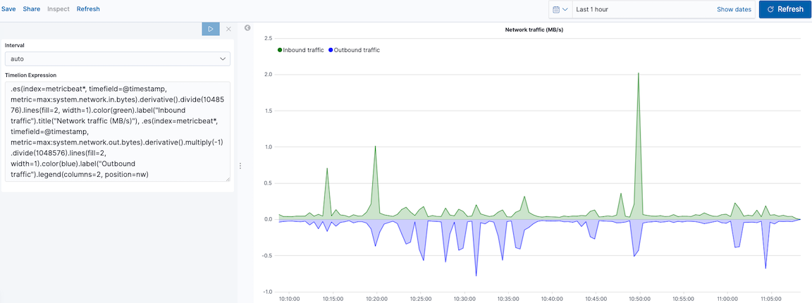
Customize and format the visualization
editCustomize and format the visualization using functions:
.es(index=metricbeat*,
    timefield=@timestamp,
    metric=max:system.network.in.bytes)
  .derivative()
  .divide(1048576)
  .lines(fill=2, width=1)
  .color(green)
  .label("Inbound traffic")
  .title("Network traffic (MB/s)"),
.es(index=metricbeat*,
    timefield=@timestamp,
    metric=max:system.network.out.bytes)
  .derivative()
  .multiply(-1)
  .divide(1048576)
  .lines(fill=2, width=1)
  .color(blue)
  .label("Outbound traffic")
  .legend(columns=2, position=nw)
|
|
|
|
|
|
|
|
|
|
|
|
|
|