What’s new in 8.10
editWhat’s new in 8.10
editHere are the highlights of what’s new and improved in 8.10. For detailed information about this release, check the release notes.
Previous versions: 8.9 | 8.8 | 8.7 | 8.6 | 8.5 | 8.4 | 8.3 | 8.2 | 8.1 | 8.0
Alerting
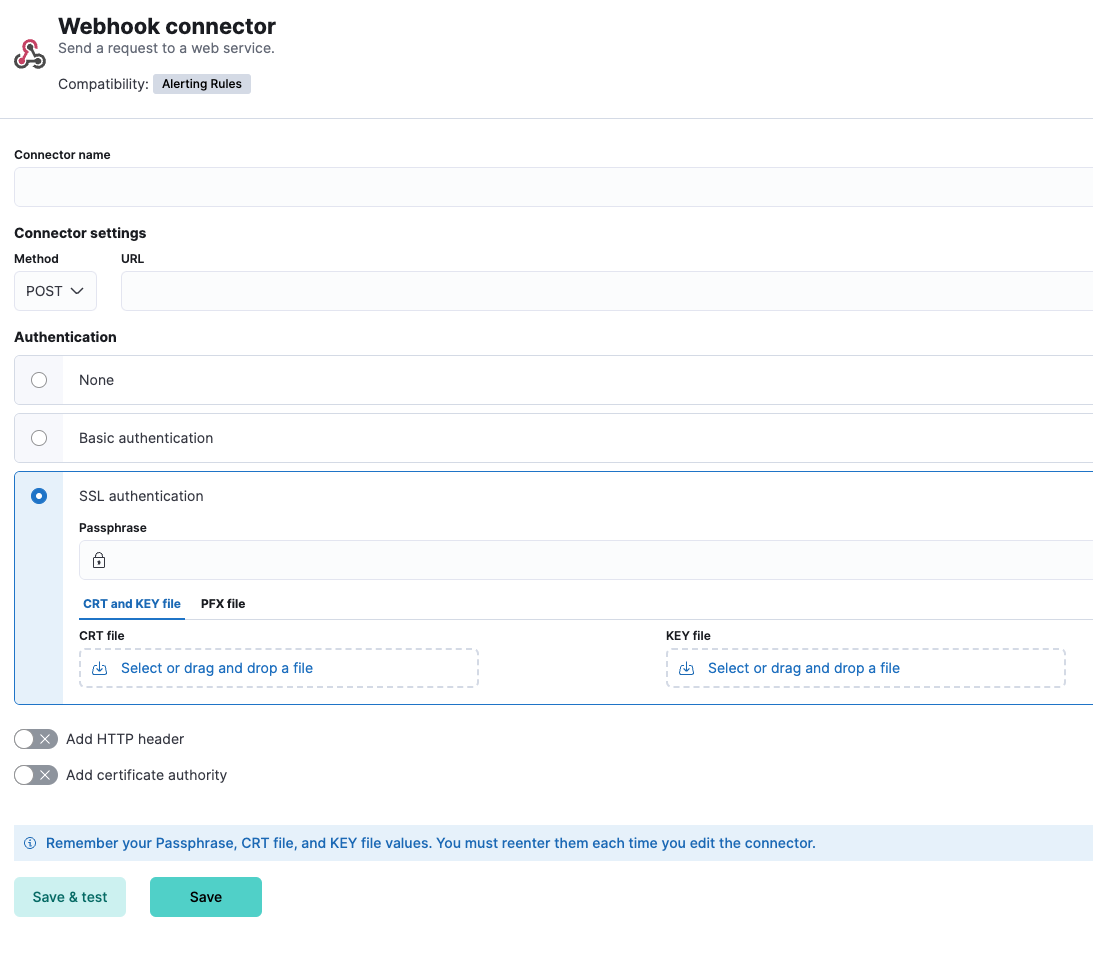
editWebhook connector improvement
editThe Webhook connector now supports client certification. You can now use the webhook connector for secured integration with third parties, beyond basic authentication (using usernames and passwords or tokens).
Dashboard
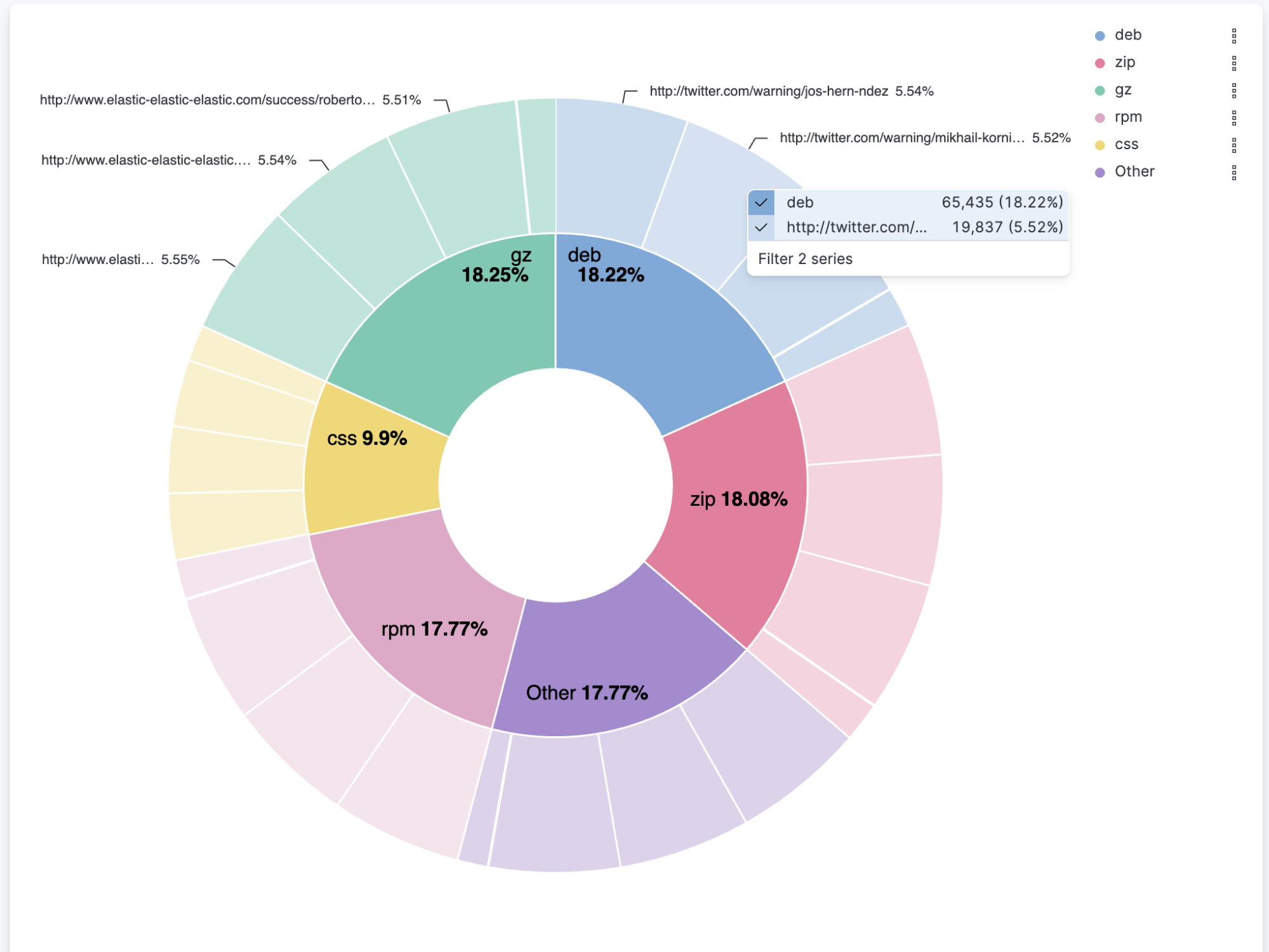
editMultivalue filtering using tooltip actions
editMultivalue filtering using tooltip actions is already enabled for XY charts, and we are now enabling it for heat maps and partition charts. You can now filter these by multiple values at the same time, making it easier to find the insights you’re looking for in your data.
For example, you can filter a heat map by both region and country. You can also filter a partition chart by both product and date.
To use multivalue filtering, right-click on the chart to show the tooltip menu. Then select the values you want to filter by, and click on Filter X Series. We will continue to add support for multivalue filtering for other types of charts in the future.
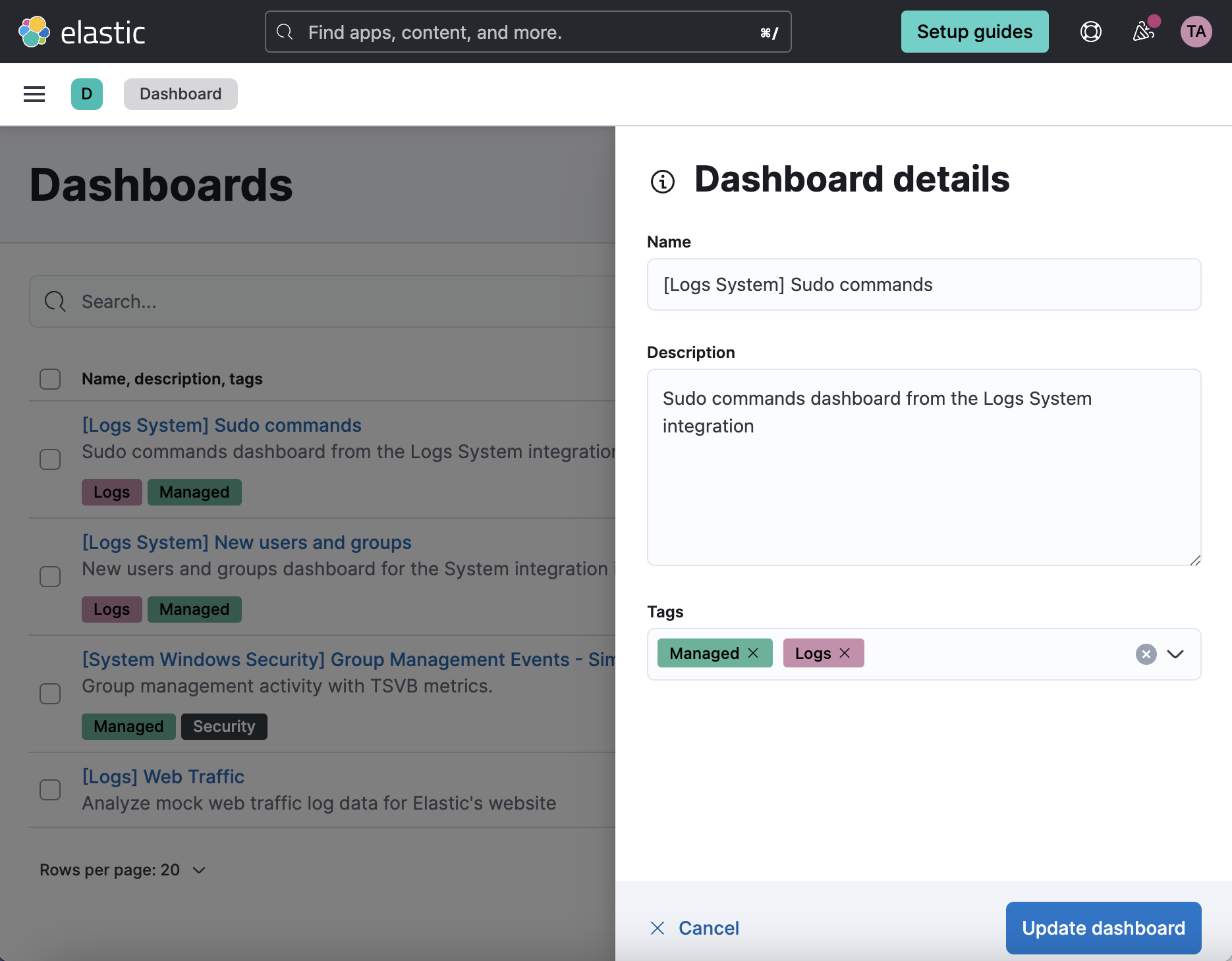
Access dashboards' metadata from the listing page
editEasily view and edit dashboards’ title, description, and tags from the listing page.
Reduce duplicate toasts in dashboards and discover
editIn previous versions of Kibana, Dashboards and Discover queries had the potential to create multiple duplicate toast notifications when a query generated multiple errors. Now new toasts that are identical to a toast already on your screen are combined into a single toast. Additionally, these toasts that represent more than one message, are displayed on a counter badge so the magnitude of errors is still visible.
Machine learning
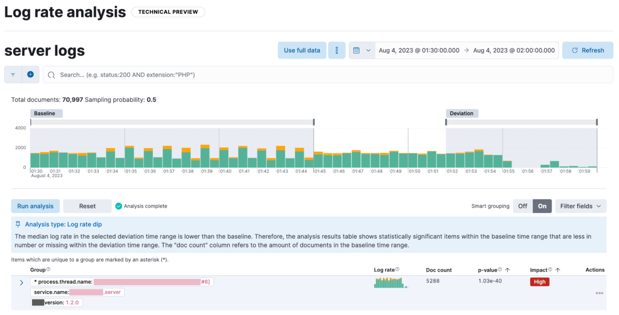
editExplain log rate dips
edit[preview] This functionality is in technical preview and may be changed or removed in a future release. Elastic will work to fix any issues, but features in technical preview are not subject to the support SLA of official GA features. Previously, you could detect and analyze log rate spikes using our log rate analysis functionality, and now you have the ability to do the same for dips. Log rate analysis helps you explain log rate dips and spikes by identifying field-value pairs that display a statistically significant deviation (decrease for dips and increase for spikes) in the selected time range, compared to their baseline occurrence. Using log rate analysis can help you move from simply detecting changes to correlating events and identifying root causes in just a few clicks.
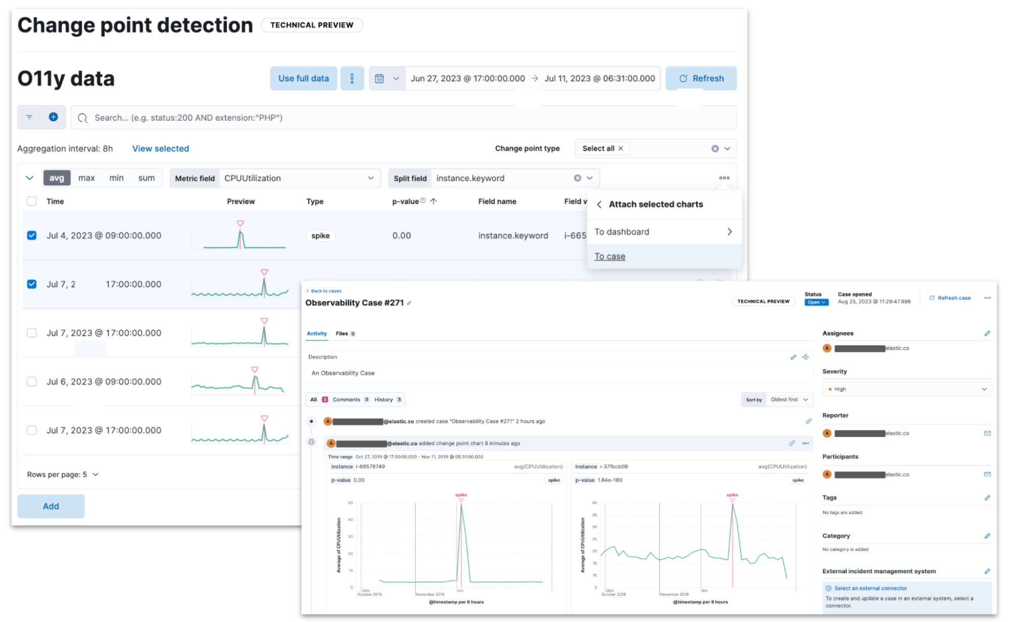
Add Change Point Detection charts to dashboards and cases
edit[preview] This functionality is in technical preview and may be changed or removed in a future release. Elastic will work to fix any issues, but features in technical preview are not subject to the support SLA of official GA features. Continuing the integration of Machine Learning deeper into Elastic tools and workflows, you can now easily attach Change Point Detection charts to Dashboards and Cases with just a few clicks. Starting from Machine Learning > AIOps Labs> Change Point Detection, select the charts that you want to embed, then select the Attach charts option using the ellipsis at the top right, and finally select the dashboard or case that you want the selected charts to be added in.
Additional AIOps enhancements include a validation mechanism when you perform log pattern analysis in AIOps Labs and in Discover. This verifies that the selected field is suitable for analysis and if not, the UI displays the reason(s) why.
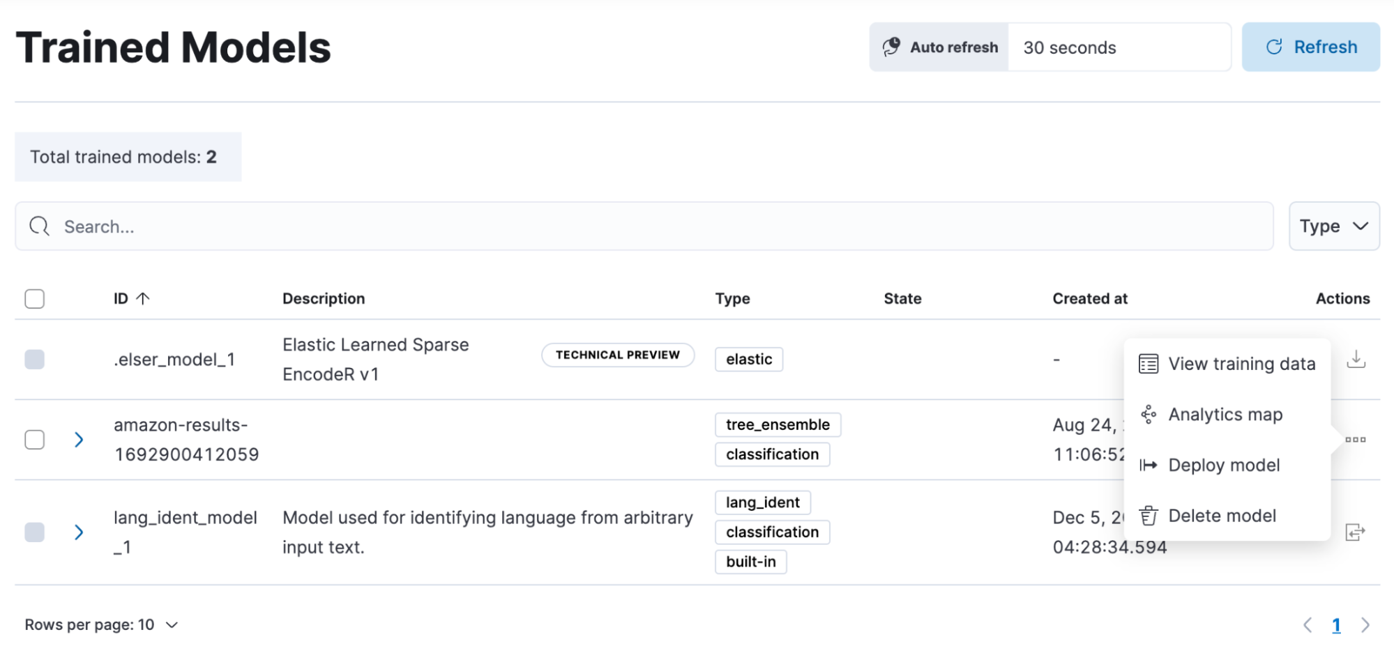
Data frame analytics model deployment workflow
editYou can now create an inference ingest pipeline straight from the Trained Models view for your data frame analytics models, by selecting the new Deploy model option in the Actions column. The pipeline will use this model to perform inference on your incoming data and it will index the results according to your configuration.
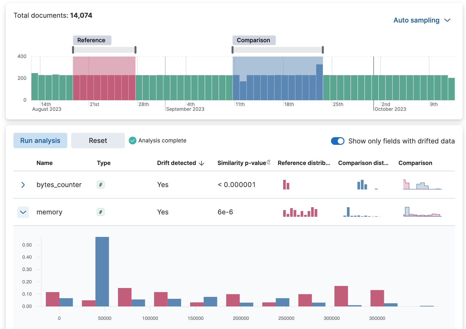
Data comparison view
edit[preview] This functionality is in technical preview and may be changed or removed in a future release. Elastic will work to fix any issues, but features in technical preview are not subject to the support SLA of official GA features. A new Data Comparison view has been added under the Data Visualizer menu, to help you detect data drift. Choose a ‘reference’ and a ‘comparison’ time range on the UI and run the data comparison to see if there is a significant change of values, and for which numerical and categorical fields. The UI gives you a measure of how strong the change appears to be (the p-value) for each field and a side-by-side visual comparison of the reference and comparison distributions. By expanding each field in the results list, you can see the details of the distribution of values for the reference and comparison windows.
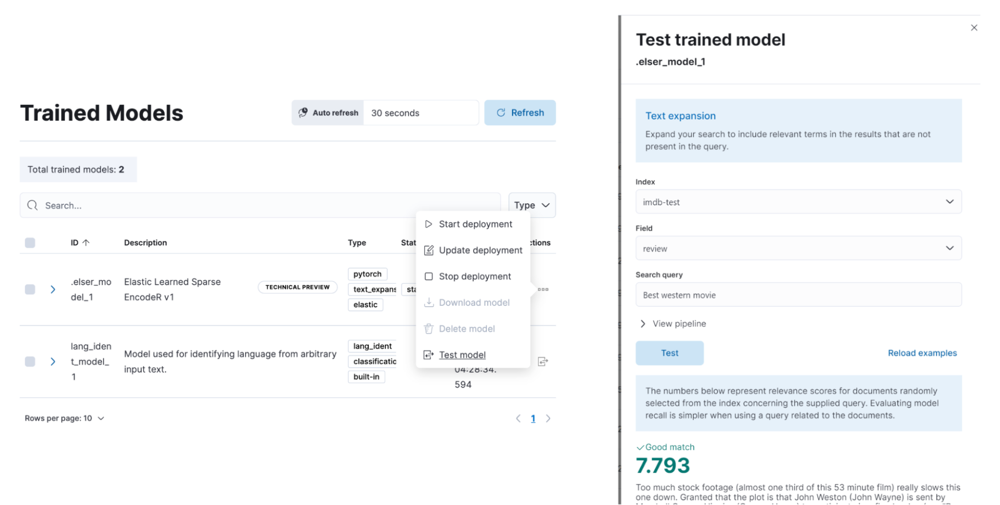
ELSER test user interface
edit[preview] This functionality is in technical preview and may be changed or removed in a future release. Elastic will work to fix any issues, but features in technical preview are not subject to the support SLA of official GA features. Elastic machine learning introduced AI search out of the box with the release of Elastic Learned Sparse EncodeR in 8.8. Now you have the option to easily test ELSER on the user interface. From the Trained Models view select the Test model option from the Actions column menu.
Platform security
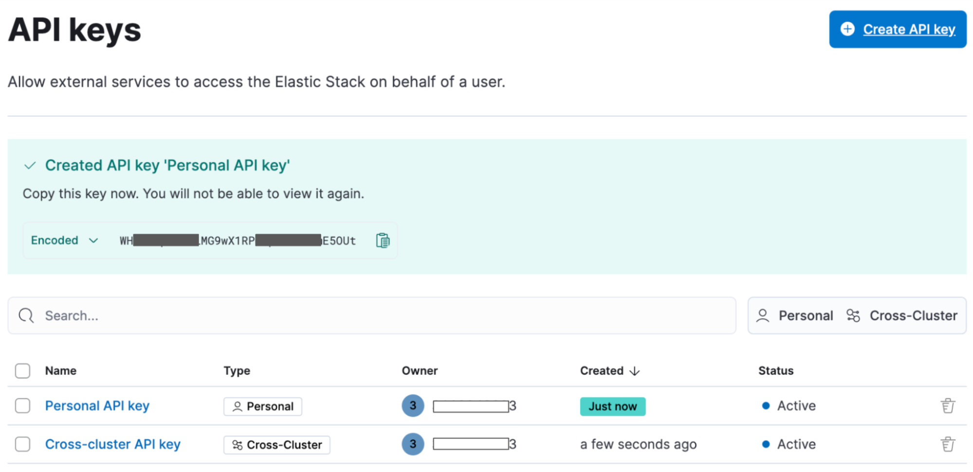
editCross-cluster API keys
editThe API keys page in Kibana (under Management > Security > API keys) has been redesigned to enable you to create and manage cross-cluster API keys more easily. You can now select the type of key that you want to create and find or filter through the existing API keys you have access to using the tagged list view.
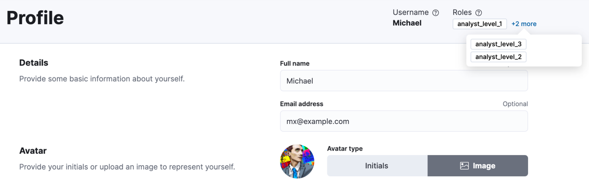
Transparent unobtrusive security
editUser profiles now display the role(s) assigned so that your Elastic access always makes sense. The default idle session timeout has also been increased to ensure a smoother user experience and to not interrupt users during their workflows. The new default is 3 days (from 8 hours previously) and only applies to new instances. You can continue configuring the session.idleTimeout setting to the value that works best for your organization.