What’s new in 8.5
editWhat’s new in 8.5
editHere are the highlights of what’s new and improved in 8.5. For detailed information about this release, check the release notes.
Previous versions: 8.4 | 8.3 | 8.2 | 8.1 | 8.0
Data views — use without saving
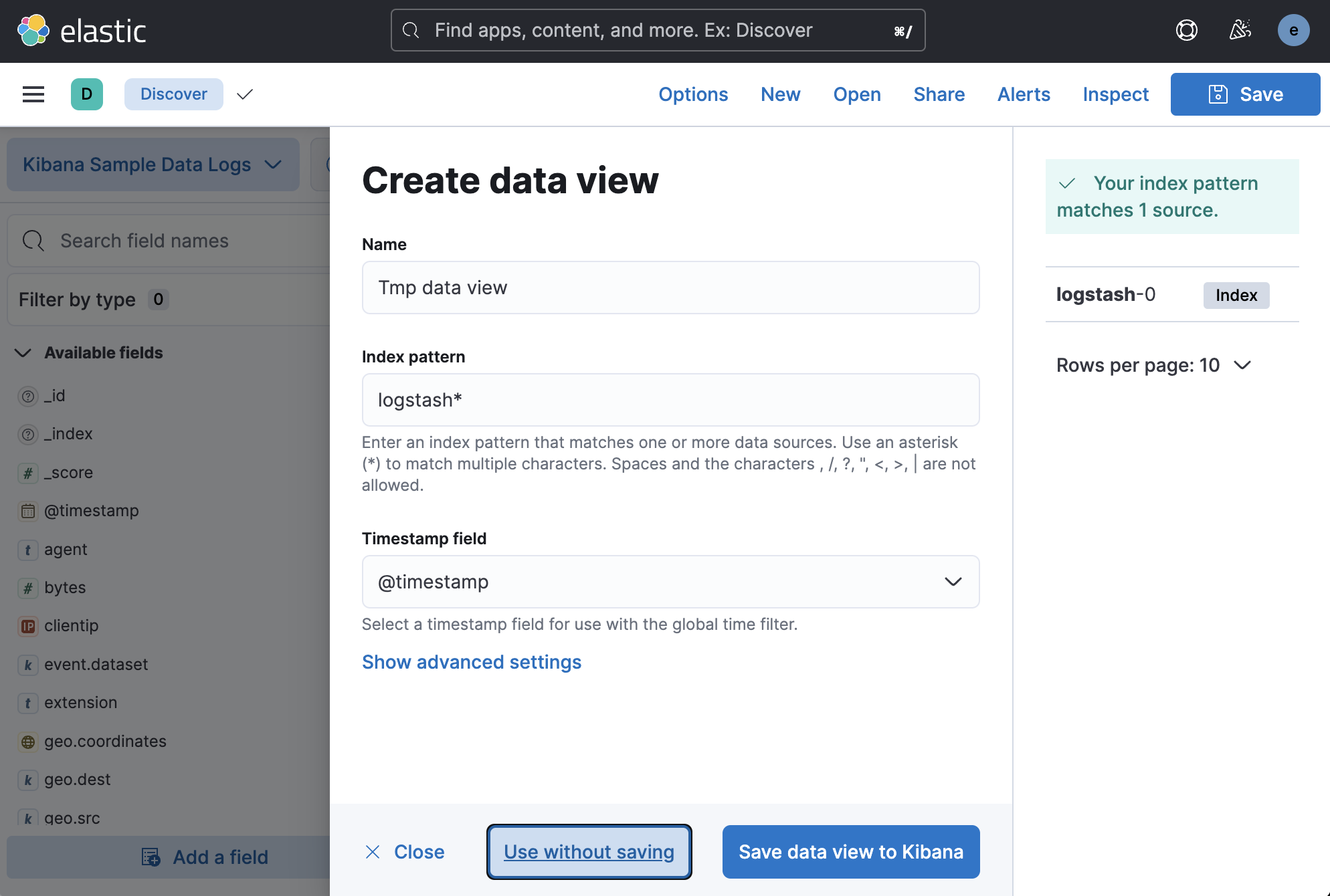
editWhat if you could explore your data or create a visualization without first creating a data view? Now you can do just that by selecting Use without saving in the Create data view form. This enables you to quickly explore your data in Discover, Lens, and Maps right after ingesting it. You can save the data view later if you create a search or visualization that you want to share.
Discover
editResize the date histogram
editIn addition to toggling the display of the histogram, you can now change its height. Your preferences are saved locally in your browser.
More insights in fields list
editThe field popover in the Available fields list now shows more data, making it similar to the field popovers in Lens and Fields Statistics:
- Statistics are based on a sample of 5000 records per shard. Previously the sample size was 500 records.
- The popover shows up to top 10 values, instead of just 5.
- The “exist” filter appears at the top of the popover for better visibility.
- The distribution of values is available for aggregatable fields.
Dashboard
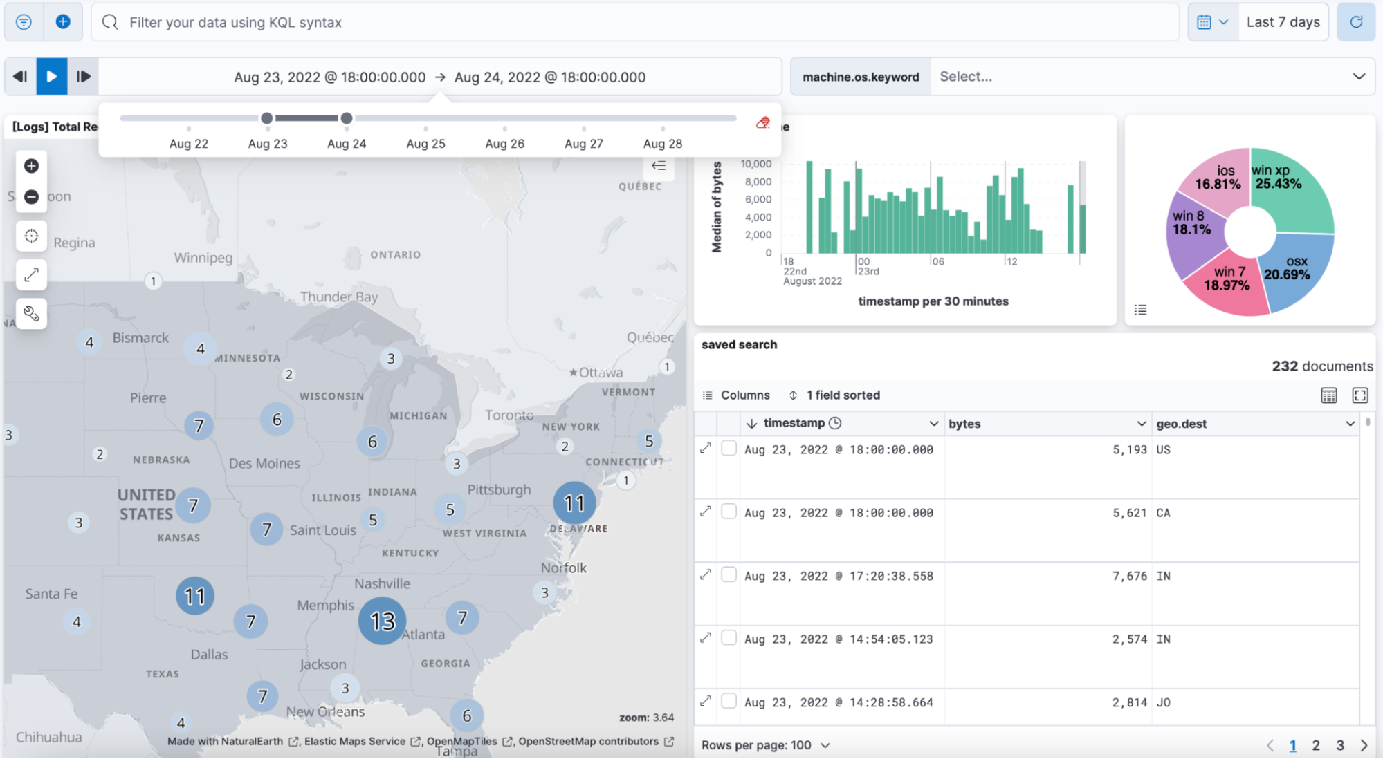
editNew time slider control
editAdd the newest control for interacting with your dashboard data, the time slider control. The time slider allows anyone viewing the dashboard to playback and scrub through the data by time, or quickly view the data for a specific time range, just like a song or movie.
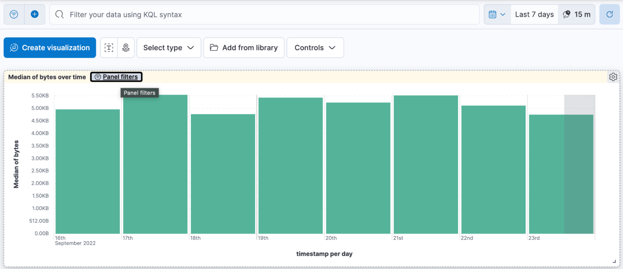
Filters for panels
editWhen filters are applied to the individual visualization panels on your dashboard, you can now easily view them without opening the visualization editor and leaving the dashboard. Simply click Panel filters in the header.
Lens visualization editor
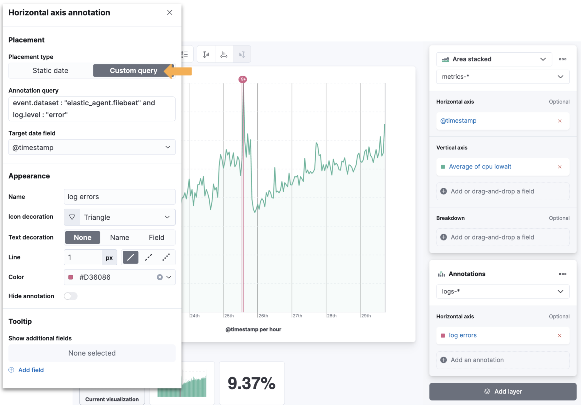
editAdd query-based annotations
editA key method of troubleshooting metric performance is to analyze the events that take place at the same time. Now you can add query-based annotations from multiple data sources to your Lens visualizations. This makes it easy to layer time series events and view the relationships between the annotations and other metrics. Query-based annotations also come with improved overflow support, additional style options, and a customizable tooltip.
Turn table values into links
editVisual cues are important to dashboard users, especially when it comes to clickable values. With the Table visualization in Lens, you can now enable Directly filter on click to turn any column value into a link that filters the data, or drills down into the data.
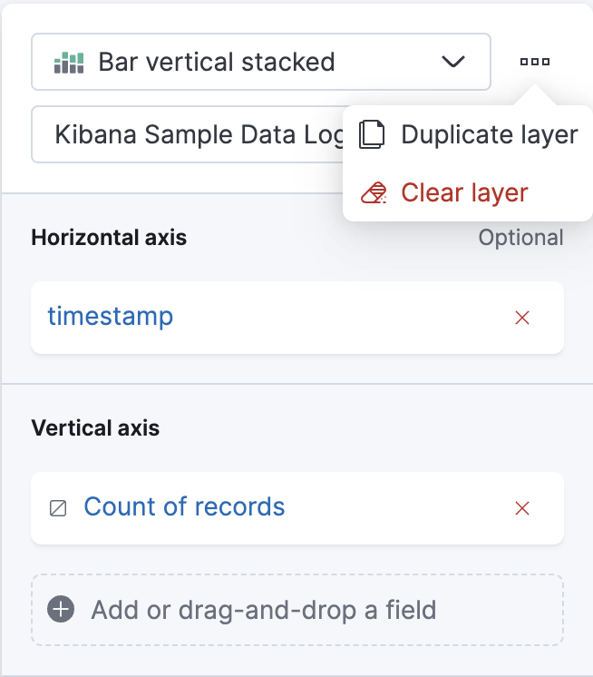
Clone visualization layers
editWhen you create visualization layers in Lens, you don’t have to start from a blank slate. You can now duplicate layers, making it easy to adjust the filters and data options from a common starting point.
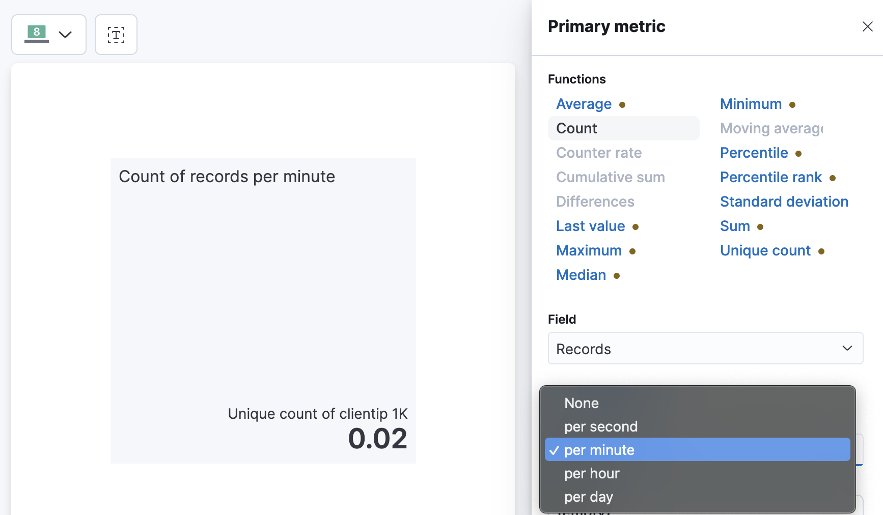
Normalize by unit
editNeed to use Normalize by unit for more than just date histogram visualizations in Lens? Now you can! Suppose you have a metric visualization that displays the count of the records field. With Normalize by unit, you can view a per minute calculation of the field.
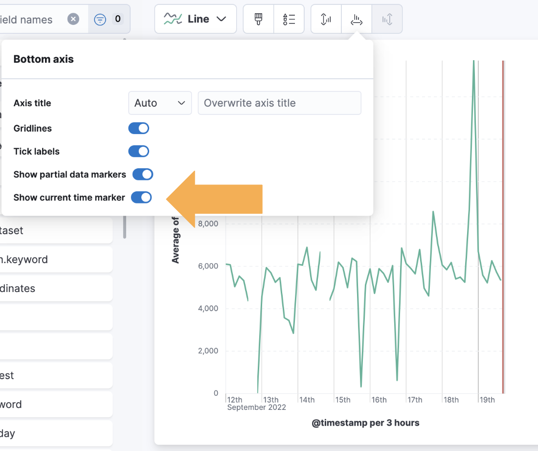
Display the current time
editMarkers make it easy for anyone viewing your dashboard to quickly understand important events on visualizations. With the new Show current time marker axis option, you can add a red line to signify where “now” is on time series visualizations.
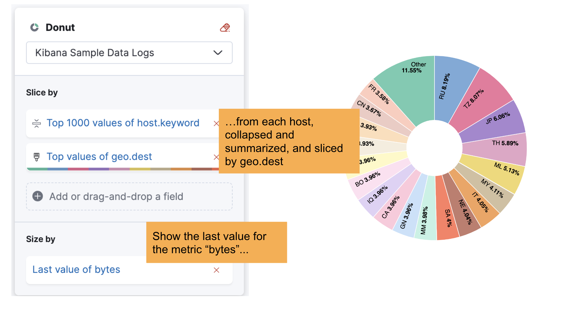
Collapse by option
editLet’s say you’re creating a partition chart with sampled data, such as metrics, and want to break down the last values from each reporting dimension, such as hosts. You can use the new Collapse by option to break down and summarize the result of each last value from hosts without displaying the detailed reporting dimension.
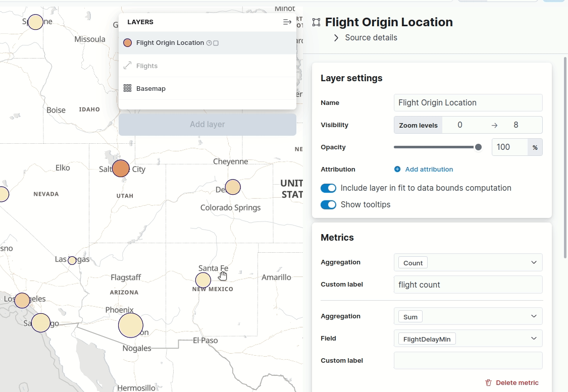
Maps — hide tooltips
editTooltips display when you hover over a document or cluster in a map. Don’t want to display them? Turn them off with the new Show tooltips toggle in Layer settings.
Machine Learning
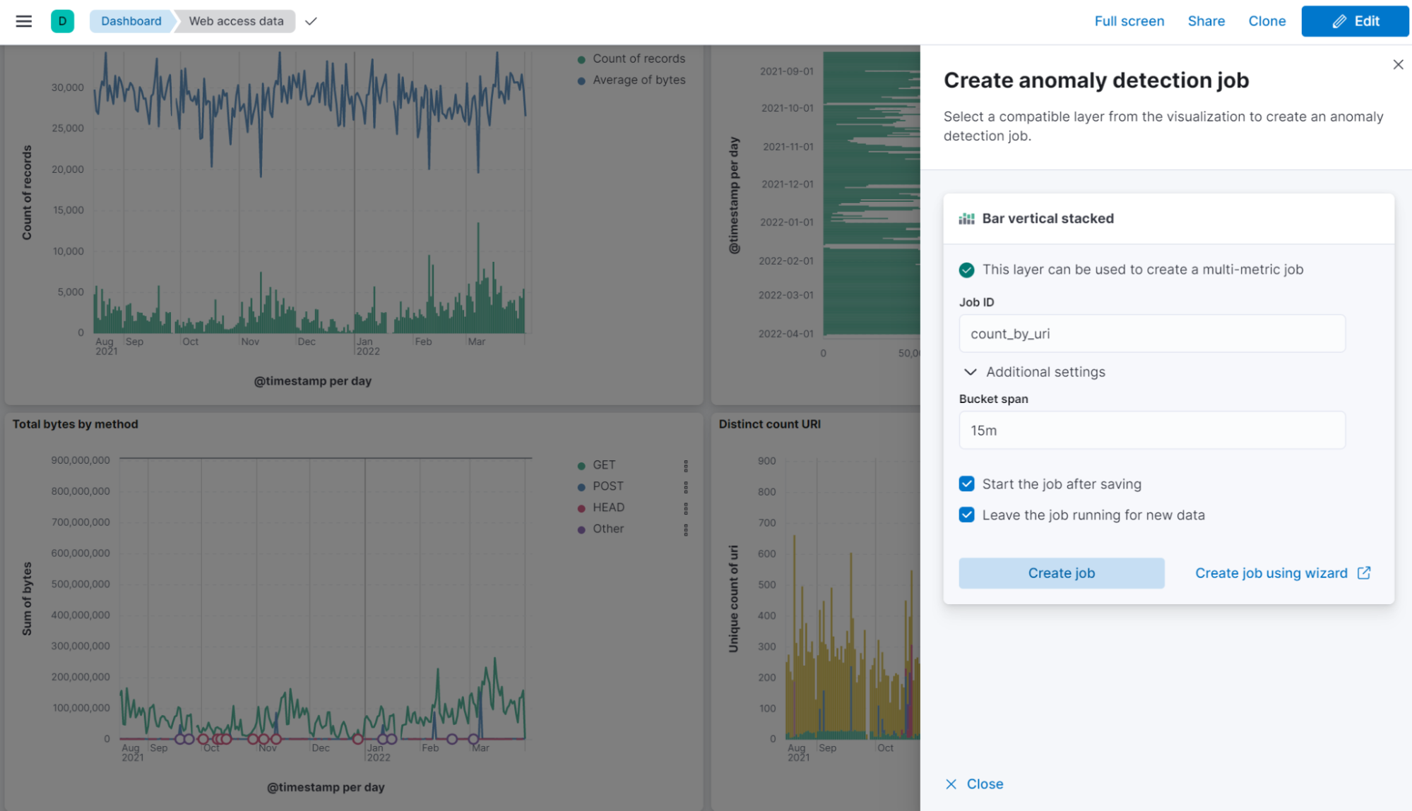
editAnomaly detection jobs from Lens
editYou can now create anomaly detection jobs from the flyout of a Lens visualization. Enter a job ID before creating the job, so it starts automatically after saving. For a more advanced configuration, follow the link that takes you to the ML job wizard.
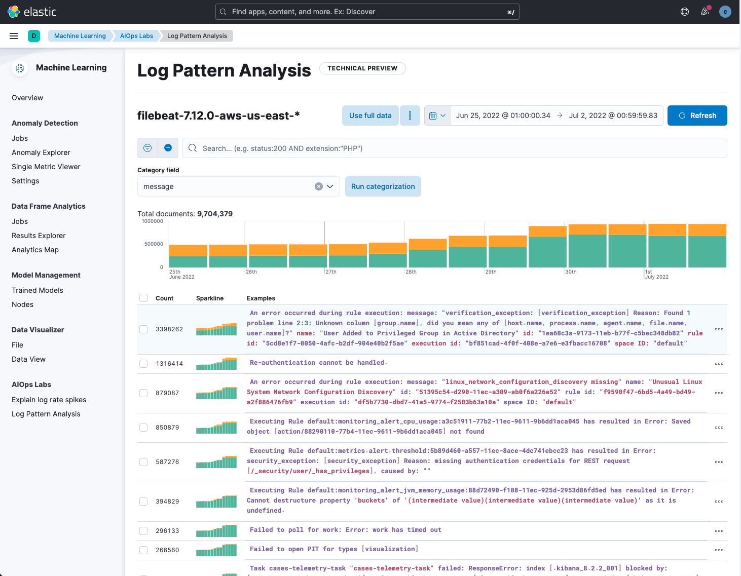
Log pattern analysis
editYou can now select a data view and message field, apply optional filters, and then run on-demand categorization analysis. Messages that are similar are grouped using the same underlying algorithms as a machine learning categorization job. The distribution of the documents in each category are highlighted on the main chart. You can then open Discover, use one or more of these categories as a filter to view the matching documents, and continue your investigation.
Locations of anomalous results in Maps
editThis release adds a link to Maps in the Anomaly Explorer and Single Metric Viewer
for any anomalies where the source data contains geo fields,
even if the analysis does not use the location field directly.
View the anomaly on the map by following the link.
For example, view the location of a client making an unusually high number of
requests that failed with a page not found 404 error.
Access agreement enhanced
editThe access agreement
now allows admins to set a default access
agreement message that applies to all authentication providers.
If you set the new xpack.security.accessAgreement.message setting, it will apply to all providers
for which you do not specify an access agreement.
Collaboration with Cases
editCase assignment
editThis release adds the ability to assign a case to users. You can do so either while creating a case or in an existing case by using the “assignees” UI in Observability, Elastic Security, and Stack Management.
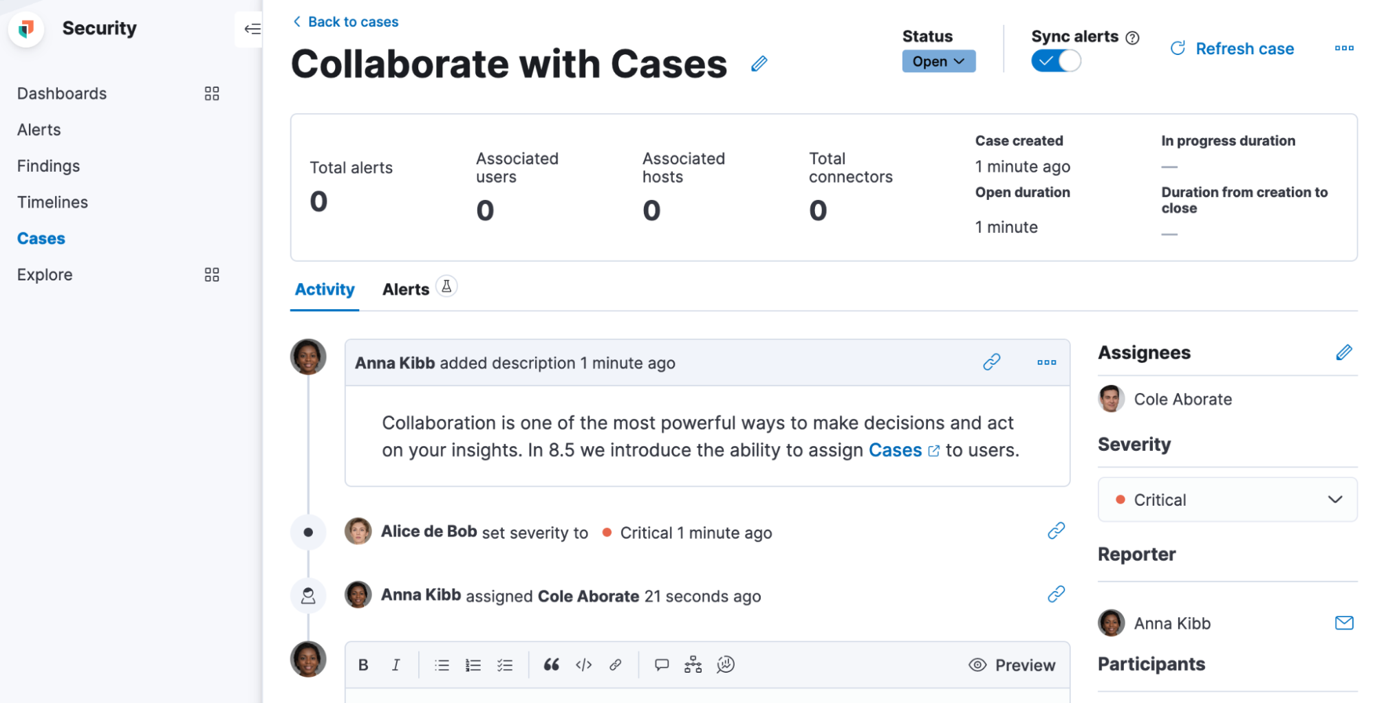
You can assign one or more users (and unassign as needed). The UI builds on previous releases, which introduced the ability for users to customize their avatars by selecting an image or color. Avatars add visual help in easily identifying and disambiguating users.
The assignees and their avatars show up in each case. They also now appear in the central Cases view that lists all existing cases in Observability, Elastic Security, and Stack Management. On this view, you can easily filter through the cases assigned to you and all other users.
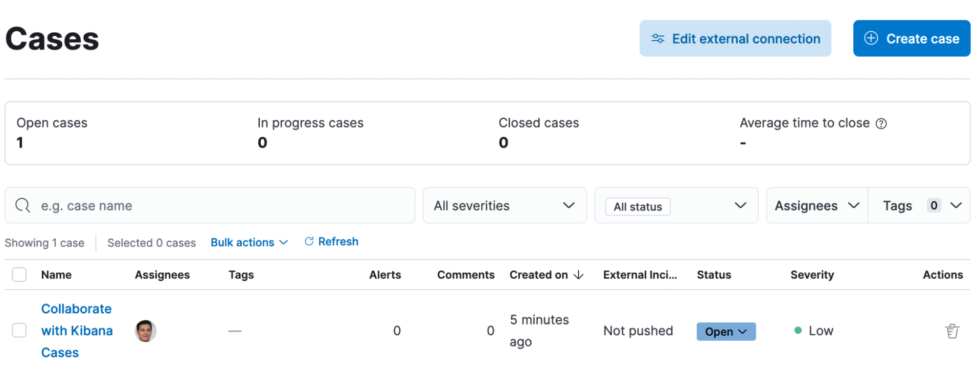
User search
editYou can now search for users by their full name, username, or email as part of the case assignment flow. Kibana users from all authentication realms are searchable. On first access, Kibana creates a user profile and surfaces it in the user search results.
The user search UI includes auto-complete and search highlights.
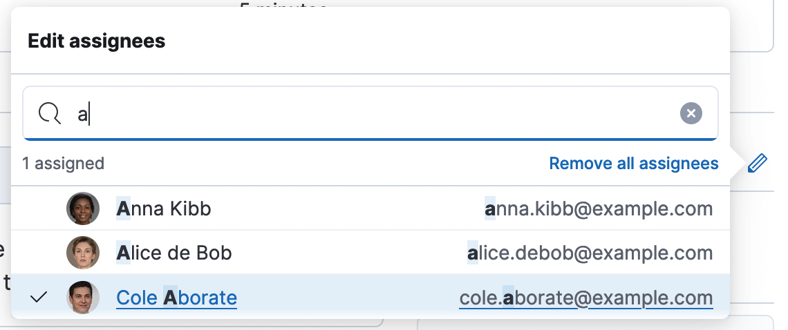
User search adheres to Kibana role-based access control. Users who do not have access to Cases within the space will not surface in the results. For more details, go to Configure access to cases.