What’s new in 8.9
editWhat’s new in 8.9
editHere are the highlights of what’s new and improved in 8.9. For detailed information about this release, check the release notes.
Previous versions: 8.8 | 8.7 | 8.6 | 8.5 | 8.4 | 8.3 | 8.2 | 8.1 | 8.0
Alerting
editRules as code
editThe Terraform Elasticstack provider enables you to automate manual processes, manage multiple clusters from a single place, and unlock use cases like version control. Check out the new elasticstack_kibana_action_connector and elasticstack_kibana_alerting_rule resources for Kibana rules and connectors.
Cases
editThese features are all available for cases in Stack Management, Observability, and the Elastic Security app.
Case management improvements
editThere’s a new category field to enable better case classification and a better understanding of the overall distribution and trends within different areas of a case management system.
It is also simpler to add visualizations to cases:
The email notification that occurs when a user is assigned to a case has also been enhanced:
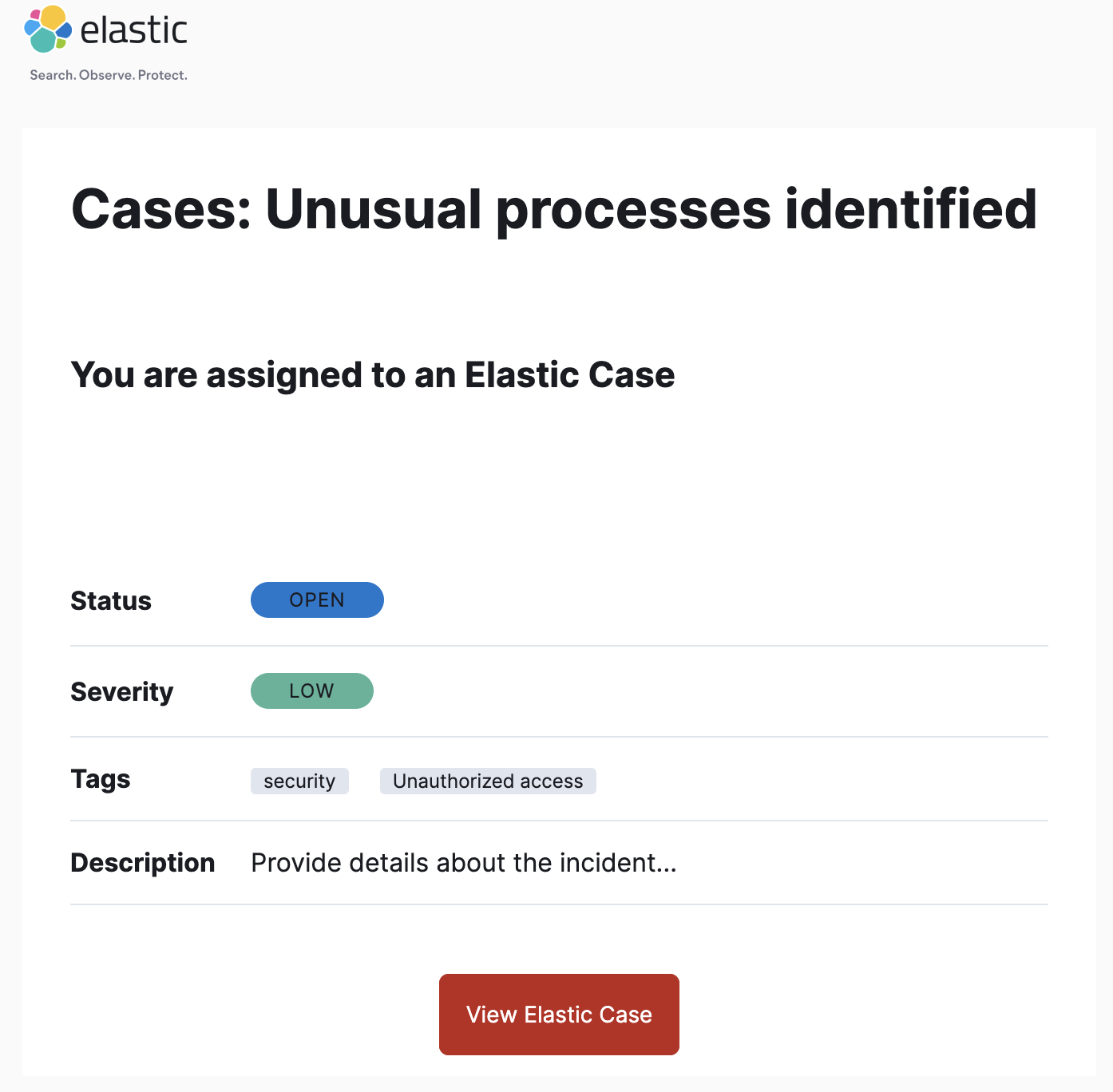
To learn more, check out cases in the Observability, Stack Management, or Elastic Security app.
Dashboard
editWildcard search in dashboard controls
editYou can now search for strings anywhere within a control. Previously, the string had to be located at the start of the value. This option is disabled by default as it is more expensive than just searching for the prefix. To enable it in Dashboard, select Edit control > Options list settings > Contains.
Maps
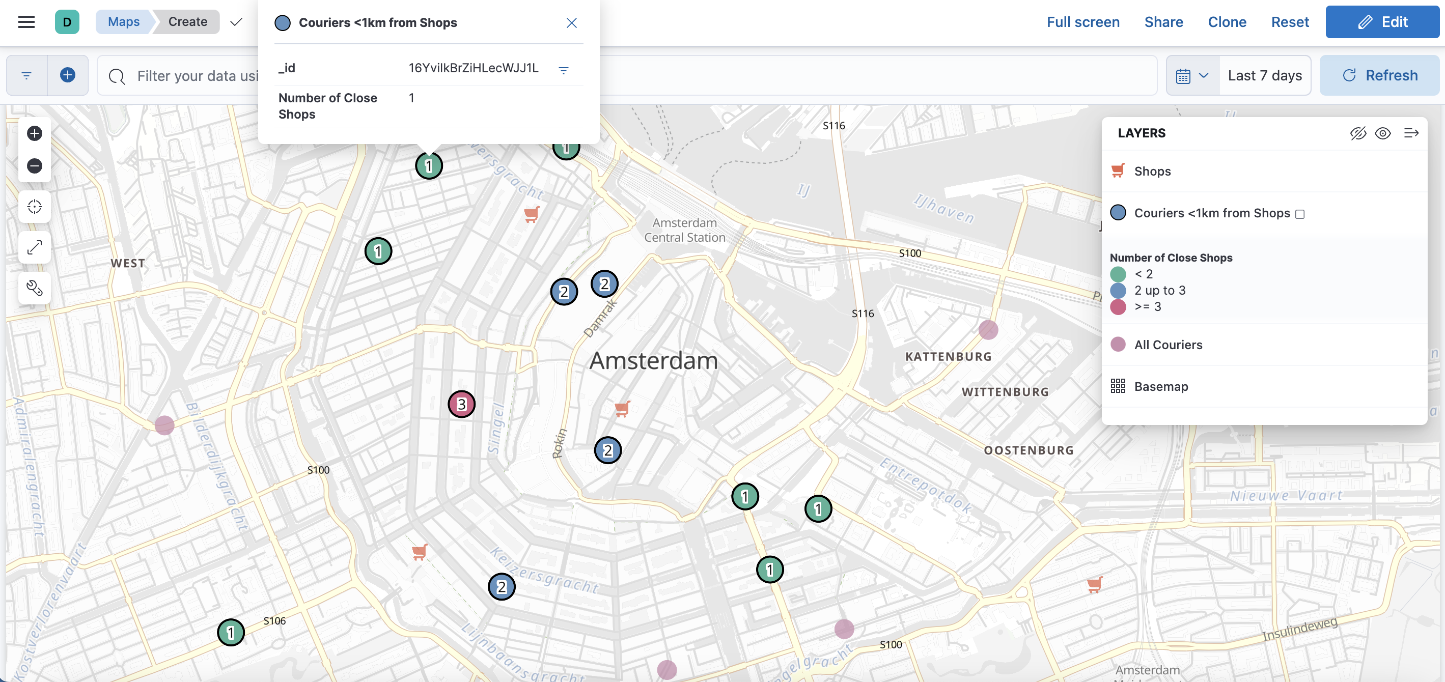
editSpatial join
editMaps now supports grouping documents by geospatial relationships using a new layer wizard named Spatial join. Useful for tracking moving objects in relation to static ones. For example, tracking bicycle courier in relation to stores.
Lens
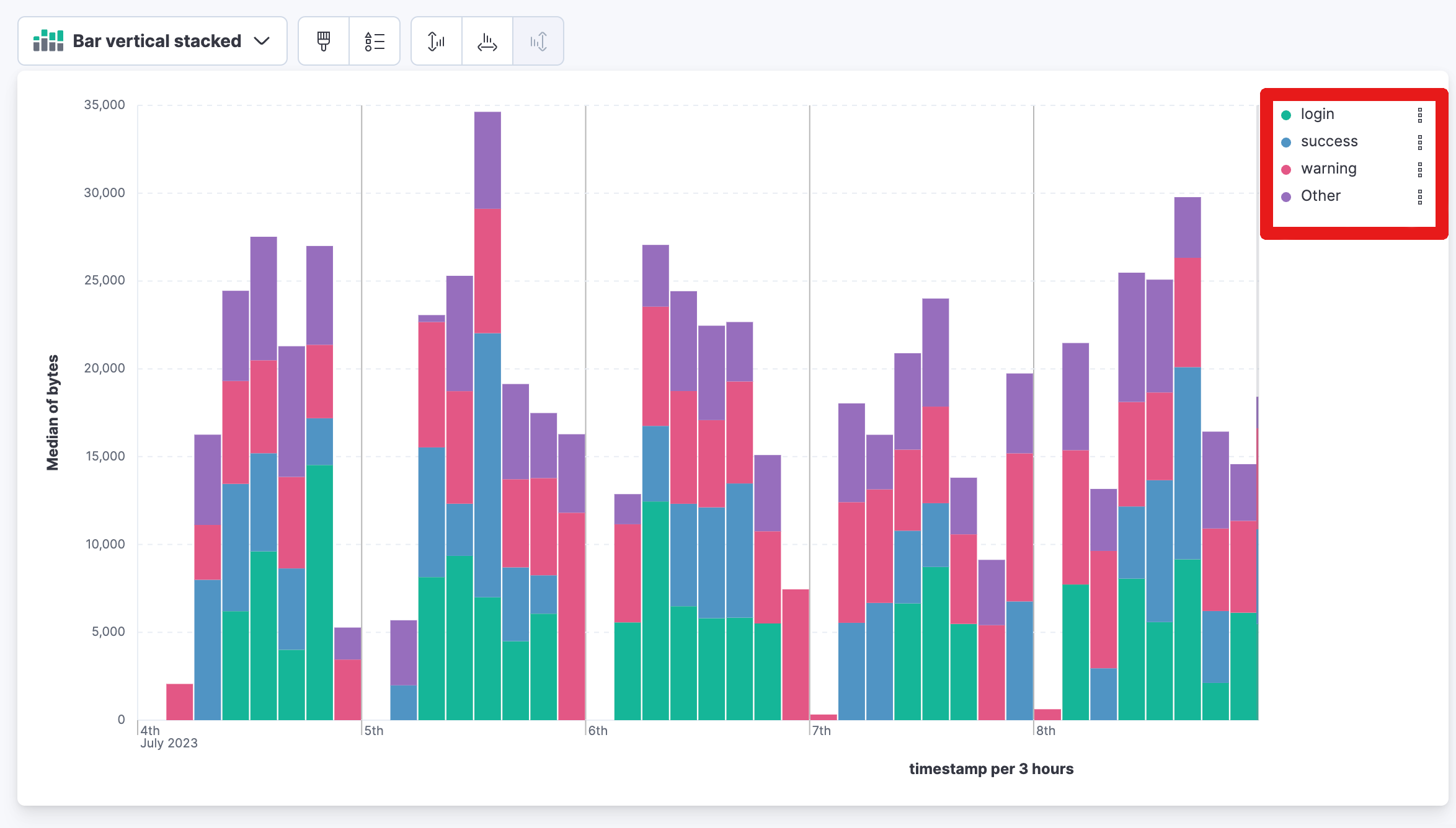
editStacked bar chart legend
editThe stacked bar chart legends are now arranged in descending order based on their values, with the segment having the highest total value shown at the top.
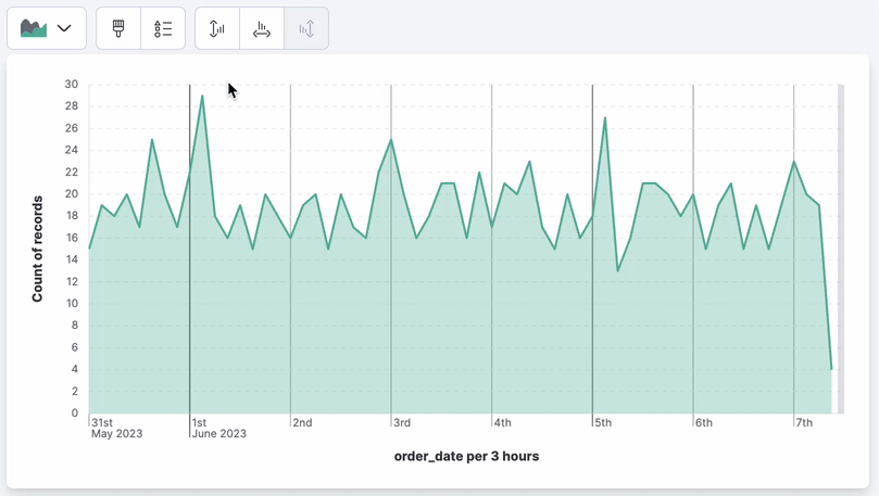
Step curve
editLens now supports a new line interpolation option for line charts. Step curve line charts help users understand clearly when data changes at irregular intervals, reducing misinterpretation. When creating visualizations, select Line in the visualization type dropdown. Then use the Visual options menu to choose step in the Line interpolation dropdown.
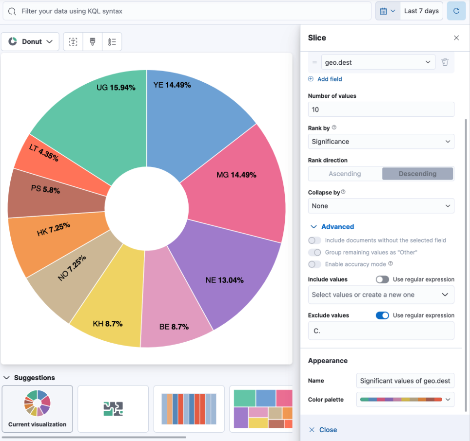
Significance (significant terms)
editThis new ranking method in the top values breakdown displays data by significance (significant terms). It helps you identify the key and most crucial terms for a specific query. It’s a powerful way to find anomalies in your data with multiple use cases. Refer to the Significant terms aggregation documentation to learn more. This is not just based on the most popular terms in a set. When calculating significant terms, Elasticsearch looks for significant changes in popularity of a specific term between two sets of data. A foreground set (the data returned by a query) and a background set (the data in our indices). This is supported on all charts.
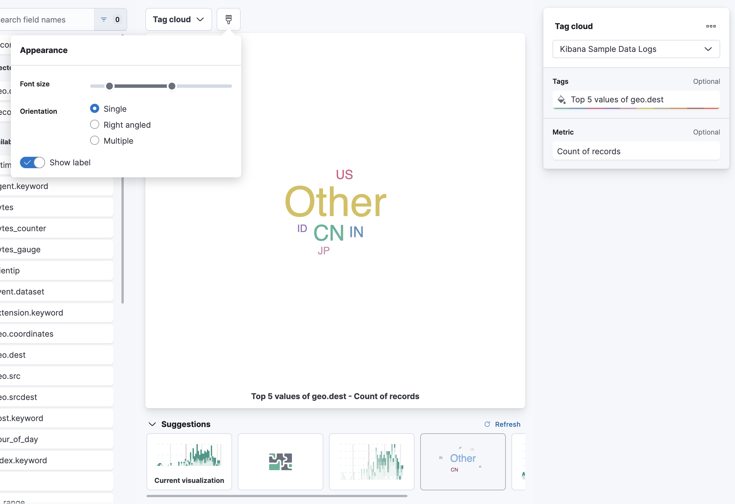
Tag cloud
edit[preview] This functionality is in technical preview and may be changed or removed in a future release. Elastic will work to fix any issues, but features in technical preview are not subject to the support SLA of official GA features. You can now create a word cloud in Lens using Tag cloud. When creating new visualizations, select Tag cloud in the visualization type dropdown. From the available fields, drag and drop the desired field into the workspace to visualize keywords.
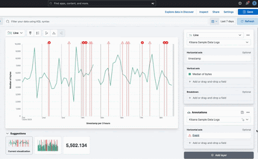
Save annotation groups as a Kibana saved object
editGroup annotations and save them to the visualize library, so the content can be reused across multiple visualizations. This saves time for users with complicated annotations. From the main menu select Visualize Library, then select the tab Annotation groups. Here you can create new annotation groups in Lens, or select from a list of previously created annotation groups.
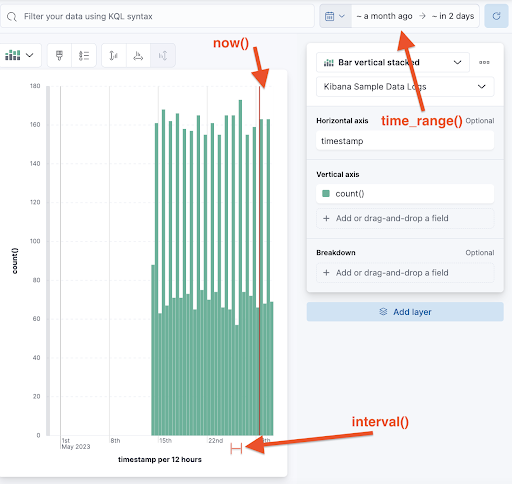
New time functions in Lens formula
editThe Lens formula now supports customizing the histogram interval and defining the desired time range. This was already available in TSVB charts and it was important to facilitate the conversion to Lens.
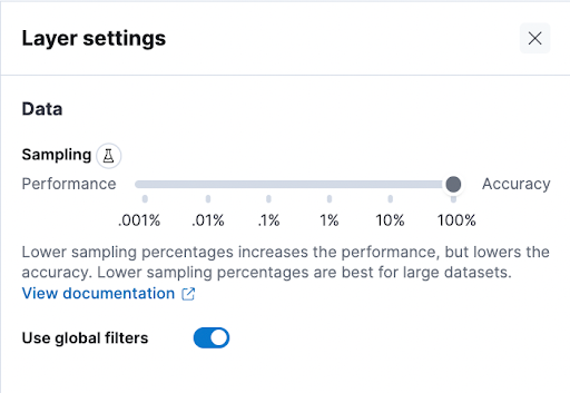
Ignore global filters in Lens
editWe now offer users the ability to ignore global filters per data layer in Lens. This allows users to easily compare different time frames in the same chart. This functionality previously only existed in the annotations layer.
Machine learning
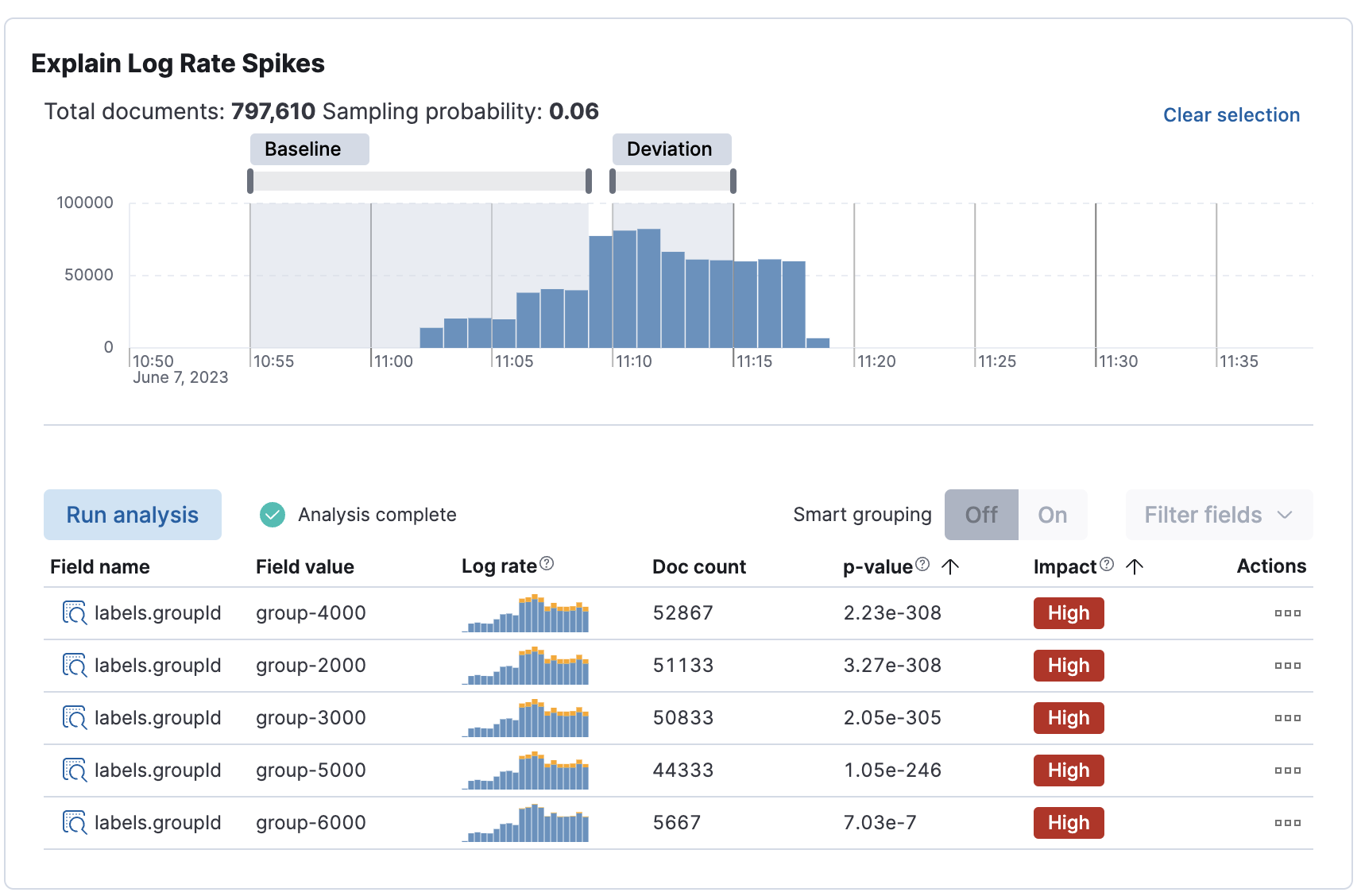
editExplain log rate spikes
edit[preview] This functionality is in technical preview and may be changed or removed in a future release. Elastic will work to fix any issues, but features in technical preview are not subject to the support SLA of official GA features. The AIOps Labs Explain Log Rate Spikes feature is now embeddable into other pages. This reusable component has been picked up by the Observability team and added the analysis to their log threshold alert details page. This is a new view introduced in 8.9. It is the starting point for troubleshooting log alerts. The log rate spike analysis helps find the reason behind a particular change possibly in millions of log events across multiple fields and values in seconds. Additionally, users can trigger the AI assistant from here to get remediation and troubleshooting suggestions.