Visualize your data
editVisualize your data
editIn the Visualize application, you can shape your data using a variety of charts, tables, and maps, and more. In this tutorial, you’ll create four visualizations:
Pie chart
editYou’ll use the pie chart to gain insight into the account balances in the bank account data.
- Open Visualize to show the overview page.
-
Click Create new visualization. You’ll see all the visualization types in Kibana.
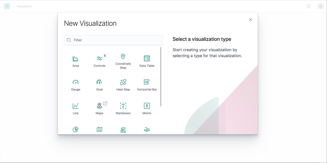
- Click Pie.
-
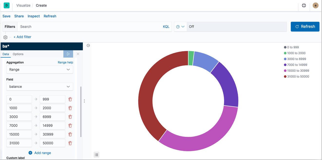
In Choose a source, select the
ba*index pattern.Initially, the pie contains a single "slice." That’s because the default search matched all documents.
To specify which slices to display in the pie, you use an Elasticsearch bucket aggregation. This aggregation sorts the documents that match your search criteria into different categories. You’ll use a bucket aggregation to establish multiple ranges of account balances and find out how many accounts fall into each range.
-
In the Buckets pane, click Add > Split slices.
- In the Aggregation dropdown, select Range.
- In the Field dropdown, select balance.
- Click Add range four times to bring the total number of ranges to six.
-
Define the following ranges:
0             999
1000         2999
3000         6999
7000        14999
15000       30999
31000       50000
-
Click Apply changes
 .
.Now you can see what proportion of the 1000 accounts fall into each balance range.
-
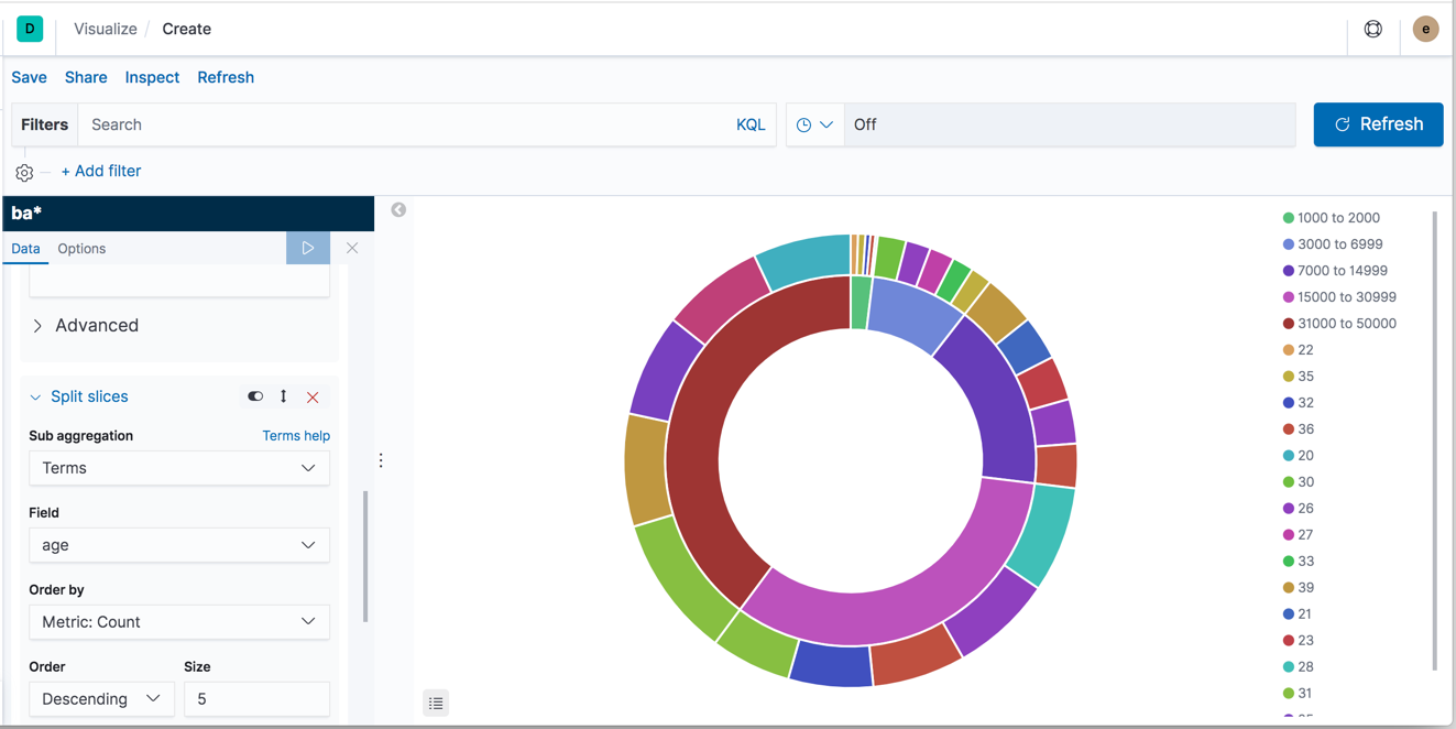
Add another bucket aggregation that looks at the ages of the account holders.
- At the bottom of the Buckets pane, click Add.
- For sub-bucket type, select Split slices.
- In the Sub aggregation dropdown, select Terms.
- In the Field dropdown, select age.
-
Click Apply changes
.Now you can see the break down of the ages of the account holders, displayed in a ring around the balance ranges.
-
To save this chart so you can use it later, click Save in
the top menu bar and enter
Pie Example.
Bar chart
editYou’ll use a bar chart to look at the Shakespeare data set and compare the number of speaking parts in the plays.
-
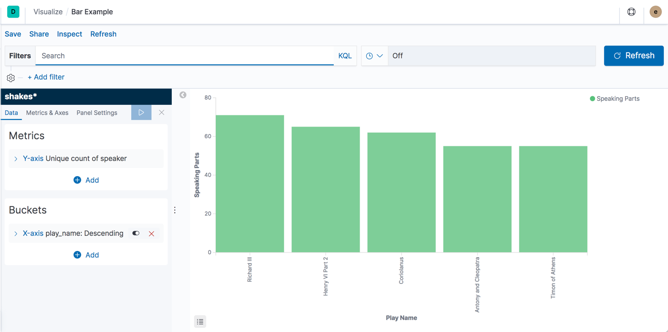
Create a Vertical Bar chart and set the search source to
shakes*.Initially, the chart is a single bar that shows the total count of documents that match the default wildcard query.
-
Show the number of speaking parts per play along the Y-axis.
- In the Metrics pane, expand Y-axis.
- Set Aggregation to Unique Count.
- Set Field to speaker.
-
In the Custom label box, enter
Speaking Parts.
-
Click Apply changes .
-
Show the plays along the X-axis.
- In the Buckets pane, click Add > X-axis.
- Set Aggregation to Terms.
- Set Field to play_name.
- To list plays alphabetically, in the Order dropdown, select Ascending.
-
Give the axis a custom label,
Play Name.
-
Click Apply changes
.
-
Save this chart with the name
Bar Example.Hovering over a bar shows a tooltip with the number of speaking parts for that play.
Notice how the individual play names show up as whole phrases, instead of broken into individual words. This is the result of the mapping you did at the beginning of the tutorial, when you marked the
play_namefield asnot analyzed.
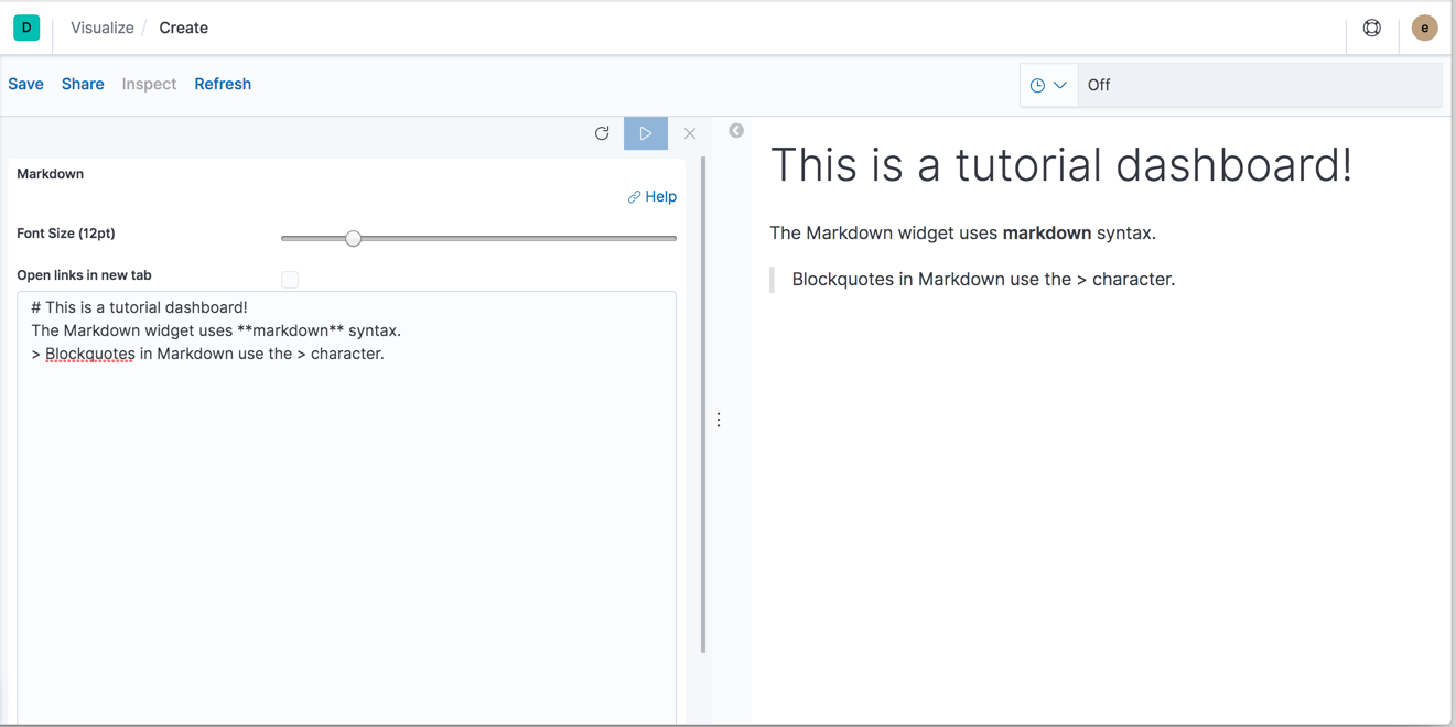
Markdown
editCreate a Markdown widget to add formatted text to your dashboard.
- Create a Markdown visualization.
-
Copy the following text into the text box.
# This is a tutorial dashboard!
The Markdown widget uses **markdown** syntax.
> Blockquotes in Markdown use the > character.
-
Click Apply changes
.The Markdown renders in the preview pane.
-
Save this visualization with the name
Markdown Example.
Map
editUsing Elastic Maps, you can visualize geographic information in the log file sample data.
- Click Maps in the New Visualization menu to create a Map.
-
Set the time.
- In the time filter, click Show dates.
- Click the start date, then Absolute.
- Set the Start date to May 18, 2015.
- In the time filter, click now, then Absolute.
- Set the End date to May 20, 2015.
- Click Update
-
Map the geo coordinates from the log files.
- Click Add layer.
- Click the Grid aggregation data source.
- Set Index pattern to logstash.
- Click the Add layer button.
-
Set the layer style.
- For Fill color, select the yellow to red color ramp.
- For Border color, select white.
-
Click Save & close.
The map now looks like this:
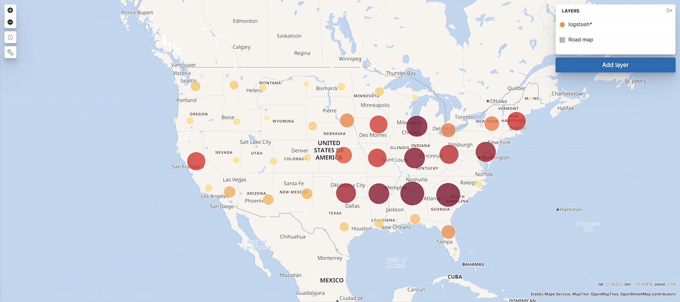
- Navigate the map by clicking and dragging. Use the controls on the left to zoom the map and set filters.
-
Save this map with the name
Map Example.