Normalizing sparse time series with Timelion
Caller: Help! I only get data once per minute but I want to show a per second rate! Me: Congratulations caller number 8! You're getting backstage passes to Saturday's "Sponges and Gum" show! Er, wait, different radio program. This is the data one right?
Ok, you're getting data once per minute, and you've dropped into Timelion and you've got this stupid looking chart.
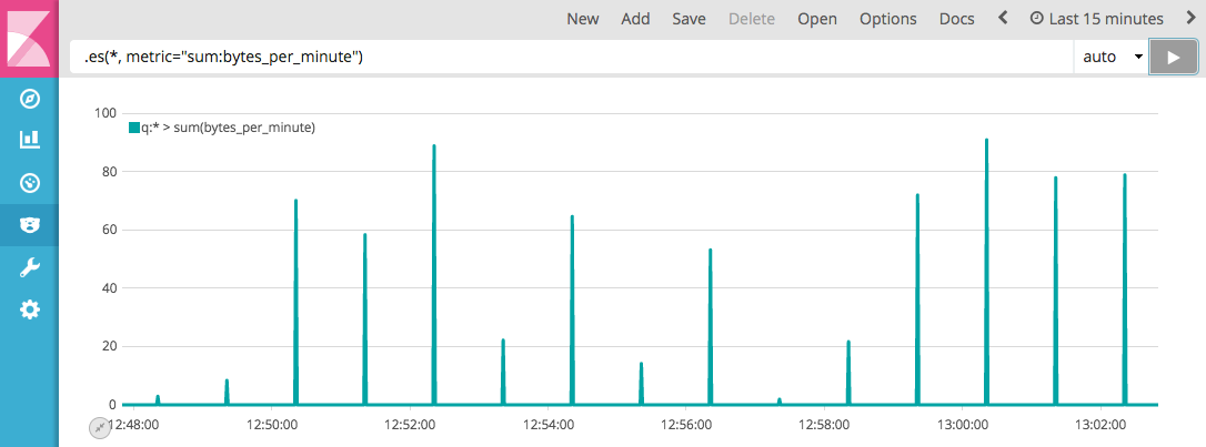
It's calculating an interval of less than 1 minute--1 second in this case--because you're only looking at 15 minutes of data. So Timelion says "Ah, I can show you a nice high resolution" chart. You only get data every minute, but Timelion is asking Elasticsearch for per-second data. So once every 60 seconds, there is a big number, and no documents in between. The sum:bytes_per_minute is 0, zip, zilch, nada, nothing for 59 out of 60 seconds, so timelion plots that big fat zero.
But as far as you're concerned, it isn't 0, its just that you only reported at the end of the minute. We need to tell timelion "If there are no documents in the bucket, the number isn't 0, it's just not known yet, aka, null". The keyword in that statement: if. Timelion does if.
.es(_exists_:bytes_per_minute).if(eq, 0, null, .es(metric="sum:bytes_per_minute"))
This says: Ask Elasticsearch for a count of documents, over time, in which the bytes_per_minute field is present: _exists_:bytes_per_minute. If that count equals (eq) 0, set the bucket to null, otherwise, set the bucket to the value of .es(metric="sum:bytes_per_minute")), that is, our original expression from the first chart.
Since there are now a bunch of null buckets, I'll need to set this chart to points() for the moment, as lines won't connect over null buckets…we'll get to that in a moment.
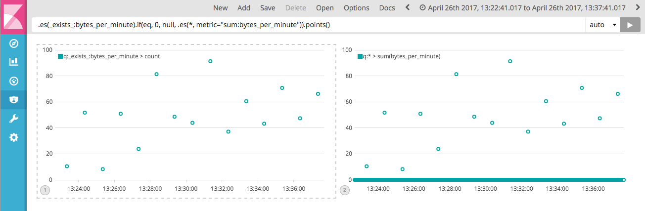
It might not look like it, but this is progress. The chart on the left doesn't have all the zero values of the chart on the right, but we need to connect the dots by filling in the null values. Timelion's .fit(average) could do this for us:
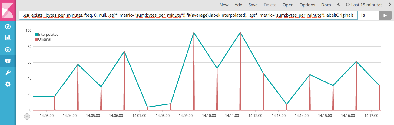
Oooo, it lines up nicely with our original. Oh, that looks good right? But it's not. It's actually very wrong. We've invented bytes that didn't happen! Look what happens when we apply .cusum() to total up all these bytes:
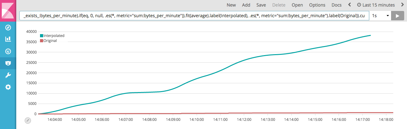
We can't just interpolate like that. Drawing those straight lines between the points is a lie, and not your usual little-line-chart lie; its a big fat everything-is-totally-wrong-now lie. No, what we need is to distribute that total of bytes every 60 seconds, into the other 59 buckets. We can use .fit(scale) for that:
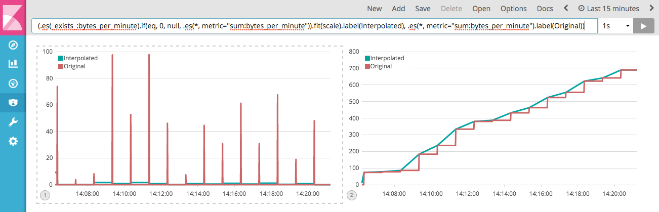
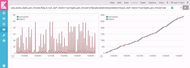
Now the chart on the left doesn't look as good, but looks aren't everything… and don't judge a book by its cover… and a bird in the hand. Hey, leave that bird alone. Where were we? Oh right, charts. The chart on right reveals that what we've done is actually quite accurate. The teal line now represent the per-second data, while the red continues to be per minute. The cumulative sum of the post-fit() series now tracks the original quite well and setting the interval drop down does a nice job of always showing us the data at the requested resolution, even if it has to correct it because you don't have frequent enough data.
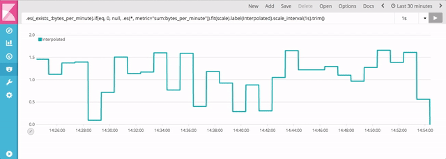
But what if you want to see a bytes per second chart? No matter what interval is selected? We can now employ scale_interval(1s). Below we can see that that chart's y-axis extents and shape stay about the same as we change the interval. This is because we're scaling the chart to always represent a 1 second rate.
So there you go. Now you know how to normalize sparse data, as well as bring it back to a per interval rate, and hopefully you can see how you might use .if(), .fit() and .scale_interval() in other problems too. If you need more ideas, check out this blog post about Timelion conditionals: Time series If-Then-Else with Timelion