WARNING: Version 6.2 of the Elastic Stack has passed its EOL date.
This documentation is no longer being maintained and may be removed. If you are running this version, we strongly advise you to upgrade. For the latest information, see the current release documentation.
Exploring Multi-metric Job Results
editExploring Multi-metric Job Results
editThe X-Pack machine learning features analyze the input stream of data, model its behavior, and perform analysis based on the two detectors you defined in your job. When an event occurs outside of the model, that event is identified as an anomaly.
You can use the Anomaly Explorer in Kibana to view the analysis results:
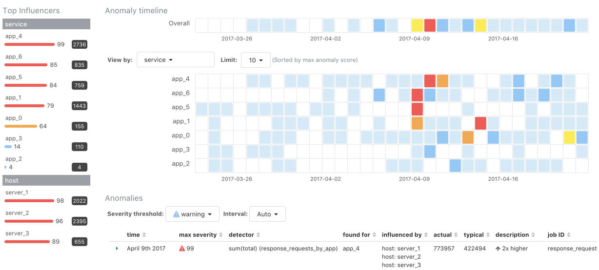
You can explore the overall anomaly time line, which shows the maximum anomaly score for each section in the specified time period. You can change the time period by using the time picker in the Kibana toolbar. Note that the sections in this time line do not necessarily correspond to the bucket span. If you change the time period, the sections change size too. The smallest possible size for these sections is a bucket. If you specify a large time period, the sections can span many buckets.
On the left is a list of the top influencers for all of the detected anomalies in that same time period. The list includes maximum anomaly scores, which in this case are aggregated for each influencer, for each bucket, across all detectors. There is also a total sum of the anomaly scores for each influencer. You can use this list to help you narrow down the contributing factors and focus on the most anomalous entities.
If your job contains influencers, you can also explore swim lanes that
correspond to the values of an influencer. In this example, the swim lanes
correspond to the values for the service field that you used to split the data.
Each lane represents a unique application or service name. Since you specified
the host field as an influencer, you can also optionally view the results in
swim lanes for each host name:
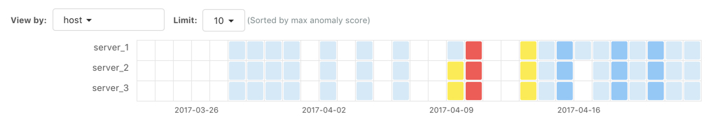
By default, the swim lanes are ordered by their maximum anomaly score values. You can click on the sections in the swim lane to see details about the anomalies that occurred in that time interval.
The anomaly scores that you see in each section of the Anomaly Explorer might differ slightly. This disparity occurs because for each job we generate bucket results, influencer results, and record results. Anomaly scores are generated for each type of result. The anomaly timeline uses the bucket-level anomaly scores. The list of top influencers uses the influencer-level anomaly scores. The list of anomalies uses the record-level anomaly scores. For more information about these different result types, see Results Resources.
Click on a section in the swim lanes to obtain more information about the
anomalies in that time period. For example, click on the red section in the swim
lane for server_2:
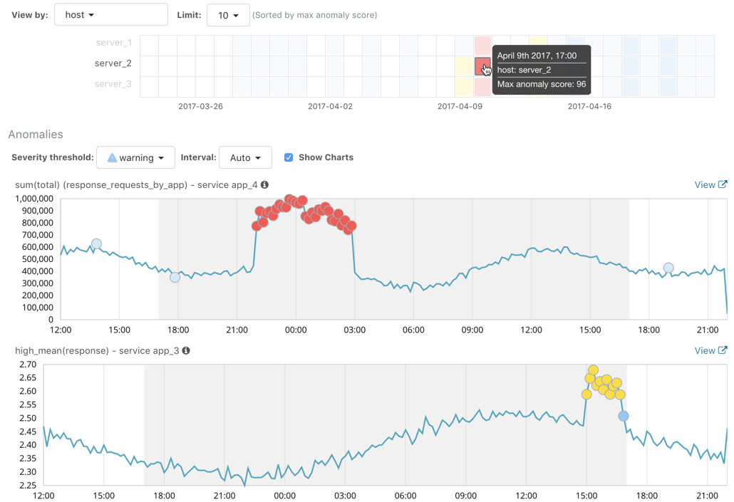
You can see exact times when anomalies occurred and which detectors or metrics
caught the anomaly. Also note that because you split the data by the service
field, you see separate charts for each applicable service. In particular, you
see charts for each service for which there is data on the specified host in the
specified time interval.
Below the charts, there is a table that provides more information, such as the typical and actual values and the influencers that contributed to the anomaly.
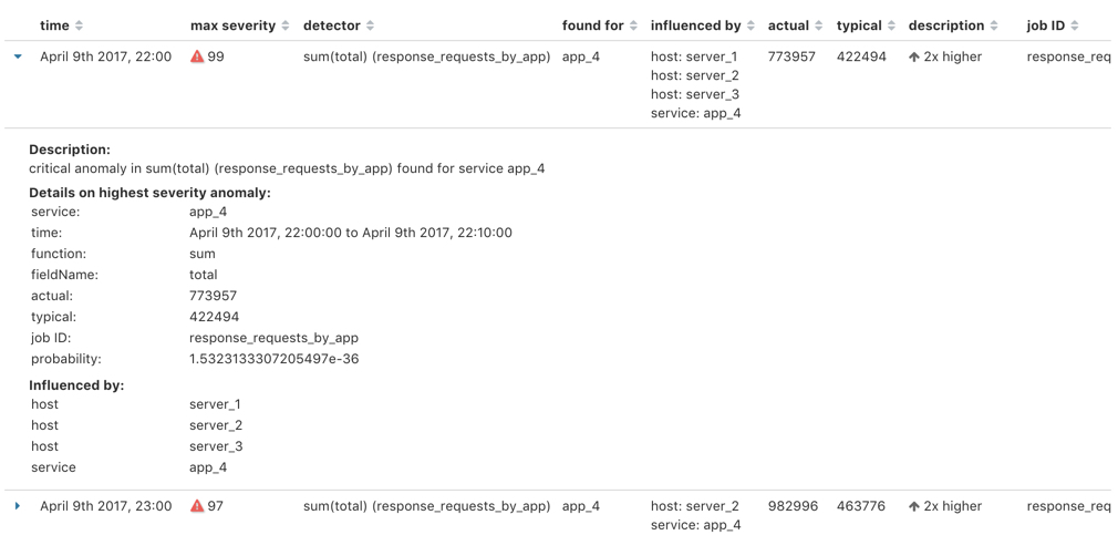
Notice that there are anomalies for both detectors, that is to say for both the
high_mean(response) and the sum(total) metrics in this time interval. The
table aggregates the anomalies to show the highest severity anomaly per detector
and entity, which is the by, over, or partition field value that is displayed
in the found for column. To view all the anomalies without any aggregation,
set the Interval to Show all.
By investigating multiple metrics in a single job, you might see relationships between events in your data that would otherwise be overlooked.