Explore data
editExplore data
editThe Explore data view in Kibana enables you to select and filter result data in any dimension, and look for the cause or impact of performance problems.
Based on your synthetic monitoring, infra metrics, user experience, and mobile experience data, you can create multi-series visualizations of performance and device distributions, key performance indicators (KPI) over time, and core web vitals of your web applications.
Explore data view
editYou can use the Explore data view to filter your data and build multi-series visualizations that help you clarify what’s essential, and examine the cause or impact of performance difficulties. You can compare different time periods, different cohorts, and even different data types.
Hover over the chart to display crosshairs with specific metric data. To drill down into a specific time period, click and drag a selection then click Apply changes.
To add visualizations to an existing case, click Add to case from the toolbar.
To customize a visualization further, click Open in Lens from the toolbar to modify visualizations with the drag and drop editor. To learn more, see Lens.
What report types are available?
edit| Report type | Description |
|---|---|
KPI over time |
The KPI over time histogram represents the performance indicators based on the metric you select, such as page views or monitor duration. |
Performance distribution |
The Performance distribution time-series chart enables you to examine the perceived performance of your web applications based on the metric you select. |
Core web vitals |
The Core web vitals chart is a graphical representation of key metrics, such as loading performance, load responsiveness, and visual stability, for each of your web applications. To learn more about metrics such as Largest contentful paint, First input delay, and Cumulative layout shift, see User Experience metrics. |
Device distribution |
The Device distribution chart displays device information such as OS, carrier name, and connection type. |
For a breakdown of which data types are available for which reports, see What data types can I explore?
You can create multi-series visualizations for each report type, but you cannot combine different report types in one visualization. To change the report type for your visualization, click Remove series and then Add series.
Create multi-series visualizations
editThe Explore data view is currently enabled for the following apps:
- Metrics
- Uptime
- User Experience
To create a multi-series visualization:
-
Click Explore data from a compatible app.
-
The report type will default to the most appropriate for the app, but you can
edit the series or add more series to the visualization. For example, if you
click Explore Data from the Uptime app, the
Synthetics monitoringdata type andMonitor durationreport metric will be preselected.
-
The report type will default to the most appropriate for the app, but you can
edit the series or add more series to the visualization. For example, if you
click Explore Data from the Uptime app, the
- Click Add series to define an additional series for the visualization.
-
Click Select data type and choose from the following options:
- Synthetics monitoring
- User experience (RUM)
- Infra metrics
- Mobile experience
- Click Select report metric and select the options and filters you need. You will see a Missing… warning if required fields (highlighted with red underline) are incomplete.
- Click Apply changes to see the updated visualization, or repeat the Add series process to expand the visualization.
- To add the visualization to an existing case, click Add to case and select the correct case.
Metrics
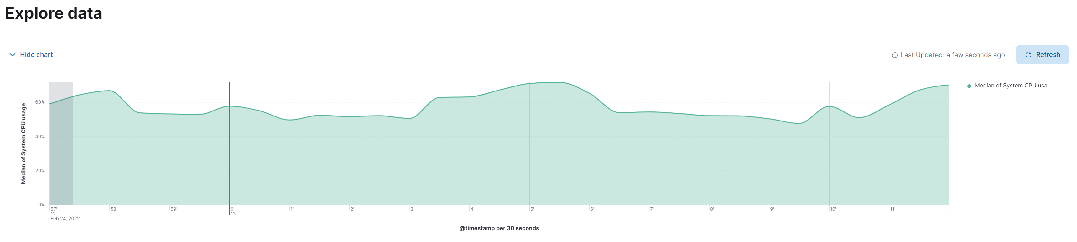
editBased on your infrastructure metrics, you can create various visualizations relating to memory or CPU usage, or any of the available data types.
KPI over time |
The KPI over time histogram represents the performance indicators based on the metric you select. By default, the |
Synthetic Monitoring
editBased on the Uptime data you are sending to your deployment, you can create various visualizations relating to monitor durations, pings over time, or any of the available data types.
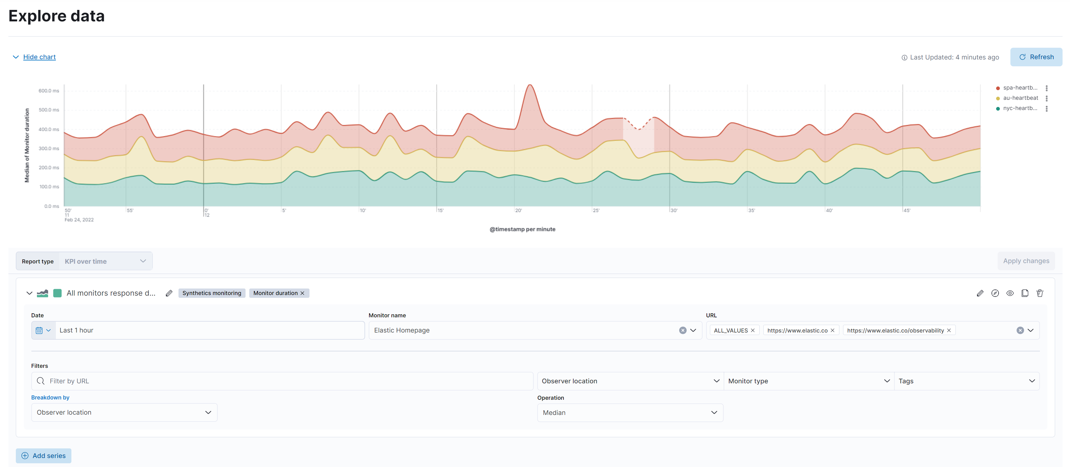
Monitor duration |
The Uptime monitor duration time-series chart displays the timing for each check that Heartbeat performed. This visualization helps you to gain insights into how quickly requests resolve by the targeted endpoint and give you a sense of how frequently a host or endpoint was down in your selected time span. |
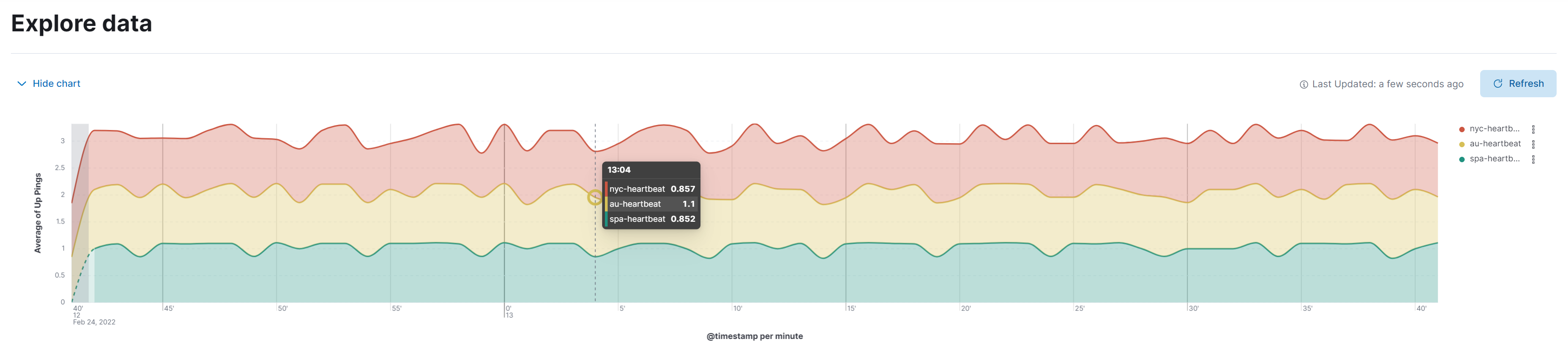
Pings histogram |
The Uptime pings chart is a graphical representation of the check statuses over time. |
User Experience
editBased on the User Experience data from your instrumented applications, you can create detailed visualizations for performance distributions, key performance indicators (KPI) over time, and for core web vitals of your web applications.
KPI over time |
The KPI over time histogram represents the performance indicators based on the metric you select. By default, the |
Performance distribution |
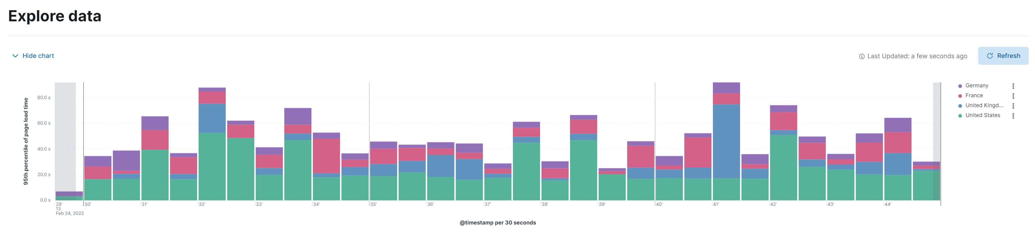
The Performance distribution time-series chart enables you to examine the perceived performance of your web applications based on the metric you select. By default, the |
Core web vitals |
The Core web vitals chart is a graphical representation of key metrics, such as load performance, load responsiveness, and visual stability, for each of your web applications. By default, the |
What data types can I explore?
editThe following table shows which data types are available for each report type:
| Data type | Synthetics monitoring | Infra metrics | User experience (RUM) | Mobile experience |
|---|---|---|---|---|
Monitor duration |
|
|||
Up Pings |
|
|||
Down Pings |
|
|||
Step duration |
|
|||
DOM content loaded |
|
|||
Document complete (onLoad) |
|
|||
Largest contentful paint |
|
|
||
First contentful paint |
|
|
||
Page load time |
|
|
||
Cumulative layout shift |
|
|
||
Page views |
|
|||
Backend time |
|
|||
Total blocking time |
|
|||
First input delay |
|
|||
Latency |
|
|||
Throughput |
|
|||
System memory usage |
|
|
||
CPU usage |
|
|||
Number of devices |
|
|||
System CPU usage |
|
|||
Docker CPU usage |
|
|||
K8s pod CPU usage |
|
