Create user experience visualizations
editCreate user experience visualizations
editThis functionality is in technical preview and may be changed or removed in a future release. Elastic will work to fix any issues, but features in technical preview are not subject to the support SLA of official GA features.
Based on the User Experience data from your instrumented applications, you can create detailed visualizations for performance distributions, key performance indicators (KPI) over time, and for core web vitals of your web applications.
- Go to Observability > User Experience > Dashboard.
- Click Analyze data.
- For data type, select User Experience (RUM).
-
Under Report, choose the type of data you want to analyze:
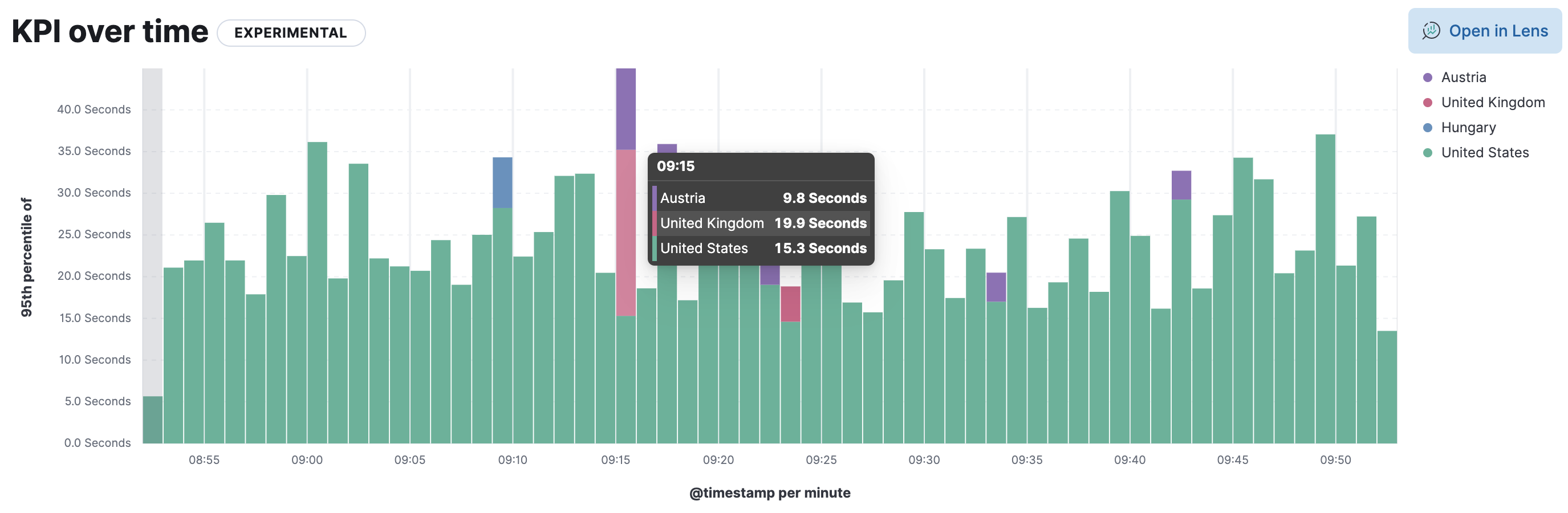
KPI over time
The KPI over time histogram represents the performance indicators based on the metric you select.
By default, the
page viewsmetric is selected. Hover over the chart to display crosshairs with specific metric data.Performance distribution
The Performance distribution time-series chart enables you to examine the perceived performance of your web applications based on the metric you select.
By default, the
page load timemetric is selected. Hover over the chart to display crosshairs with specific metric data.Core web vitals
The Core web vitals chart is a graphical representation of key metrics, such as loading performance, load responsiveness, and visual stability, for each of your web applications.
By default, the
largest contentful paintmetric is selected. Hover over the chart to display crosshairs with performance indicators for each web application:poor,average, andgood. - Now let’s define your report. Set the time filter as an absolute or relative time.
- Select the web application name and its environment. You can make multiple selections.
-
From the Metric dropdown, choose the metric you want to analyze; available options depend on the previously selected report type:
- Page views
- Page load time
- Backend time
- First contentful paint
- Total blocking time
- Largest contentful paint
- First input delay
- Cumulative layout shift
- Largest contentful paint
- First input delay
-
Cumulative layout shift
To learn more about these metrics, see User Experience metrics.
-
From the Chart type dropdown, choose the aggregation-based visualization you want to view; available options depend on the previously selected report type:
- Bar vertical
- Bar horizontal
- Bar vertical stacked
- Bar horizontal stacked
- Bar horizontal percentage
- Area
- Area stacked
- Area percentage
- Line
-
Filter the type of data you want to examine.
Dependent on which report you selected, you can filter by
URL,Web application,Operating system,Location,Device, orBrowser family. -
To further segment the data and view multiple data series on the chart, you can specify a breakdown.
For a KPI over time report and a Performance distribution report, you can segment the data by the
browser family,operating system,location, ordevice.For a Core web vitals report, segment data by
web application,browser family,operating system,location,deviceorURL.
To customize the visualization further, click Open in Lens where you can modify visualizations with the drag and drop editor. To learn more, see Lens.