Create synthetic monitoring visualizations
editCreate synthetic monitoring visualizations
editThis functionality is in technical preview and may be changed or removed in a future release. Elastic will work to fix any issues, but features in technical preview are not subject to the support SLA of official GA features.
Based on the Uptime data you are sending to your deployment, you can create various visualizations relating to your monitor durations or pings over time.
- Go to Observability > Uptime.
- On the Overview page, click Analyze data.
- For data type, select Synthetic Monitoring.
-
Under Report, choose the type of data you want to analyze:
Monitor duration
The Uptime monitor duration time-series chart displays the timing for each check that Heartbeat performed.
The visualization helps you to gain insights into how quickly requests resolve by the targeted endpoint and give you a sense of how frequently a host or endpoint was down in your selected timespan.
Hover over the chart to display crosshairs with specific metric data.
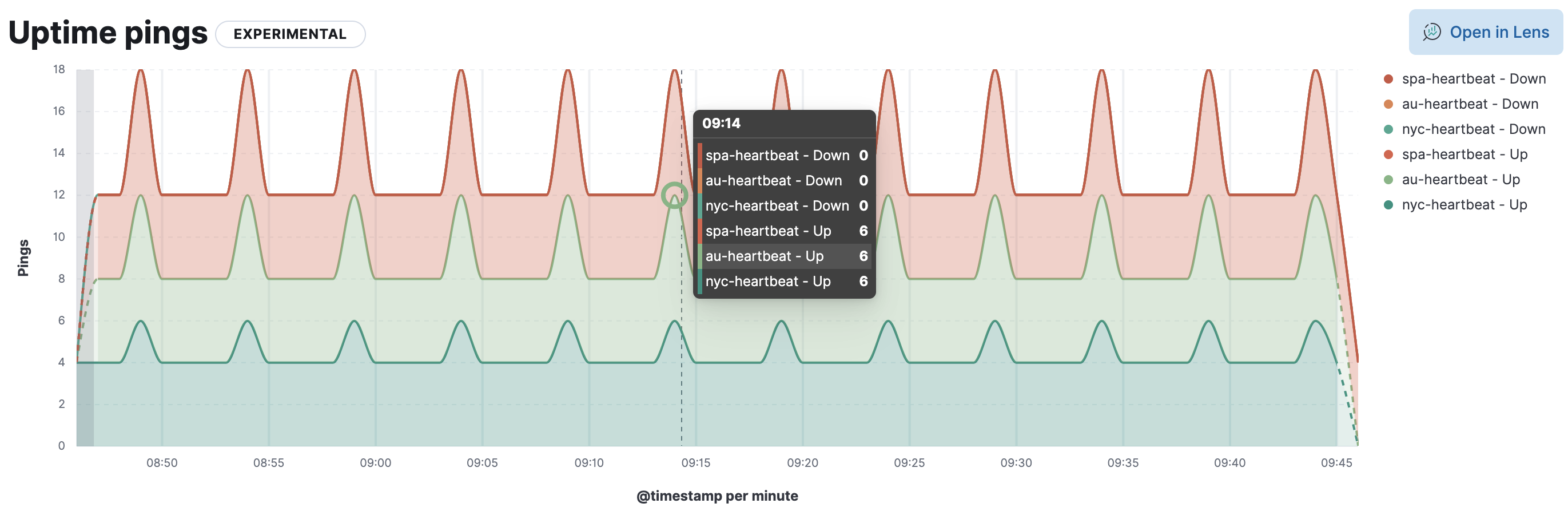
Pings histogram
The Uptime pings chart is a graphical representation of the check statuses over time.
Hover over the chart to display crosshairs with specific metric data.
- Let’s define your report. Set the time filter as an absolute or relative time.
- Select the monitor name and/or the URL. You can make multiple selections.
-
For a monitor duration report, you can specify the percentile to calculate and filter the chart by
average,median,75th,90th,95th, or99th.A percentile represents the value at which a certain percentage of observed values occur. For example, the 95th percentile is the value that is greater than 95% of the observed values.
-
From the Chart type dropdown, choose the aggregation-based visualization you want to view:
- Bar vertical
- Bar horizontal
- Bar vertical stacked
- Area
- Area stacked
- Line
-
Filter the type of data you want to examine.
You can filter by
monitor type,observer location, and anytagsyou previously created for a monitor duration report.You can filter by
monitor type,observer location, and anytagsyou previously created for a pings histogram report. -
To further segment the data and view multiple data series on the chart, you can specify a breakdown.
For a monitor duration report, you can segment data by
location,ID, orport.For a pings histogram report, you can segment data by
observer locationormonitor type.
To customize the visualization further, click Open in Lens where you can modify visualizations with the drag and drop editor. To learn more, see Lens.